
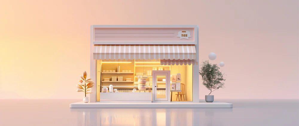
As the owner of a retail business, you know that smart store design drives sales. And for small business owners facing tighter footprints, rising rents, and omnichannel pressure, every square foot needs to perform.
If you’re stuck for ideas on how to make a small space more visually appealing, this guide is for you. We’ll cover the foundational principles of customer flow, including the natural loop many shoppers follow through retail spaces. Plus, see research-backed design ideas you can incorporate to improve your brick-and-mortar store’s atmosphere and merchandising to boost sales.
Key principles of small store design
There are three key principles when it comes to designing a small store:
Maximize customer flow and navigation
At the entrance of your retail store, there’s a zone environmental psychologists call the “decompression zone” (the first five to 15 feet where visitors pause and adjust after entering). According Paco Underhill, renowned expert on the science of shopping and founder of Envirosell, most customers instinctively turn right upon entering a retail space. Knowing both of these things, you can design a natural loop, or a planned right-hand path, that guides visitors past more merchandise.
Create a cohesive atmosphere and brand experience
Lighting, color palette, music, and materials all shape how comfortable shoppers feel—and how likely they are to buy. For example, a specialty cafe might use warm wood, low-glare ambient lighting, and soft music to create a relaxed experience that invites browsing.
Employ strategic merchandising
Visual merchandising involves tactics like establishing focal points, applying cross merchandising (pairing complementary items), and working from a planogram.
And according to Underhill’s findings, when display placement aligns with how people physically interact with space, sales tend to go up. There are multiple ways small, independent retailers can use his research:
- Place a bundle of “grab-and-go” items at eye-level in the path of your natural loop to trigger impulse buys.
- Use a power wall at the right turn from the entrance, featuring a signature product with supporting items displayed nearby.
- Refresh focal displays regularly to keep attention high and encourage regular customers to make repeat visits.
21 design ideas for your small retail store
- Leverage vertical space with high shelves
- Use multipurpose furniture
- Adopt an open floor plan
- Create a natural loop
- Opt for mobile fixtures
- Optimize underused areas
- Optimize employee areas
- Choose a neutral color palette
- Use lighting strategically
- Incorporate mirrors to expand visual space
- Use clear glass for windows and doors
- Create an accent wall
- Play music in-store
- Use cross-merchandising displays
- Create a focal point
- Display products in the window
- Create seasonal displays
- Use baskets and bins
- Use display screens
- Show QR codes
- Create social media opportunities
Layout and space optimization ideas
Your retail store layout is the backbone of how customers move and interact with your products. A strong store layout defines customer flow—the predictable path shoppers follow—and helps you create a natural loop that guides them smoothly through your entire space before guiding them toward checkout.
1. Leverage vertical space with high shelves
In a small shop, the easiest way to gain square footage is upward. Using tall, well-anchored shelving lets you expand product displays without crowding floor traffic.
To maximize vertical space:
- Choose sturdy fixtures and secure them to wall studs or ceiling brackets.
- Keep high margin or bestselling products at eye level—items at this height are easiest to see.
- Use consistent facing, spacing, and labeling so shoppers can browse comfortably without visual clutter.
Making use of vertical space also keeps pathways open, improves sightlines, and your shop’s perceived spaciousness. These three factors work together so customers see more of your merchandise in one glance, as Tomlinson’s shows:

📚 Learn: Tomlinson’s Automates Discounting and Reduces Checkout Time by 56% with Shopify POS
2. Use multipurpose furniture
In a small retail store, every fixture should earn its place. Pieces that double as storage or seating give you flexibility without adding bulk. You likely won’t have enough space to add seating areas and large volumes of stock, but you could get a multipurpose table that contains hidden storage to store inventory and offer customers a place to sit.
Other examples include:
- Nesting tables that separate for promotions
- Storage benches that hide extra stock
- Rolling display units that double as mobile cash wraps during peak hours or events
Opt for consistent material palettes so multifunctional pieces look intentional, not improvised. Reconfigure these layouts seasonally—the same fixtures can feel brand new with a different arrangement as part of your store design.
3. Adopt an open floor plan
An open floor plan is a type of retail store layout that brings all aspects of your store together in one large space. It can make your store look bigger because the eye sees much more space, even if it was previously the same space separated by dividers, walls, or shelving.
Free flow and loop formats both work well for smaller stores, where open layouts invite longer browsing and make your footprint feel larger than it is.
Combine this layout with store design features like:
- Removing unnecessary partitions or tall racks blocking visibility
- Keeping at least three feet between pathways, for both comfort and ADA compliance
- Using lower fixtures or transparent cases to maintain clear sightlines
4. Create a natural loop
Studies have shown that shoppers tend to turn right when they enter a retail store, then follow a clockwise path around the back of the store, concluding on the left-hand side before exiting the store.
Cater to this bias with a natural loop that brings customers past key products before heading back to checkout. Your natural loop should:
- Keep the “decompression zone”—the first few feet inside your door—open so visitors can adjust to your store’s lighting and noise.
- Place a high-impact display or “power wall” immediately to the right of the entrance.
- Arrange fixtures to guide movement around the perimeter and gently back toward the register.
5. Opt for mobile fixtures
Mobile fixtures allow you to refresh your small store’s design without hiring builders or contractors to repeatedly dismantle and rebuild permanent displays. Lightweight or wheeled displays also let you adapt your store design to seasons, events, or shifting traffic patterns without making major, costly renovations.
Invest in racks and tables with locking casters so they move easily but stay secure. Reposition these units once every week or two to test different product pairings or flow patterns. Use them to widen aisles on busy weekends or highlight new arrivals upfront.
6. Optimize underused areas
Designing a small store layout is all about maximizing available space. Hidden corners, endcaps, and narrow aisles can become powerful selling spots with a few smart tweaks:
- Add small endcap displays for accessories or add-ons.
- Maximize the space between two joining walls with corner shelving units.
- Turn unused wall sections into vertical pegboard displays.
- Use soft lighting or mirrors to brighten dark corners and make them feel intentional.
- If you’re lucky enough to have a retail space that spans multiple floors, turn the area under your stairs into extra storage or display space.
7. Optimize employee areas
Behind the scenes matters as much as the sales floor. A tidy, efficient backroom helps staff serve customers faster and keeps the front of house clutter-free.
Take your stockroom, for example. You’ll be receiving inventory and storing excess stock here that isn’t on display. If a customer asks whether a product is available, you don’t want to spend too long rummaging through the stockroom to find out. Shelving that organizes inventory by product type, SKU number, or use case means you can get quicker answers and keep customers excited.
Visual enhancement and atmosphere ideas
Atmosphere is one of the most powerful tools in retail design. The way your store looks, feels, and sounds shapes how comfortable customers feel shopping, and how long they’ll stay.
8. Choose a neutral color palette
A balanced color palette helps small stores feel bright, cohesive, and spacious. Neutrals like soft white, light beige, and warm gray make your merchandise stand out rather than compete with the décor.
Here are some tips to keep in mind:
- Test paint samples under your actual store lighting before painting entire walls.
- Introduce one or two accent colors that tie into your logo or product packaging for consistency. Be consistent in how you use your brand colors to strengthen recognition and trust.
- Avoid overly dark walls that absorb light and make your space feel smaller.
- A clean, neutral backdrop puts the focus where it belongs: on your products.
9. Use lighting strategically
The more light you have bouncing around your retail space, the bigger it will look. Natural light is your best friend here. It’s easy on the eye and doesn’t distort the color of your products (like yellow or blue light sometimes can).
Natural lighting has also been proven to improve mood and energy levels, helping people feel happier when they’re shopping in your store.
If you don’t have large windows or doors to let it natural light, use lighting fixtures strategically by combining:
- Ambient lighting for overall illumination
- Accent lighting for focal displays
- Task lighting for areas like the checkout counter

10. Incorporate mirrors to expand visual space
Mirrors help bounce natural light around your store by reflecting windows or doors, and create an illusion of depth, helping small spaces feel open and airy. They also brighten up dark corners and expand sightlines—both of which help small spaces feel bigger.
Place large mirrors opposite your windows or main lighting source to reflect light deeper into the store. You could also angle mirrors in corners or narrow aisles, or add mirror backing to shelving or display tables, to visually widen the space.
11. Use clear glass for windows and doors
There are various types of glass you can use for window displays. Although it’s not the most exciting option, clear glass is the best choice. It allows passersby to see in, which could help you bring them in-store—even if they didn’t intend to. Plus, clear glass windows are better for security because it makes it more difficult for shoplifters to steal merchandise.
12. Create an accent wall
An accent wall, also known as a power wall, acts as a visual anchor that immediately captures attention when people first enter your store. It gives customers a focal point to orient themselves and builds excitement as they enter.
To make your accent wall space more effective:
- Position your accent wall opposite the entrance or to the right-hand side where shoppers naturally turn.
- Paint it a contrasting color or add a textured finish that complements your brand.
- Feature bestsellers, limited editions, or high-margin products here to maximize exposure.
- Refresh the design each season to keep regular visitors engaged.
- Only design one wall—an accent or power wall isn’t as effective when you have multiple.

13. Play music in-store
Sound completes the sensory experience. The right playlist can set the mood, influence pacing, and make shoppers more likely to linger. Studies have shown that playing the right background music in a retail store can convince 41% of shoppers to spend more time shopping.
Select music that reflects your brand personality—relaxed and acoustic for boutique settings, or upbeat for lifestyle shops. Keep volume under 70 decibels, and use licensed streaming services to stay compliant with music licensing laws.
Experiment with the retail music tempo throughout the day—for example, slower in the morning or off-peak hours, faster during busy periods.
Merchandising and display ideas
Merchandising is storytelling through space and arrangement: it’s how you show customers what goes together, what’s new, and why it matters. These product merchandising ideas help you build visual logic that guides shoppers from discovery to purchase.
14. Use cross-merchandising displays
Cross-merchandising means displaying related products together to encourage larger baskets. To do this effectively as part of your store design, group complementary items that naturally go together—for example, like candles with match sets or jackets with scarves.
Use tiered tables or risers so every product is visible from multiple angles. Place high-margin or new items in the center of the grouping to draw attention, and add a small sign explaining the connection.
Rotate pairings regularly to test which combinations perform best. This also keeps your displays fresh so regular customers have a reason to keep coming back.
💡Tip: Shopify is the only platform to unify data wherever you sell. One single infrastructure powers both online and offline sales channels, so you get complete visibility on performance—including bestselling products, how campaigns influence store sales, and more. Can’t find the metric you need? Ask Sidekick to create a custom data exploration for you.

15. Create a focal point
Every retail space needs a visual anchor, or a single area that immediately draws attention and sets the tone for the rest of your store.
Position your focal display just beyond the decompression zone so it captures attention without blocking movement. Feature your most profitable or story-driven collection here, styled to highlight color or texture so it stands out, and avoid overcrowding. Empty space gives the display room to breathe.
You can also use focal points to reduce congestion in high traffic spots. If people tend to congregate around the entrance of your store, for example, you could create a focal point off to the side.
16. Display products in the window
Your window display is your first chance to tell a story. They can entice passersby to enter your store—even if they didn’t intend to.
Window displays should have one clear theme rather than multiple competing ideas. For example, if you’re promoting a new product launch, use display screens and visual merchandising to showcase the product and hide any other items behind the display.
17. Create seasonal displays
Seasonal displays are your chance to re-energize repeat customers and highlight new arrivals. Treat them as mini-campaigns that tie back to your store’s larger theme.
Build displays around key retail events, like holidays, back-to-school, or local festivals. Reuse core fixtures and props, but change the product mix and visuals to stay relevant. Then track which themes drive the most engagement to refine future campaigns.
Plan a small refresh each month (e.g., color swap, new signage) and a major overhaul each quarter. Regular updates help make your space feel alive, signaling freshness and encouraging customers to stop by more regularly.
18. Use baskets and bins
It’s hard to replenish inventory when small items sell out frequently. And it can feel like a waste of space if you’re loading large quantities of small items onto a shelving unit. But if you’re not showing enough inventory, you might sell out and lose potential revenue while the shelves are waiting to be restocked.
Baskets and bins help you strike the right balance between either issue. They make it easy to showcase affordable add-ons that boost average order value:
- Place baskets and bins on the ground to maximize floor space.
- Keep pricing clear and visible, and use consistent signage and colors so mini-displays feel cohesive with the rest of your store.
- Place small, impulse-buy items—like travel-sized goods or accessories—in bins near the register or fitting rooms.
Using baskets and bins for small items also opens up shelving space for bigger or bulkier items that are better suited to being displayed that way.
Customer experience and technology ideas
The right technology elevates shop design without overwhelming it. These ideas show how to merge tech with atmosphere to create a modern, seamless shopping experience.
19. Use display screens
Display signage helps you maximize space because you can show multiple retail campaigns—from promotions to lifestyle imagery or even local community content that resonates with your shoppers—on a single screen.
For example, you could have a rotating display screen that shows:
- Special offers or promotions that customers can take advantage of in-store.
- User-generated content from other happy customers, such as TikTok videos or reviews.
- Upcoming product launches to get in-store shoppers excited about the new products.
You could also use point of purchase displays—a type of marketing that helps you deliver more personalized shopping experiences without hiring more sales associates. A shopper can view your dining chairs, compare different options, and choose their product on this customer-facing display, then head to the POS desk to complete their purchase.

20. Show QR codes
It’s unlikely that every customer visiting your store will make a purchase. QR codes act as digital bridges between your physical store and online presence. They let shoppers learn more, check availability, or claim offers without waiting for staff assistance.
Customers can also self-serve by scanning a QR code beside a product display. The code could take them to the specific product page on your ecommerce website which contains:
- Pricing details, including any time-sensitive deals
- Instructions on how to care or use the product
- A visual breakdown of its ingredients or materials
- Your store’s returns policy
- Whether the item is available for immediate collection or delivery
21. Create social media opportunities
Social media has the power to drive foot traffic toward your store, but you don’t always need to be the one posting.
Let shoppers do the hard work—encourage them to take pictures in-store and share them online. This not only exposes you to a new audience (your shopper’s friends and family), but it acts as social proof. People might be more willing to visit if someone they trust has vouched for it.
Here’s how to use thoughtful store design to encourage people to snap and post naturally:
- Identify one or two well-lit areas that can serve as “photo-friendly” zones featuring subtle branding or creative backdrops.
- Encourage customers to tag your store or use a branded hashtag with clear but unobtrusive signage.
- Get customers’ consent before resharing user-generated content on your own channels.
Shopify POS is the perfect addition to any store
Shopify POS helps small retailers make the most of their floor space by turning any counter—or even a mobile fixture—into a checkout station. By freeing you from bulky registers, it keeps traffic flowing and prevents bottlenecks.
Whether you have a single store, multiple locations, or you sell on the go, Shopify POS gives you everything you need to offer a seamless customer experience both in-store and online, combining your back office, online sales, and POS system into one comprehensive setup.
Shop design ideas FAQ
How do I design a retail store layout?
Start by keeping your entrance clear so customers have a decompression zone to adjust before they start shopping. From there, create a natural path that guides people to the right, since that’s where most shoppers instinctively turn, and loops them past your key products. Don’t forget to use vertical shelving to save floor space and keep aisles wide enough for easy browsing.
How can I make my retail store look better?
Good lighting is everything. Try mixing natural light with ambient fixtures to make your space feel open and airy. You can also use mirrors to bounce that light into dark corners, which tricks the eye into thinking the room is bigger than it is. Also stick to a neutral color palette on your walls so your products really pop without fighting for attention.
What are the four main types of store layouts?
The most common layouts are the grid, the loop (racetrack), free-flow, and the spine. For smaller spaces, a free-flow or loop layout usually works best because it invites customers to explore rather than just rushing through aisles. Open styles like these maximize square footage and guide shoppers past more of your inventory.
What is the 3-5-7 rule in interior design?
The 3-5-7 rule is a little trick that makes focal points and product tables feel more engaging. It involves arranging items in odd numbers, like groups of three, five, or seven, because our eyes are naturally drawn to asymmetry. Overall, it creates more visual interest than a symmetrical pair would.