

When it comes to eCommerce, checkout page design is arguably one of the single most important things to you can do to optimize your website.
Why?
Because it’s the last thing people see before they buy something, or – abandon their cart.
But don’t worry! In this article, I’ll walk you through some ways in which you can nail your checkout page design and your checkout flow, helping get customers get through your checkout faster, easier, and with bigger purchases.
As you’ll see, implementing one simple change can increase your conversion rates by as high as 42%.
Alright, let’s jump in!
I’ve already talked about why your checkout page design is more important than anything else on your site, but here are some statistics to back those claims up.
First up, the average online shopping cart abandonment rate is nearly 70%.
So you might have 100 shoppers who add items to their cart… but only 30 of them will go on to complete their purchase.
Image from Invespcro.com.
Here’s the good news:
According to research, the average eCommerce platform can gain a 35% increase in conversion rates though better checkout page design.
Let this sink in for a second.
Even if you don’t spend a single second on SEO, blogging, and all that jazz, you can still increase your conversion rate by a whopping 35%.
For good measure, I’ll even throw in a case study.
Here’s how fashion retailer ASOS reduced their cart abandonment rates by 50%.
Now that you’re crystal-clear on exactly how important your checkout page design is, let’s get to those tips.
Here’s a golden rule to keep in mind: In order to be effective, a checkout page has to be laser-focused.
The goal of your checkout page is to get your shopper to complete their purchase. This means you should only have one Call To Action (CTA) prompting your customer to make a purchase.
Newsletter signup button? You don’t need that.
Link to your About Us page? Nope.
Contact Us button? Not necessary.
But CTAs aside, also ensure that your checkout page is straightforward and minimal, and doesn’t have too much clutter.
Here’s an example of a sleek checkout page design:

Image from Medium.com.
As you can see, it has one button to push: purchase. There are no distractions, the customer is that bottom of funnel and it’s super-easy for them to complete the transaction.
And here’s an example of a checkout page gone wrong:
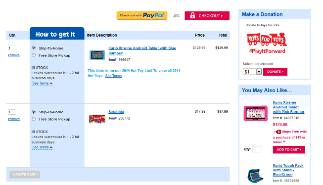
Image from Cloudfront.net.
Besides the archaic-looking design, this checkout page has a lot of other distractions, potentially confusing the customer, and giving them too many opportunities to abandon their cart.
Why is establishing trust so important?
In this day and age, pretty much anyone can start their own eCommerce store. It’s super easy. So how do your shoppers know that you’re a legit company and not a scam website that’s just going to run away with their money?
You have to show shoppers certain trust signals, and these influence their perception of your store, determining whether you’re going to scare them off or convert them into a paying customer.
These include…
First up, let’s talk about trust badges.
Now, most eCommerce stores experience a boost in conversion rates after incorporating these trust signals on their checkout pages.
Check out these case studies:
As these case studies show you, trust badges can be implemented pretty much anywhere on your website.
But for eCommerce stores, I still recommend that you place the badges where it matters the most. And that’s your checkout page!
As to which trust badges are the most effective, here’s a breakdown…

Image from ConversionXL.com.
While the Visa-Mastercard badge is the most recognizable, PayPal is the badge that shoppers trust the most.
Trust badges aside, you can also use the other trust signals (testimonials, media mentions, and client lists) on your eCommerce store.
For example, here’s how bedding company QuickZip Sheet displays their media mentions on their homepage:

And here’s how V-dog displays customer reviews in its “Testimonials” section:
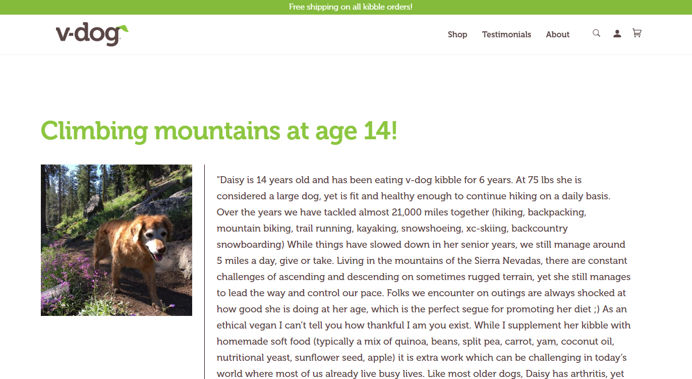
When it comes to your testimonials, always try to flesh these out with real names and pictures to make them more compelling.
In the above testimonial, for example, V-dog actually showcases the pictures of the dog who’s consuming their kibble.
How’s that for social proof?
According to statistics, the #2 reason for abandoned carts is that people don’t want to create an account for eCommerce checkouts.
Look, I know you want to collect your customer’s data so that you can add them into your database and hit them up with promotional emails further down the road.
But there will always be a group of shoppers who don’t want to give you their data, either because:
If you insist on getting all your shoppers to create accounts before checkout, then you’ll lose out on sales from these guys — simple as that.
So what do you do? How do you optimize your checkout process?
Whenever someone arrives at your checkout page, ask for their email address, and then let them choose if they want to create an account, or proceed as a guest.
Here’s an example from Hyphen Mattress:

Image from BigCommerce.com.
If the shopper chooses the guest checkout, that’s completely fine.
You already have their email address, and you can add them to whatever drip campaign you’ve got set up.
Don’t worry about not having enough demographic data (age, gender, etc). It’s better to have a paying customer and not know much about them, instead of losing them as a customer altogether.
You’ve probably already set up your site to accept credit cards and PayPal.
Guess what? That’s not enough!

Image from Mart2Web.wordpress.com
While the majority of shoppers do pay with credit cards, many also use other options such as debit cards, e-wallets, bank transfers, and even Cash On Delivery (COD).
If you don’t want to support bank transfer and COD, fair enough. These 2 methods are fairly difficult to set up and offer.
That said, you should definitely allow other payment methods such as:
And if you’re in Asia, consider these as well:
These platforms are fairly simple to set up, and they bring a ton of convenience to your customers. Try it for yourself!
When it comes to eCommerce checkout page design, less is more.
As a general rule of thumb, you should always:
Piece of cake? Check out these advanced tips as well:
If you’re scratching your head and wondering how you can do these things, a simple solution is to use our Cashier App.
We built Cashier to cater to busy eCommerce store owners who need a simple plug-and-play tool that optimizes their checkout page (I’m guessing that’s you).
The app comes with a ton of awesome features, including…
And not to brag, but most folks who start using our Cashier app see an immediate increase in their conversion rates and sales. 😉
To learn more about Cashier, click here.
Upselling is a great way to increase your sales and revenue.
And I’ll let you in on a little secret that you can use to supercharge your upsell strategy:
Instead of upselling your customer before checkout, do this after checkout instead.
What’s the rationale behind this?
Well, since a customer has already completed their purchase, their guard is down, and they’re more open to the offers or promotions you show them.
It’s kind of like when you’re at H&M, and queuing in line for the cashier.
You’ve already decided that you’re going to make a purchase, so when you see those shelves of knick knacks near the cashier, you think:
Hey, I might as well get a few pairs of socks. And I’ll replace my phone case while I’m at it.
Boom. You’ve just been upsold.

If you’re using Cashier, setting up your post-checkout upsell is simple.
There’s a nifty feature that allows you to create an upsell offer, and customize its location and trigger.
And, get this:
Our customers who have implemented this post-checkout upsell have seen conversion rates of as high as 10%. That’s pretty legit, even if we say so ourselves!
To learn more about how you can upsell your customers using Cashier, read this guide.
Your eCommerce checkout page design can mean the difference between a lost customer and a 42% increase in conversions.
By starting with the checkout page and working backward, you’re getting the most bang for your buck. If you’re familiar with the 80/20 rule, this page is your 20% that will get 80% of your results.
Are you ready to optimize your checkout page design? Drop a comment and let us know what your results are!
If you liked this article, please take a second to share it with your other eCommerce store owner friends.
This article was originally published by our friends at Bold Commerce.

