
The right website design does more than catch the eye; it guides visitors purposefully through your site. Every design choice should create a clear path toward what matters most: your call to action (CTA), portfolio, or brand story.
Your site design shapes how people experience and perceive your business—in fact, 50% of consumers say design of the company’s website is crucial to their impression of the brand. A clean, visually appealing website also signals credibility to visitors and search engines, improving both trust and discoverability.
Here are the main types of modern website design to help you build a site that reflects your brand and leads visitors exactly where you want them to go.
Types of website design
- Static website design
- Dynamic website design
- Responsive website design
- Liquid website design
- Adaptive website design
- Single-page website design
Each website design type has its own pros and cons, and many sites use a hybrid of multiple styles. The right design for your site depends on your specific goals, target audience, content needs, budget, and how you want visitors to interact with it. Here’s how they differ:
Static website design
A static website is like a digital flyer or brochure. Even with several pages of information, the design is steady and unchanging, uses fixed, basic code, and typically contains few or no interactive elements. The content does not change based on user location or preference.
With fewer variables, static websites are relatively easy to set up, publish, and optimize for performance. They don’t rely on databases or complex server-side code, making them relatively inexpensive to host. Static websites can be useful for building a personal website, a simple portfolio site, a basic business website, or even a simple blog website.
Static sites have disadvantages. For one, a basic static website is typically not responsive to different device screen widths, so you have to create a separate mobile version of your site. Because static web pages don’t use a template system, updating it means editing each page individually, which can be time-consuming. Adding familiar functionality, like web forms, can require third-party services like Google Forms.
There has been a resurgence in static and hybrid site design in recent years. Some web designers and web developers see them as a great way to deliver fast, secure user experiences.
Dynamic website design
If you’re looking for an interactive, functional website, a dynamic or database-style website design might fit the bill. Dynamic websites generate content in real time based on factors like user location, database queries, or time of day. This creates a more interactive, user-friendly interface, and personalizes what visitors see. Dynamic sites can update automatically and respond instantly to user input. The server assembles each page on demand by pulling content from a database before displaying it in the browser.
Dynamic websites use a content management system (CMS), allowing non-technical users to easily add or update content, create new pages, and enable user engagement features like web forms and comments. This is done without touching any of the structural code of a static web page.
Dynamic websites are commonly used for ecommerce websites, hotel or rental car booking systems, and news websites with multiple contributors. Choose a CMS that makes dynamic content simple to manage. Tools like Shopify, WordPress, and Drupal let you update your pages automatically, connecting directly to your product or content database.
Responsive website design

Responsive website design focuses on layout flexibility, allowing your content to fit perfectly on the user’s screen. For example, you can show extra “related products” in a slider or more in-depth information in a sidebar, while hiding them on mobile. You could even condense them into a button titled See More.
Responsive design is widely used across all types of websites—like ecommerce websites, restaurant pages, and artist portfolios—because it ensures a user-friendly interface on any device. It’s especially important for mobile users, who make up the largest share of web traffic. It also eliminates the need to build and maintain separate mobile and desktop sites. It can take more time to build and develop because you’re creating many website layouts based on the size of users’ browser windows.
Most templates on web builders offer responsive design right out of the gate. For example, the Shopify theme Startup adapts as the page width shrinks. Once the screen width hits 786 pixels, the image enlarges and centers, while the headline and CTA button shift below it. This guides mobile users toward the site’s main purpose. On larger screens, extra details and copy appear alongside the primary content, but on mobile, they move beneath the Buy Now CTA to keep the focus clear.
Liquid website design
Also known as fluid website design, this type of website uses flexible units that adjust across a web page depending on the user’s device screen width. Each unit is given a percentage of screen real estate it can use, adding up to 100% of the device’s size. This way, the page always fills the width of your visitors’ screens, regardless of device. Unlike responsive layouts, which adjust based on specific pixel widths, liquid design resizes elements proportionally based on screen percentages.
Liquid design can be easier to set up than a responsive one due to its single layout. It also ensures the information on your site won’t get cut off like on a static website.
There are disadvantages, however. On very wide browser windows, your site’s content can become stretched out. On the other hand, if the browser is much narrower than the original design, content can become cramped. As a designer, you have less control over what your users see, since the content blocks stretch but don’t rearrange, like on responsive sites.
The main design consideration with this type of layout is to make sure your content is simple enough to work at various screen sizes.
Adaptive website design
This type of design also focuses on screen width. Like responsive layouts, it adjusts the website’s page size based on the width of a user’s screen. The difference is that adaptive web design uses specific parameters based on common device sizes (like iPhone, iPad, Android, tablet, desktop, etc.) instead of breakpoints that adjust on the fly. Unlike a liquid design, an adaptive design changes layout to preset sizes, not a percentage of screen width.
When a visitor arrives on an adaptive website, the server detects their screen size and delivers a layout from a list of six common options. You can track which website layouts or screen sizes are most commonly used on your site, then optimize your design for those devices—potentially reducing overall design and development time.
These six common options are:
-
320 px. Smaller mobile phones.
-
480 px. Larger mobile/small tablets.
-
768 px. Tablets in portrait mode.
-
1024 px. Tablets in landscape mode/small laptops.
-
1366 px. Standard desktop/laptop displays.
-
1920 px. Larger desktop/widescreen monitors.
One challenge with this approach is the need to create and maintain multiple website layouts for the same content. If a visitor uses an unusual screen width that doesn’t align with your predefined layouts, the experience can suffer. However, this method can be a good fit when updating older static sites, as it allows you to recreate familiar layouts that stay consistent for returning users.
Single-page website design
Sometimes your website needs to focus users on a single main message. A single-page website places the content on one page. There aren’t links to other pages, though you might have some anchor links that jump to content farther down the page for navigation. Users scroll to find out more and discover the rest of the content.
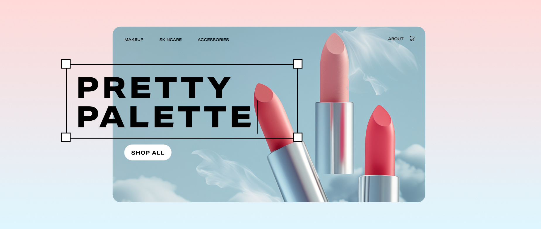
Single-page sites are great for storytelling about a single product, educational, and creative sites. Use a single-page website design for product launches, service showcases, landing pages for marketing campaigns, and more.
These websites can be easy to create and help you design clean, simple layouts with very clear messages. Make sure you don’t put too much on the single-page site, as users may click away if the scroll is too long. If your site needs multiple pages, with branching pages for each, a single-page design won’t be the right fit. It does have limited space for detailed information, too, which could be a mismatch for your specific business goals.
Types of website design FAQ
How do you start designing a website?
There are tons of great Shopify themes to help you choose the type of visual and structural design and match current web design trends. If you’re starting from scratch, you can also check outShopify’s AI store builder to create a custom website or visually appealing homepage design in minutes.
What are the types of website design?
The different types of website design include static, dynamic (or database-driven), and single-page designs, as well as responsive, adaptive, and liquid (or fluid) website designs.
What are the five golden rules of a well-designed web page?
Regardless of the website design type you choose, follow the five golden rules of modern web design:
- Make your site easy to navigate.
- Design for every device.
- Provide useful and updated content.
- Maintain visual consistency.
- Prioritize a seamless user experience.
How do I design my own website?
The best way to create a website for your business is to use a web builder that gives you modern features like mobile-responsive web design, fast load times, and secure checkout, as well as drag-and-drop design tools. Shopify provides these essentials for sites both large and small, with scalable features that expand as your business grows.