


Key Takeaways
- Outperform competitors by designing landing pages that load in under three seconds, dramatically improving visitor retention and conversion rates.
- Structure your landing page with a width between 940-960 pixels for desktops and 320 pixels for mobile to ensure proper display across all devices.
- Connect with visitors by placing authentic testimonials near your call-to-action buttons, building trust and encouraging meaningful engagement.
- Discover what works best through A/B testing different headlines, colors, and layouts to continuously refine your page’s performance.
If you want your page to show clearly on your customers’ desktops, stick to a width size between 940 and 960 pixels.
Selecting the right dimensions will mean that the content can be displayed properly across various devices. This is where you can find Clickfunnels to be helpful because it can provide you with pre-designed templates that can optimize conversions.
The best platform, like Clickfunnels, is already following the best practices for pre-set width, and it’s already mobile-responsive, so the elements are adjusting automatically. Users can also have customization options where they can modify margins to help maintain consistency so customers can easily navigate your website.
Since many users are now using their mobile phones to access information, it’s best to optimize your pages for various screen sizes so you can take advantage of the opportunities that may be coming your way.
Making sure that a landing page is responsive will also encourage your potential customers to explore more of what you have to offer. They will visit your blog posts and your current product selections, and if you have discounts that you can offer if they sign up for your newsletters.
Optimal Landing Page Width and Height
When you’re designing, you need to use a flexible width that can accommodate a larger screen while the letters’ readability is maintained. The narrower width will often not utilize the available space, while excessively wide ones can make the pages difficult to read.
Another factor to consider is height, which would affect how the posts would be viewed when the users scroll to the bottom. You can use a platform that will make sure that your headlines will still stay on the fold, which is the portion of the page that’s visible when you don’t scroll. Content should be below it so the users will be able to navigate back to the previous pages when they need to.
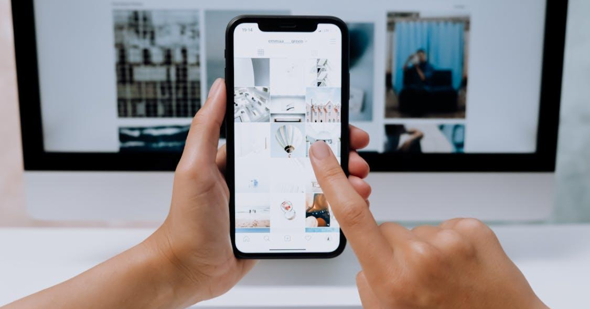
Mobile-Friendly Business Pages
When showing your website to a smaller screen size, you might want to make sure that everything is rendered correctly on a phone before you make the website live.
The standard frame rate is around 393 pixels, while the content area should have a width of 320 pixels. Height can depend on requirements, but it should be adjusted in such a way that excessive zooming or horizontal scrolling can be avoided. See information about pixels when you click here.
Your lead website page should also have touch-friendly buttons, including clear-to-action sign-up elements. Content should be displayed very fast to the users, and the images should be optimized to avoid slow loading times.
The text should also be legible enough without the users needing to pinch their mobile phones, with a minimum of input fields. These are all tips to increase conversions, and you can get this with the right platform where you set up your landing page.
What are the Best Practices for Landing Page Design?

Aside from the dimensions, know that there are several principles that you need to follow in order to be effective with your landing page. You need to be clear about what you’re offering so the visitors will immediately understand what your business is all about.
Be engaging with your headings and write a concise body text that can effectively communicate your message. You also need to utilize white space and visual hierarchies to highlight your most important messages.
You need to be compelling with your CTA, whether it’s a purchase option or a download link. Make the button’s color show up by contrasting it against the other texts. Make sure that the clear-to-action button remains above the fold so users can see it regularly, so it would encourage them to take action.
Another huge factor that can influence your search engine rankings is the page load speed. You need to compress images, use a content delivery network that can lessen redirects, minify your JavaScript files, and use caching mechanisms to improve your load times. It’s best if you can achieve less than three seconds of loading times so you can retain the attention of your potential customers.
Visual Elements on the Website
The way you present your pictures and videos will affect how users will perceive your brand. You need to place them in such a way that they won’t clash with your brand message. The images should be relevant to the text, and the videos might follow at the base of the page so you can convey your message more effectively.
Don’t make the space look too busy or cluttered. Instead, use the blank spaces and group related elements together. Testimonials should be placed near the CTA button so the users will be able to read them immediately.
Keep the text scannable and use bullet points so the important points can be grasped quickly. Read information about CTAs in this URL: https://study.com/learn/lesson/call-to-action-overview-examples.html.
Another important factor that you need to consider is consistency. You need to create a page that aligns with your brand logos. The colors should be uniform, as well as the fonts, so customers can easily recognize you.
A/B Testing for Optimization

You need to perform a series of tests to see which landing pages are going to give you the most sales. Fortunately, some platforms allow you to perform A/B testing, which plays an important role in letting you experiment with different colors and headlines. You’ll then get insights about how long the customers have stayed on your page and which one resonated the most with the users.
Analyzing the behaviors of your would-be customers will help you place more effective ads. You can also refine everything to have higher conversion rates. If a visitor drops off before they can make payments for their orders, you will be able to follow up with them with the right platform that captures their user information. Continuous optimizations will also mean that your landing page remains effective as time goes by.
