


What if you could cut drop-off on your product pages without redesigning your entire store? Product page optimization helps you turn more product-page visits into confident purchases by improving the content, layout, and trust signals shoppers rely on most.
Key Takeaways
- Product page optimization works best when you improve the essentials first: CTA visibility, product imagery, descriptions, reviews, and mobile usability.
- High-converting pages reduce hesitation by showing clear product details, linking variants to images, and reinforcing trust with reviews and checkout signals.
- Strong product page optimization should be measured with one primary KPI per test, such as conversion rate, plus guardrails like AOV or return rate.
- Small, focused updates to your highest-traffic pages can produce meaningful gains faster than broad sitewide changes with unclear impact.
What is product page optimization?
Product page optimization is the process of auditing and improving the design, content, and functionality of a webpage dedicated to selling a product.
It involves optimizing elements such as:
- Product descriptions
- Images
- Pricing
- Reviews
- Call-to-action buttons
These elements work together to create a personalized shopping experience, increase customer confidence in your brand, and drive sales on ecommerce product pages.
What is Product Page Optimization in the App Store?
As a quick clarification, Apple also uses the term Product Page Optimization for App Store listing tests. In this article, the focus is ecommerce product pages, though the broader idea of testing page elements is similar.
11 elements of a great product page
- A clear call to action (CTA)
- Compelling product and lifestyle photography
- Images that link to product variants
- Detailed product descriptions
- Consistent branding
- Aspirational content
- Conversational copy that speaks to your target customer
- Social proof: Reviews, expert testimonials, and UGC
- Related and recommended products
- Buying and checkout options
- Trust signals
Every product page is different, with certain elements being more important depending on the industry, product, and customer need. A beauty brand, for example, will want to focus on transparent ingredient information and customer reviews, while an apparel company should invest in high quality images and in-depth sizing and fit information.
That said, each of these elements is worth an inspection as you dive into product page optimization for your own site.
1. A clear call to action (CTA)
A product page’s primary job is to help shoppers feel confident enough to add the product to cart. That’s why Maria Bonello, director of strategy at SMAKK Studios, recommends starting here. “This is the most important component on the page, and should stand out from the surrounding content,” says Maria. “The area around the button should be uncluttered so that there are no distractions or obstacles that block the user.”
In this example below by sustainable brand Suri, the CTA button has high contrast against the background, which makes it stand out from other page elements.

Your CTA button should be visible as soon as a visitor lands on your product page. “If your product description pushes the Add to Cart button below the bottom of the browser, it’s time for a redesign,” says Maria.
In Q2 , smartphones accounted for about 78% of retail site traffic and about 68% of online shopping orders in the US. Mobile optimization is critical. Test your product pages on multiple browsers and mobile devices to ensure your call to action is front and center no matter how your customers are shopping online.
For example, Dorai’s CTA button is not only clear and central on its product pages, it also sticks to the top of the screen while scrolling, ensuring it’s always accessible, no matter where the customer navigates.

In terms of copywriting, Courtney Hartmann Tisa from Internet Marketing Inc. says to keep it simple. “Don’t try to be clever with CTAs. Direct Add to Cart or Submit Order will do,” Courtney says. Make sure you’re not confusing customers or adding friction to the purchase journey with your CTA copy.
2. Compelling product and lifestyle photography
Photography on an ecommerce site serves several purposes. Most importantly, it helps customers see and “feel” the details of a product, even if they can’t touch it, taste it, or try it on.
Photography is also a branding tool, conveying an aspirational lifestyle that customers can achieve with your products. Photos can also impact conversion. Google’s shopping research shows that product information and images are among the most influential content types shoppers use when deciding what to buy.
“My experience as a web designer has taught me that when it comes to ecommerce, people do judge a book by its cover, so invest in solid product photography,” says Mark Perini, founder of ICEE Social.
There are two types of photos you’ll want to consider when optimizing product pages:
Product photography
Product photography usually refers to images of products that focus on the product itself, eliminating distractions and zooming in on details. You’ll want to shoot products from several angles, including close-up details to show features like texture, stitching, or shine. Often these photos are shot against a white or solid background.
In this example by furniture company ReFramed, the brand’s beds are shot on a neutral, plain background from multiple perspectives.

“Show multiple angles, allow users to zoom, call out unique features,” says Maria. “Good photography builds expectations and credibility.”
Lifestyle photography
Lifestyle photography is useful for branding, as it’s a chance to let your brand shine on product pages. It’s a place to showcase your brand’s aesthetic, to reflect your target customers and show them how the product fits their lives, and offer styling tips or use cases. Lifestyle images help your customer envision your products in their life and spaces. Digital lookbooks linked to product pages are a great option for fashion brands to feature lifestyle images for seasonal collections.
On scroll, ReFramed product pages contain a gallery of lifestyle images that show its bed frames in spaces, adjacent to other products, and styled within a real space.

High-quality images with proper alt tagging can also help with on-page SEO (search engine optimization). Not only will an optimized page have a better chance of landing in search results, optimized images can also appear in image results.
“Your products will show up in a magnitude of sites throughout the web,” says Mark. “Make sure you are perceived in the best possible light by really making your products shine!”
3. Images that link to product variants
Product variants are options customers can select to choose a product’s:
- Color
- Size
- Style
- Delivery method
- Customization options, such as monograms
While offering choice is a big plus, customers should have a very clear understanding of what the end product will look like.
That’s why linking images to product variants is so important, and can help increase your conversions, says Alan Schaffer, director at Bismuth Studios. “Often people name their colors with funky names, making it hard for customers to be sure they are picking the right color,” he says. In short: while it’s fine to be clever with your variant names, be sure the linked images help customers understand that, for example, “midnight train” is a deep blue-black.
Another benefit of this tactic for fashion and beauty brands is that it helps customers understand if the product will look good on their body or skin tone. Offering and linking images on various bodies and faces means customers get the best shot at a perfect match—and you get a potentially lower return rate.
For products with more complex configurations, the same principle applies: show only the options that matter based on what the shopper has already selected. Automotive brand Boost Auto used Shopify metaobjects and conditional logic to guide customers through thousands of mirror customization combinations in one flow, reducing confusion while also passing accurate build details to its assembly team on the back end (Source).
“The number one goal was to make it all flow.”
— Adam Wolfe, Founder and CEO at Boost Auto (Source)
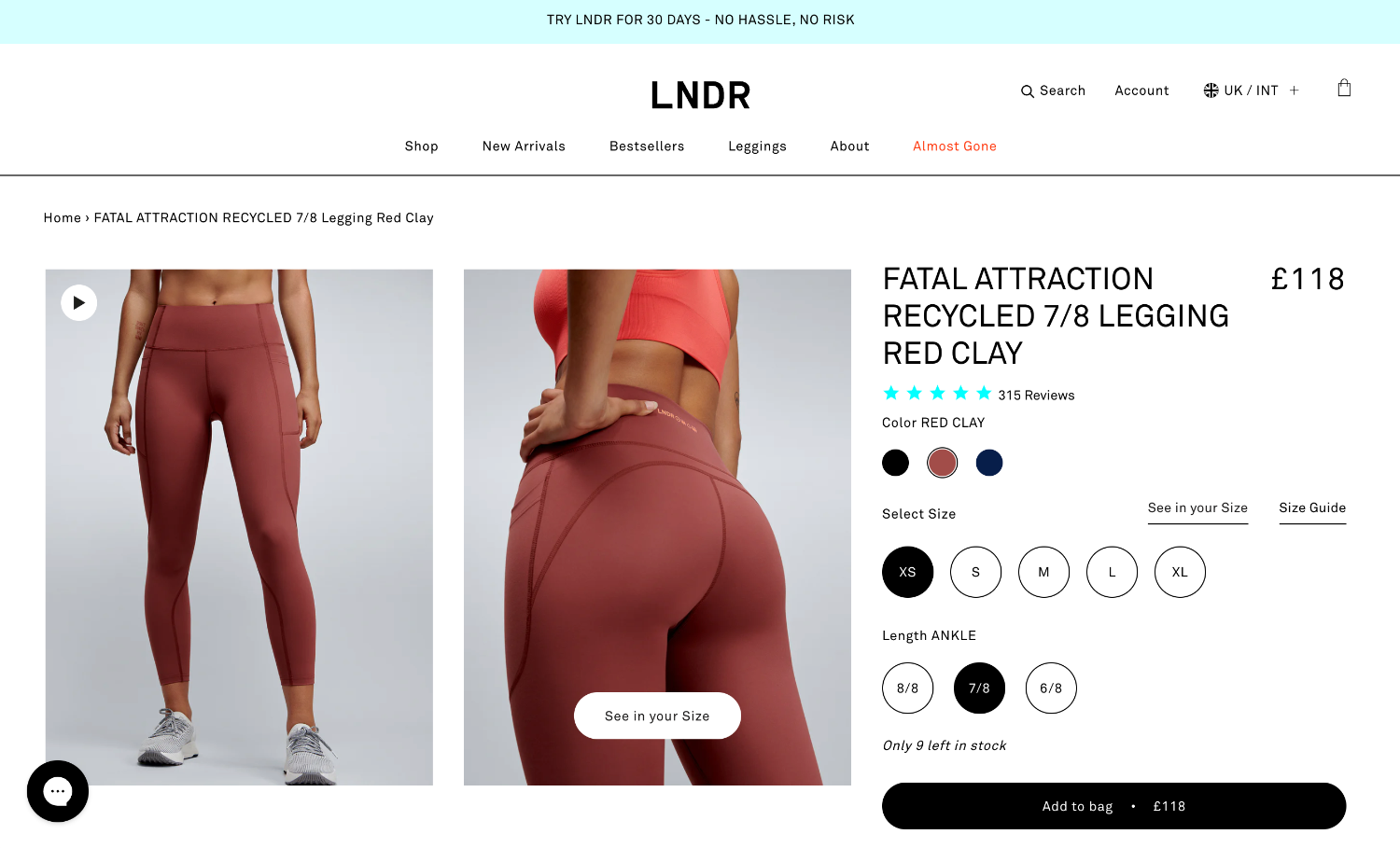
Activewear brand LNDR not only displays a product in a different color when you click a variant, it also offers a pop-up window letting customers specify their size and see the product on a model with the same proportions.

4. Detailed product descriptions
Like photography, product descriptions serve many purposes. On the surface, they describe the product, helping the customer understand what they’re ordering. Product descriptions can include the following:
- A general written product description (often one to two paragraphs)
- Ingredient information or material composition
- Allergen and safety information
- Sizing information (often with a linked size chart) or product specs
- Usage instructions or ideas (like recipes)
“The paramount goal for your product pages should be to build user confidence by providing all the information necessary for a purchasing decision and making the process as intuitive and straightforward as possible,” says Rosara Joseph, content strategist at VentureWeb.
That can include educational content when the purchase is technical or high-consideration. In its Shopify case study, Audio Advice paired product pages with comparison charts, expert guides, setup walkthroughs, and full technical specifications to help shoppers make informed decisions on premium equipment, an approach that contributed to a 47% year-over-year conversion rate increase after launch (Source).
The uncluttered product page for Haven’s large duffel bag has plenty of product information tucked neatly under nested headers.

When a customer clicks on each section, they can review additional information like product features, sizing, and warranty details.

Product description best practices
When optimizing product descriptions, keep the following best practices in mind:
- Write content that appeals broadly. Your website visitors will have varying levels of knowledge about your product. “Make sure that the information you share is useful and understandable for as many as possible, without patronizing or talking down to your users,” says Rosara.
- Try video. Product-focused videos can condense complex details and storytelling into a short clip.
- Organize dense information with UX features. Drop down tabs, overlay or pop-over boxes, and hover-triggered content can help keep a page from becoming cluttered.
- Use a clear structure in your copywriting. Careful use of headings and subheadings will make it easier for users to scan content and find what they’re looking for.
- Anticipate questions. Answer any questions your target customer may ask right on the product page. This may include featuring a separate FAQ for each product.
- Center the customer. Product copy should focus on how your product will solve the customer’s problem or benefit them.
- Consider search engines. Product copy is the perfect place to inject keywords that signal to Google that your product meets the needs of a search term. Do keyword research to find relevant terms for your SEO product descriptions.
On Flakes’ website, each product page has tons of information from ingredient listings to benefits to product reviews. Upon landing on the page, however, beautiful images and the CTA dominate most of the space, with a small product description.

Visitors can then scroll to read about product benefits. In this example, the copy centers the user problem and explains how the product can help. Notice how the CTA button travels on scroll, too!

Product descriptions are especially critical for luxury items. “If you have a simple product with a rather high price point you need to make sure that your copy will help you backup that price,” says Alan. “Make sure you describe properly the materials, the origins, and the passion behind this product.”
Don’t assume customers understand the value of your product. Include as much detail as possible to help customers have confidence in their purchases.
Conversion rate is the percentage of visitors who complete a desired action, such as adding a product to cart or finishing checkout. Better product page optimization often improves conversion rate by reducing uncertainty at the moment of purchase.
5. Consistent branding
Your brand surfaces all along the customer journey at every touchpoint, from social ads to your ecommerce homepage to product packaging. A memorable brand identity, consistent brand voice and tone, and imagery that reflects brand aesthetic can help customers identify you in the wild and build affinity with your business.
Product page optimization shouldn’t skimp on brand. Conduct an audit of your pages to understand if they are a true representation of your brand. “The difference between creating a mediocre product page and a stellar [one] is your ability to weave your brand’s DNA into the page,” says Mark.
In these two examples, brands Kallo and Frank Body both surface brand personality within product descriptions, with the former choosing a playful poem style and the latter using cheeky slang directed at its young audience.


Your product page needs to function as a standalone landing page, too. “Remember that some visitors may never visit your homepage, so put your brand in the absolute best light,” says Mark. That means weaving branding through every page.
6. Aspirational content
You’ve already read about the power of lifestyle images, but what other content can convert a browser to a buyer?
- Customers want your products to solve a problem
- Make them better
- Bring them joy
- Help them accomplish something
Your product pages should make it easy for them to see how your products can achieve those goals.
“Make your content provide an answer to an aspiration,” advises Rosara Joseph, content strategist at VentureWeb. “Think about how your product can help make your users’ lives more fun, enjoyable, or efficient. How does this bike help someone ride with more confidence or speed? How might these skis help a skier feel more stable and in control in deep powder?”
Frank Body uses how-to video content as well as images that demonstrate the product’s ability to overcome common skin problems.

Eleat Cereal uses copy and graphics to clearly communicate its products’ benefits.

Consider also the emotional benefits of a purchase, especially if you sell eco-friendly products or have sustainable business practices. Highlighting this information on a product page can help a conscious consumer understand why a product is good for the world and for them. Here, Rareform highlights the impact it has made by recycling garbage into usable products.

“How do your brand and products fit into a specific lifestyle and how do you make it relevant for your consumers?” asks Maria. “Selling your products is all about the story that you tell around them—bring them and the brand to life by guiding your users through the details that matter.”
7. Conversational copy that speaks to your target customer
AI is an incredible technology that can help business owners get more done. It can even help you generate content for your product pages. But beware of overusing it or not applying enough oversight. Use a tool like Shopify Magic to generate your product descriptions, but don’t forget to apply your own touches.
Your copy should strike a balance between being on brand and functional. Straightforward descriptions, headers, and button copy can help visitors find the information they need. But it should still match the tone of your brand voice.
“Descriptions don’t have to be bland. Invest the time and energy to speak to your users,” advises Maria. “You have only a moment to make a strong first impression, so make it a lasting one by owning your voice!”
In the following examples, both MìLà and Lyka offer product pages with straightforward language injected with a playful tone that humanizes it.


A detailed FAQ page is a great way to house more detailed or technical information away from the main product description. Your answers should sound human and speak to your target audience. Expanding Suri’s product page FAQ drop-down reveals technical information presented in plain language for the average user.

8. Social proof: Reviews, expert testimonials, and UGC
Borrowing from landing page best practices (because after all, a product page can be a landing page too), add some social proof and expert backup to product pages. This helps increase customer confidence and trust, and legitimizes your claims. “Especially for new brands, giving consumers a reason to believe adds a layer of trust to the buying experience,” Maria says.
There are a number of ways to add social proof:
Embed user-generated content (UGC)
Use a Shopify app to port user-generated content over to product pages using distinct hashtags. These provide visual reviews from real customers. Haven imports content from Instagram where real customers share experiences in short-form video posts.

Include reviews directly on the page
BrightLocal’s Local Consumer Review Survey found that 49% of consumers trust online reviews as much as recommendations from a friend. Pull reviews into your product page using a review app. Aggregate the product’s review score at the top of the page.
LNDR prominently displays its average user rating at the top of its page. Visitors can scroll to find detailed reviews that include customer information like height and size purchased.


Gather and feature expert testimonials
Testimonials are great for beauty, wellness, and food brands that want to back up benefit claims of a product. Flakes’ website is a great example of how to use social proof. Along with reviews, its product pages highlight its partnership with a doctor who helped develop the product.

If you’re a new brand and don’t yet have reviews to feature on your website, consider sending products to influencers or paying creators for a promoted post. Influencer marketing can provide the social proof you need to get your brand off the ground.
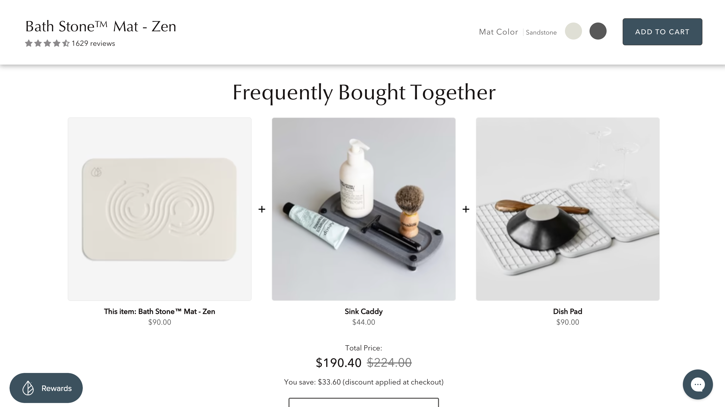
9. Related and recommended products
One way to increase average order value (AOV) is by employing upselling and cross-selling tactics to encourage customers to buy additional products. You can do this on a product page by suggesting related or recommended products.
Use related products when a shopper may want similar alternatives, such as another colorway, style, or price point. Use complementary products when the goal is to complete the purchase, such as socks with shoes or a refill with a starter kit. This distinction matters because alternative products can help comparison shopping, while complementary products are better for increasing basket size.
Placement matters too. Related items often work best lower on the page or near the footer, after the shopper has seen the main product details. Complementary add-ons can work closer to the CTA or in a “frequently bought together” module, as long as they don’t distract from the primary purchase decision. Keep recommendations tightly relevant, and suppress modules when the match quality is weak so you don’t hurt conversion with random suggestions.
This kind of relevance matters in practice. Boost Auto used Shopify’s search and discovery tools to map related recommendations on product and cart pages, helping surface add-ons that fit each shopper’s configuration and increasing average order value without making the experience feel disjointed (Source).
Related products can fit nicely on the footer of your product page, like the example below from Beyli. You can also use an AI tool to understand user behavior and suggest products based on browsing and buying habits.

10. Buying and checkout options
Giving customers choice is more than just offering a product in multiple colors. Providing options that could save them money (as in a product bundle) or time (as in the case of recurring subscriptions) is another way to benefit the customer while also influencing them to buy.
Mixhers offers its products in two sizes and two delivery methods: one-time purchase or a monthly subscription plan that saves them 10%.

Checkout options can also increase conversions when you offer customers’ preferred payment methods. Here, Thesus includes a Buy with Shop Pay option on its product pages, allowing customers who use this accelerated checkout option to complete their purchase faster with one-tap checkout.

If price is the barrier holding your customer back from checking out, offer a buy now, pay later option, like this example from Tentree.

11. Trust signals
There are a few ways to increase trust with your product pages. While user reviews and science-backed claims can go a long way, you still need to get them to check out. Providing a secure checkout experience can give customers peace of mind when ordering.
Adding trust badges, linking to a privacy policy, backing up claims with certifications, and offering recognizable checkout options can all signal to a customer that you run a legitimate business with a secure checkout.
Strong trust signals usually fall into a few categories: payment security indicators, clear shipping and returns information, third-party certifications, guarantees or warranties, and visible contact or support options. For example, a product page might show accepted payment methods, estimated delivery windows, a simple return policy summary, certifications relevant to the category, and an easy way to contact support by chat, email, or phone.
These signals work best when they support real evidence rather than replace it. A badge alone won’t make a weak claim credible, but a badge paired with transparent policies, detailed product information, and verified reviews can reduce hesitation at the point of purchase. Audio Advice, for example, redesigned its product detail pages to make shipping policies, inventory status, and full technical specifications more prominent—useful proof points when customers are considering expensive purchases (Source).
These examples from Consonant and Tentree both demonstrate the use of trust signals. For Consonant, payment symbols show the customer that the website accepts recognizable and safe payment options. Tentree features certifications from reputable sustainable organizations, backing up its product claims.


What to avoid in product page optimization
Now that you know what to do to build beautiful, on-brand, and converting product pages, here are the common pitfalls to avoid as you build and optimize product pages:
- Use keywords naturally. SEO is important, but relevant terms should feel like a natural part of the copy and improve clarity for shoppers.
- Avoid low quality images. If your images are small, blurry, unintentionally dark, or off-brand, don’t use them. They can actually harm your business. Invest in a photographer or learn DIY photography to create your own crisp and clean product photos.
- Include all relevant product details. Organize information with tabs, accordions, or FAQs when needed so customers can find what they need without feeling overwhelmed.
- Steer clear of inconsistent branding. Your product page is an opportunity to solidify your brand in the minds of your customer. Use it wisely.
- Show costs and fees clearly. Being upfront about any additional costs on the product page will help avoid surprises—and cart abandonment.
- Prioritize mobile usability. Most ecommerce website themes will be mobile optimized by default, but it’s important to test your own on multiple browsers and devices to ensure the experience is consistent.
- Avoid clutter. Pick the right theme to accommodate the amount of information you need to include on product pages. Look for themes with tabs or drop down features that let you organize information.
- Use feedback from loyal customers. Factor customer feedback into the design of your product pages and use their reviews and content to help you build trust with new ones.
“Everything stems back to your audience and telling a story that matters to them,” says Maria. “Do your homework to understand your consumers and learn who they are, what their motivations are, and what matters to them.”
How to measure product page success
There are a number of success factors to consider when evaluating your product pages. Here are a few metrics to look at when analyzing the strength of your pages:
- Conversion rate. Are your visitors buying more?
- Bounce rate. Are visitors exiting your website without a purchase at a lower rate?
- Time on page. Are your visitors spending more time on your product page?
- Click-through rate (CTR). Are your visitors compelled to click through to other pages on your website?
- Average order value (AOV). Is the average value of customer orders increasing?
- Search engine rank. Is your product page appearing higher in search results?
- Return rate. Are customers returning products at a lower rate?
Each metric tells a slightly different story. Conversion rate is usually the clearest signal when your goal is more purchases, while AOV matters more when you’re testing bundles, subscriptions, or add-ons. Bounce rate and time on page can be useful diagnostic metrics, but they’re not always positive on their own—a longer visit can mean engagement, or it can mean confusion.
Interpret metrics in context and by page goal. For example, if you simplify copy and conversion rate rises while time on page falls, that can still be a win. If you add more product education and return rate drops, that may matter more than a small change in CTR. For many stores, a practical workflow is to choose one primary KPI per test, such as add-to-cart rate or conversion rate, and one or two guardrail metrics, such as AOV or return rate, to make sure the change doesn’t create new problems.
To truly see the impact your changes are making, test, test, test. You can run A/B tests on product copy, featured images, and positioning of the CTA button. A simple workflow is to test one meaningful change at a time, run the test until you have enough traffic to compare results, and then roll out winners to similar product pages before starting the next experiment.
Be careful with attribution, too. Product page changes can overlap with promotions, seasonality, traffic source shifts, or inventory issues, so avoid crediting every lift or drop to the page alone. Segment results by device, traffic source, and product type when possible, especially because mobile behavior often differs from desktop behavior.
There are also a number of web analytics tools you can use to measure the changes you’ve made, including Shopify’s own built-in analytics features.
Product page optimization FAQ
How do I optimize my product page?
Start with the highest-impact elements: your CTA, product images, descriptions, reviews, and mobile layout. Then test one change at a time so you can see which updates actually improve product page optimization results.
What is product page optimization?
Product page optimization is the process of improving a product page’s design, content, and functionality to help more shoppers buy. It typically includes refining imagery, copy, pricing presentation, reviews, and calls to action.
Why is product page optimization important?
It reduces hesitation at the point of purchase by giving shoppers the information and reassurance they need. Strong product page optimization can improve conversion rate, support organic visibility, and lower returns when expectations are clearer.
What’s the best way to optimize a product page for SEO?
Audit the page for search intent, then improve titles, descriptions, internal links, image alt text, and page speed. The best approach is to combine keyword research with readable copy so your product page optimization helps both search engines and shoppers.
What is the difference between CPP and PPO?
Custom Product Pages (CPP) and Product Page Optimization (PPO) are App Store Connect features for app listings, not ecommerce product pages. CPP creates separate pages for different audiences, while PPO tests variations of the main App Store product page.
Optimizing product pages to reach your goals
If your numbers aren’t quite where they should be, there are many ways to troubleshoot your website, reexamine your brand positioning, and evaluate your marketing programs. But making simple tweaks to your product pages can help you make measurable gains without a major overhaul.
Focus your product page optimization efforts on the changes that reduce friction fastest: clearer CTAs, stronger imagery, more useful product details, and trust-building proof. Then audit your highest-traffic pages, prioritize one test at a time, and use analytics to scale what works across similar products.
If you’re ready to turn more product-page visits into sales, put these improvements into action in Shopify and start optimizing today.
Additional reporting by Desirae Odjick
