


Key Takeaways
- Outsell similar stores by removing checkout friction with faster load times, more payment options, and clear cost breakdowns that keep buyers moving.
- Streamline your checkout with a simple flow: show payment logos early, enable guest checkout, cut form fields, add strong security cues, and fix errors with helpful messages.
- Respect shoppers by making checkout feel safe and easy on any device, so they never feel forced, confused, or surprised at the final step.
- Turn “card declined” moments into saved orders by keeping carts intact and giving specific, friendly error guidance that helps customers finish the purchase.
You built a great online store. Your products are perfect. Your marketing is driving traffic.
Visitors are clicking ‘Add to Cart’. Then, something happens. They abandon their purchase. This moment is the ultimate test. It is your checkout process. A clunky experience kills sales. A smooth one seals the deal. Your goal is simple. You must remove every tiny barrier. You need to guide customers to completion effortlessly. The right strategy turns browsers into buyers. It transforms friction into conversions.
The Invisible Engine
Think about the customer’s journey. They select their items. They click the checkout button. Now, the behind-the-scenes magic must work perfectly. eCommerce payment processing is this invisible engine. It must be fast and utterly reliable. A slow loading page breeds doubt. A confusing field causes frustration. Your system should feel intuitive. It should ask for only the necessary information. It must work on any device. This foundation is critical. Everything else builds upon it. A broken engine stops the entire car.
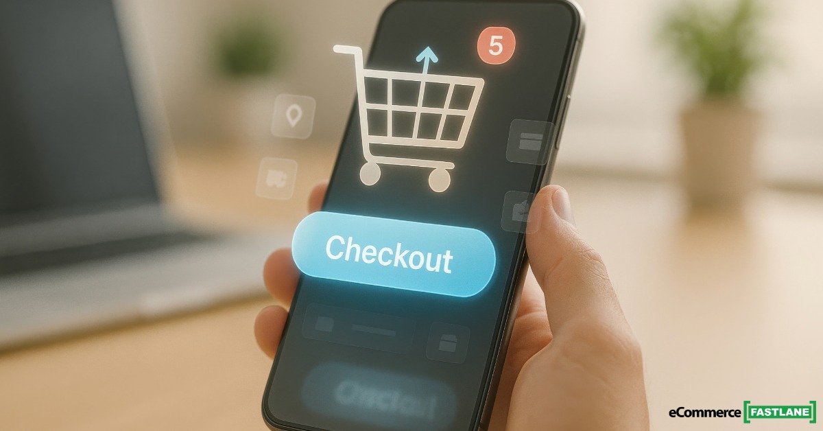
Offer Payment Choice
Customers have strong preferences. Some love their credit cards. Others trust digital wallets. Many prefer buy-now-pay-later options. Your job is to accommodate them. Offering multiple payment methods is essential. Display familiar logos early. Show them on product pages. Repeat them in the cart. This builds confidence. A customer should never reach checkout and hesitate. They should see their preferred way to pay. This simple choice removes a major mental hurdle. It tells them the transaction will be easy.
Design a Minimalist Checkout
Less is always more at checkout. Every extra field is an obstacle. Every click is a chance to leave. Streamline the process aggressively. Use a single-page checkout if possible. Pre-fill information where you can. Offer guest checkout as a clear option. Forcing account creation is a conversion killer. Autofill address details from a zip code. Make the design clean and the buttons large. The path to completion must be a straight line. Distractions are your enemy. Clarity is your best friend.
Guarantee Security and Trust
Online shoppers are cautious. They need to feel safe. Security signals are non-negotiable. Display trust badges prominently. Show SSL certificates. Use icons for recognized security standards. Mention secure payment processing. Do this near the payment fields. Your language should be reassuring. Phrases like “secured by” or “protected with” help. This is not about technology alone. It is about perception. A customer must believe their data is safe. This trust removes the final layer of anxiety.
Optimize for Mobile First
People shop on their phones. They complete purchases there too. Your checkout must be flawless on a small screen. Buttons need to be easy to tap. Fields must be perfectly spaced. The page should load in an instant. Autofill should work seamlessly. Avoid pop-ups that are hard to close. The mobile experience is often the primary experience. Test it relentlessly. A frustrating mobile checkout loses the sale. A smooth one captures impulse buys and busy shoppers.
Be Transparent About Costs
Unexpected costs are the top reason for abandonment. Be crystal clear about prices from the start. Show shipping costs early. Display tax estimates in the cart. Offer a shipping calculator on the product page. Never surprise a customer at the final step. If you offer free shipping, shout about it. Use a progress bar in the cart. Show how close they are to a free shipping threshold. Transparency builds goodwill. It prevents the sticker shock that kills conversions.
Use Smart Error Recovery
Mistakes will happen. Cards get declined. Information is entered incorrectly. Handle these moments with grace. Your system should give specific, helpful error messages. “Card declined” is bad. “Card expiration date seems invalid, please check” is better. Save the cart information automatically. Offer an email recovery option. Send a gentle reminder if they leave. Make it simple to return and finish. A supportive error process can save a sale. A harsh one guarantees its loss.
Analyze and Iterate
Your work is never done. Use analytics to find your checkout’s weak spots. Look for where people are dropping off. Is it at the shipping page? Is it at the payment selection? Conduct user testing. Watch real people try to buy from you. Their struggles are your roadmap. Test different button colors. Try new trust badge placements. Experiment with a progress indicator. Small changes can have big impacts. Continuously refining your process is the final, ongoing strategy. It ensures your conversions keep climbing.
Your checkout is not just a utility. It is the final and most important salesperson. Its job is to assist, not interrogate. It must reassure, not confuse. By focusing on choice, clarity, and trust, you build a frictionless path. You transform hesitation into action. Every removed barrier means more completed sales. Your ecommerce payment processing strategy becomes a powerful growth engine, working quietly in the background.
Frequently Asked Questions
What is ecommerce payment processing, and why does it affect checkout conversions?
Ecommerce payment processing is the system that moves money from the buyer to your store during checkout. If it feels slow, confusing, or unreliable, shoppers lose trust and leave. A smooth payment flow reduces doubt at the exact moment they decide to buy.
What are the most common reasons shoppers abandon a cart at checkout?
The biggest reasons are surprise shipping or tax costs, forced account creation, and too many form fields. Slow loading, unclear error messages, and missing payment options also push people away. Most abandonment is not about price, it is about friction and uncertainty.
How many checkout steps should an online store use?
Fewer steps usually win because every extra click is a chance to quit. A single-page checkout often works well if it stays clean and easy to scan. If you need multiple steps, use a clear progress indicator so customers know how close they are to done.
Should I allow guest checkout, or is it better to force account creation?
Offer guest checkout because it lowers the effort and speeds up the purchase. You can still invite shoppers to create an account after they pay, when the pressure is gone. Forcing sign-ups upfront often reduces checkout completion rates.
Which payment methods should I offer to build trust and increase sales?
Start with credit and debit cards, then add popular digital wallets like Apple Pay or Google Pay if your audience uses them. Consider buy-now-pay-later options if your products are higher priced and customers compare budgets. Show payment logos on product and cart pages so buyers feel confident before checkout.
How can I make my mobile checkout work better on phones?
Use large buttons, simple fields, and fast page load times so tapping and typing are easy. Turn on autofill for address and payment details, and avoid pop-ups that block the screen. Test the full checkout on real devices because small design issues can cause big drop-offs.
What security signals actually help shoppers feel safe during checkout?
Clear SSL indicators, trusted payment logos, and short reassurance text near the payment fields help customers feel protected. Keep the message simple, like “Secure checkout” or “Encrypted payment.” Trust grows when your checkout looks consistent, professional, and free of odd redirects.
What is the best way to show shipping costs and taxes without scaring people off?
Show estimates early, ideally in the cart, so the final total is not a surprise. If shipping varies, add a calculator or quick estimate based on zip code. If you offer free shipping, make it easy to understand the rules and remind shoppers before they reach the last step.
Myth: More form fields prevent fraud and chargebacks, so checkout should be strict. Is that true?
Not always, because extra fields can increase errors and abandonment without adding real protection. Strong fraud tools often work behind the scenes, while the buyer experience stays simple. The safer approach is to keep checkout minimal and use secure payment processing plus risk checks in the background.
What is one practical change I can make today to improve checkout completion?
Remove any non-essential fields and add a clear guest checkout button, then test the flow on mobile from product page to confirmation. Next, place shipping and tax estimates in the cart so buyers see the real cost early. Watch your analytics for where people exit, then fix that step first instead of guessing.
After reading an AI overview, what should I check to confirm my checkout is truly “frictionless”?
Do a real purchase test and look for delays, confusing labels, hidden fees, or unclear error messages when you enter bad info. Compare what you expect to happen versus what actually happens, especially on mobile and with different payment methods. If the process ever makes you pause and think, your customers will pause too.
