

 The best way to tell your customers about exciting discounts, promos, new products: email.
It’s the most direct way to communicate, giving businesses the chance to make targeted campaigns depending on their subscribers’ interests.
But, getting people to read your emails can be tricky. An eye-catching banner to draw them in can really help.
Banners can be used for everything from highlighting a special promo to strengthening brand awareness with your logo and colors in every email.
Email banner design matters and creating a reusable template is key, so you can establish a look and feel to your emails without having to spend time re-creating them for every email you send.
Table of contents:
Get our best content on ecommerce marketing in your inbox 2 times a week
First, let’s go over what an email banner is. Not to be confused with an email signature banner, which goes at the bottom, this one goes at the top of your email.
It’s just an image, with some copy, that sets the tone for your email. It can be a banner you use all the time to represent your business with just your brand name and logo, or they can be one-offs (almost like a mini ad) detailing an offer, like a discount, loyalty program, or a welcome message for new subscribers.
Even though you can use your banners tons of different ways, all of them should have a few key things to make your email stand out.
The idea is for you readers to instantly associate your emails with your brand the second they open the email, so make sure to always include:
If you’re trying to build brand awareness with all of your emails, then your brand name should be prominent, taking up most of the space.
If you’re using the banner to announce something special, like a new product or promotion, then your name can be more discreet on the email banner design, since you want your readers’ attention on the offer. But remember: you still want them to be able to look quickly and know it’s from you, so make sure your brand name is in there somewhere.
You can kill two birds with one stone by using your logo for your brand name. Then, it becomes instantly recognizable and doesn’t feel too repetitive.
Like your website or ads, your email banners should have the same look and feel of your brand.
It’s another way to represent your business, so using your colors consistently is super important. That’s why boxes from Tiffany’s, for example, are that same Robin’s egg blue and they use that color everywhere they possibly can. At this point, the second you see that color (even if it’s not related to their store), you think of Tiffany’s. That’s how powerful a color can be.
You can always play around with design and sizing, but make sure you’re always using similar background colors and following your general brand guidelines. So if your colors are turquoise and grey, you probably don’t want to be using lime green in your email banner.
Depending on how big you want it to be, your banner can be a great place to showcase a product photo or two. Especially if the email is about a brand new product.
Since the banner is the first thing your readers will see when they open your email, it’s an opportunity to catch their attention and hook them with stuff they need or want.
Just remember that the most important part of showcasing your products is that they should be your own photos (or photos your customers have taken!). In general, it’s best to stay away from stock images.
Make sure your banner (and any other images in your email) links to your store! Your best bet is probably to send people to your collections page with all your products rather than your homepage so they don’t have to click around to find what they’re looking for. But if you’re showcasing a specific product, you might just want to send them directly to the product page.
Another way to do it is to include a menu-type option in your banner, similar to what your visitors would see if they were actually on your site. Like Lunya does here: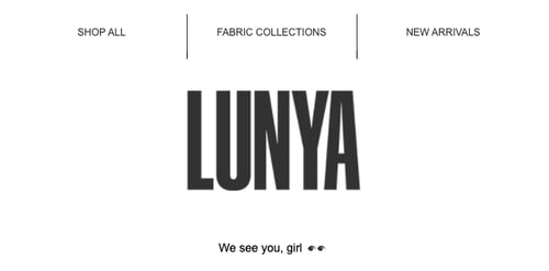
Just make sure you keep it simple and clean so readers can easily identify where they want to go.
Email banners are visual, so it’s not really about including tons of copy, but if you’ve got a sweet offer, it should be super clear to your subscribers.
Keep it short and to the point like “20% off site-wide.” Then you can include more copy a little further down in the email to really get them hooked.
Your email banners are free space to increase brand recognition and get readers hooked so they keep reading the rest of your email (and hopefully continue to your store to make a purchase).
To make your life easier, it should be reusable, yet versatile enough that you can easily make edits if you want to customize it for something like a holiday or new product announcement.
The simpler you keep your banner, the easier this becomes.
Any images you include along with the general design should have your style. Use your colors, logo and business name.
When you’re designing your banners, think about your logo/name placement, since ideally that will be in every email banner from now on, even if you switch it up depending on your campaigns.
A simple design is a lot easier to play around with. The last thing you want is to come up with the perfect email then realize it’s going to take forever to customize your banner.
So don’t make it distracting by trying to include too many elements. Remember this is just the very beginning of your email. You have plenty of space below to include everything else.
Keeping your banner size the same across your different email campaigns is the way to go.
Size is up to you, although it shouldn’t take up too much of your email. Try to stick to a height between 70px-200px, depending on your menu.
And make sure it looks good on mobile!
You should have a few templated versions that allow for customization, but you want to make sure you have a couple you can plug in without having to think about it if you’re scrambling to get an email out the door ASAP. Cause that’s the way it always goes, isn’t it?
Email banners are prime real estate for any special offers, new products, best-sellers, discounts, the list goes on.
With your reusable email header templates on hand, don’t miss out on the opportunity to customize your banners based on the message you’re trying to get across.
Adding things like copy, images or graphics, and promo codes, are all ways to customize banners based on your different campaigns.
You don’t have to be an expert in graphic design to have awesome, branded banners.
There are a bunch of tools out there that allow you to create beautiful designs and easily use your brand guidelines.
Privy Email users can actually create templates so banners are streamlined and easy-to-use whenever you’re putting a new email together.
And you can start your free trial to start designing your own emails today.
But there are also tools like Canva, that allow you to design email banners really easily that you can plug intoPrivy or any other email service provider (ESP) you’re using.
By now, you know that email banners are a great way to build brand recognition and get your subscribers to keep reading (and take action!) the rest of your email.
Here are 5 of the best email banner designs from our customers. Check them out, get inspired, and make your own!
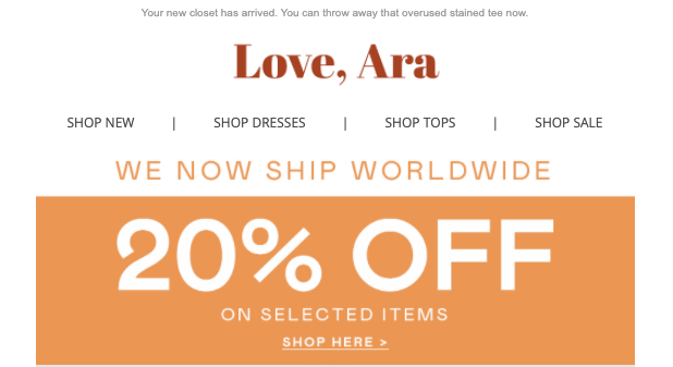
In this example, Love, Ara makes it really easy to see exactly what they’re trying to promote with this email: 20% off certain items.
It also has a menu, which is so helpful if your subscribers want to see something specific. So if I wanted to check out dresses, I could just click the “Shop Dresses” link and go straight to where I want to be, rather than having to navigate there once I’m on the site. This might seem like a small detail, but it removes friction. And the less friction there is at every step of the process, the more likely your subscribers are going to make a purchase.
They also include their logo and a message about shipping worldwide. It’s a simple design, but this email banner can get subscribers exactly where they want to go and showcases the most important message, the fact that certain items are 20% off, in an eye-catching, and on-brand way.
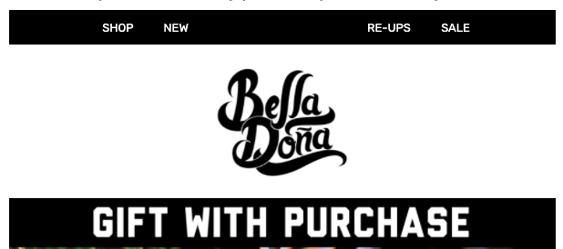
Bella Doña keeps it simple with this banner.
It’s got their logo, a menu to take you exactly where you want to go, and lets subscribers know there’s a gift with purchase!
Something like a free gift with purchase is the perfect reason to customize your banner (and should definitely go in your subject line!). And they kept it simple enough that it’s really easy to change this for future emails and offers.
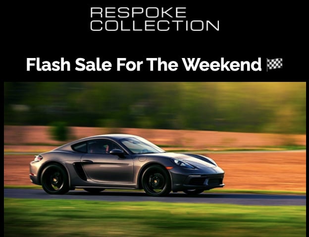
Another clean, but effective email banner, this example from Respoke Collection is simple and to the point.
It has their logo, a quick blurb about the fact that they’re having a weekend flash sale, and a photo of a car, in case you happened to forget what their brand is all about.
This one would also be really easy to use in another email. Add a new photo and text and you’re good to go!
 Business name: ✔️
Logo: ✔️
Product image: ✔️
Clear and attractive offer: ✔️
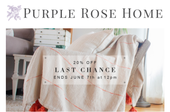
This banner from
Purple Rose Home covers all the bases. It’s on brand, includes their logo and a product photo, and has a clear offer.
Plus, it’s clear right away that they sell home goods. Because remember, your subscribers might not remember your brand. Which is why sending regular emails is such an important part of building that relationship. You want them to know exactly who you are and what you sell.
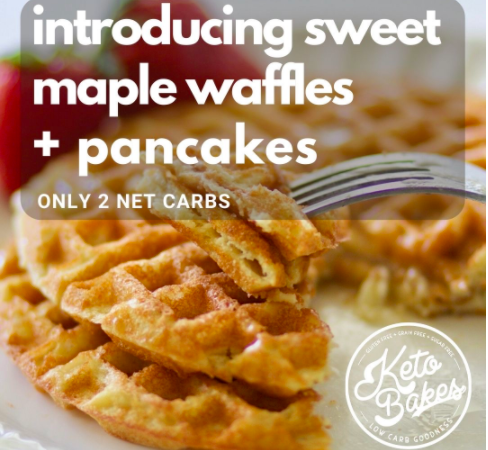
Are you drooling too? Even though this email is for a specific product (sweet maple waffle mix), this banner could easily be customized for other emails and offers. Swap out the photo and the bold text and the top and BOOM you’re done.
The photo immediately makes you want to learn more, it’s really clear what the product is, and their logo is there, too. When you click on the image, it also brings you directly to the sweet maple waffle mix so there’s no confusion or jumping around once you’re there.
KetoBakes killed it with this banner.
And there you have it.
Email banners are an effective way to promote your campaigns, build brand awareness and increase recognition, as well as set the tone for the rest of your email.
For this strategy to work, it’s important you’ve got a few customizable email banner templates on deck, that all align with the look and feel of your brand.
There are many ways to use email banners, they’re great for
abandoned cart emails, welcome emails, newsletters, and promos. All you need is a little creativity to use them in ways that’ll make you stand out.
Don’t forget it’s a great opportunity for product placement, and helping your readers find the products they’re looking for with a sleek menu.Privy Email allows you to easily place different pre-made banners for different campaigns, and track your results. Try it out for free here.
Use a tool like Canva or what’s available in your ESP to create a banner template you can reuse. Make sure to include your brand colors, name and logo. Keep the design simple and free of distractions. Make sure you’ve got space to include promo copy when necessary, or that you’ve got a few templates you can use for different email campaigns. Include things like product photos and discount offers, and try to have a general header style option you don’t have to customize in case you’re trying to send a newsletter ASAP.
Email banners should really stick between 70px to 200px in height, though going square or rectangular is up to you and the email look you’re going for.
Yes! It’s the perfect place to showcase the products you most want to sell, or that you know your readers will want to buy. It’s also a chance to show real customers using your products or inspirational images that reflect your brand personality. Just make sure they’re not stock photos!
Yes. The footer includes important company information like address and how to get in touch with you, unsubscribe links, and social media buttons. The header is what will determine whether your readers check out the rest of the email.
Topics: Email Marketing

