


Can you imagine running an online store without being able to contact your customers or process their payments? Most of the time, collecting this crucial data is relatively seamless through a simple but powerful website element: a form.
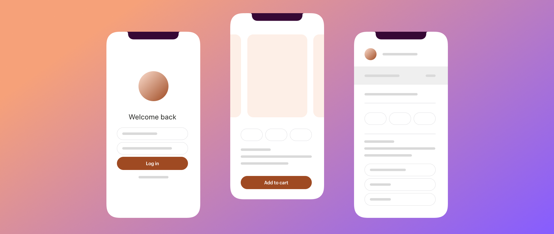
When building a web form, the visuals and user experience can be the difference between someone abandoning the form after a few questions or sticking with it to the end. Let’s take a closer look at some form design best practices, complete with plenty of examples of well-designed forms in action.
Why ecommerce form design is important
The exchange of user information—from email addresses and credit card numbers to demographic data and constructive feedback—is threaded through every part of ecommerce. A web form streamlines the process of collecting this data. It lets users input information quickly and easily, and allows you to access this customer data for various purposes.
When building a form, it’s important to consider not only the content but also the way it’s presented. Form design encapsulates everything from the number and layout of input fields to the visual cues that guide users through the form-filling process.
Why is the form design element of your website so crucial? In a survey by Clutch, 50% of customers said that effective web design is “crucial” to a company’s brand. A confusing or overwhelming form is a place where you can lose people on your site, while a well-designed form is a place you can capture them, ultimately resulting in more (and better) customer data thanks to a positive user experience.
Types of forms in ecommerce
Here are a few common forms with different use cases and the types of data they might collect:
- Registration form. Typically, these forms collect information from new users on your website who create a customer account or opt in to emails. This data often includes names, email addresses, phone numbers, etc.
- Login form. These forms collect information from existing users, allowing them to access their account, and can include fields for usernames, passwords, two-step verification codes, etc.
- Checkout form. These forms collect data to process payment and initiate shipment, such as credit card numbers, gift card numbers, discount codes, shipping addresses, shipping speed preferences, etc.
- Return forms. These forms collect information to locate and identify an order and begin a return or exchange, such as order number, return reason, return address, alternative product choice, preferred refund method, etc.
- Contact form. These forms collect information from users that details their query and helps direct it to the appropriate department, such as topic, description of issue, preferred contact method, option to upload files, etc.
Core elements of good form design
When designing a web form, there are some broad design principles to keep in mind that can help you collect the most (and best) responses:
Clarity
Provide clear instructions for users that signal how to fill out a given form and how to format their answers. Use clear labels so users know exactly what information is being requested, and distinguish essential fields from optional fields. Placeholder text can assist users as they enter their responses.
Here’s an example. On its checkout page, shoe brand Larroudé has placed form labels into the relevant fields and illustrated the desired format for dates:

Efficiency
To reduce a user’s real or perceived cognitive load, aim for the fewest possible fields for them to fill out. Save space with elements like expandable fields and dropdowns. For a more complex form, keep a user’s attention by breaking it up across multiple pages rather than presenting them with a block of text to parse with a seemingly endless scroll bar.
How you lay the form fields out matters, too. Research from the marketing training platform CXL indicates that users completed a six-field form 15.4 seconds faster—a significant boost—when the fields were presented in a single-column layout rather than across multiple columns.
Transparency
Let users know what to expect from the form, and what will happen once it’s completed. Establish user expectations by noting how many questions there will be, for example, or even providing a time completion estimate for the whole process.

Spice purveyor Diaspora has a quiz that suggests products based on user preferences. Those who finish receive a discount code—an incentive stated at the beginning—and a progress bar shows users how much of the quiz remains as they complete it.
Ease
Minimize any roadblocks to completing the form. Make sure it’s usable and attractive at any screen size; if you fail to optimize for use on mobile devices, you risk losing your mobile users—a significant portion of ecommerce shoppers. Give users the option to navigate backward and forward without losing their progress. Other considerations for a user-friendlyform include intuitive visual cues, fast load time, and high contrast for legibility—dark text on a dark background isn’t ideal for anyone.
Feedback
Confirmation and error messages are helpful for correcting any user error in real time. This can look like inline validation—a message or symbol confirming information has been entered correctly—or a reminder for the user to go back and check all the boxes before moving on. You can also enable autocorrect to alert form users to possible misspellings.
This mailing list sign-up form from jeweler John Hardy includes built-in error prevention that catches and flags an invalid email address.

Form design examples
- Communications opt-in: Fly By Jing
- Newsletter sign-up: Saveur
- VIP account registration: Ilia
- Wholesale account registration: Baggu
- Checkout: Soft Services
- Checkout and newsletter subscription: Equal Exchange
- Contact: Quiet Town
- Recommendation quiz: D.S. & Durga
- Referral program: Crap Eyewear
If you’re new to web design, fear not. These days, there are many options to help you create forms that fit your needs, with zero coding required. You can find plenty of custom form apps in the Shopify App Store, like the Powerful Contact Form Builder. Here are some successful form examples to inspire your design process:
Communications opt-in: Fly By Jing


This pop-up form on the website of the chili crisp brand Fly By Jing gathers a user’s email address and phone number in exchange for a discount code. The combination of an interactive element, striking images, and a clearly stated incentive invites the user to engage with the form.
Newsletter sign-up: Saveur

Independent food magazine Saveur has a newsletter sign-up built into its website’s homepage, using the same branding colors that appear as a motif throughout the site. Slim and simple, with just one field and one line of explanation, it lets users enter their email easily as they scroll.
VIP account registration: Ilia


For its VIP sale, beauty brand Ilia added a dedicated pop-up form to prompt VIP account registrations. The incentives—free samples and a discount—are clearly stated, while a quiz feature motivates users to click through. The main registration page lists even more benefits of completing the form.
Wholesale account registration: Baggu


In its wholesale customer registration form, Baggu includes an announcement for people with existing accounts and provides the option to apply for a new one, collecting information about the user’s business in a single-column form. The content is practical but not lacking in personality.
Checkout: Soft Services

Cult-favorite body care brand Soft Services uses Shopify Checkout (proven to be the best-converting checkout offering on the market) for its customized checkout page. The simple design is easy to parse, with optional fields clearly marked. The phone number field includes a checkbox to easily opt in to marketing texts, increasing the potential for further customer checkpoints.
Checkout and newsletter subscription: Equal Exchange

Equal Exchange, a fair-trade cooperative, also uses Shopify Checkout. Here, the brand has designed its checkout form to include a newsletter subscription opt-in at the top, along with a detailed call to action that leverages social proof (in the form of readership numbers) and explains the benefits of signing up.
Contact: Quiet Town
Alt text: A contact form on the customer service page of an ecommerce brand
Source: Quiet Town
Homewares company Quiet Town uses a simple single-column design for its contact form, which contains only four questions—a great example of efficiency in action. A dropdown field lets customers indicate the nature of their inquiry from a preset list of topics, meaning the brand can pre-route requests on the back end and ultimately resolve requests more efficiently. Required form fields are marked clearly with red asterisks.
Recommendation quiz: D.S. & Durga


Perfumer D.S. & Durga asks customers engaging questions about their taste and personality to suggest fragrances they might like. The quiz states clearly the number of questions and what the results will look like. At the end, the user has the option to add samples to their cart.
Referral program: Crap Eyewear

Crap Eyewear, a sunglasses brand, makes it easy to join its referral program with a simple form that collects an email address before generating a referral link. The user benefit is stated in big, bold text, and the casual language aligns with the company’s cheeky branding.
Tips for form design
Use these tips as a guide to keep your own forms easy to fill out:
- Keep things conversational. Using simple, casual language can make a form more approachable and help customers fill it out right the first time.
- Group information in a logical way. Clustering related questions (e.g., putting all credit card-related information on the same page) is helpful for guiding users naturally from topic to topic rather than having them skip around.
- Provide instructions and examples when relevant. If you’re looking for something specific or need answers to be formatted in a certain way, showing users what a good answer looks like can be a big timesaver.
- Incorporate confirmations and positive feedback. Let users know that they’ve checked all the boxes on a given page or successfully completed the form and, conversely, when there’s information missing.
- Make it mobile-friendly. Filling out a form should be a relatively enjoyable experience, whether users are on their laptop or their phone. Make sure every step is legible on any screen size.
Form design examples FAQ
What is good form design?
A good form is easy and intuitive to use on any device, has a simple, easy-to-follow layout, gives real-time feedback to prevent errors, and collects the information you need as a business owner while keeping things concise for the user.
How do you design a form?
Identify the purpose of the form and what data you need from the user for it to meet your needs. Once you know the content of the form, many digital products make it easy to design forms of various kinds without knowing how to code, using customizable templates and drag-and-drop functionalities to make the process simple.
How do you design a checkout page?
Checkout page design is crucial for turning a potential purchase into a completed one. Prioritize simplicity and ease; ask only for the information you need, and keep the process brief. Shopify users can easily create custom checkout pages with Shopify Checkout.
