


Quick Decision Framework
- Who This Is For: Ecommerce store owners, Shopify merchants, and DTC brand operators who have invested in professional design but are not seeing the conversion rates or revenue growth that the site’s visual quality should support
- Skip If: You have not yet launched your store or have fewer than 500 monthly sessions, as you need real traffic data before diagnosing conversion problems
- Key Benefit: Identify the specific design, technical, and content gaps that cause visually impressive ecommerce sites to underperform on revenue, and understand the fixes that close the gap between aesthetics and conversion
- What You’ll Need: Access to your site analytics, the ability to view your store on both desktop and mobile, and an honest willingness to evaluate your site as a first-time visitor would
- Time to Complete: 7 minutes to read; 1 to 2 hours to conduct a full self-audit of your site using the framework in this article
A beautiful ecommerce site that does not convert is not an asset. It is an expensive distraction. The goal is not to impress visitors. It is to remove every reason they have not to buy.
What You’ll Learn
- Understand why visual polish and conversion performance are not the same thing, and why investing in one without the other produces a site that looks credible but fails to generate revenue
- Identify the four technical failure patterns that cause visitors to abandon sites that look professional, from slow load times to clunky mobile navigation
- Evaluate your product pages against the standard that actually drives purchase decisions, including copy depth, sizing information, shipping clarity, and social proof placement
- Apply the friction audit framework to your checkout flow to identify the specific points where purchase intent breaks down
- Understand when to DIY a site fix and when the gap between your site’s current state and its revenue potential justifies working with a professional development partner
The Difference Between A Site That Looks Professional And One That Actually Performs
There is a version of this problem that every ecommerce operator eventually encounters. The store looks exactly the way it should. The branding is coherent, the product photography is strong, the color palette is considered, and the layout feels current. And yet the conversion rate sits below 2%, the cart abandonment rate is high, and the revenue numbers do not reflect the quality of what is on the screen. The instinct is to question the marketing, the pricing, or the product. The answer is almost always somewhere in the site itself.
Aesthetics and conversion performance are related but they are not the same variable. A site can score well on both, on neither, or on one without the other. The stores that score well on aesthetics but poorly on conversion have a specific profile: they were designed to communicate credibility and brand quality, which they do, but they were not engineered to guide a visitor from product discovery to completed purchase with as little friction as possible. That engineering is a separate discipline from visual design, and it requires a different set of decisions about page structure, information hierarchy, load performance, and mobile behavior. The brands that understand this distinction build sites that are both beautiful and functional. The brands that do not end up with stores that impress visitors without converting them.
This is not a problem unique to small operators or first-time store owners. It appears consistently across brands at every stage of growth, often after a significant investment in a professional redesign that prioritized visual quality over conversion architecture. The redesign makes the site look better. It does not necessarily make the site sell better. Understanding where those two outcomes diverge is the starting point for closing the gap.
Why Design Alone Does Not Carry Conversions
The relationship between aesthetics and purchase behavior is real but frequently misunderstood. Visual quality does influence trust, and trust is a prerequisite for conversion. A site that looks amateurish, inconsistent, or outdated signals to a first-time visitor that the brand behind it may be similarly unreliable. Fixing that signal is worth doing. But fixing it does not automatically produce conversions. It removes one barrier. It does not remove all of them.
The barriers that remain after the visual credibility problem is solved are functional ones. They live in the navigation structure, the page load time, the product description quality, the checkout flow, and the mobile experience. A visitor who arrives on a visually polished site and cannot find what they are looking for within ten seconds will leave. A visitor who finds the right product but cannot get a clear answer about sizing, shipping cost, or return policy will hesitate. A visitor who reaches the checkout and encounters a form that feels slow, confusing, or unnecessarily long will abandon the cart. None of those outcomes are prevented by strong photography or a well-chosen typeface. They are prevented by functional design decisions that prioritize the buyer’s journey over the brand’s aesthetic preferences.
The generational dimension of this problem is worth naming directly. Younger shoppers, particularly those in the Gen Z cohort who came of age shopping on TikTok, Instagram, and mobile-first platforms, have high aesthetic expectations and equally high functional expectations. They will not tolerate a beautiful site that is slow to load, hard to navigate on a phone, or unclear about what happens after they click “Buy Now.” The aesthetic bar has risen, but it has risen alongside the functional bar, not instead of it. Meeting one without the other is no longer sufficient to convert this audience. The guide to psychological design tactics that turn leads into customers covers how the brain’s decision-making process responds to both visual and functional design signals, and why optimizing for both simultaneously produces better conversion outcomes than optimizing for either in isolation.
The Four Technical Problems That Kill Sales On Visually Impressive Sites
Page load speed is the first and most consequential technical failure pattern. A site that loads slowly on mobile is not just a performance problem. It is a revenue problem with a measurable cost. Amazon’s internal research, now widely cited across the industry, found that a 100-millisecond increase in load time reduced their sales by 1%. For a smaller ecommerce brand with a $50,000 monthly revenue run rate, a site that loads in four seconds instead of two is not a minor inconvenience. It is a material drag on every marketing dollar spent to bring traffic to that site. Video backgrounds, uncompressed hero images, and heavy JavaScript libraries are the most common culprits in visually ambitious sites that load slowly. They are also among the most fixable performance problems once identified.
Navigation structure is the second failure pattern. A site whose navigation was designed to look clean rather than to help customers find products quickly creates a specific type of friction that is invisible until you measure it. If a visitor cannot locate the product category they came for within two clicks from the homepage, a significant percentage will leave without exploring further. Product filters that do not work correctly on mobile, search bars that return irrelevant results, and category structures organized around internal logic rather than customer language are all versions of the same problem: the navigation was designed for the brand, not for the buyer.
Mobile rendering is the third failure pattern, and it is the one most frequently overlooked during the design process because most design work happens on desktop screens. A layout that looks elegant at 1440 pixels wide can become unusable at 390 pixels if the responsive breakpoints were not tested carefully. Buttons that are too small to tap accurately, text that requires horizontal scrolling, images that load at full desktop resolution on a mobile connection, and add-to-cart buttons that shift around during page load are all mobile-specific friction points that drive abandonment. With mobile accounting for the majority of ecommerce traffic across most categories, a site that underperforms on mobile is underperforming on its primary channel.
Cumulative Layout Shift is the fourth technical failure pattern and the least intuitive one for non-technical operators to diagnose. It describes the phenomenon of page elements moving around as the page finishes loading, which causes visitors to misclick, lose their place, or simply lose confidence in the site’s stability. A visitor who clicks what they believe is the “Add to Cart” button and instead triggers a popup because the page shifted at the wrong moment has had a friction experience that no amount of visual polish can compensate for. Google’s Core Web Vitals framework measures this directly, and sites with high Cumulative Layout Shift scores consistently show lower conversion rates than technically stable counterparts with comparable visual quality.
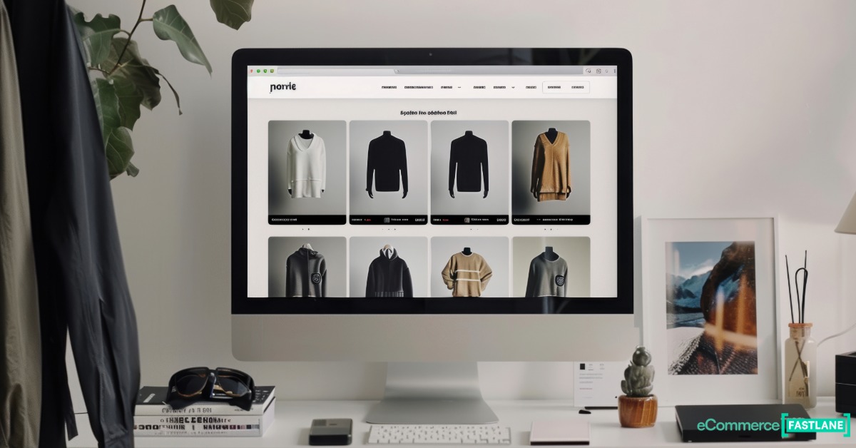
What Your Product Pages Are Actually Supposed To Do
The homepage is where first impressions are made. The product page is where purchase decisions are made. These are different jobs, and they require different design priorities. Many stores invest heavily in homepage design and treat product pages as a lower priority, which is precisely the wrong allocation of attention. A visitor who arrives from a paid ad, an organic search result, or a social media link will often land directly on a product page without ever seeing the homepage. That product page has to do the entire job of converting them, without the benefit of a brand introduction or a curated browsing experience.
The elements that make a product page capable of doing that job are specific and well-documented. High-quality images from multiple angles are the baseline. But images alone do not answer the questions that prevent purchase. Sizing information that is vague or absent forces hesitation. Shipping costs and delivery timelines that are hidden until checkout create the kind of late-stage surprise that drives abandonment. Return policy information that requires navigating to a separate page introduces friction at the moment when a buyer is closest to committing. Customer reviews that are missing, sparse, or unverified remove the social proof signal that many shoppers require before they will purchase from a brand they have not bought from before.
The copy on a product page is not a description of the product. It is a sales argument. It should answer the specific questions that a buyer in the consideration stage is asking: What problem does this solve? How does it compare to alternatives? What do I need to know about fit, material, or compatibility? What happens if it does not work for me? A product description that answers those questions in plain, specific language will outperform a beautifully written but vague brand narrative every time. The detailed framework for building product pages that answer those questions consistently is covered in the guide to the 11 elements of high-converting product pages, which addresses each element from CTA placement to social proof structure with specific implementation guidance.
Making The Buying Process Feel Easy
The checkout flow is where the gap between a site built to impress and a site built to convert becomes most expensive. A visitor who has found the right product, read the description, checked the reviews, and added the item to their cart has done the hard work of becoming a buyer. The checkout flow’s job is not to sell them anything further. Its job is to not lose them. Every additional step, every required form field, every moment of confusion about what happens next, and every payment method that is missing is a reason for a buyer who was ready to purchase to change their mind.
The specific friction points that drive checkout abandonment are well-documented by the Baymard Institute, which has conducted large-scale usability research on ecommerce checkout flows for over a decade. Forced account creation is consistently the highest-impact abandonment driver: a significant percentage of buyers will abandon a purchase rather than create an account they did not ask for. Unexpected shipping costs revealed at the final step are the second most common driver. A checkout form that asks for information in an illogical order, that does not autofill on mobile, or that does not clearly indicate progress through a multi-step process creates the kind of friction that accumulates across steps until the buyer simply stops. None of these problems are visible in a screenshot or a design mockup. They are only discovered by completing the checkout process as a real customer would, on a real device, with a real payment method.
The principle that applies here is straightforward: unless your product is genuinely unavailable anywhere else, buyers will not tolerate unnecessary friction to purchase from you. The ecommerce landscape in 2026 gives every buyer instant access to alternatives. The site that makes buying easiest, not the site that looks most impressive, wins the sale. The UX principles that govern how navigation, page structure, and CTA placement combine to create that ease are covered in detail in the guide to designing high-converting ecommerce product pages using UX best practices, which addresses the specific layout decisions that reduce friction between product discovery and completed purchase.
When To Fix It Yourself And When To Bring In A Professional
The DIY versus professional development decision is not primarily a budget question. It is a complexity question. Many of the highest-impact conversion fixes on a Shopify store are accessible to a non-technical operator: compressing images, rewriting product descriptions, adding a guest checkout option, making the return policy visible on product pages, and improving the mobile tap target size of add-to-cart buttons. These changes require time and attention but not development expertise. If your site’s conversion problems are concentrated in content quality, information architecture, and basic mobile usability, a systematic self-audit and a willingness to iterate will close most of the gap.
The scenarios that justify professional development involvement are different. Custom checkout modifications, performance optimization at the code level, integration of third-party tools that require API work, and structural changes to theme architecture that affect page rendering speed are all problems where a non-technical operator attempting a DIY fix is as likely to create new problems as to solve existing ones. Working with an internet marketing service, website development who understands both the technical and conversion dimensions of ecommerce site performance is the appropriate solution when the gap between your site’s current state and its revenue potential is large enough that the cost of professional help is smaller than the cost of the ongoing underperformance.
The diagnostic question to ask before making that decision is: do I know specifically what is causing my conversion rate to underperform, and do I have the technical access to fix it? If the answer to both parts is yes, start with the self-audit. If the answer to either part is no, the investment in a professional diagnosis is almost always recovered quickly through the revenue improvement that follows a properly executed fix.
Frequently Asked Questions
How do I know if my ecommerce site’s design is hurting my conversion rate?
The clearest signal is a gap between traffic quality and conversion performance. If you are driving qualified traffic from paid search or organic channels and your conversion rate is consistently below 1.5% to 2%, the site is not doing its job. The diagnostic process starts with three checks. First, complete a purchase on your own site from a mobile device you have not used before, without skipping any steps. Note every moment of hesitation or confusion. Second, check your site speed using Google PageSpeed Insights and look specifically at your mobile score and your Largest Contentful Paint time. Third, review your cart abandonment rate in your analytics. If it is above 70%, the problem is almost certainly in the checkout flow rather than the product pages. Each of those three checks will point you toward a specific category of fix rather than a general redesign.
Is it worth investing in a professional ecommerce website redesign if my current site already looks good?
A redesign is worth the investment only if the current site has a structural problem that cannot be fixed through targeted optimization. If your site looks good but converts poorly, the most common cause is not a design problem that requires a full redesign. It is a functional problem that requires targeted fixes: product page content, checkout flow friction, mobile performance, or navigation structure. A full redesign addresses all of those things simultaneously, but it also introduces risk, requires significant time, and may not improve conversion if the new design makes the same functional mistakes as the old one. The better approach in most cases is to audit the current site, identify the specific friction points that are driving abandonment, fix those points systematically, and measure the impact of each fix before committing to a full rebuild.
What is the single highest-impact change I can make to improve my ecommerce conversion rate?
The answer depends on where your site’s current biggest friction point is, but across a large sample of ecommerce stores, three changes appear most consistently in the highest-impact category. Adding a guest checkout option, if your store currently requires account creation, typically produces the largest immediate lift because forced account creation is the single most common reason for checkout abandonment. Making shipping costs visible on product pages rather than revealing them at checkout eliminates the late-stage surprise that drives a significant percentage of cart abandonments. And rewriting product descriptions to answer the specific questions a first-time buyer would ask, rather than describing the product’s features in general terms, consistently improves both conversion rate and return rate. If you can only make one change, audit your checkout flow first and identify whether forced account creation or hidden shipping costs are present. Those are the two changes with the most consistent and immediate impact across store types and categories.
How much does page load speed actually affect ecommerce sales?
The research on this is consistent and significant. Google’s data shows that as page load time increases from one second to three seconds, the probability of a mobile visitor bouncing increases by 32%. From one second to five seconds, that probability increases by 90%. For an ecommerce store, a bounce from a product page is a lost sale opportunity. The practical implication is that every second of load time above a two-second threshold is costing you a measurable percentage of the traffic you paid to acquire. The most common causes of slow load times on visually ambitious ecommerce sites are uncompressed images, video backgrounds that load on mobile, and heavy JavaScript from third-party apps that block page rendering. Each of those is fixable without a full redesign. Google PageSpeed Insights identifies the specific issues affecting your site and ranks them by impact, which gives you a prioritized fix list rather than a general performance problem to solve.
Why do so many ecommerce stores have great homepages but weak product pages?
The pattern reflects how most ecommerce design projects are scoped and reviewed. The homepage is the most visible page, the one that gets shown in design presentations, shared in team reviews, and used in marketing materials. It receives the most attention during the design process because it is the most visible output. Product pages are typically templated, reviewed quickly, and treated as a lower-priority design problem because they are numerous and because the content on them, the product descriptions, images, and specifications, is often added after the design work is complete. The result is a homepage that reflects the full attention of the design process and product pages that reflect a fraction of it. The revenue consequence of this imbalance is significant, because product pages are where purchase decisions actually happen. Most visitors who arrive from paid ads or search results land directly on a product page, never seeing the homepage at all.
What does “friction” mean in the context of an ecommerce checkout, and how do I identify it?
Friction is any point in the purchase process where a buyer’s momentum toward completing a transaction is interrupted or slowed. It can be cognitive, such as a form field that asks for information the buyer does not understand why you need. It can be technical, such as a page element that shifts position during loading causing a misclick. It can be informational, such as a shipping cost that is not revealed until the final checkout step. It can be structural, such as a multi-step checkout that does not show progress indicators. The most reliable way to identify friction in your checkout is to complete a purchase yourself on a mobile device, timing how long each step takes and noting every moment where you had to think about what to do next. Any step that requires more than a few seconds of consideration is a friction point. The Baymard Institute’s checkout usability research provides a comprehensive framework for evaluating each step against the standard of a frictionless checkout, and their findings are publicly available as a reference for self-auditing your own flow.
Should I use a website template or hire a developer for my ecommerce store?
Templates are the right starting point for most new ecommerce stores, and a well-chosen template on Shopify or a comparable platform will handle the majority of the functional requirements that drive conversion: mobile responsiveness, fast load times, structured checkout flows, and standard product page layouts. The limitations of templates become relevant when your brand’s specific requirements cannot be met by the template’s configuration options, when your product catalog has complexity that requires custom filtering or navigation logic, or when your conversion data shows that a specific structural element of the template is driving abandonment and cannot be modified without code changes. At that point, working with a development partner who understands both ecommerce conversion principles and technical implementation is the appropriate next step. The decision is not template versus developer as a permanent choice. It is a question of which approach is right for your current stage of growth and the specific problems your site needs to solve.
