
Key Takeaways
- Outperform your competitors by building a high-quality component library that allows your team to launch new features faster.
- Adopt the atomic design process to break complex layouts into small, manageable parts that work together perfectly.
- Reduce developer burnout and daily stress by creating clear rules for how your team builds and updates software.
- Stop hard-coding visual details and use design tokens to update your entire app’s look in just one click.
Unpredictability of the rapid enterprise software world is the silent killer of productivity.
What began as a mere button element can evolve into something different. In no time, there are dozens of slightly different versions scattered in a legacy codebase.
For organizations planning to scale their digital products effectively, partnering with a professional UI UX design agency can be the initial step towards standardization.
However, the real challenge lies in implementation: turning these design files into code that remains robust, flexible, and maintainable as the application grows. This blog will show you how to create UI components that scale.
What is a Scalable UI Component?
Before diving into architecture and concepts, we must address a core point. A Scalable UI Component is not just a piece of code that renders a visual element in the browser. It is a future-proof unit that is designed to survive change.
Here are some core principles of scalable UI components:
-
Modularity: Breaks the UI elements into small, independent pieces that can be built and updated separately.
-
Reusability: Components can be used in different places without needing to rewrite the whole code.
-
Consistency: Make sure the same look, feel, and behavior across the app for a unified user experience.
-
Responsiveness: Adapts smoothly to different screen sizes and devices.
-
Maintainability: Easy to fix, update, or expand without creating problems in other parts of the system.
Flexibility vs. Consistency
Enterprise apps have massive codebases and lifecycles spanning over the years. The core challenge is balancing consistency with flexibility (handling complex use cases).
If components are too rigid, developers will “throw” them to build custom solutions. If they are too flexible, the UI becomes fragmented.
The Cost of UI Debt
“UI debt” accumulates when components are built without scalability in mind.
-
Nightmares: Changing a brand color requires editing hundreds of files instead of updating a global variable.
-
Friction: New developers waste days selecting which card component to use.
In order to pay down this debt, we need a structured approach.
How to Build Scalable Enterprise UI Components
We have hand-selected and composed 8 steps that will help you understand and assist you in building scalable UI components.
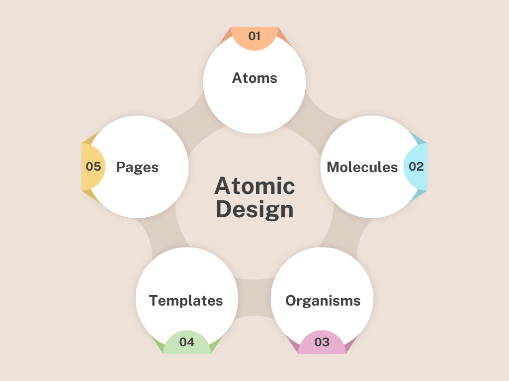
Step 1: Adopting Atomic Design
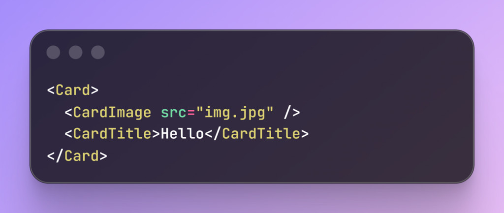
Scalability begins with an organized design mindset, and Atomic design is an ideal approach for this. To clarify, Atomic design is a methodology that breaks down UI designs into smaller pieces, which can then be merged together to form a large, cohesive design.
-
Atoms: Smallest blocks (Inputs, Buttons).
-
Molecules: Groups of atoms (Search Bar = Input + Button).
-
Organisms: Complex sections (Navigation Bar).
-
Templates: Layout structures.
-
Pages: Real instances with data.
The Enterprise Rule: Strictly separate Atoms and Molecules. Atoms should be visual only, while Molecules handle logic. If branding changes, just update the Atoms, and changes will be visible globally.
Step 2: Utilizing Design Tokens
Hard-coding is the enemy of sudden changes, because changing a specific value in multiple files can be time-consuming. The scalable UI Component takes advantage of design tokens. With this technique, you can modularly make changes to any part of the UI element without breaking it.
-
Color: Use –primary-color: #3B82F6; instead of just color: #3B82F6;
-
Font: Use –font-size-medium: 1rem; instead of font:16px
-
Background: Use –bg-color: #FFF; instead of background: #FFF;
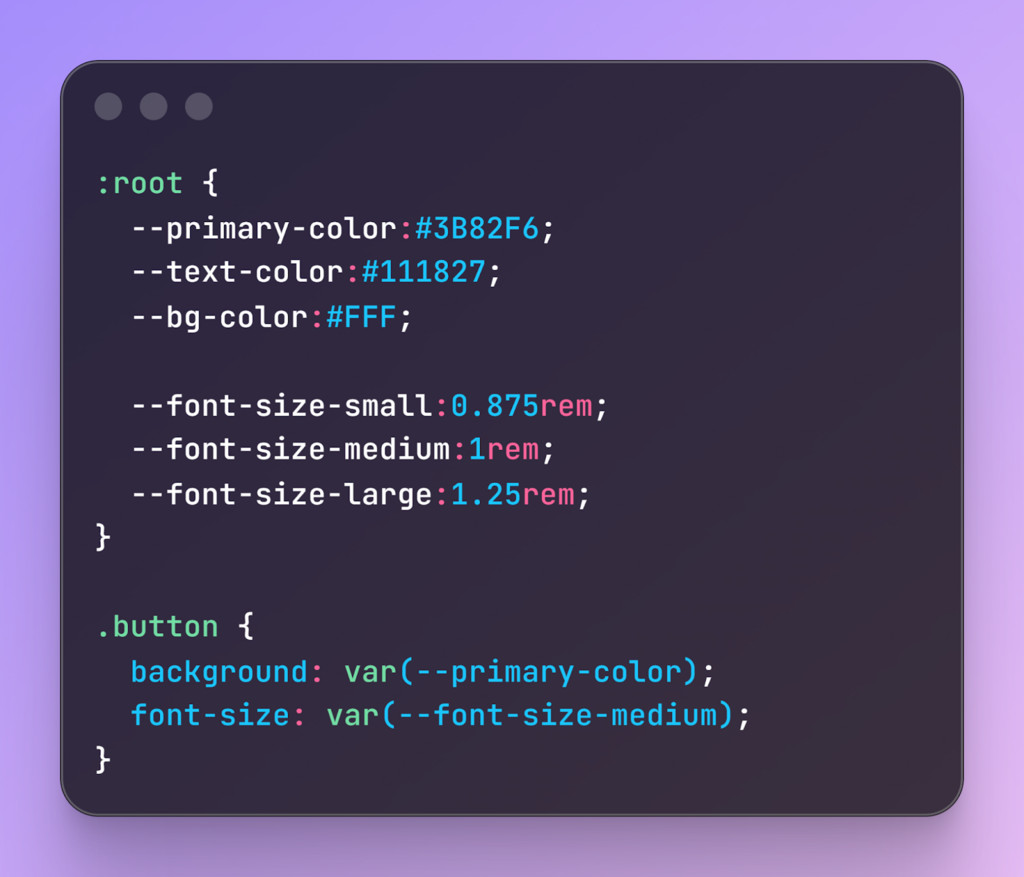
This may seem more work, but design tokens will save you time in the future.
Step 3: Strict Contracts
In an enterprise app environment, not understanding what type of data is required can cause bugs. With TypeScript, you can force explicit rules to prevent future mishaps.
Instead of guessing what props a component can take, you define them with an interface:
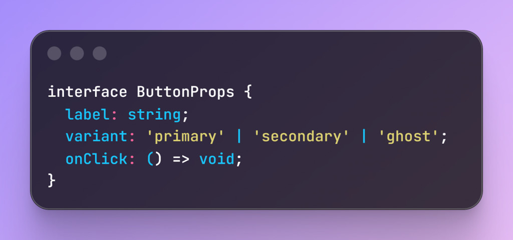
With this, if a developer tries to pass variant=”blue”, the build fails. This prevents “rogue” styles from entering production and ensures adherence to the design system.
Step 4: Component API Design
When you make a component (like a Button or Card), you want it to be easy for other developers to use correctly. This way, you keep your apps consistent and easy to scale.
Restrict Styling with Variants
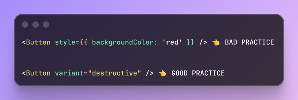
Favor Composition Over Configuration
Avoid “God Components” loaded with dozens of boolean props (hasIcon, isBlue, noBorder). These components are hard to maintain, understand, and modify.
Instead, break components into smaller chunks, modular pieces:
Step 5: Optimizing Performance (Tree-Shaking)
Focus on efficiency as much as functionality in large apps. Use the tree-shaking method to remove leftover code from the final bundle release. Structure your library with JavaScript ES modules and mark it as side-effects-free.
Keep your enterprise app codebase lean and performant, allowing it to scale smoothly as complexity grows.
Step 6: Prioritizing Accessibility (A11y)
Make accessibility a priority in every component. Ensure that all types of app users can navigate every component using their keyboard, such as moving with the Tab key.
Add ARIA labels so that screen readers can understand the state of your page elements.
Carefully manage focus, returning it to the correct place when modals or dialogs close. Build accessibility into your smallest “Atoms” so that every larger component automatically inherits it.
Step 7: Versioning and Distribution
Implement a strong version control strategy when multiple products are using the same library. Release patch for bug fixes, minor versions for new features, and major versions for breaking changes that require coordination.
Use a repo service to house both your library and applications collectively. Make Atomic commits to update the library and dependent apps simultaneously to prevent dependency conflicts.
Step 8: Testing and Governance
-
Visual Regression Testing: Check each component’s functionality and use visual regression tools to ensure they look and feel correct something that gets much easier when you hire dedicated software developers with design-system experience. Compare screenshots of each commit and foundation to catch styling issues before they reach production.
-
Documentation: Create a living style guide in Storybook where developers can toggle props and explore components.
Recommended Tools
To build scalable ui components, you will need to ensure the industry-standard tools. Here are some tools that will assist you on your journey.
|
Category |
Recommended Tool |
Why? |
|
Documentation |
Storybook |
Allows isolation of components so devs can build them without running the whole app. |
|
Testing |
Chromatic or Percy |
Automates “Visual Regression” (screenshots of every commit to check for broken pixels). |
|
Linting |
ESLint + Prettier |
Enforces consistent code style across large teams. |
|
Distribution |
Bit.dev or NPM |
Manages versioning for shared component libraries. |
Final Takeaway
Building scalable UI components is not an easy design task. Devs need to keep up with multiple factors at once. Moving away from traditional hard-coding to the Atomic design principle comes with complexity. But this is an integral movement to scale your enterprise apps without issues. This is the core reason many seek help from skilled professionals.
Ultimately, the goal is to reduce the mental pressure and excessive load on your developer. By enforcing the steps above, you can have an all-around system that can be scaled in the future without any extra hassle.
Frequently Asked Questions
What makes a UI component truly scalable for a large company?
A scalable component is a future-proof unit of code designed to survive changes as your software grows. It relies on modularity and reusability so that developers can update one small piece without breaking the entire application. True scale happens when your code remains easy to maintain even as your team adds dozens of new features.
Why should developers use atomic design for enterprise apps?
Atomic design helps you organize code by breaking it down into atoms, molecules, and organisms. This method ensures that your smallest building blocks, like buttons, stay consistent across every single page. When you separate these visual pieces from complex logic, you can update your brand colors or fonts in one place and see the change everywhere instantly.
How do design tokens help prevent technical debt?
Design tokens replace hard-coded values like hex codes or pixel sizes with simple variables like primary-color or body-text-size. Without these tokens, a simple brand update would require you to search through and edit hundreds of individual files. Using tokens creates a central source of truth that makes your codebase much more flexible and easier to manage over time.
Can flexible components actually damage my user interface?
Yes, because components that are too flexible allow developers to create slightly different versions of the same element. This leads to a fragmented user experience where buttons and inputs look different on every page. Successful teams find a balance by using strict rules and variants that keep the design consistent while still solving complex problems.
Is it necessary to use TypeScript for building component libraries?
While not strictly required, TypeScript acts as a contract that prevents developers from making mistakes when passing data to components. It catches bugs during the building phase by enforcing rules about what kind of information a component can accept. This extra layer of safety is vital for enterprise teams who need to move quickly without causing production errors.
What is the advantage of composition over configuration in UI design?
Composition means building complex sections by nesting smaller, simple components together rather than creating one giant component with too many options. These giant components are often called God Components and are incredibly difficult to fix or change later. Breaking them into smaller chunks makes your code easier to read, test, and share across different parts of your app.
How does tree-shaking improve the performance of my digital product?
Tree-shaking is a process that identifies and removes unused code from your final application bundle. In large enterprise apps, libraries can become very heavy, which slows down the experience for your users. By structuring your library correctly, you ensure that customers only download the specific parts of the code they actually need to see.
Should I prioritize accessibility at the atom level or the page level?
You should always build accessibility into your smallest atoms so that every larger molecule or organism inherits those traits automatically. This includes adding ARIA labels for screen readers and ensuring that every element can be navigated using only a keyboard. Making accessibility a fundamental part of your small pieces saves you from having to fix thousands of errors later.
How do visual regression tools differ from standard unit testing?
Standard tests check if the code logic works, but visual regression tools like Chromatic take screenshots to check if the pixels actually look right. These tools automatically compare new changes against a baseline to catch unintended styling shifts before they reach your users. This is the most effective way to ensure that a small CSS change in one area doesn’t ruin the layout elsewhere.
What is the best way to handle versioning for a shared component library?
You should use a clear system where patch versions fix bugs, minor versions add features, and major versions alert teams to breaking changes. Using a central repository service allows multiple apps within your company to stay in sync with the latest updates. This organized approach prevents dependency conflicts where different parts of your software stop working together.