
You likely have plenty to share on your website—from pricing and shipping details to return policies, answers to FAQs, and more. An accordion section is a user interface (UI) element that keeps all these particulars organized by tucking them away behind clear, simple headers.
Don’t overwhelm your visitors with long text blocks or endless scrolling pages. Accordions let them decide when to access extra details and how much to see at once. When used well, accordion UI design reduces clutter, keeps shoppers focused, and supports clearer browsing paths by helping users navigate complex information. In this guide, you’ll learn when accordions help—and hurt—your site, plus 10 implementation best practices for this versatile component.
What is accordion UI design?
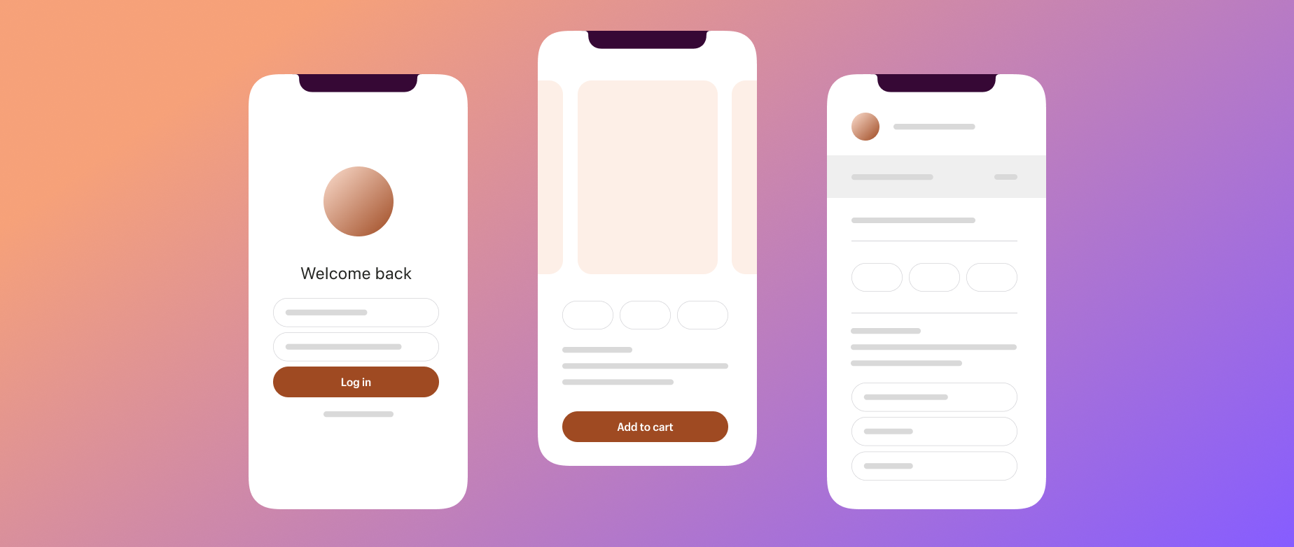
An accordion section—or expansion panel—is a user interface (UI) pattern that groups a list of collapsible options and stacks them vertically. Each heading can be expanded to reveal the content within.
Accordion UI design can help you present complex information by breaking your content up into manageable, expandable parts. This makes pages easier to scan and navigate, especially on mobile devices, where screen space is limited.
An accordion component typically includes three elements:
-
Accordion header. The row or headline that identifies the content hidden inside the accordion.
-
Expand indicator icon. A symbol—such as an arrow, caret, or plus/minus—that indicates the section can be expanded or collapsed.
-
Accordion content. The segment that opens to expose details, visuals, or additional material.
Accordion components often appear on FAQ pages, product detail pages, filters, and other spots where users may want quick summaries with optional deeper details. They’re especially useful for content like ingredient lists, size guides, or technical product specs that would otherwise make a page feel long or cluttered.

All accordion components should follow accessibility best practices, including keyboard navigation and ARIA controls (HTML attributes that help screen readers and other assistive technologies understand and read interactive elements).
Some accordion sections have dividers between the content, a bounding box around the whole component, or additional icons like a settings gear or user icon that indicate to the visitor what each section contains.
Advantages of accordion UI design
When used thoughtfully, accordions can make pages easier to navigate and help visitors focus on the details that matter most—ultimately supporting smoother browsing and better purchasing decisions.
Reduces visual clutter and improves navigation
If you have a lot of content to communicate, accordion sections help prevent overwhelm by hiding finer details until users want them. With clear accordion headings and clean alignment, visitors can scan the page quickly, jump directly to the information they need, and expand deeper details only when helpful. This reduces visual clutter, supports both skimmers and deep readers, and helps shoppers stay focused instead of abandoning the page.
Enhances the mobile experience
Mobile devices have less screen real estate, making accordion design UIs ideal for mobile website versions. An accordion structure is especially helpful on long pages with multiple layers of information or multiple sections, preventing endless scrolling, reducing fatigue, and helping users stay engaged longer.
Centralizes related information
Accordion sections are great for aggregating related information, which can help your users get the information they need. Centralized information reduces the chance that shoppers miss important details, increasing clarity and confidence during the buying process.
Limitations of accordion UI design
While accordion components offer user experience (UX) benefits, they come with trade-offs worth understanding before you implement them.
Hides critical information
Visitors sometimes don’t notice that accordion sections can be expanded. If you want essential content available to all users, an accordion section may not be your solution. Burying key details—content tied directly to pricing comparisons or variant selection, for example—can increase site abandonment if shoppers feel unsure or unable to find the information they need.
Slows users down with extra clicks
Extra steps can interrupt the browsing flow, especially for mobile users or shoppers in a hurry. If your users have to click several levels deep into an accordion UI section, they can get lost in the multiple nested sections and may end up moving on from your page. This friction between user and content can also slow decision-making and result in fewer conversions. In some cases, allowing users to keep multiple sections open at once can reduce this friction, but it depends on your layout and how much content you’re displaying.
Requires careful accessibility support
Your accordion sections need to include properly structured ARIA controls, with clear headings and keyboard navigation. Without these, visitors who use screen readers or keyboards to navigate the web are left out. Inadequate accessibility support makes sections unreadable or unusable for part of your audience, limiting who can engage with your content and potentially exposing your business to accessibility-related compliance issues.
When to use—and avoid—accordion UI design
An accordion section keeps your information organized and easy to access—but only in the right context.
When accordions work best
Accordions are ideal when:
-
Users don’t need the information right away
-
The content can be divided into clear, logical sections
-
You need to save vertical space (especially on mobile)
When to choose a different approach
Accordions may not be the best option when:
-
The information needs to be visible all at once
-
Users need to maintain context across multiple details or compare items
-
Collapsing content makes navigation slower or more confusing
-
User testing finds that visitors expand every section by default
In these cases, a standard layout that keeps key information visible upfront may better support clarity, usability, and faster decision-making.
How to implement accordion UI design effectively
- Use clear headers
- Organize sections by priority
- Let sections open independently
- Keep one panel open when helpful
- Avoid overly long lists
- Don’t hide critical details
- Use clear expand indicators
- Support accessibility needs
- Keep animations subtle
- Align text and spacing
Here are 10 ways to design accordion components to support your customers instead of slowing them down:
1. Use clear headers
Each accordion header should read like a straightforward category title—direct and obvious. Short labels like “Care instructions” or “Shipping and returns” set expectations immediately, while long, vague headers force users to guess what’s inside.

2. Organize sections by priority
Place your most valuable or frequently accessed content at the top of the vertically stacked list, especially if your page uses multiple accordions. For example, put the most common questions at the top of an FAQ accordion, or surface key product details before secondary information, like care instructions. Prioritizing content this way helps visitors find what they need faster and reduces the chance they’ll overlook important details.
3. Let sections open independently
Visitors may want to view more than one answer or content block at a time. Let them open multiple sections simultaneously without automatically closing the previous one. This gives users more control and prevents frustration when comparing details across sections.
4. Keep one panel open when helpful
On product pages or informational hubs, leaving the first accordion block expanded can prevent that empty “everything is collapsed” impression. It also signals how the accordion works, giving shoppers a clear starting point. Use this technique to help orient visitors.
5. Avoid overly long lists
If an accordion contains more than eight to 10 collapsible sections, it becomes harder for users to scan the list and spot the item they need. Long accordions also increase scrolling and make visitors work harder to compare or revisit sections. If your list gets too long, consider reorganizing the content or breaking it into smaller groups.
6. Don’t hide critical details
Don’t hide content that’s essential for a purchase decision. Elements like shipping policies, pricing differences, or product specs shouldn’t disappear into a collapsed accordion. Keeping key details visible builds trust and helps shoppers make confident decisions faster.
7. Use clear expand indicators
Use a rotating chevron, plus or minus symbol, or another intuitive icon to show that a section can be expanded or collapsed. Clear indicators reduce hesitation and help visitors understand how the accordion works at a glance.

8. Support accessibility needs
An effective accordion includes proper ARIA attributes, predictable behavior, and full keyboard navigation. Users should be able to press Enter or Space to open a heading, and screen readers should be able to announce each item clearly. Strong accessibility ensures all visitors—including those using assistive technologies—can interact with your content.

9. Keep animations subtle
Brief, smooth opening and closing animations help users follow content as it moves between collapsed and expanded states. Simple slide or fade effects work best, while bouncy or decorative motions can slow users down and distract from the information they came to see. Aim for motion that enhances comprehension rather than calling attention to itself.
10. Align text and spacing
Left-aligned text and consistent spacing between accordion items make the layout easier to scan—especially when presenting a step-by-step process or other detailed content. Uniform spacing helps visitors process information faster, particularly for mobile users navigating collapsible sections.

Accordion UI design FAQ
What is an accordion in UI design?
An accordion UI design is a collapsible content system that reveals hidden sections when users click or tap on a header or expand icon. This design feature can guide users through extensive information by creating organized segments, giving them control over when and how much content they access.
When should I use an accordion UI?
Use accordions when the page contains multiple related topics, each with deeper details. They’re ideal for FAQ pages, detailed product information, onboarding guides, and any layout where a top-level overview sits alongside optional, more in-depth content.
When should I not use accordions?
Avoid using accordions in situations where users need immediate access to vital content or when they need to perform comparisons. Avoid them when hiding the information increases friction between users and your content.
What are common accordion UI mistakes?
Common issues include nesting too many accordion sections, creating overly long lists, or using vague headers that force visitors to guess what each item contains. Another frequent mistake is placing essential information inside collapsed panels, which can make it harder for users to find key details.