
For furniture and home-goods brands, the most underrated product-page asset is not another photo but a simple to-scale floor plan that shows how the piece fits inside a real room, because that visual directly answers the shopper’s “will this work in my space” anxiety.
On big-ticket furniture, photos build desire, but floor plans give shoppers the spatial confidence they need to actually click “buy.”
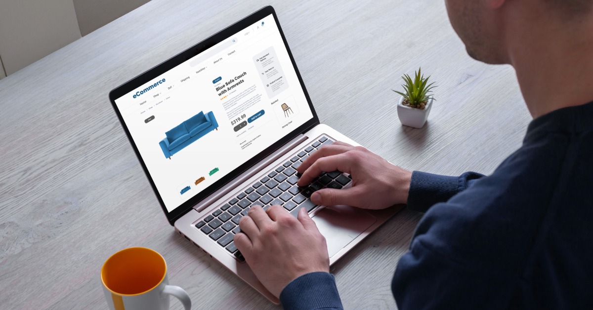
Walk through the product page of almost any furniture or home-goods store on Shopify and you’ll find the same playbook: a clean studio shot, a lifestyle photo of the piece in a beautifully staged room, maybe a 360 spin if the brand has budget, and a spec table with dimensions buried near the bottom. It’s a polished setup, and it sells. But it has a blind spot that quietly costs these stores conversions every single day, and almost nobody fills it.
The blind spot is spatial context. A gorgeous photo of a sectional in a sun-drenched loft tells the shopper everything about how the sofa looks and nothing about whether it works in their own 11-by-13 living room with the TV on the short wall. Dimensions are supposed to answer that, but “84 inches wide” is an abstraction most people can’t translate into a felt sense of space. So the shopper does the spatial math in their head, gets it wrong or gives up, and either bounces or buys nervously and returns it later.
The asset that closes this gap is one the home-goods world has weirdly ignored as a marketing tool: the floor plan.
A photo answers “is this beautiful?” A floor plan answers “will this work in my space?” Those are different questions, and the second one is the one stalling carts on big-ticket furniture. When a shopper can see a to-scale top-down layout showing your dining set inside a realistic room — with the chairs pulled out, a clear path to the kitchen, breathing room around the table — the dimensions stop being a number they have to interpret and become a picture they instantly understand.
I’ve watched this play out in analytics for home brands enough times to trust the pattern. The pages that pair a product with even a simple room layout tend to hold attention longer and convert at a higher clip on exactly the items where “will it fit” anxiety is highest: sofas, sectionals, dining tables, bed frames, modular storage. It’s not magic. You’re just answering the buyer’s real question before they have to ask it, instead of leaving them to guess.
If floor plans work so well, why doesn’t every furniture store use them? Because for a long time, producing one meant hiring someone who knew CAD, or paying a 3D rendering studio per scene, or buying enterprise visualization software that priced out every independent merchant on the platform. A flat photo and a dimension line were simply cheaper, so that’s what shipped. The asset that could have answered the buyer’s biggest question got cut for budget reasons, and an entire category learned to live without it.
That economic constraint is the part that’s actually changed, and it’s why this is worth revisiting now. Tools like floor plan AI let you describe a room in plain English — “modern open-plan living room, roughly 20 m², sofa against the long wall” — and generate a clean, to-scale plan in seconds, in styles ranging from a technical blueprint look to a softer illustrated 2.5D view, exported as a PNG you can drop straight onto a product page. The work that used to need a CAD operator and a day of turnaround now takes a sentence and a minute, which means the cost argument for skipping floor plans has basically collapsed.
You don’t need to overhaul your store to test whether this moves numbers. Start narrow and let the data decide.
Pick your top three or four products by revenue, because that’s where any lift compounds fastest. For each, generate two or three representative room layouts — a small apartment living room, a standard bedroom, an open-plan studio — with the product placed sensibly inside. Put those visuals on the product page right next to the spec table, where the “will it fit” doubt actually lives. The goal is for the shopper to see the answer before the question fully forms.
From there, the same assets earn their keep in more than one place. A collection page can open with a short “plan your room” section that reframes the visit from browsing isolated items to furnishing an actual space — and a shopper thinking in terms of a whole room tends to build a bigger cart than one clicking through products one at a time. Your email flows get sharper too: an abandoned-cart message that says “see how the Aspen sectional lays out in a real living room” speaks to the precise hesitation that caused the abandon, which a generic “you left something behind” never touches.
One practical note: keep the layouts honest. The temptation is to draw a generous, magazine-perfect room that makes everything look effortless, but a shopper comparing it to their cramped apartment will feel the mismatch and trust you less. Use realistic square footage, show doorways and windows where they actually constrain placement, and label the rough dimensions on the plan itself. A layout that admits a room is tight does more for conversion than one that quietly oversells the space, because it reads as a brand being straight with the buyer rather than staging a fantasy.
Underneath the tactic is a change in what a furniture product page is for. The old version was a brochure — show the thing, list its specs, hope the customer can imagine the rest. The version that’s winning treats the page as a planning tool that helps the shopper make a confident spatial decision, because confidence is what’s actually missing at the moment of purchase for anything large. Beautiful photography builds desire; spatial context removes the doubt that desire alone can’t overcome.
For years the only thing standing between independent home brands and that kind of content was production cost. That barrier is largely gone now, which makes floor plans one of the cheapest under-exploited conversion levers left in furniture ecommerce. The stores still treating spatial confidence as the customer’s problem to solve will keep leaking carts at the “will it fit” moment. The ones that start treating it as content they own — content that’s now trivial to produce — will quietly pick up the sales those hesitations were costing everyone else.
Product photos are not enough to sell big furniture online because they answer how a piece looks, not how it fits into a shopper’s actual room. Lifestyle shots are usually staged in idealized spaces that do not resemble real apartments, which leaves customers to mentally translate dimensions into usable space on their own. That translation is hard for most people, so many either abandon the cart or buy with lingering doubt, which often turns into returns when the item feels too large or awkward once it arrives at home.
Floor plans reduce returns for sofas and dining tables by turning abstract dimensions into a clear picture of how the item occupies space in a realistic room. When shoppers see a to-scale top-down layout with walkways, door swings, and chairs pulled out, they can quickly judge whether movement and comfort will still feel good in daily use. This extra context screens out customers whose rooms are truly too tight and reassures those whose spaces are suitable, which together lowers the volume of “it was bigger than I expected” return reasons.
You typically do not need a developer to add floor plans to your Shopify product pages, because in most themes they can be inserted as standard images or blocks alongside your spec table. Once you generate the layouts using a design or AI tool, you upload them like any other asset and position them near the dimensions or size guide section so they are visible at the moment spatial questions arise. If your theme is heavily customized, a light template tweak from your developer or agency may help you standardize placement, but the underlying assets themselves do not require code-level changes.
Floor plan AI tools help smaller furniture brands by removing the need for CAD skills, expensive rendering studios, or enterprise visualization software to produce convincing room layouts. A merchant can now describe a room in natural language, specify where a sofa or table should sit, and receive a to-scale floor plan in seconds that is ready to use on a product page or in email. This makes it economically feasible to provide spatial context on the exact SKUs where it matters most instead of reserving that level of content only for a handful of hero products or skipping it entirely.
You should place floor plans on the product page as close as possible to your dimensions or specifications section, because that is where shoppers naturally look when they start asking “will this fit my space.” Positioning them directly beside or just above the spec table lets the visual answer replace a mental calculation that many buyers find intimidating. If your layout supports it, a short heading like “See it in a real room” can call attention to the plans without disrupting your existing photo gallery or hero media.

