


Quick Decision Framework
- Who This Is For: Shopify merchants doing $5K to $150K per month who sell physical products and are ready to treat packaging as a brand asset rather than a shipping necessity.
- Skip If: You are pre-revenue or still testing product market fit. Get to 30 orders a month before investing in custom label design. The fundamentals matter more right now.
- Key Benefit: Build a label system that generates consistent brand recognition across every product touchpoint, reducing the cost of repeat customer acquisition over 90 days.
- What You’ll Need: A locked brand identity (logo, color palette, typography), a label vendor that supports custom die-cut shapes and durable materials, and a design file in vector format (AI, EPS, or PDF). Budget $200 to $800 for initial design and sample runs depending on complexity.
- Time to Complete: 15 minutes to read. 1 to 2 weeks to design, sample, and approve. 30 to 60 days to see measurable brand recognition improvement in customer reviews and repeat order behavior.
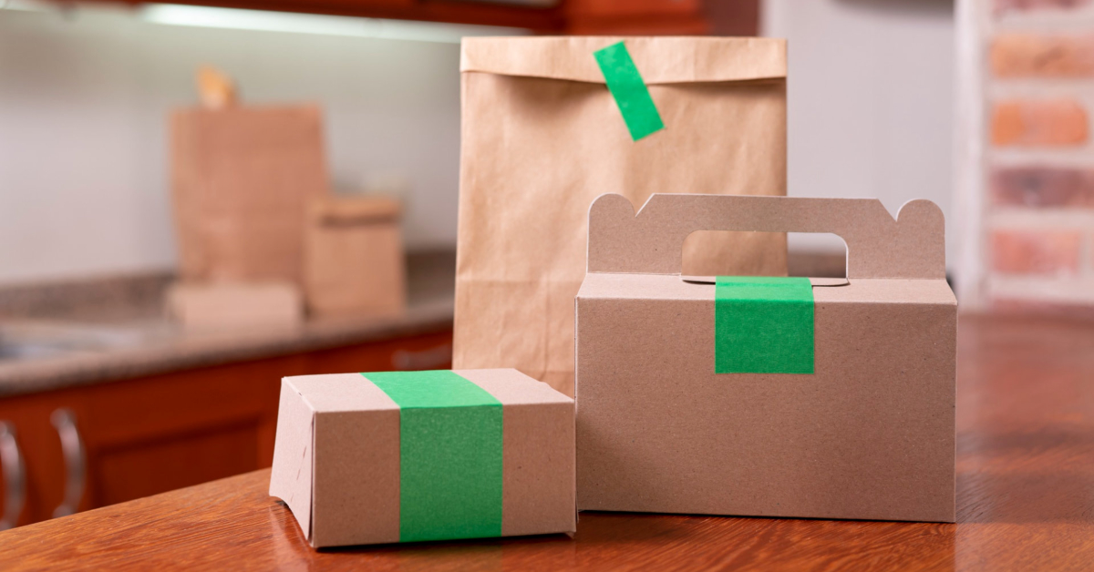
Your label is not packaging. It is the last brand impression before a customer decides whether to buy again. Most brands treat it like a sticker. The ones growing treat it like a storefront.
What You’ll Learn
- Why product labels generate more brand impressions per order than any other physical touchpoint and how to use that compounding effect deliberately.
- How visual consistency across your label system functions as a growth strategy, not just a design preference, and what that looks like at the $10K versus $500K monthly revenue stage.
- What separates a label that builds instant product recognition from one that gets ignored on a shelf, in a photo, or in an unboxing video.
- How your label connects to your broader brand identity across your website, social content, packaging inserts, and email design to create the coherence that drives customer confidence.
- When to order samples, how to evaluate label materials by surface type and use condition, and how to build a print cadence that matches your inventory cycle without wasting budget on outdated designs.
Why Labels Do More Work Than Most Brands Give Them Credit For
Sixty-two percent of consumers say they make a purchase decision based on packaging alone. Most Shopify founders I talk to know that number exists somewhere but haven’t connected it to their own label strategy. They think about ads, email flows, and conversion rate optimization. The label is an afterthought. That’s a mistake, and it’s one that compounds in the wrong direction.
Here is what actually happens when a customer places an order. The package arrives. Before they open it, they see your label on the outside. They open it and see your label on the product. They use the product and see your label again. Anyone nearby sees it too. A single label can generate four to six brand impressions from one transaction. If the customer shares an unboxing photo or posts a review with a product image, that number multiplies again. For brands doing 200 orders a month, that is potentially 1,000 brand impressions per week from a single label design. Most founders are leaving that entirely to chance.
For ecommerce brands without a physical retail presence, the packaging moment is your storefront. There is no window display, no floor staff, no ambient music. Just the product and the label. If you are doing $10K months and trying to build something real, this is one of the most cost-effective brand investments available to you. If you are at $500K months and still running a label that looks like a template, you are actively working against the customer loyalty you have already earned.
Consistency Is the Actual Brand Strategy
A lot of founders treat visual consistency as an aesthetic preference. It is not. It is a growth strategy with a measurable effect on repeat purchase rates and word-of-mouth referrals.
When your label design stays consistent across your product line, using the same fonts, the same color palette, and the same logo placement, customers start to recognize your products without reading the brand name. That is the goal. You want someone scrolling through a crowded feed, opening a box on camera, or walking through a pop-up market to spot your product from a distance and know it is yours before they process a single word of copy.
The beverage startup category has demonstrated this pattern more clearly than almost any other. Brands in that space routinely keep the same label layout across an entire product range, changing only the color accent or the product name between SKUs. The result is a system where customers can instantly identify the brand while still distinguishing individual products. It is a simple constraint, but the recognition effect compounds quickly. After enough touchpoints, the label itself carries the brand identity without any additional marketing spend required to reinforce it.
There is also a compliance layer worth understanding before you design anything. In the U.S., the Fair Packaging and Labeling Act requirements for consumer products mandate that certain information appear on many consumer product labels, including the product identity, net quantity, and the name and address of the manufacturer or distributor. Food, supplements, and cosmetics also fall under FDA labeling requirements. You are going to have required label content regardless of what you want to design. The question is whether that required content sits inside a design that builds your brand or one that dilutes it. The brands that handle this well treat regulatory constraints as a useful design brief. They know exactly how much real estate they have and what goes where. Every square centimeter is intentional.
What Separates Effective Ecommerce Product Labels From Forgettable Ones
I have looked at a lot of label designs across a lot of product categories. The ones that work share a small number of qualities. The ones that fail almost always fail for the same reasons.
Legibility at a glance is the first filter. If the logo or product name is not readable in under two seconds under normal lighting conditions, the label is not doing its job. Fancy scripts and dark-on-dark color combinations can look compelling in a design file. They frequently fall apart on a physical product under real-world conditions, particularly at smaller label sizes or when applied by hand with slight misalignment. The test is simple: print the label, apply it to the actual product, and read it from three feet away in average room lighting. If you hesitate, revise it.
Color that carries meaning is the second factor. Color does significant psychological work in packaging. Blue is associated with trust and reliability in brand design contexts. Green is used to communicate natural or sustainability positioning. Red signals urgency or excitement in retail environments. These are not rules; they are patterns with enough consistency to be worth considering deliberately. The brands that struggle most with color tend to choose what looks nice in isolation rather than what communicates something specific about the product or the brand. The choice should be intentional and should match what you are already communicating everywhere else.
Material selection is where a lot of smaller brands cut corners and pay for it later. A matte finish on a skincare label communicates something different than a glossy finish on a food product. The physical feel of the label is part of the brand experience. Options like StickerYou professional business labels have made it significantly easier for smaller brands to access custom die-cut shapes and durable materials without committing to large print runs, which removes one of the most common barriers to investing in better label design. If your product is going to live in a refrigerator, a gym bag, a bathroom, or anywhere with regular moisture exposure, your label needs to be rated for that environment. A label that peels at the corner after two weeks of normal use is not a packaging problem. It is a brand problem that shows up in reviews.
Restraint is the quality most difficult to execute and most impactful when done well. The brands that struggle most with label design tend to overpack the space. Every certification badge, every tagline, every piece of product information ends up competing for attention on a surface that might be two inches wide. Good label design edits ruthlessly. The essential information is there. Everything else is left out. The white space that results is not empty; it is doing work.
Labels in the Context of Your Broader Brand Identity
Your product label does not exist in isolation. It should feel connected to your website, your social media content, your packaging inserts, and your email design. When all of those elements share a visual language, customers experience a coherence that builds confidence in the brand at a level that is difficult to articulate but easy to feel. If you have not thought through how your labels fit into the broader packaging system, it is worth working through how to develop a complete packaging strategy for your brand before committing to a label design direction.
The unboxing moment is where this coherence pays off most visibly for ecommerce brands. When a customer opens a package and the label on the product matches the energy of the box it arrived in, the insert card inside, and the email they received when they ordered, that consistency creates a feeling of intentionality that customers associate with quality. It is the physical equivalent of a well-designed website where every element feels like it belongs together. The opposite, where the label looks like it came from a different brand than the box, reads as amateur to customers even when they cannot name exactly why they feel that way.
This matters more for DTC brands than most people realize. You are asking someone to buy from a website they may have found through an ad thirty minutes ago. When the ad, the product page, and the label all speak the same visual language, the brand feels more real. That coherence is a trust signal. Understanding how to create an unforgettable unboxing experience that builds brand loyalty is the natural next step once your label system is locked in, because the label is the anchor around which everything else in that experience is built.
Inconsistency across brand touchpoints does not just look bad. It actively undermines the trust you have worked to build. Customers notice when things do not fit together, even if they cannot explain what is off.
Practical Starting Points for Ecommerce Brands Rethinking Their Labels
If you are at the stage where label quality needs attention, a few practical decisions will determine whether the project succeeds or stalls.
Start with your design system, not the label itself. Your colors, fonts, and logo need to be defined and locked before you design a label. If those elements are still in flux, the label project will drift in the same direction. This is a prerequisite, not a suggestion. Brands that skip this step end up redesigning the label again within six months when the broader brand identity finally gets resolved.
Order samples before you commit to any volume. Seeing how a label actually looks on your product, applied to the real surface, under real lighting, is a completely different experience than approving a digital proof on a monitor. The sample step catches problems with color rendering, legibility at actual size, and material behavior on the specific surface you are using. It is not optional. It is the step that prevents expensive mistakes.
Consider the surface the label goes on before you specify the material. Labels behave differently on glass, plastic, paper, fabric, and metal. Adhesion, finish appearance, and durability all vary by surface. Make sure whatever material you choose is rated for the substrate and the conditions the product will experience after it leaves your warehouse. For brands launching their own product line, the guide on launching your own brand with private labeling covers the intersection of label compliance, design, and manufacturer requirements in useful detail.
Print in batches that match your inventory cycle. One of the practical advantages of on-demand label printing is that you are not locked into thousands of units of a design you may iterate on in three months. Print what you need for the current cycle. When the design improves, the next run reflects the improvement. This is especially important for brands that are still refining their visual identity or expanding into new product categories where the label system needs to evolve. The label that works for your first SKU may need adjustment when you add a second or third, and a smaller print run gives you the flexibility to make those adjustments without waste.
Your label is often the last brand touchpoint a customer encounters before deciding whether to buy again. The brands that treat it seriously are the ones whose customers remember them. The ones that treat it as an afterthought are the ones who spend more on acquisition because retention is not working as hard as it should.
Frequently Asked Questions
Do professional business labels actually affect ecommerce repeat purchase rates?
Yes, though the mechanism is indirect. A well-designed label reinforces brand recognition at the moment a customer uses the product, which is the moment most relevant to a repurchase decision. Brands that invest in consistent, legible, and durable label design typically see improvement in review quality and organic social sharing, both of which reduce the cost of acquiring the next order. The label itself does not drive a repurchase in isolation, but it is part of the post-purchase experience that determines whether a one-time buyer becomes a repeat customer. For brands doing over 100 orders a month, even a 5 to 10 percent improvement in repeat purchase rate has meaningful revenue impact.
How many label variations do I need across my product line?
Start with one consistent design system, not multiple independent designs. A single visual framework with controlled variation, such as changing only the color accent or product name between SKUs while keeping everything else identical, is almost always more effective than designing each product label independently. Variations that diverge too far from each other require customers to re-learn your brand with each new product, which works against recognition. Meaningful variation only makes sense once your core brand identity is established and you are intentionally differentiating product categories that serve different customer segments with different purchase triggers.
Is label consistency more important for small brands than large ones?
More important, not less. Established brands have years of recognition and cultural presence to fall back on. A customer who sees an inconsistent label from a brand they already know and trust will forgive it. A customer who encounters an inconsistent label from a brand they found two weeks ago will use it as evidence that the brand is not serious. Smaller brands are building recognition from zero, which means every touchpoint either deposits into or withdraws from the customer’s mental brand account. Inconsistency at the label level makes all other brand-building efforts work harder than they need to.
What file formats should I provide to a label printer?
Most professional label printers require vector files, typically AI, EPS, or high-resolution PDF, at final print dimensions. Vector formats preserve clean edges at any size and allow the printer to make minor technical adjustments without degrading the design. Always request the printer’s specification sheet before finalizing your design file, as requirements vary by vendor and print method. Raster files like JPG or PNG are generally not acceptable for professional label printing because they pixelate at print resolution. If your designer delivers files in raster format only, that is a signal to revisit the design process before it goes to print.
Can a poor-quality label damage a product’s perceived value even if the product itself is excellent?
Yes, consistently and significantly. Research on packaging psychology shows that perceived product quality is heavily influenced by packaging quality, often before the product is experienced at all. A label that peels, fades, smears, or wrinkles communicates that the brand did not care enough to get the details right, and customers transfer that judgment to the product itself. This effect is strongest in categories where the product is difficult to evaluate before purchase, including skincare, supplements, food, and specialty goods. In those categories, the label is doing a substantial portion of the quality signaling that the product cannot do for itself until after it has been used.
