


Your font choice can make the difference between appearing credible and professional or amateur and careless—often within the first three seconds someone looks at your business materials. Those crucial few seconds means it can pay to think through a cohesive brand typography for your business cards, presentations, and other business documents, so that you present a well-developed brand identity.
Thanks to the SIL Open Font License, business owners have access to thousands of professional fonts for free online. Collections like Google Fonts and Open Foundry make it easy to find elegant, sophisticated fonts supported by standard software like the Google suite.
Read on to learn how to choose professional fonts for your business needs, popular font types, and tips for pairing fonts together, along with advice from Shopify senior staff designer Kjell Reigstad.
What are professional fonts?
Professional fonts are typefaces that are easily legible, widely available, and stylistically neutral or authoritative. These are fonts you’d typically use for your résumé, business cards, and presentations, rather than the more creative typography you’d use for your website or product packaging.
That said, if you’ve cultivated a brand identity, your professional fonts should echo your brand fonts. Say you’re a graphic designer and have a portfolio website with a creative logo and wordmark. You may want to echo that in your résumé, though in a way that doesn’t affect legibility.
Professional fonts typically fall into major basic categories: serif and sans serif. Those little “feet” on the ends of letters in fonts like Times New Roman, Georgia, or Merriweather are serifs. Serif fonts are often considered classic, elegant, and formal. Fonts like Arial and Helvetica don’t have them, hence the term “sans” (without) serifs. They tend to convey a sense of simplicity and modernity.
Typefaces that fall into the script, fantasy, or monospace categories are usually not good choices for professional projects because they’re too whimsical and/or illegible. When selecting a professional font, go for clarity and neutrality, not creative edge.
Free serif professional fonts
The decorative strokes of serif fonts guide the eye, making them a good choice for large blocks of text. Here are some popular free serif fonts for professional projects:
Crimson Pro
Designed for long-form writing, Crimson Pro feels smart and academic. If you’re working on a longer report or blog post, Crimson is a good fit. It’s also appropriate for more traditional workplace
EB Garamond
Since its conception in the 16th century by French type developer Claude Garamond, the Garamond family of typefaces has evolved into a type tradition. Google “Claude Garamond” and your search results will display in Garamond in honor of this legendary designer. EB Garamond is a modern interpretation that lends itself well to tasks that require sophistication and polish.

Lora
Rooted in calligraphy and designed for body copy, Lora is a good option for businesses with a modern design style. Straightforward but elegant and a little crisper than other serifs, Lora is also a strong choice for a website font—it has excellent legibility, was designed for screen reading, and is available in many languages.

Newsreader
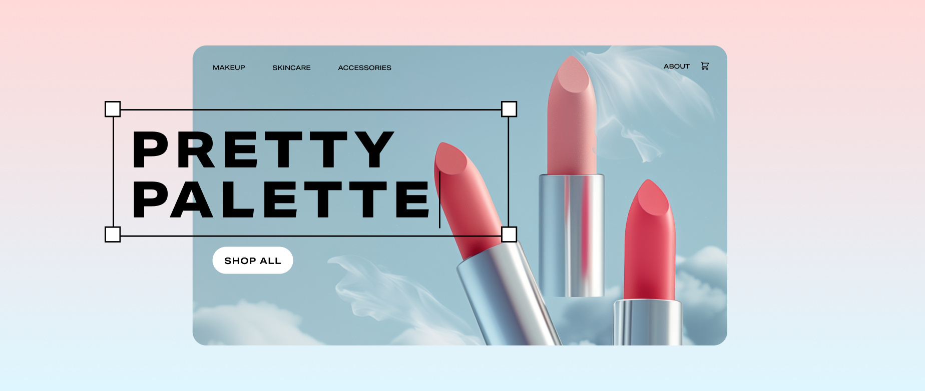
Kjell says he loves Newsreader, which is used in a couple of Shopify’s Horizon themes, including Atelier and Dwell, because it’s modern and broad. “I’m particularly drawn to its elegant lighter weights,” he says, which he uses to evoke a sophisticated, high-fashion feel. Consider Newsreader if you work in fashion, beauty, or home goods.

Free sans-serif professional fonts
While many sans serif fonts have become ubiquitous, Kjell says they’re popular because they’re practical: “These are all really nice typefaces that can be used effectively,” he says. “They’re built to work in a wide range of contexts.”
Here are some of the most popular free sans-serif fonts for professional work:
Inter
Inter is basically “Helvetica with a twist,” says Kjell. It’s an industrial-feeling, geometric sans serif that recalls midcentury modern design. But unlike decades-old Helvetica, Inter was designed for the screen, making it more versatile than its predecessors. Think of it like a handshake: Kjell says he uses it for designs he wants to feel both formal and warm.

Roboto
Like Helvetica, Roboto is a widely used sans serif with enough personality to make you look, but common enough to be practical. With slightly narrower letters and rounder details than Helvetica, it feels like its younger cousin.

Montserrat
Wide and round, Montserrat is less neutral than other sans serifs. Named and designed to honor the history of the eponymous neighborhood in Buenos Aires, Montserrat feels utilitarian with a touch of whimsy. In a professional context, it’s a good fit for industries like marketing, retail, or consumer packaged goods.

Work Sans
Work Sans is a popular and approachable option that Kjell describes as opinionated but not overbearing. Optimized for both screens and print, Work, well, works hard. “I’ve been staring at that font for years now, and I still don’t hate it,” Kjell says.

How to choose a professional font
- Define how you want to be perceived
- Research the industry standard
- Prioritize legibility and range
- Create a sample project
With so many free, professional fonts available, it can be overwhelming to choose between them. While your font choice may be guided by brand identity, there are also practical concerns to consider. Here’s how to get started:
Define how you want to be perceived
Before you develop a product presentation, business card, or other professional project, think about the qualities you’d like others to associate with you in a professional context. Then, try to select a font that reflects those qualities. For example, if you want to appear serious and intellectual, a font used for print publications, like Times New Roman or Garamond, could be a good choice. “It’s important to remember,” says Kjell, “that the font feels right to you.”
Research the industry standard
Research can help you get a sense of the aesthetic expectations in your specific line of work. For example, if you’re a lawyer working on your résumé, search for other lawyers’ résumés to see what employers might expect to see. That doesn’t mean yours needs to look like everyone else’s—but you should know what the rules are before you decide to break them.
“There’s a lawyer who is going to need Baskerville or something really official and serious, and then there’s also a lawyer who’s gonna want something weirder and sillier, or modern and quirky,” says Kjell.
Prioritize legibility and range
Legibility is a crucial factor in choosing a typeface. If your font is hard to read, it doesn’t matter how great your content is; you’ll lose your audience quickly.
Another important aesthetic factor to consider: range. Does the font have enough weights (thickness or boldness of the font) and special characters? Fonts that display only in all caps or don’t have a variety of punctuation marks can be limiting, so make sure your favorite meets all the needs of your project before you fall in love with the way it looks.
Not sure whether a font is objectively legible or not? Tools like Tipotype can evaluate fonts based on criteria like clarity, simplicity, and elegance.
Create a sample project
The best way to test out if a font is a good fit for your professional project is to see it in action. Before you start developing your entire project in one font, type some example sentences first. Fonts will look different once they’re part of a document, whether you’re using them for titles, short product descriptions, or long-form content.
How to pair professional fonts
Pairing fonts means using two different fonts together to create an aesthetic that a single font can’t achieve on its own. For example, you might use a more elegant display font that’s easy to read at large sizes for your name and the section headers on your résumé, then use a simpler font for the body text.
Since pairing fonts can be difficult and time-consuming to get right, Kjell says he likes to use a three-part decision tree:
1. Decide if it’s necessary
First, consider whether you really should use more than one font. You might want to play around with pairing if:
- You want to evoke a feeling that doesn’t come through with one font alone
- You’re creating a wide range of assets across multiple sizes, mediums, and use cases
- You’re in love with a display font that you’d like to use for headings, but that doesn’t work well for smaller type
If none of these situations apply, consider skipping font pairing. “It’s difficult to do correctly,” Kjell says. “There’s a whole bunch of different ways to establish hierarchy without involving font pairing, and if you found a typeface that is totally speaking to you, you may not need another one.”
2. Look for built-in pairs
If you know you do want to pair fonts, the next step is to see if you can use two that were designed to go together. Merriweather, Noto, Barlow, and Instrument are all examples of fonts that come in both sans and sans serif styles.
3. Find common traits
If you really want to pair two different fonts, “choose fonts that are clearly different but do share subtle similarities,” says Kjell. If one font feels geometric, look for another that’s angular in a slightly different way. If the font is tall, choose another that echoes its height. “You don’t want to get too close, but you always want to have something thematically that ties the two together,” Kjell says.
Free professional font pairs
Here are a few examples of paired fonts you can try. “These are designed to work together—they’re ready-made font pairs,” says Kjell.
Noto Sans and Noto Serif
Noto is another neutral font that Google Fonts calls “the typeface of the world,” since it comes in a huge variety of languages. The sans and serif versions offer typographical contrast, and they were designed to complement one another.

Merriweather Sans and Merriweather Serif
Merriweather is a pair of sans-serif and serif fonts designed to be adapted for different screen resolutions and devices. With boxy serifs and terminals (the ends of the letters), Merriweather feels academic or collegiate. That makes it a great fit for industries in which you need to convey friendly expertise. This pairing would work well for a résumé—using the serif at larger sizes for headlines and the sans for the details could make it feel like a print product while still optimizing for online readability.

Professional fonts FAQ
What font looks most professional?
There is no one font that tops the list, as the best choice will depend on context. But fonts that are easy to read, come in a variety of weights (thickness or boldness of the font), and include a large library of glyphs and special characters can improve the look of your professional projects.
What font should I use for a professional document?
Standard fonts like Times New Roman, Garamond, and Roboto are good choices for most professional documents. More adventurous fonts like Work Sans, Merriweather, or Newsreader can also work, depending on your industry and the purpose of the project.
What is the most attractive font?
Beauty is in the eye of the beholder, but Garamond is a type-design masterpiece dating back hundreds of years. Helvetica has been called the perfect font, even inspiring a documentary about its ubiquity.
