
A landing page is the first page of your website a visitor arrives on, including when they click on an ad that redirects them to your site.
Great landing pages can deliver results for store owners: They have an average conversion rate of 6.6%, more than twice as high as the average ecommerce conversion rate of 2.31%. With this conversion potential in mind, you’ll want to make them count.
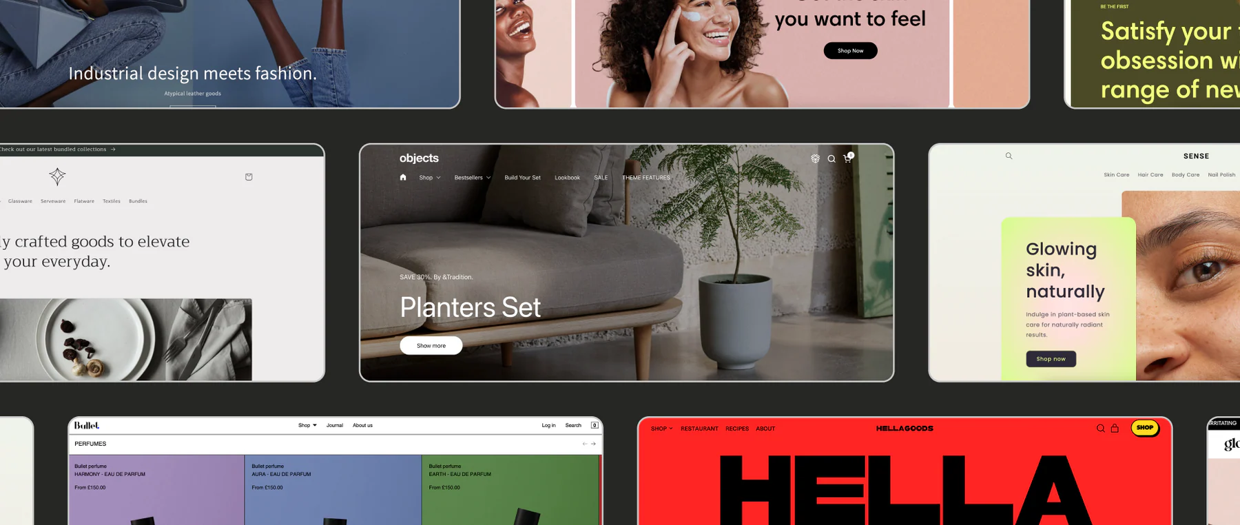
Ahead, learn from experts about what makes an effective ecommerce landing page and how to improve your own landing page design, with 10 inspiring ecommerce landing page examples from brands doing it right.
What makes an ecommerce landing page effective?
The 10 landing page examples on this list all share a handful of core elements:
Above the fold content
Above the fold content is what visitors first see when they arrive on your page, before scrolling or swiping down.
The examples on this list all follow a similar format, with a large hero image and call to action (CTA) that’s visible above the fold, followed by more granular details below.

Landing page copy
Write in your brand voice and answer questions visitors might have based on how they reached your landing page, such as through an ad.
In an episode of Shopify Masters, Nik Sharma, marketer and CEO of Sharma Brands, says ecommerce landing pages should answer these four questions for customers:
- Why are you selling this product?
- How does it make my life better?
- How does it compare to the competitive set of products that exist?
- How soon will I get it if I order now?
Imagery and color scheme
Great ecommerce landing pages convey the company’s visual brand identity. This includes elements like brand colors, typography, and logos.
Following brand guidelines ensures consistency across customer touchpoints.
“There’s something to say for sticking to consistent visuals,” says Margaret Pilarski, strategy director at branding firm Outline. “You’re creating a recognizable environment so that your shopper is confident and they feel like they’re in a community.”
Social proof

Landing pages present an opportunity to share social proof like customer testimonials and five-star ratings. Social proof might include a roundup of ratings (as seen in this ecommerce landing page from the water bottle brand Owala), individual reviews, or press mentions.
Call to action
Every landing page on this list includes a CTA somewhere on the page. CTAs like “Learn more,” “Shop all,” “Buy now,” or “Subscribe” guide users toward a specific goal. Many of these examples include one CTA above the fold and additional CTAs as you scroll down.

Refillable deodorant company Wild has two CTAs above the fold on their homepage.
Both of these CTAs lead shoppers to product pages. “The shorter that journey can be to checkout, the better,” Wild cofounder and CMO Charlie Bowes-Lyon says on Shopify Masters.
Charlie uses A/B testing to find the perfect CTAs.
“It could be as simple as changing your CTA button on the homepage … from ‘Buy now’ to ‘Learn more.’ Test those two against each other, split the traffic, and see which converts better,” says Charlie. He says that these small changes can translate to millions in extra revenue.
Social proof ecommerce landing page examples
Social proof shows potential customers that people already love your products, whether those people are writers for news outlets or everyday consumers. Here are two ecommerce landing pages that include social proof:
Brightland

Brightland, a California-based olive oil brand, showcases praise from publications like Wirecutter and Goop on their ecommerce landing page. Nik of Sharma Brands calls this showcase of media mentions a “brag bar.”
Rare Beauty

Rather than showing its products on edited photographs of models, makeup brand Rare Beauty shares user-generated content (UCG) of real customers on their landing page with the tagline “This is Your Community.” The text below encourages shoppers to use the branded hashtag #RareRoutine on their own photos for a chance to be featured on the landing page.
Another option for displaying social proof is to use a product review app that can display an auto-generated summary. Rare Beauty uses Yotpo to organize the reviews on their product pages.
Product-focused landing page examples
Nik encourages store owners to emphasize product benefits over features on product-focused landing pages.
“Customers don’t care that your water bottle purifies water when they first hear about your brand. It won’t hook them,” Nik says. “However, they will be attentive as soon as they hear that the tap water they drink is what leads to serious medical issues. Or, on a lighter note, instead of ‘Long-lasting scents,’ you should say, ‘Smell fresh for eight-plus hours’ for your deodorant.”
Tower 28

People shopping for makeup in-store sample different shades. To achieve something similar when selling cosmetics online, some beauty brands offer virtual shade matching.
Tower 28, for example, offers customers three ways to find the right match on the product landing page for their Swipe Serum Concealer: taking an Octane AI quiz, uploading a selfie, or DMing Tower 28 on Instagram. CTAs direct viewers toward the next step for the option they choose.
Below the fold, site visitors learn more about the Swipe Serum Concealer and have the option to choose their shade and add the product to their cart.

Olipop

Olipop sells sodas packed with plant-based ingredients and prebiotics to support a healthy microbiome. The brand differentiates itself from competitors with the simple headline: “A New Kind of Soda.”
Concise copy tells readers why their product is worth buying: “High Fiber. Less Sugar. Delicious Flavors.” A video shows those different flavors.
Maev

Maev sells raw dog food made with minimally processed ingredients. The landing page for their compare feature, which lets users check Maev’s ingredients against those of other brands, presents the company’s value proposition in an easy-to-digest visual format.
Below the header and search bar, high-resolution images of Maev’s ingredients (like USDA beef and peanut butter) quickly communicate what’s inside the dog food.
Ecommerce landing page examples with strong brand messaging
A strong brand identity helps you stand out from your competitors. Communicating your identity above the fold on landing pages helps you communicate who you are, fast. Here are a few examples of landing pages with strong brand messaging:
Liquid Death

The canned water company Liquid Death sells a familiar product, but they set themselves apart with unique branding. The company communicates in an edgy brand voice that’s unusual among water companies. Visually, Liquid Death leans into their brand identity by using a gothic font and death-related imagery like skulls.
Liquid Death communicates this brand identity on their ecommerce landing page. An image of a dark mountain stream and the headline “Deadly mountains. Delicious water” convey the company’s dark humor.
Thousand

Gloria Hwang founded the bike helmet brand Thousand with the mission of saving 1,000 lives. This brand mission is so central to the company’s brand identity that it became the brand name.
Thousand shares this brand mission in a timeline landing page that shows the history of the company. A subheader reads “A decade of safety. A decade of style. And we’re just getting started.” The landing page offers an interactive element, since visitors can scroll down to see company milestones for each year between 2015 and 2025.
When visitors get to 2024, they see that Thousand has fulfilled their mission to save 1,000 lives. The company tracks this number through their accident replacement policy.
“We offer the only lifetime guarantee that if you’re ever in a crash, we will replace your helmet for free for life,” founder Gloria Hwang says on Shopify Masters. In their first 10 years, the company replaced more than 1,300 helmets.
Examples of ecommerce landing pages with strong CTAs
The CTAs in these ecommerce landing page examples are clear and actionable: They quickly explain what will happen when customers click. These landing pages exemplify CTAs above the fold, which allow customers to take action right away.
Jolie

Not all CTAs direct customers toward product or collection pages. Take Jolie, which sells a filtered showerhead designed to improve hair and skin health. Jolie built a landing page for their water report. The report shows people which chemicals may be in their water, based on their ZIP code.
Here, the headline “Stop showering in chlorine” points out a problem that Jolie can solve. A clear CTA (“Get my free water report”) encourages site visitors to learn more about the issue.
This report also serves as a lead capture form for Jolie, since users must enter their emails and phone numbers and consent to marketing messages in order to receive the report.
Bearaby

The blanket and bedding company Bearaby uses this promotional landing page to push customers toward a sale. The simple headline “Mother’s Day Sale” immediately alerts site visitors to the event, and the CTA “Shop the Sale” lets them access it. A graphic reading “Save up to 30%” helps convince shoppers to click the CTA.
ButcherBox

Subscription meat delivery service ButcherBox has multiple CTAs on one page. Two above-the-fold CTA buttons (“Choose your plan” and “Get started today”) push site visitors toward signing up. Sticky banners at the top, bottom, and right of the screen serve as additional CTAs: “Claim your free protein now!” “Get started,” and “Get free protein.”
“We’re always looking to help the customer to finally make the decision with some sort of free product,” ButcherBox founder and CEO Mike Salguero says on an episode of Shopify Masters. ButcherBox experimented with different CTA offers like free bacon for life or a free turkey around the holidays.
“All of it was really trying to dial in on: How do we acquire customers and how do we do it cheaply and efficiently, but also acquire the right customers?” says Mike. “Because you want customers who are going to stay. You don’t want customers who get one box and then leave.”
Find the perfect fit
Transform your store’s appearance with fast, flexible themes designed for your business. Add checkout options, branding, navigation menus, product recommendations, reviews, and more with hundreds of themes to choose from.
6 ecommerce landing page best practices
- Consider information flow
- Focus on visual elements
- Use responsive design
- Match your content to the traffic source
- Test your landing page designs
- Prioritize UX research
Great landing page design directs site visitors’ attention to what matters most—the one thing you’d like them to remember. Here are six best practices to make the most of your ecommerce landing pages:
1. Consider information flow
Conversion rate optimization (CRO) consultant Michael Aagaard recommends an intentional approach to deciding which content appears at the top of any landing page by first considering the entire page as a whole.
“Marketers should think less about ‘over the fold’ and much more about the overall information hierarchy and flow of the content on the landing page,” Michael says. Trying to fit in too much above the fold can look cluttered and overwhelm your site visitors.
Many of the landing page examples above include only a strong headline, supporting lines of text, and a CTA button above the fold. The headline captures attention, the text supports it, and the CTA lets site visitors take action.
2. Focus on visual elements
Images help shoppers understand your product, especially when they can’t touch or try it in person.
In addition to high quality product photography, the examples above include graphic design elements that make it easy for customers to skim the page and quickly glean information. Those include:
- Bullet points or numbered lists
- Logos or illustrations
- Star ratings
- Videos
3. Use responsive design
Responsive web design ensures your landing page adapts to any screen size. As of mid-2025, more than half of all internet traffic comes from a mobile device, according to Statista. Depending on your audience, this number may be even higher.
“For some of our clients, we’re even looking at 80% [traffic from mobile devices],” says Rembrant Van der Mijnsbrugge, cofounder and software engineer of Shopify Partner agency Mote. “It often depends on where the traffic is coming from. We have some clients that are very popular on Instagram. If a lot of your traffic is coming from Instagram, that Instagram in-browser experience is actually something that a lot of people end up using.”
Even if most of your website traffic currently comes from desktop, that might change down the line.
“Depending on which marketing channels you end up using for your business in the future, suddenly your audience can shift quite drastically from one device to another,” Rembrant says. “You don’t want to have to catch up when that happens.”
4. Match your content to the traffic source
Tailor your landing page content to the platform your traffic comes from to help ensure you meet site visitors’ expectations.
For example, if most of your website traffic comes from TikTok users looking up a viral product, optimize your landing page to match what shoppers saw in the video and answer any questions they might have after watching that video.
“Not making your pages contextual to the platform they came from will cause your bounce rate to skyrocket and your overall platform ROAS [return on ad spend] to stay low,” says Nik of Sharma Brands.
5. Test your landing page designs
Once your landing page is live, you can run A/B tests to look at the effectiveness of different versions. You might test various CTAs, product images, or headlines to see which versions lead to more purchases or sign-ups. Shopify businesses can use A/B testing tools in the Shopify App Store to streamline this process.
Ben Labay, managing director at customer experience optimization platform Speero, says to align your tests with your business goals. “If you test, you don’t want to test to prove opinions, but rather to challenge strategy or test hypotheses directly linked to customer problems or business opportunities,” Ben says.
6. Prioritize UX research
“Don’t get blinded by the latest design trends,” says CRO consultant Michael. “Instead, make sure you get all the basics in place and do in-depth user research so you’re making informed decisions that impact behavior, rather than simply tweaking page layouts.”
You can see exactly how users are interacting with your site by looking at heat maps, visual representations of how users navigate your online store. Get started by installing a heat map app like MIDA or Lucky Orange to your online store.
Ecommerce landing page examples FAQ
What should a landing page consist of?
In ecommerce, a landing page typically consists of a headline, a call to action, informative text (such as product descriptions), and product images. It may also include videos, star ratings, and customer testimonials.
How does landing page design impact conversion rates?
Landing page design can impact conversion rates because it can influence customers’ first impression of your brand. Later on in the customer journey, landing pages can direct shoppers toward CTAs for product or collection pages, where they’ll then add items to their cart.
Should you A/B test your landing page designs?
Yes. A/B testing means creating two versions when you build landing pages (while making one small change at a time) and monitoring which one has the highest conversion rate. This helps you make data-backed decisions on how to design your landing pages.

