
Few of the ecommerce stores that are killing it right now are doing anything you can’t.
They haven’t reinvented the wheel. They don’t necessarily have better products or services than you. Most are not pioneering a trail into unchartered ecommerce territory.
They are simply following best practices: proven ways to optimize their stores by making the tweaks that improve their customers’ user experience and boost sales.
I’m going to share 12 tips that reveal how ecommerce behemoths are designing their stores, so that you can test them on your own store and get more conversions.
Nobody buys from people they don’t trust.
An Econsultancy/Toluna study found that trust seals like those shown above were the single most important factor in determining whether a user trusts a website.
Another study by ConversionIQ found that applying McAfee Secure trustmark to ecommerce websites resulted in a 12 percent lift in conversion rate for new visitors.
Add seals like the ones below to increase the credibility of your store – and test the results:

Don’t have your phone number or address displayed clearly in your header and footer?
That’s a simple change that should produce positive results if you’re not already an established name:
An A/B test from Databox showed that adding a phone number to the header increased conversions by over five percent.
Including details like your phone number and address increases the trust level in customers’ minds. This shows that you’re real and not just out there hanging in the ether.
One of the key questions in shoppers’ minds is, “what happens if the product’s not right for me?”
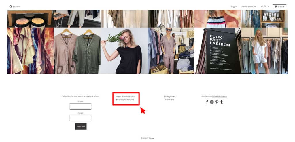
You need to answer this question to increase the likelihood of a sale. They probably expect to be able to return it for free.
If that’s your store policy, make sure that there’s a link to it included prominently in your header or footer so that shoppers are not left guessing.
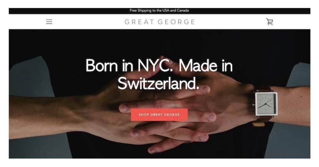
Nothing on your home page is more important than your value proposition. What’s the first message you want to hit shoppers with when they land on your page?
What’s going to keep them there?
Why should they care about you?
You need to answer these questions immediately by talking directly to your target audience in a clear, succinct, and benefit-driven way: think what’s in it for them rather than you ?:
You can carry these value proposition through to ad creatives and make sure you have what’s called ‘message match’ between ecommerce ads and landing pages.
When Amazon implemented a free shipping policy, sales went up in every country.
Customers don’t like surprises when they get to the checkout page. Shipping should be free – and you need to make it clear that this is the case:

E-tailing Group found that 70 percent of people considered free shipping as “critical” to their purchase.
After your value proposition, your call to action is next up. This needs to encourage users to take the one action you want them to take.
Don’t be tempted to provide a few options – be clear on one action that will bring shoppers closer to a sale.
And don’t over-think it. It does not need to be complicated or clever:
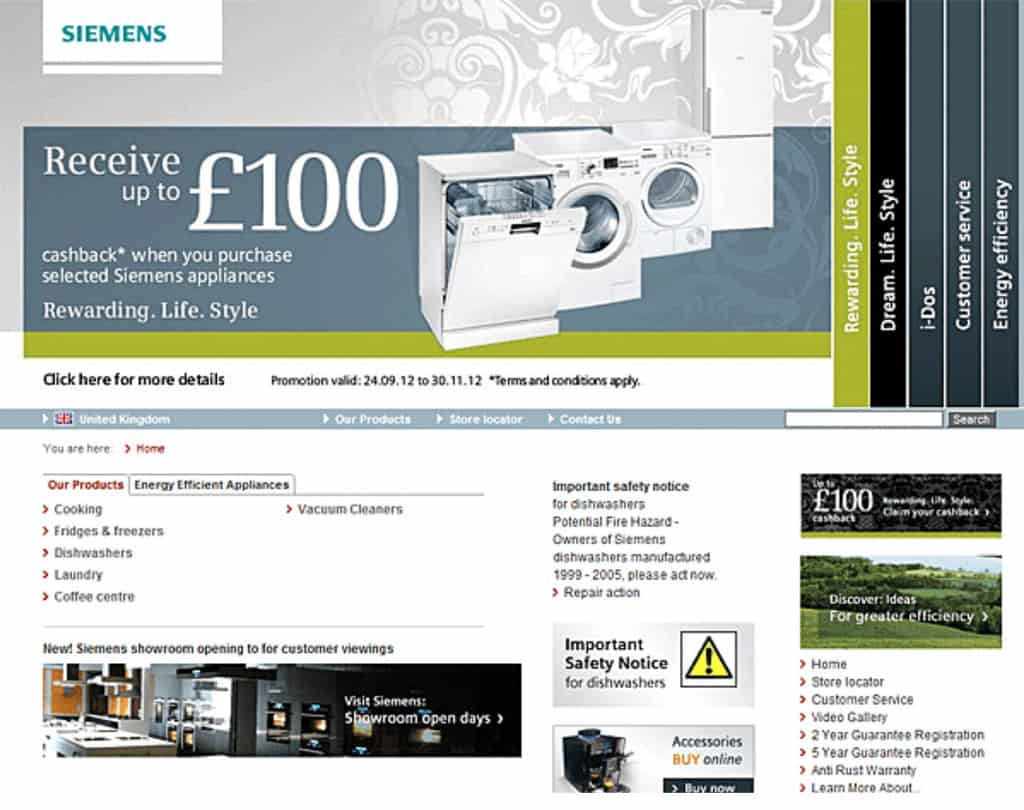
Sliders and rotating banners won’t improve your store sales, according to most conversion rate optimization specialists.
Peep Laja is one of the best in the business and he hates them.
They don’t look great and do nothing for the user experience – like this one from Siemens demonstrates:
 Keep it clean and uncluttered
Not only does the example above use a rotating banner, it looks cluttered and difficult to navigate.
Simplicity and convenience are the names of the game for ecommerce shoppers.
Keep your site visually appealing and “clean” and your visitors will be more inclined to buy (remember that the majority are probably shopping on mobile devices):

Did you know that 47% of shoppers expect a webpage to load in two seconds or less?
The quickest way to ruin sales is to have a slow-loading homepage.
We’re an impatient bunch these days, so make sure that you don’t give visitors a reason to bounce away to a competitor’s site.
Page speed is also an important ranking factor when considering ecommerce SEO.

Make it easy for shoppers to browse your collection by adding filters to your archive down the side of the page:
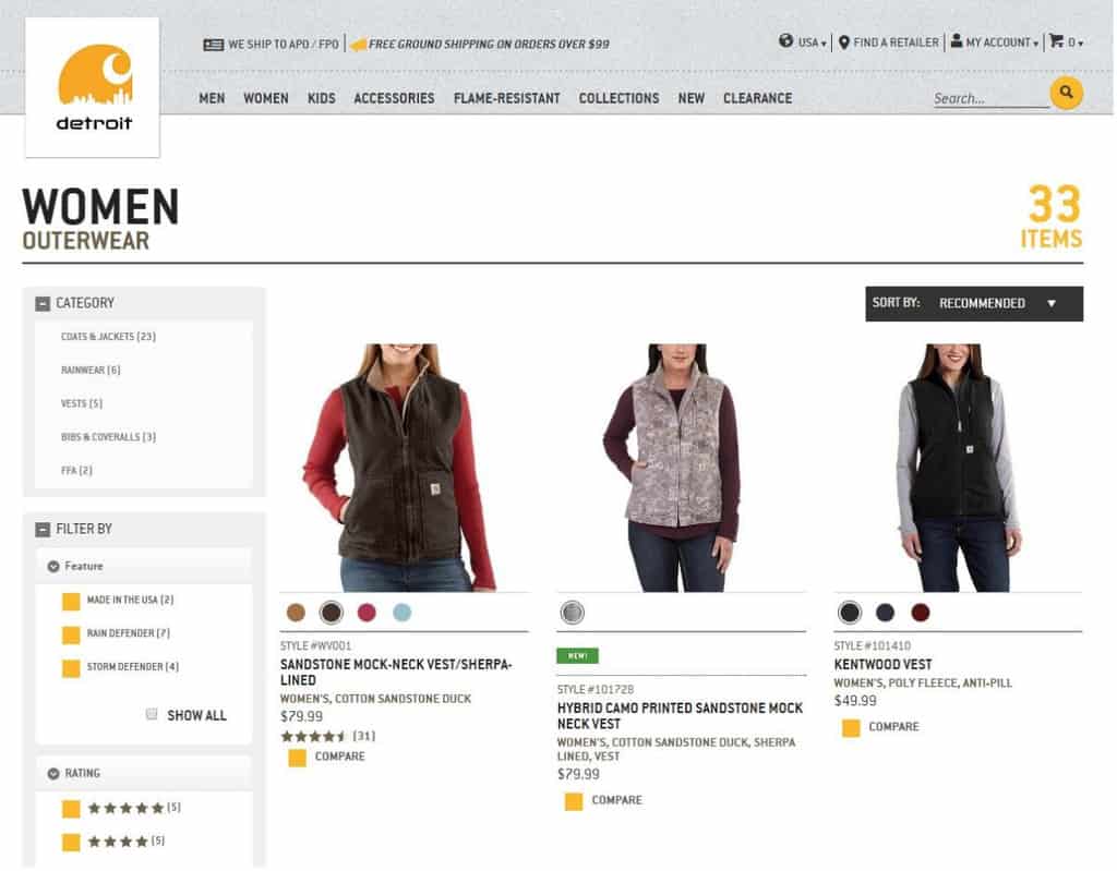
Make your products sortable by:
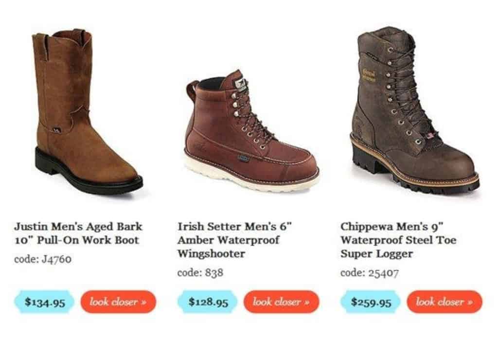
Shoppers want to see the products in detail so that there are no surprises.
While this is especially important for technical products or items like clothing and jewelry, practically any product can benefit from being able to see it close up.
ConversionXL reported a 25 percent increase in sales when one boot store went from a four-row grid to a three-row grid with larger product images like these:
Spot the difference between this:
And this:

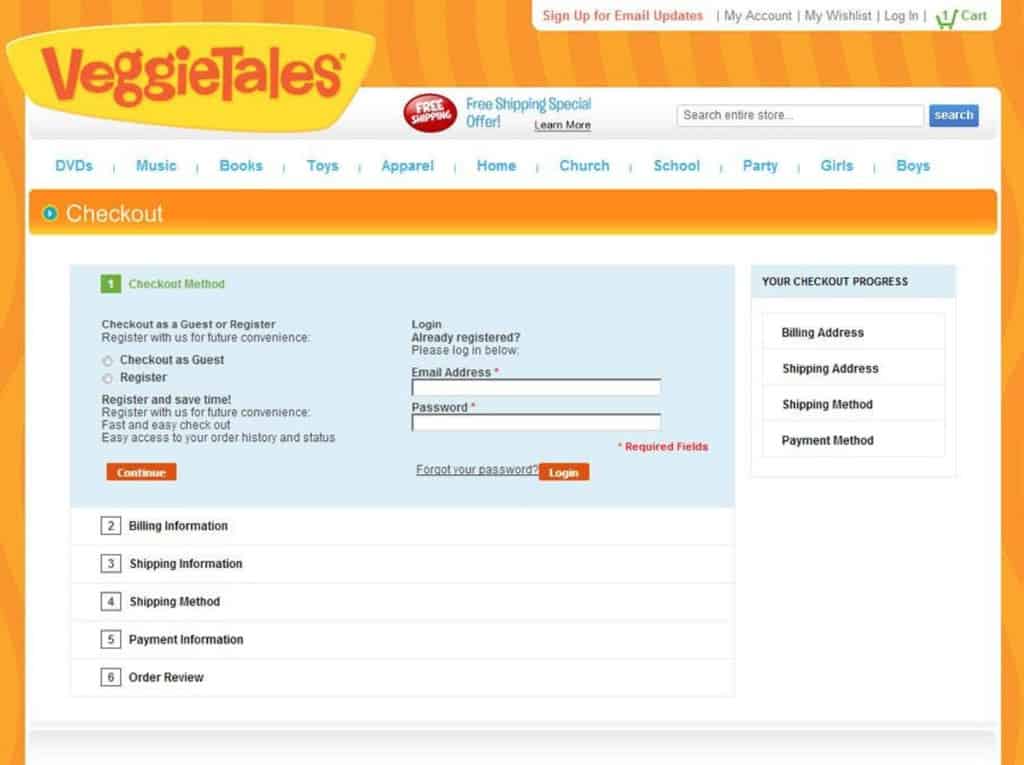
Look above where it says “Checkout” on the first page. There are plenty of options on it that have nothing to do with checking out.
This could lead to more abandoned shopping carts and therefore harm the conversion rate.
You don’t need a navigation menu or social share buttons that encourage a shopper to take actions that will distract them from finalizing their order and paying for it. Remove them!
Econsultancy found that the average revenue generated across 21 stores was highest from visitors who performed searches.
Search is a much-used feature that boosts the usability and convenience of your store.
Make it prominent and powerful (with autocomplete, autocorrect, and related search features) on every page from the homepage onwards:
We’ve just scratched the surface of ecommerce best practices but each of the strategies above has worked for successful entrepreneurs.
They can work for you but the secret is to test them all first.
A/B testing really is the key to boosting your ecommerce sales. No strategy is worth a cent if it doesn’t work on your store.
Adapt them to your target audience, test various approaches, and analyze the results.
Your store must become your lab.
It’s time to get the test tubes out.
This article originally appeared in the Bold Commerce blog and has been published here with permission.

