

Strong brands stick to consistency. The product packaging, promotions, social media – everything has to be in line with brand identity.
That’s exactly what makes a brand recognizable and strong.
Messages via email take a significant part in the brand’s overall communication. So retailers, as well as DTC brands’ marketers, should pay decent attention to how those messages look like and whether they do or don’t communicate properly between the lines.
It doesn’t matter whether you need clear, minimalistic email templates or bold eclectic designs. That’s a fact that today’s demanding audience won’t tolerate outdated email look. Unless, of course, old-school is your business identity.
However, it’s not all about the email trends. There are some technical peculiarities that you should know when looking for new templates. Whether all templates are equally good, should or shouldn’t you expect some tech-support, what to expect from different providers, etc. All of these things I’m going to discuss in the following chapters.
Also, you will learn about templates of Omnisend, best layout practices and some hints on how to boost your email engagement. But let’s start from the beginning.
You will find plenty of search results for HTML email templates on the internet. There are dozens of providers who offer huge collections of templates that could fit your business needs.
There are some things that you should know before diving into those template-rich collections.
Newsletter templates might be offered by providers that mainly belong to two different groups:
Both sources will provide you with a newsletter template. But there are some perks and limitations of each that you should take into consideration.
The perks of standalone templates:
The perks of using newsletter templates built with a native ESP email builder:

So all in all, standalone HTML templates have more flexibility and gives you independence from an email service provider. However, if you’re thinking about automated email workflows and more frequent email communication, you should consider using the in-house email builder of your email service provider and native templates.
By the way, if you have already built a investment newsletters template that you adore,
Omnisend offers pre-built newsletter templates that save you time and minimize the effort needed to create a professional-looking newsletter. You can customize these templates according to your needs – choose the colors matching your brand, add extra elements, fill it with content, etc.

Inside the templates, you may also customize the layout of the elements. Which mostly depends on the purpose of your email. For example, one layout is best for showcasing the new product, another one – for product listing, or flash sale, etc.
So using one template and different layouts you can get different looks of your newsletters without losing style integrity.
In case you want to save time and avoid looking for the best color palette, button size, and font to fit your brand, you can go for ready-made themed templates.
These templates are prepared by professional designers so it’s even easier to look good without investing any effort.

All you need to do is to add your logo, your contact details, and content.
By the way, as these templates are based on our standard templates, you can still edit the design any way you want.
See the example below how our clients adopt the themed templates to their needs.
One of the themed templates offered by Omnisend:

Actual email campaigns sent by our clients:
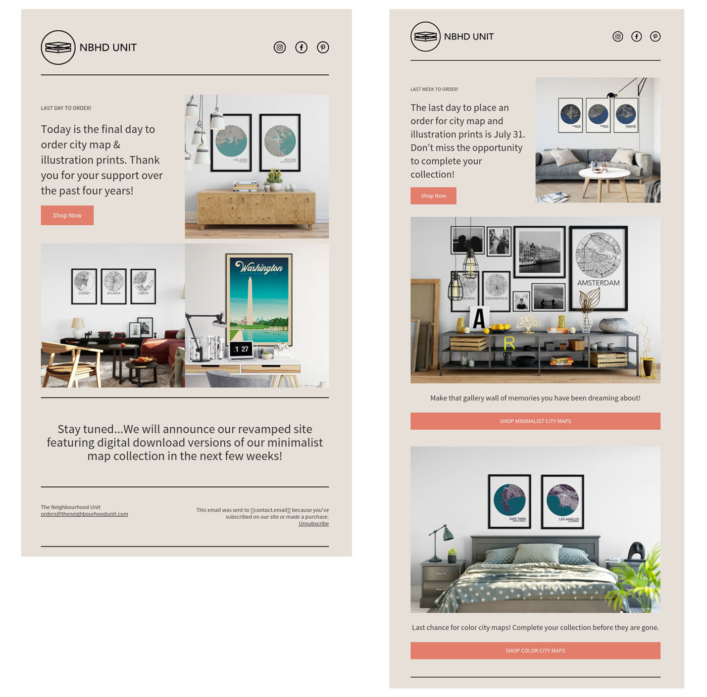
The same or similar designs can be adjusted to entire email communication flow: email campaigns and all automated workflows. So it’s easy to prepare and edit such emails as well as keep your brand identity within them.
Although the purpose of email communication might differ a lot, the design key elements stay the same. All ecommerce emails should have high-quality visuals, clear structure, bold call-to-action (CTA) button and appealing copywriting. Let’s take a closer look at what I mean by naming that.
The type of content you want to include in your email will lead to its layout.
A single-column layout with a hero image is best for more focused messages; for example, a final reminder for Summer sale, or Black Friday. Meanwhile, a multi-column layout is better for revealing a variety of content, like new arrivals. One way or another, your email layout must be responsive.
3 hints for choosing an email layout:
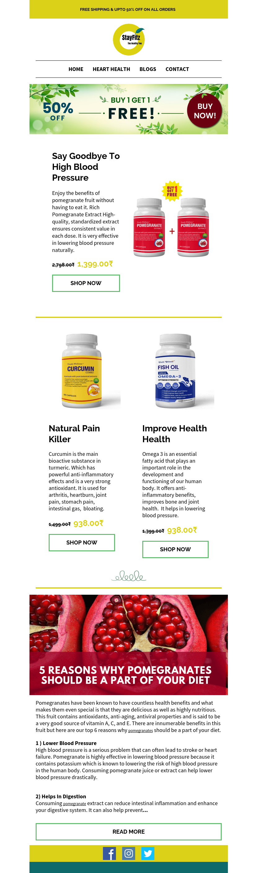
A good example is this Stay Fitz email campaign. Look at how well-resolved their email structure is:
The quality of visuals that you use in your communication is crucial. The high quality of images and logos contribute to your professional brand look and credibility.
Needless to say, that while shopping online, nice product images are the ones that convince a customer to purchase your products. So visuals have a direct impact on conversion rates as well.
Today’s DTC brands pay a lot of attention to revealing the texture, consistency of the product, unique, minimalistic but luxury packaging. It all matters. So make sure you pay decent attention to your visuals.
There are a few tips on how to make your images look good in your emails:
Your CTA buttons should be short and clear and placed strategically.
However, if you include too many buttons into your email, clicks will spread all over the content and end up with a humble conversion rate. So keep your CTA focused.
Also, avoid using images as buttons. Many retailers create ready-made images with copywriting and buttons and put them into their newsletters without adding any text or additional buttons. That’s a bad habit as some email clients block images, so subscribers won’t see the email content at all. Plus, it spoils text-to-image ratio which is important for email deliverability.
From a design perspective, the best way to make your CTA button stand out is to leave some empty space around it and use a color that fits with the overall color scheme but differs from the rest of the colors in your email.
See a few examples below:
1. Supply place

2. Shamrock Shirts

Although some marketers include long text into their newsletters, it’s more an exception than the rule. Usually, promotional ecommerce emails stick to short and appealing copywriting.
One of the most effective copywriting used in emails is customer reviews. Sale prepositions, brand stories, product descriptions – these texts also can be great for your newsletters.
Also, including some texts into your emails is a good practice because of the text-to-image ratio that I have mentioned before.
Our deliverability experts suggest sticking to 50% images / 50% text ratio when creating your emails. It’s because an image-heavy newsletter will increase the chances of your email client flagging it as spam, resulting in damage to your email deliverability.
In addition to that, email clients that block images are one more reason why retailers should repeat the key message and have the call to action in written text. The email idea should be clear when opening the email, even if the images are not visible.
When it comes to fonts, the optimal size for the email body is within 14–16px. The headings should be bigger – within 22–42px. And don’t forget about email-safe fonts.
When talking to our clients, it seems that the biggest challenges they meet in email design are the lack of good images as well as product listing that most often makes the email look messy or boring.
Do you have the same experience?
Let’s see what you can do to avoid this kind of situation.
Firstly, for product listing use only the same size and the same style of images. They cannot be blurred, or too dark. ( A portable mini studio comes in handy for taking great-looking photos with your phone.) The descriptions below should be of the same length and the buttons on the same level.
By using this rule, you will create a better-looking product listing. See the example below.

Also, there are some alternatives for how you can showcase more of your products without using standard product listing layouts. See examples below:
1. Make GIF images of different products

2. Make a stylish mosaic like the following from the Omnisend themed “Fresh Urban” template.

This is a common issue when rolling out your business. Especially when we talk about more general, brand photos that could be used as “hero” images in the newsletters.
Of course, the best what you can do is to arrange some photoshoots to produce photos. But if it’s still not a time for such kind of investment, use typography instead.
Typography is a great alternative for “hero” images. Imagery with typography looks awesome and conveys your message as good as any other image.
See some great examples below.
1. Tire Adventure has wonderful photos. However, for this sale they chose typography.This kind of image you can design straight in the email editor without using any of graphic design tools.

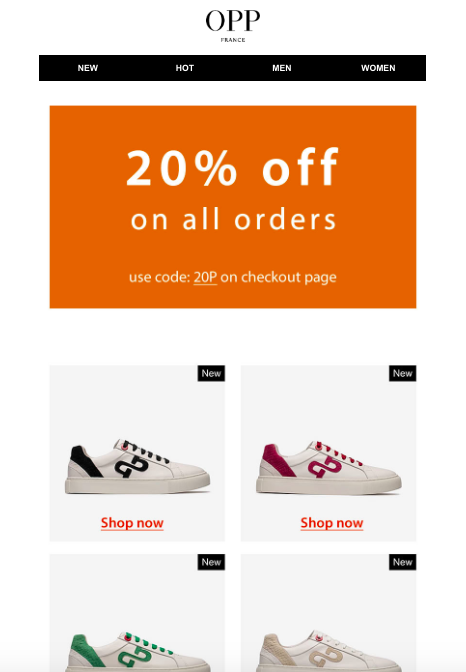
2. OOP France also chose a simple color block for emphasizing the deal.
3. Stitched Leather Loafer example

If you don’t have any help from graphic designers, tools like Canva can help you to create images like these.
The way how readers engage with your emails depends on many different factors starting from their mood, following with email design and ending with offering that you send them.
Revealing tweaks that resonate with your audience requires a lot of testing and improvements. Although it’s time-consuming and never brings unambiguous results, that’s what marketers do daily.
However, some help in improving email engagement can be found. Check out the following hints on how to improve your email campaign engagement.
Including a video element into your email campaign can double your campaign performance. It is one of the most effective elements that can boost your email engagement. Plus, you can get many benefits from the video. Like the following:
So it’s definitely worth including video into your next campaign. See examples below how other brands do that.
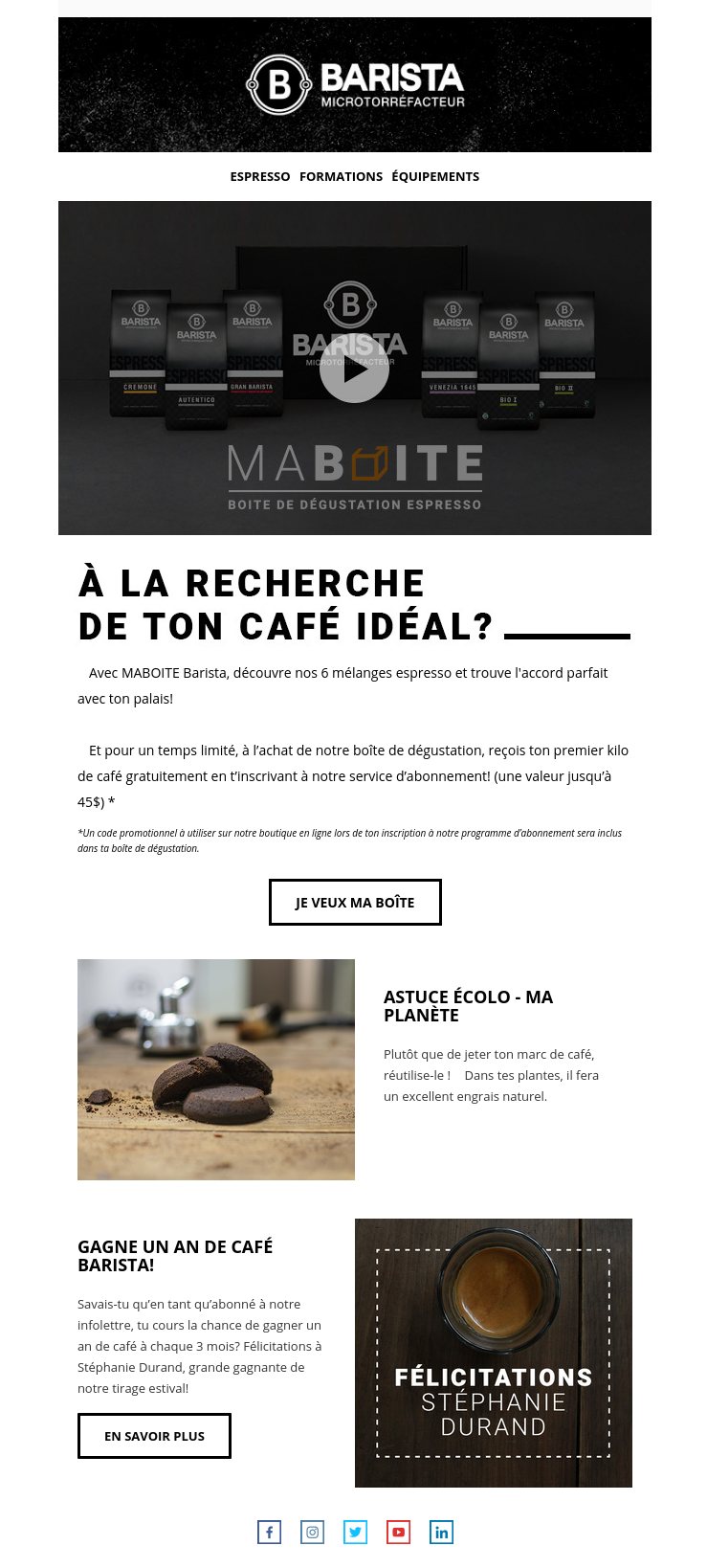
1. Barista puts the video at the beginning of the email, instead of the “hero” image.
2. Brooklyn Way did on the opposite. This brand featured the new sneakers first and then at the end they included the video review.

People love games and entertainment. With that in mind, Omnisend offers another email engagement booster – a Scratch Card. It looks and works like an instant lottery ticket. Subscribers click to scratch off the top layer as they would do with a paper lottery ticket. And this unveils a prize – a discount, free shipping, etc.
This small email gamification can help you improve click rates by 2-3 times. The bigger is the email engagement, the more potential sales you’ll get.

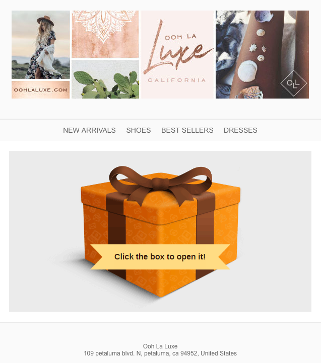
Another great way to increase email engagement is to use a Gift Box. It’s also for offering discounts and similar incentives, but this method is more entertaining than a simple discount code.
You have to click on and unbox your gift to see the offer. See the example of such email below.
If you don’t feel like using those interactive elements in your emails, consider including a simple discount coupon element. This feature is one of the most popular among ecommerce marketers. It looks simple but it works just great.
A discount coupon helps highlight the offer and create a unique discount code for every user. A CTA button always stands out and subscribers click on it the most often. See the example of a discount element below. Also, pay attention to the way other products are listed: instead of common product listing, the brand has chosen the “mosaic” view.

A sense of urgency often helps to sell more, especially if it’s a limited-time campaign, like Black Friday or the last summer sale call.
You can create this kind of timer with tools like Motionmailapp.com and insert it into your email.

If you use the timer in your email, think of using it on your website as well.
Interactive, unusual elements in emails can help you get more of the reader’s attention as well as achieve a higher email engagement rate and better traffic to your store.
The owners of That Ring Shop recently emailed their very first newsletter. The message is clear: Our online store is now open. Come visit us!
They introduce their primary categories—such as designs for women and men—and then introduce an offer exclusively for subscribers. This is a good practice: subscribers can see the benefits of belonging to That Ring Shop’s club.
A clean design, high-resolution photos, and plenty of white space make this newsletter look elegant and professional.

Highlight the must-have items of the season. You may send this type of message four to twelve times a year, depending on the nature of your items.
You could focus on individual products or categories or create sets and ensembles for each season.
The example below mixes the essentials. The focus is on J.W. Anderson’s Dusty Rose bag, but the newsletter also reveals some products from the new collection.

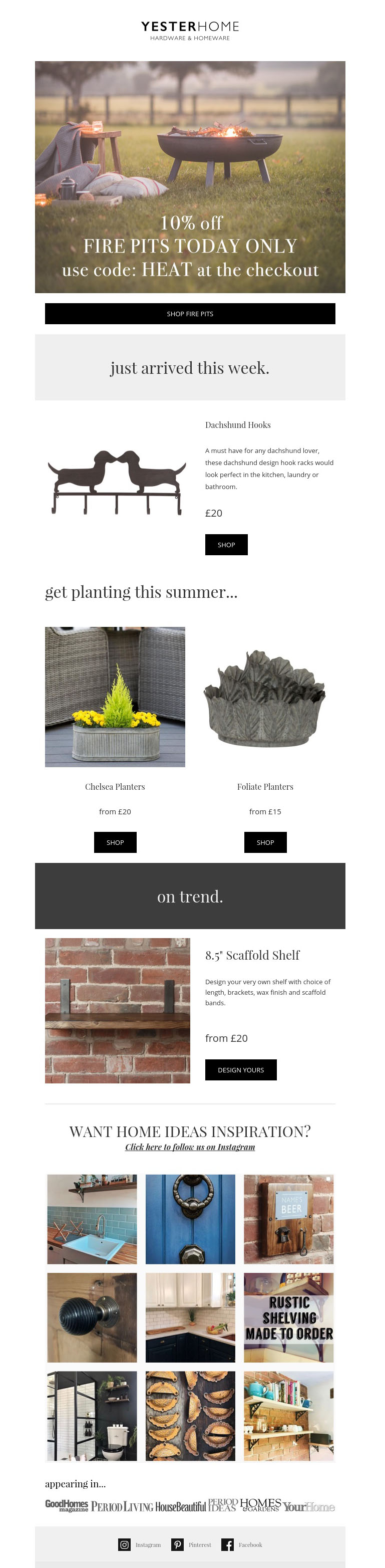
A long list of products does not make for the most enticing message. However, if you do it with taste and good design, like Yester Home, your email can look brilliant.
The most important thing in a product list is to put them into different sections, repeat your call-to-action button, and include the hero image/main message at the top of the email.
This is an example of flash, stock cleaning, and other kinds of sales.
Pick one nice photo, write an offer your subscriber will not be able to resist, and add a big button linking to your store. Simple as that!

Even if you are a text-heavy email fan, don’t forget to include good images – ecommerce emails need them.
Look at the Clove & Twine example. This brand combines great imagery with reasons why you should buy corporate gifts this season and how to pick ones. It seems like a perfect match with the products they sell!

__________________
That’s all for now. Hopefully, I will come back with even more great newsletters to add on this list.
How did you find these newsletter examples? Feel free to leave your feedback in the comments.
This article was originally published by our friends at Omnisend.

