

From responding to an email in the elevator to checking the “your order is on its way” email during a meeting that could have been an email, we all constantly use email on our mobile devices.
As a matter of fact, 42% of email is now opened on a mobile device; therefore, being able to execute marketing campaigns that operate effectively and are displayed properly on mobile devices is a must for e-commerce brands.
Here’s what our Essence of Email experts say will help optimize your emails to create the best mobile experience.
1. Know your audience. What devices and email clients are your subscribers using?
While in a perfect world, you’d optimize your emails to look flawless across all devices and email clients, in reality, this is quite difficult to achieve. A smart thing to do is to pinpoint which devices and clients the majority of your subscribers use, and provide the best possible experience for them first.
You can check this data within your email service provider (ESP) and various analytics software.
Here’s the overview for Klaviyo users:
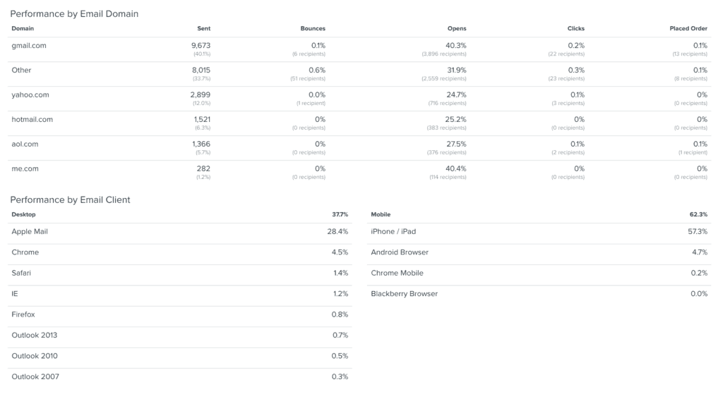
To utilize Google Analytics for monitoring which devices your customers use to read emails, and interact with your website, set up UTM tracking for all links in your emails. You can check the results in your Google Analytics account, in the Audience/Mobile/Devices report, by setting the Secondary dimension to Source/Medium.
2. Use short subject lines
Keep subject lines under 40 characters. The amount of space mobile devices provide for displaying subject lines is pretty limited, so keep them short or use the first 40 characters for mentioning the most important phrase of your subject line to maximize the chances of readers seeing it.
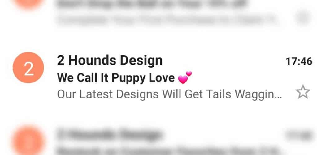
3. Add emojis to subject lines to increase engagement ?
While most of Essence of Email’s clients continually see higher performance for subject lines that contain an emoji, it’s also important to keep brand voice and style in mind. Recipients that are used to brands with serious, to-the-point copy may not show as much interest in subject lines featuring emojis. However, for brands with a more playful voice, emojis are a great way to pique recipient curiosity and inspire higher open rates.
Bear in mind that not all emojis render properly across all email clients and devices. Learn how to test if your emoji will be displayed properly.
4. Write meaningful preheaders to boost open rates
Including compelling preheaders is a great way to boost your email open rates. Also known as the “Johnson Box,” preheaders typically outline the subject of your email and entice recipients to read on. So, before your recipients have even opened your email, they’ll get the chance to preview its content.
Maximize the power of your preheaders by using strong verbs that help your readers imagine exactly what you are trying to describe – and don’t forget to include the main point of your email.
Here are a couple of examples of a good Subject Line + Preheader combinations:
Subject Line : Make Health Your No.1 Priority ?
Preheader: How to Keep You and Your Customers Safe
Subject Line: Enjoy This Dreamy Offer of 10% Off!
Preheader: Complete Your Purchase for Some Well-Deserved Sleep
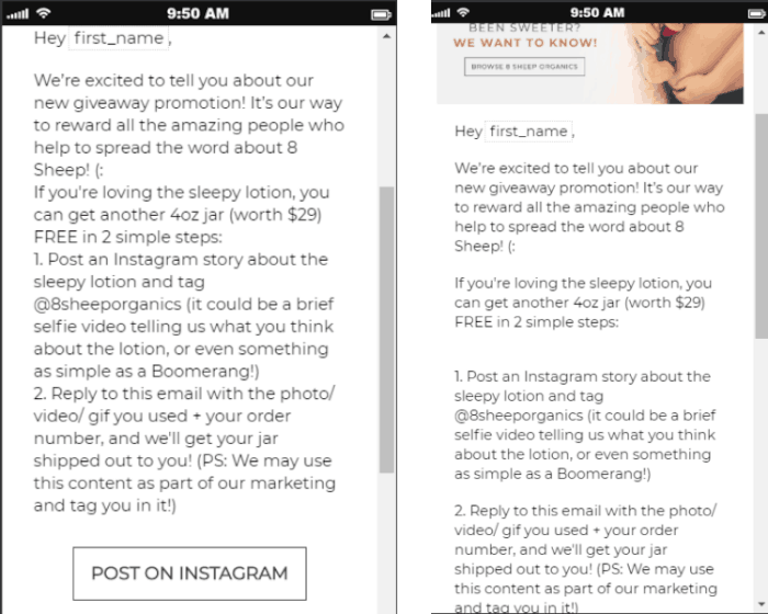
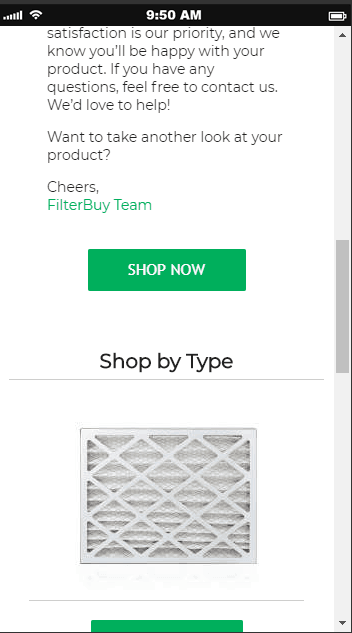
5. Focus your copy on the customer benefits
Let’s be honest – customers want to know what’s in it for them. So, instead of focusing on the features of a product or service, emphasize the benefits your readers will have by using them.
Think about the problem your potential customer is trying to solve, or what they’re trying to achieve. Then, offer them a valuable solution they can’t resist!
Here’s a an example of a browse abandonment email with customer-focused copy:

Reading aloud forces you to slow down and process what you’ve written.
Grammar mistakes and similar issues that can slip by when reading silently become much more obvious when spoken. It’s also a great way to check the flow of your copy – if it sounds weird when read out loud, it probably sounds weird when read silently.
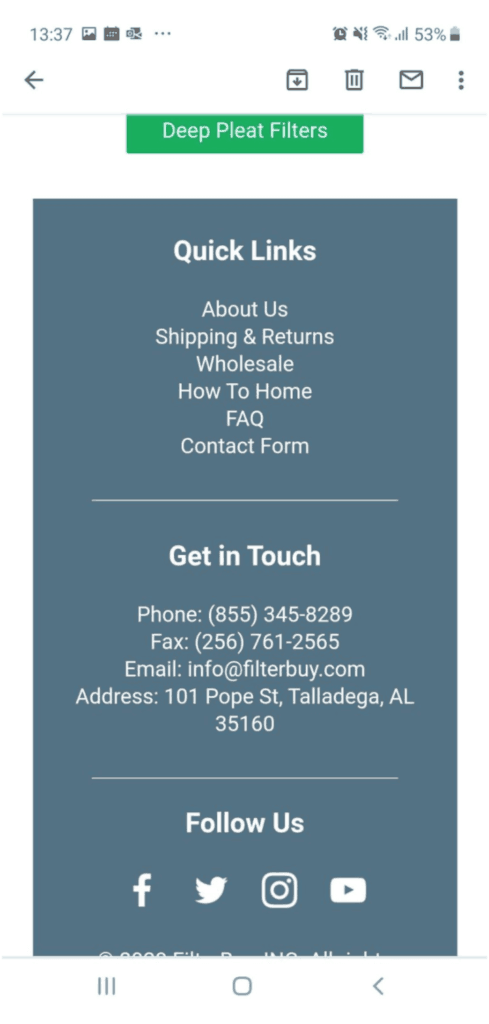
7. Consider the header and footer navigation
While it is a good practice for desktop-focused emails to contain header navigation that includes the logo and key website links, in mobile-focused emails we recommend removing this header navigation, to keep it from pushing important content down.
Instead, we recommend to put the header navigation links in the footer and stack them on top of the other.
8. Use line breaks to split big chunks of text
Breaking your text into a couple of smaller paragraphs is crucial.
Mobile users have a really short attention span; they are reading emails on the go, so it’s crucial to make it as easy as possible for them to follow and read your copy. No one is going to read a full page of text on their mobile device.
These breaks in the content create more white-space in the email and allow the reader’s eye to be drawn to each section, rather than seeing an imposing wall of text and becoming overwhelmed.
Here’s an example of the same email with the copy broken up in the example on the right:
Single or Multi-Column Emails
9. Use single-column email templates
On a mobile device screen, multiple content columns typically appear condensed, making them confusing to navigate. A single column makes your email cross-device compatible and straightforward, even when it’s viewed from different email clients. Single columns can also simplify your design and highlight important content.
Images/GIFs/VIdeo- For Emails
10. Make sure your images are fully optimized
Using images in emails is pretty common these days, but it is really important not to add any unnecessary weight to the email that will slow down its loading time.
Make sure your images are optimized to ensure quick loading time for subscribers when reading your emails on mobile while n the go. Many mobile users still use 3G or slower connections, so the speed at which images load is vital.
The general recommendation is to keep images at a maximum of 1MB; however, our experience shows that it is best to keep it around half of that with a maximum of 500KB. Running tests at WebPageTest shows that keeping the size under 500KB gets a score of 100/100 for image compression even on old phones and slow 3G connections.
11. Add movement to your emails with GIFs
Adding movement to your emails will grab the subscribers’ attention and help you stand out from the crowd. Since video is not supported by most mobile email clients, GIFs are the way to go.
GIF file sizes can get heavy, depending on the number of frames used. Here are a few tips to reduce a GIF’s file size:
- Use faster transitions (cuts) rather than using fade-in and fade-out effects, as they will require fewer frames to look smooth, and fewer frames mean a smaller file size.
- When saving a GIF for the web, use “adaptive” color reduction. This algorithm samples colors that appear the most in the image and provide a fair balance between file size and color fidelity.
- Keep transparency on, even if you don’t use it, as this setting allows pixels that didn’t change position or color to remain the same; as a result, it doesn’t create duplicate data.
You can improve the GIF quality by deleting duplicate frames, adding compression, and much more with tools like this.
12. Use thumbnails for video
Only 10% of email clients allow videos to play in an email. Therefore, best practices require that you add a link to your video by including a video thumbnail with a presentable play button.
13. Add relevant and descriptive alt text to images
The images in your email may not display for a variety of reasons. Each email client has their own settings for displaying or blocking images, and the easiest way to deal with image blocking is to add ‘alt text’ to your images.
Alt text is the text that is displayed when the user can’t see the image. The more relevant and descriptive the text is, the more compelled the user will be to display the images.
If you don’t add alt text to your images, the user will see a blank box. Here’s an example of what an email looks like with alt text (example on the left) and without alt text (example on the right).

14. Image proportion is important
While most images for desktop are landscape oriented, meaning they are wider and lower in height, it is a whole different story on mobile. Use square and portrait imagery to make the most out of the mobile screen size and grab the subscribers’ attention.
If your database is split equally between desktop and mobile users, we recommend using conditional blocks that will display a different image based on the user device, i.e., a landscape image for desktop users and a square image for mobile.
However, if most of your users use mobile, we recommend designing the emails focused on the mobile experience.
In our experience, the biggest issue in the way emails are displayed on different devices is with their fonts. Basically, not all devices will render the font in your email properly.
The best practice is to use web-safe fonts and fonts that render properly on the devices your subscribers use most commonly. When creating your email, set up a primary and a secondary font you’ll keep in reserve. This way, you’ll ensure that even if your priority font is not rendered, you can use the secondary font, which will still fit into the overall email design and your brand look.
16. Use bigger font sizes
Small screens make small fonts even smaller, and most people will delete your email instead of squinting and straining their eyes to read the tiny text.
A font size of 14 pixels makes your email substantially more readable on a small screen. But don’t be afraid to go even larger than that. Large fonts make your emails easier to read on both desktop and mobile devices. This applies to both emails and pop-ups.
17. Give your email room to breathe
You need your emails to be as easy to read and follow as possible. Ensure you have a great flow of content by separating sections with enough white space. This means increasing spacing to avoid cluttered emails by adding as much space as possible. Don’t worry if the email ends up being longer than usual; it is easier to scroll through than to struggle and navigate on smaller mobile devices.
18. CTAs including strong action verbs
As users often tend to skim through emails, optimizing calls-to-action (CTAs) is extremely important, as they need to grab the attention and entice the user to perform the desired action.
Focus on how the user will benefit from clicking on the CTA and avoid generic wording such as “Click here.” For example, “Get your eBook” would be a preferred CTA to only “Download.”
A welcome message offering a first-time customer discount could include:
19. Code your CTAs instead of using images
Some users have images blocked, and having your CTAs embedded as images may result in losing precious click-through rates.
The coded CTAs will be displayed even with images off and will instantly draw the attention of your subscribers.
20. Create fat-finger-friendly buttons
Make sure you take into account people with big thumbs. If your reader has to tap more than once to continue interacting with your content, then there’s a chance they won’t bother.
Fingers are not nearly as precise as mouse pointers, and while mobile manufacturers have created devices that accurately respond to your actions, they’re not perfect.
Your calls-to-action need to be large enough to be tapped on a mobile device screen. We recommend setting your CTA button height at 30 pixels minimum, with at least 8-pixel space between elements.
21. Avoid using hyperlinks in the text
How many times have you tried to click on a hyperlink on your mobile, and it seems like a mission impossible?
When a CTA is important, the preferred practice is to break the text and add a proper CTA button instead of hyperlinking it in the text.
22. Keep emails 600PX wide
If your email width is larger than 640px, the user may be required to scroll left and right to see the full email content. While most modern mobile devices can handle responsive designs, there are exceptions.
When your email width is 600 pixels or less, users won’t have problems viewing emails that were formatted for large computer screens. Set a width attribute in your email template’s table tag to 600 pixels or use the CSS width property to make this adjustment.
23. Test the email across devices
Now that you are done with creating your email, check how that email will be displayed across different devices and email clients.
Preview your email template on platforms like Email on Acid, Litmus, and Mailtrap, to name a few. These testing tools help you spot issues with your email by showing you screenshots from all devices and email apps they support.
Clearly creating mobile optimized emails isn’t easy. It’s a multi-step process to create an inbox experience for mobile users on the go that ensures your emails are read, and their interaction with your campaigns is productive rather than frustrating. If you need help with setting these up or if you want to revamp your current campaigns, check out Justuno agency partner Essence of Email.
Essence of Email grows e-commerce brands with email. Our clients earn an average of 38X monthly ROI from their email program. Let us show you what we can do for you. Get in touch now!

Dejan Georgiev
Dejan Georgiev is a Team Lead at Essence of Email, driving our technical strategy unit in resolving technical email problems. With 4 years of experience in email marketing and a background in computer system engineering, automation, and robotics, Dejan has helped over 200 e-commerce stores optimize their email channel performance and generate 7-figure annual revenue.
This free and instant analysis of your website performance will show you what Justuno can do for your business.
Please enter a valid URL
Please enter a valid email address

