


Did you know that ecommerce companies miss out on $18 billion in sales annually due to abandoned carts? The good news is, with intuitive design and innovative merchandising tools, you can create a frictionless checkout process for your shoppers. We’re sharing nine ecommerce checkout page design tips that will help you lower your cart abandonment rate and increase sales.
1. Upsell and cross-sell
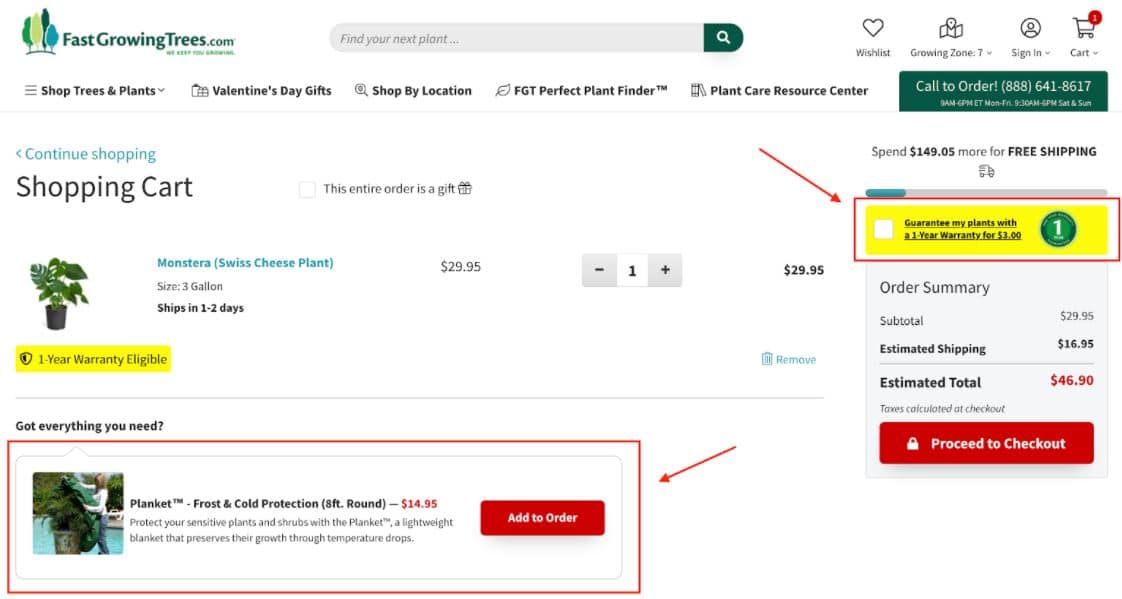
The shopping cart is your last opportunity to convince customers to spend more. Increase your average order value by upselling and cross-selling to shoppers before they finalize their carts.
We love how FastGrowingTrees.com cleverly maximizes revenue by cross-selling warranties and relevant accessories before customers check out.
2. Remove friction from your ecommerce checkout page design
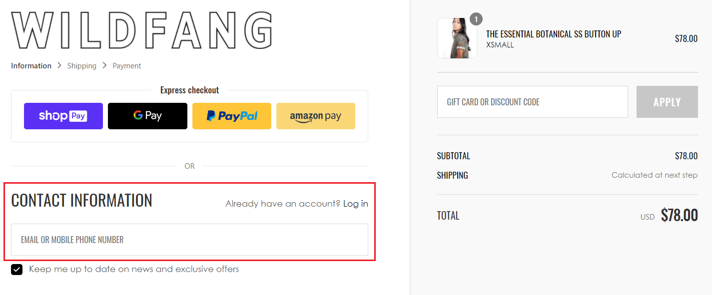
Many ecommerce retailers make the mistake of asking shoppers to create an account to check out. Placing this step up front creates unnecessary friction. The checkout process needs to be as easy as possible.
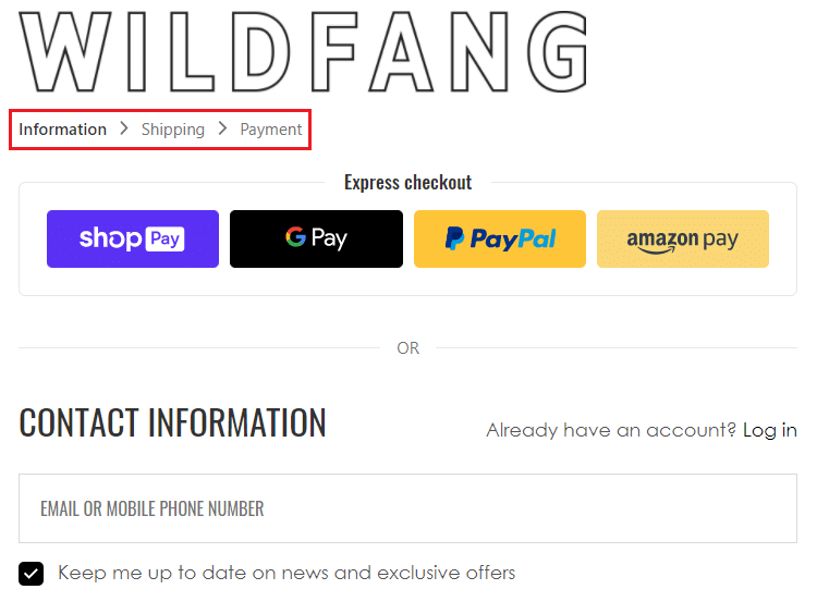
Wildfang reduces friction by only asking shoppers for their email address to check out, while discreetly giving existing customers the option to sign in.
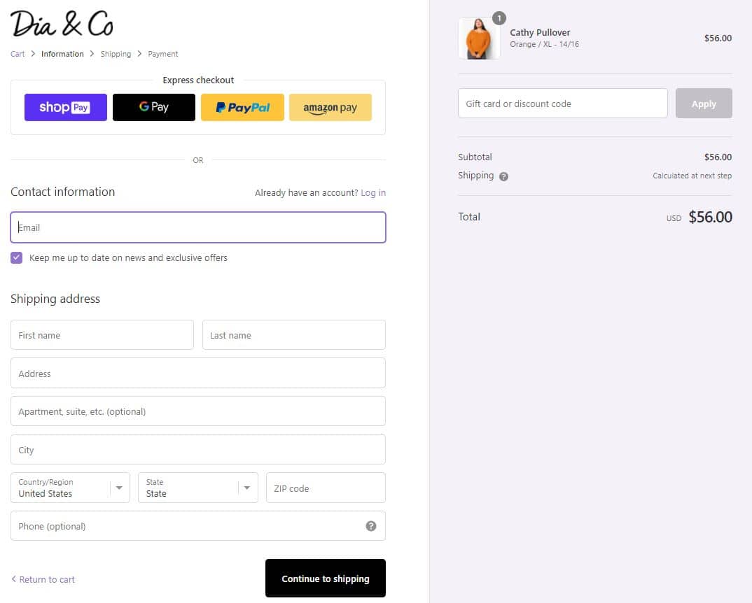
3. Reduce clutter
Your checkout page should minimize distractions so that shoppers don’t leave before they’ve made a purchase. Reduce clutter by:
- Hiding navigation and footers on your checkout pages.
- Removing unnecessary steps or boxes from forms. Simplicity is key!
- Being transparent about pricing. Show subtotal, shipping, tax, and total amounts in an easy-to-find spot that follows customers on every page of the checkout process.
Dia&Co’s checkout page is a textbook example of a streamlined experience. Shoppers only see information that guides them towards completing a purchase. And, cart items are displayed prominently on the sidebar, along with shipping prices.
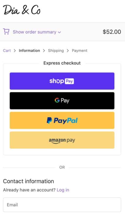
4. Keep mobile shoppers in mind in your ecommerce checkout page design
Mobile ecommerce is forecast to reach $845 billion in sales in the United States by 2022, marking an impressive 68% increase from 2020. If your ecommerce checkout page design isn’t optimized for mobile devices, you could be missing out on a piece of that lucrative pie.
Remember how sleek Dia&Co’s checkout page looked on a desktop (see tip #3)? The mobile version of that page is even more streamlined and highlights express checkout features that make mobile shopping even more convenient.
Insights to shape your ecommerce strategy in 2021
5. Simplify payments
If a shopper doesn’t have their credit or debit card handy, they may abandon their cart. Don’t let customers get away just because they don’t want to reach for their wallets. When shoppers can save payment information to their accounts on your website, or pay with a tool like PayPal, they can complete a purchase without typing in their card number.
DKOldies reduces friction during the payment process by giving customers express checkout options through PayPal, Amazon Pay, Chase Pay, and Google Pay, in addition to traditional payment options.

6. Indicate progress within your ecommerce checkout page design
Show customers how many steps they have left until their purchase is finalized to lower your cart abandonment rate. Use a progress bar to show the steps that shoppers have already taken and what they can expect next.
Wildfang’s checkout page displays a simple progress bar that follows the shopper through each step of the process. This simple addition can make the checkout experience feel faster.
7. Make customer support accessible
If your checkout process is confusing customers, and there’s no easy way for them to get help, they’ll likely abort their shopping mission. Place your customer service phone number on your checkout pages to make sure nothing gets in the way of a purchase.
Take inspiration from FastGrowingTrees.com, which includes a customer support phone number in a banner on their checkout page.

8. Entice shoppers with an exit intent pop up offer
An exit intent pop up is a Hail Mary strategy for keeping shoppers from leaving your ecommerce store without making a purchase. When you install an exit intent tool on your website, you can enable pop ups to appear when customers are about to leave the checkout page without completing a transaction.
You can customize the pop up with a gentle nudge to shoppers to continue the checkout process, or offer them an incentive, like a small discount, to complete the purchase.
9. Send abandoned cart reminder emails
Bonus tip: if you have a customer’s email address, either because they have an account with your ecommerce store or they gave you their email address at the start of the checkout process, send them automated reminder emails if they leave items in their cart without making a purchase.
Don’t stop at just one abandoned cart email. It’s best practice to create a series of them since it may take more than one reminder to persuade shoppers to complete the checkout process. Send one a few hours after a cart is abandoned, another the next day, and a third a few days later.
Strategic ecommerce checkout page design can help minimize cart abandonment and boost sales
While cart abandonment is a costly problem for online retailers, strategic ecommerce checkout page design can decrease the likelihood of it occurring. With simple adjustments like reducing on-page distractions and offering shoppers plenty of payment options, to cross-selling and using mobile-friendly design, your ecommerce store can keep shoppers on site until their purchase is complete.

