
Walk down any busy shopping street—or scroll through your favorite social media app—and you’ll notice the same thing: retail brands are designing storefronts (both physical and digital) that pull you in before you even step inside or click “shop.”
Consumers are drawn to experiences that feel tangible and human. Foot traffic to US stores climbed 0.4% year-over-year in 2024, but those visits are increasingly driven by online research.
That’s why storefront design in 2026 is about more than visual appeal—it’s the bridge between physical presence and digital discovery, engineered to convert attention into action. This guide will walk you through what “storefront” really means today and how it’s evolving to match shoppers’ behavior in the digital age.
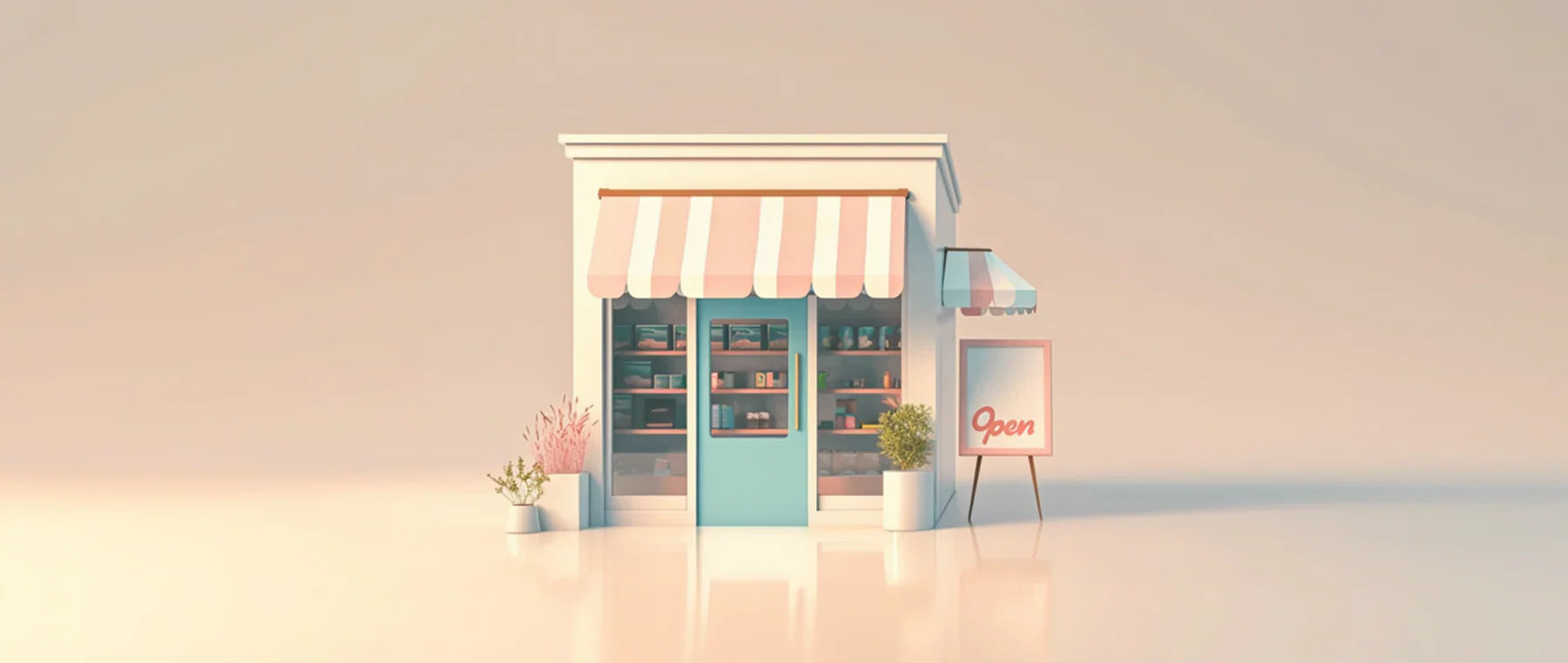
Storefront design in 2026 means designing every entry point to your brand (both physical and digital) to attract attention and convert it into action. It’s the visual and experiential layer that connects curb appeal with click appeal.
In physical spaces, that includes elements like window displays, signage, entryway design, lighting, and layout.
Online, it means your homepage hero section, Google Business Profile, and social storefronts on platforms like Instagram and TikTok Shop.
Together, these touchpoints work as one system to increase foot traffic, clicks, and ultimately sales.
When you design your storefront, you need more than an eye for style. You need a set of strategic principles that guide how and why the design works. These seven foundational principles apply to both physical and digital storefronts.
Shoppers should know who you are and what you sell the moment they see your storefront. A clear message—whether that’s bold signage on your facade or a focused headline in your homepage hero—reduces hesitation and builds trust. Clarity earns both attention and foot traffic.
The more visible your offer, the more approachable your brand feels. Open windows, well-lit entryway design, and honest imagery online all let customers preview what’s inside. Visibility drives curiosity, and curiosity drives shopping visits.
Every touchpoint should speak the same visual language. When your window displays, website, and packaging share consistent color, typography, and tone, you create a brand that’s instantly recognizable and memorable. Brand consistency builds familiarity that converts first-time visitors into repeat customers.
Design isn’t complete if it excludes people. From ramp access and high-contrast signage at retail locations to alt text and mobile optimization on your site, inclusive storefronts invite everyone to participate. Accessibility expands your audience and builds goodwill that lasts beyond a single sale.
A great storefront makes people feel something, from comfort to excitement to belonging. Physical spaces achieve this through color, lighting, and layout; digital ones through imagery, tone, and interaction. When you evoke emotion, you don’t just attract attention—you keep it.
Design is a living system, not a one-time project. The best storefronts adapt to seasons, customer behavior, and platform changes. Keeping things fresh, both visually and technically, signals momentum and keeps customers coming back.
Every storefront decision should connect to outcomes you can measure. Track metrics like dwell time, click-throughs, or conversions, then refine based on what works. Data closes the loop between design intent and business impact.
These principles form the foundation for everything that follows. Next, we’ll turn them into 12 actionable storefront design strategies you can apply to your business, both in your brick-and-mortar store and online.
The best retail environments use principles from architecture, psychology, and merchandising to turn casual interest into sales. The 12 strategies below show how to translate design theory into business performance across both your physical and digital storefronts.
Every effective storefront starts with a story.
Your storefront is the first page of your brand narrative—a physical expression of what you stand for and why you exist. Without a clear story, your design decisions become aesthetic guesses instead of business choices.
Why this matters: Humans are hardwired for narrative. As the Congress for the New Urbanism puts it, the most successful storefronts “polish their storytelling,” using visual cues and architectural rhythm to engage people emotionally before they ever step inside.
What to do:
Example: Patagonia’s store windows use simple materials, bright colors, and handwritten tags to reinforce a “use less, conserve more” mindset. It’s not just decoration. It’s mission alignment.
Layer lighting to guide attention and set the tone. Use three layers:
Why this matters: Shoppers follow light and contrast. Thoughtful layering makes your entry feel welcoming, keeps sightlines clear, and helps with eye-level product placement of key items, so customers know where to look next.
Lighting also does more than make your products visible. It shows what’s happening inside your store. A crowd of people could act as social proof—the idea that if other shoppers are in your store, passersby should join them.
What to do:
Signage serves multiple purposes: decoration, branding, and most importantly, wayfinding.
Why this matters: Signage answers critical shopper questions: What do you sell? When are you open? Why should I stop? Clear signs reduce friction and anxiety, two factors that make or break customer attraction.
What to do:
Example: Warby Parker combines bold white-on-blue signage with clean window decals listing store hours and services. The simplicity is strategic: clarity equals confidence.
For physical storefronts, treat the entrance as a momentum zone: light the threshold, keep glass unobstructed, and set the stage for visitors with a visible focal product near the inside of the door at eye-level.
This also means installing clear glass in your store windows. Clear glass isn’t the most exciting choice when you’re designing your storefront, but it’s popular for a reason. Passersby can easily see inside your store and the items you have for sale. Clear glass can also deter shoplifters from targeting your store.
Why this matters: People enter when they can see value and activity. Make what’s inside legible from outside so the transition feels safe, welcome, and worth it.
What to do:
Use window displays for the marketing opportunity they are. They can act as both a stage and a billboard. But when you create window displays, don’t overdo it—design one story, one focal point, and clear next steps.
Why this matters: A window display catches the attention of passersby. But when it has a clear story or call to action (CTA), it creates stopping power and makes the next step obvious (e.g., enter, click, or scan). And matching the window’s story on your website’s landing page keeps momentum from street to screen.
What to do:
Color psychology describes the feelings, emotions, and thoughts we have when we see certain colors. You’ll have likely seen it in action for discount stickers. They’re often bright orange or yellow—two colors proven to symbolize joy.
Choose colors that communicate your branding, not just what looks good. Use consistent primaries with contrasting accents for offers and wayfinding.
Why this matters: Color shapes perception and intent. According to Pantone, hue, saturation, and contrast influence how people interpret environments and messages.
What to do: Aside from your primary brand color(s), the matrix below shows the emotions and use cases commonly attributed to different colors you can incorporate into your physical and digital storefront design.
| Color | Emotional signal | Common use cases |
|---|---|---|
| Blue or green | Calm, trust, nature | Wellness, eco, outdoor |
| Red or orange | Urgency, energy | Promotions, limited-time offers |
| Black or white | Luxury, minimalism | Fashion, tech |
| Earth tones | Warmth, craft | Home goods, coffee, maker brands |
Seasonal displays change depending on the time of year, a particular holiday, or what’s trending. While it might sound like another unnecessary task to refresh your storefront for one of these seasons, it can keep the display fresh and exciting for passersby. You can refresh visuals on a quarterly cadence so regulars notice the change without a full rebuild.
Why this matters: Change signals momentum and gives customers a reason to revisit. Seasonal storytelling also syncs with other marketing efforts, like social content and email, increasing reach.
What to do:
Sensory cues—like subtle sound, a light signature scent, and tactile moments that invite interaction—reinforce the story you’re telling in your store design. Just be careful to take a light touch, and not to overwhelm customers with strong scents or loud sounds.
Why this matters: Multisensory design deepens memory and perceived quality when used sparingly, but heavy-handed cues can create fatigue.
What to do:
Design isn’t just about making your storefront look visually appealing. It should be easy for people to enter, which ensures that everyone—including people with disabilities, the elderly, and parents with strollers—can enter and navigate the store easily. You’ll also remain compliant with accessibility laws.
Why this matters: Accessibility is both good business and required by law for public-facing spaces. ADA Standards specify clear widths, ramp slopes, signage requirements, and more.
What to do:
Treat your website homepage, online shop, and social storefronts as an online front door. They should act as an extension of your physical storefront and communicate the same brand story and offers.
Why this matters: Most journeys start on mobile. If the first screen digital visitors encounter doesn’t clarify value and action, many shoppers will bounce. User experience (UX) experts at NN/g advise placing key messaging and primary CTAs “above the fold,” where they’re visible without scrolling.
What to do:
Keep branding identical across signage, packaging, your website, and social media channels so customers recognize you instantly no matter where they are.
Why this matters: Having a consistent brand identity improves trust and makes it easier for customers to recognize you with less cognitive load.
What to do: Put together a brand kit to keep everything consistent. Include elements such as:
Finally, keep in mind that you can’t improve what you don’t measure. Run your storefront like a product: instrument it, test it, and iterate.
Why this matters: Data turns design from taste into performance. Start with one or two simple KPIs and a weekly review to see how changes compound. Over time, add more metrics.
What to track:
Designing a high-performing storefront is rarely a solo job. Whether you’re opening your first boutique or rebranding a long-standing shop, a cohesive facade, layout, and message usually come from a mix of creative and technical collaborators. Here’s who typically shapes that process—and how to know when to bring them in versus doing it yourself.
A retail interior designer translates your brand story into spatial design. They plan store layouts, lighting, materials, and aesthetics so the flow makes sense from the moment customers walk in. If you’re undergoing a remodel, adding seating, or expanding into a new location, it might make sense to hire an interior designer to help make sure every square foot supports sales and safety. Small shops can DIY minor updates—like rearranging fixtures or repainting—but larger structural changes benefit from professional drawings and code expertise.
This role handles storytelling at the product level, from window displays to table arrangements, walls, racks, and seasonal refreshes. A merchandiser uses composition, color, and sightline theory to guide the eye and drive conversion. Even if you can’t afford one full-time, consider short-term consulting around key retail seasons (holidays, back-to-school) to maximize impact.
Signage vendors fabricate the physical components that communicate who you are: dimensional letters, hanging blade signs, decals, and digital screens. They understand materials, contrast ratios, and lighting compatibility, often helping ensure ADA compliance for height and tactile finish.
Visual identity extends beyond your storefront. A photographer or brand designer ensures that your imagery, colors, and typography match across packaging, website, and social storefronts. This consistency keeps your branding recognizable and professional, whether someone sees your sign on Main Street or your product in a customer’s social media feed.
How your storefront looks (both on the street and on your website) has a major impact on how likely people are to take notice of your store. Use these principles to design yours, thinking about principles like color psychology and accessibility in your decisions.
Remember that the storefront design you settle on today doesn’t have to be permanent. Yours should change with the seasons, introduction of new products, and any promotions. The goal is to keep it fresh and exciting enough to convince people to come back again (and again).
A storefront is anything customer-facing that represents your brand. The storefront for a retailer, for example, could be how their retail store looks from the outside. It could also be the homepage of an online store that they’re using to present their products to potential customers.
Storefront design can range between a few hundred to thousands of dollars. Larger storefronts tend to be more expensive, though you can get the most out of a small budget using multipurpose elements like display screens.
A website is considered a type of storefront for retailers. It serves the same purpose as your window displays and shopfront design: to display bestselling products and convince potential customers to learn more about them.
Attractive storefronts balance clarity and intrigue. They use strong visual hierarchy—clear signage, lighting that highlights focal products, and harmonious color palettes—to draw the eye naturally. Clean glass, welcoming lighting, and a cohesive story between physical and digital storefronts signal energy and professionalism that encourage people to step inside.
Most retailers benefit from a window display refresh every 6 to 12 weeks. This cadence keeps repeat visitors engaged while aligning with seasonal campaigns and new product drops. Even small tweaks—new props, color accents, or a different focal product—signal freshness and drive repeat foot traffic.
Three mistakes top the list: cluttered windows with too many competing products, dim or uneven lighting that hides merchandise, and mismatched branding between your store and website. Overcrowding confuses, poor lighting deadens energy, and inconsistency breaks trust. The fix: simplify, relight, and ensure every detail—from signage to homepage banner—tells one cohesive story.

