
When customers reach the checkout screen of a transaction, they are faced with one of two options: they can either leave the cart without completing the purchase, or they can enter their payment information and complete a successful transaction.
High conversion rates are at the heart of any successful eCommerce store. When a store has many visitors but few buyers, this is an indication that some aspect of the store or brand is not clicking with their audience.
Whether it be as a result of poor design, bad product reviews, or simply over priced items, customers can and will leave their carts for any reason they are given. Many brands incorporate the very factors that drive customers away into the very checkout screen itself, which is a surefire way to reduce conversion rates if not corrected.
Think about a time you may have been shopping on a page: can you recall a website that may have had a small or hidden checkout button? If you have had this experience, it’s clear how inconvenient it can be, and as it turns out – most buyers feel the same way.
Make checkout buttons big and bold, and in an expected place. Make it easy for customers to find the checkout button, because they will be very likely to give up their attempt to find it if it begins to take longer than one or two seconds.
Another issue most customers will agree is very inconvenient is a slow checkout or cart screen. For example, you add an item or two to your cart, you delete the item because you’ve decided you don’t want to purchase it, and then you add another item to replace it.
If you’ve returned to checkout and found three items in your cart, you’d be upset and surprised. Because of this, all brands should have a very seamless and fast cart/checkout process, as slowness in this area can lead to distrust and drive customers away.
One of the biggest checkout pet peeves almost every online buyer has is being forced to sign up for something in order to make a simple purchase. Not everyone wants to give their personal information away to just anyone, and this is particularly true when it involves credit cards and addresses in order to purchase something online.
Simply put, avoid mandatory subscribe buttons to check out. While it may build your email list, it will almost certainly drive away enough customers to make up for any bonus you may have gotten.
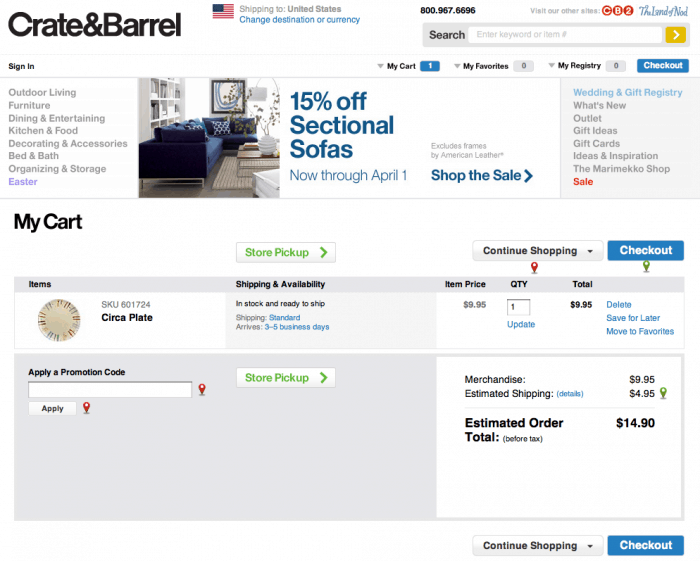
Finally, and perhaps the most important on this list, are the shipping fees. Companies that offer free shipping have higher conversion rates than those with high shipping costs, and statistically have higher conversion rates. If it’s affordable, offer free shipping on every order. If not, offer free shipping on orders over a certain amount. It will be an excellent conversion booster, and can also work to upsell products as well.

