
Entering a restaurant, patrons are often influenced by the atmosphere long before their meals are served.
Research indicates that many restaurant owners recognize the importance of effective design. However, not everyone is aware of the profound impact that color can have on customer decisions, mood, and overall profitability. Studies suggest that as much as 90 percent of a customer’s initial response to a restaurant setting is determined by color. The strategic selection of hues can evoke feelings of energy, calmness, comfort, or sophistication, thereby influencing the entire dining experience.
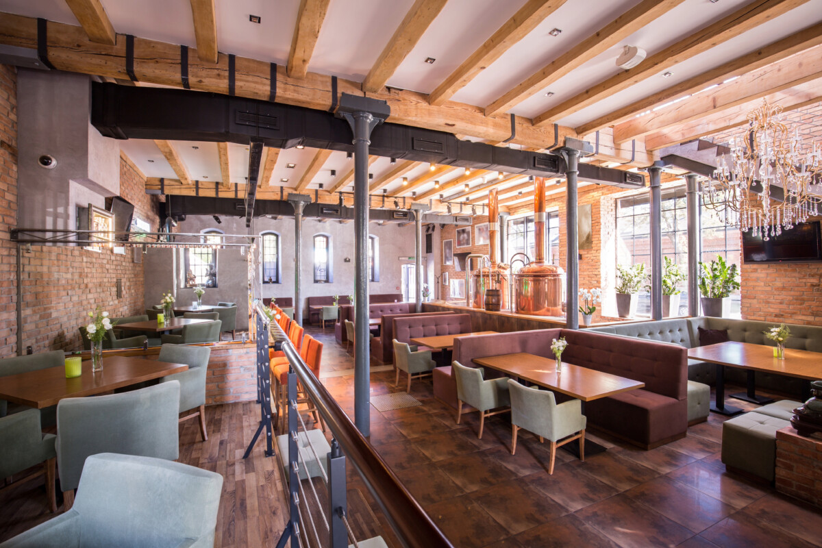
Commercial-grade furniture plays a leading role in this visual landscape, and selecting the right colors for tables, chairs, restaurant booths, and bar stools is a strategic choice. For example, restaurant booths add comfort and privacy, and their color can influence how relaxed or lively a dining area feels. These choices help restaurants connect with guests, build a recognizable brand, and leave a lasting impression that brings people back. A thoughtful color plan is more than a trend; it’s a smart investment. With the right approach, restaurant owners can turn a simple space into a memorable destination.
If you want to start a restaurant business, you need to learn about color psychology and investigate how different tints influence people’s attitudes and behaviors. This science is used in restaurant design to create settings that make guests feel welcome, comfortable, and eager to remain. Different hues can elicit significant emotional reactions even before anyone sits down.
Warm hues, such as red and yellow, are believed to stimulate hunger and motivation. Cool colors, such as blue and green, on the other hand, are more relaxing and may even suppress appetite. This emotional impact influences not only mood, but also the duration of a visit and the amount of money spent.
Each hue adds something unique to the table. When restaurant owners understand these emotional triggers, they can design more effectively. A well-matched color scheme reinforces the notion and enhances the overall ambiance. The proper use of colors can also make a room appear more balanced and visually pleasing, resulting in a better guest experience.
Warm tones, such as red, orange, and yellow, naturally attract attention. These colors are commonly utilized in fast-casual restaurants and cafés to create a dynamic ambiance. They generate energy and excitement, promoting speedy dining and high client turnover.
Red can boost heart rate and create a sense of urgency. It’s bold and effective when applied in moderation. Orange conveys a sense of friendliness and warmth, making smaller areas feel snug and inviting. Yellow produces a joyful, optimistic atmosphere that brightens the room and boosts energy levels.
Too much warmth, however, might overstimulate clients and cause discomfort. A balanced approach, such as mixing bold, warm chairs with more neutral tables, can bring harmony to the space. These mixes maintain a nice atmosphere while invigorating the area.
Blues, greens, and purples are known for their calming effects. These colors are ideal for upscale restaurants, lounges, or spaces that aim for a relaxed and elegant feel. Cool tones create a peaceful atmosphere that encourages guests to relax and fully enjoy their experience.
Blue is commonly associated with feelings of trust and cleanliness, making it a suitable choice for modern and sophisticated interiors. Green brings freshness, balance, and a natural touch to a space, while purple adds a sense of luxury and exclusivity when used in small doses.
Using cool-toned furniture can make guests feel more comfortable and increase the time they spend at the table. These hues also pair beautifully with wood, stone, and other natural materials, creating a refined and welcoming environment.
Neutrals, like black, white, beige, and gray, are popular for a reason. These colors are timeless, adaptable, and offer a solid foundation for any design theme. Restaurants that use neutral furniture can easily change their décor or branding without needing a complete overhaul.
Neutral colors bring a sense of professionalism and polish to any setting. They work especially well in modern, minimalist spaces and can serve as a backdrop for more colorful accents. By combining neutrals with seasonal or promotional pops of color, restaurant owners can keep things fresh without having to start from scratch.
Matching neutral furniture to architectural details, such as floors and walls, adds consistency and flow to the space. These shades also make a restaurant look clean, organized, and well-maintained, which customers naturally appreciate.
Color is not just about which hue you choose; it’s also about how intense or muted it is. The saturation and brightness of a color influence how people perceive a space. Bold, vivid tones can spark excitement, while soft, subtle shades promote calm and comfort.
Restaurants that want to stand out might choose bright reds, greens, or oranges to match a high-energy brand. Subtle tones, such as dusty blue or soft gray, are ideal for quiet cafés or fine dining spots. The intensity of color should match the brand’s personality and message.
A balanced palette often combines both approaches. Bold elements draw attention, while softer tones ground the design. Testing samples under real lighting helps owners see how colors perform. When used consistently, well-chosen colors can become part of the brand identity itself.
Lighting can significantly alter the appearance of colors. Whether it’s natural daylight or warm ambient bulbs, lighting influences how guests perceive color in furniture and décor. Warm lighting enhances the colors red, orange, and yellow, while cooler lighting pairs best with blues and greens.
Furniture finishes also play a role in how colors are seen. Glossy surfaces reflect more light and appear more vibrant. Matte finishes absorb light, creating a more muted and sophisticated appearance. Upholstery materials like leather, velvet, or linen can alter the perception of a color, making it feel luxurious, casual, or rustic.
Textures add depth and richness to a design. Soft finishes make spaces feel more inviting, while sleek surfaces lend a modern edge. Spot lighting can be used to highlight specific pieces or areas, adding layers to the overall visual effect.
Color isn’t just decoration—it’s a powerful tool that shapes how guests feel, what they order, and how long they stay in your restaurant or shop. Research shows that warm shades like reds and yellows can boost appetite and encourage quick visits, making them popular for fast-food counters, while cooler tones like blue or green create a calming, comfortable environment for relaxed dining. Smart use of color signals quality and cleanliness, which can build trust with customers and increase repeat visits. These principles aren’t limited to physical spaces; Shopify store owners can use them in website design, product images, and digital campaigns to create the same emotional response that keeps customers coming back.
To put these insights into action, start by evaluating your current palette—whether online or in-store. Simple updates, like adding a splash of red in high-traffic areas or using soft colors where you want people to linger, can have a big impact on guest behavior and brand perception. Think about each area’s goal: quick turnover, longer stays, or higher ticket sales, then match your color choices to these aims. Test new color schemes through A/B testing online or in small, physical updates, keeping an eye on feedback and sales trends to guide your choices.
Bringing psychology-backed color strategies into your restaurant or ecommerce design can set you apart from competitors and make your brand truly memorable. For next steps, explore color psychology resources or consult with a professional designer to find a palette that aligns with your brand’s mission and audience. Every detail—even a single accent color—can make a difference, so start experimenting today and watch your business grow.
Selecting the appropriate colors for commercial-grade restaurant furniture is a crucial aspect of design that goes beyond mere aesthetics. The colors used can significantly impact patrons’ emotions, their duration of stay, and the overall enjoyment of their dining experience. Each color has a specific role, from energizing warm tones to soothing cool hues and reliable neutrals. When applied thoughtfully to furniture such as chairs, tables, booths, and bar stools, color becomes a vital component in shaping the dining atmosphere.
Effective restaurant design requires intentionality; it seamlessly integrates color, lighting, and texture to create an environment that embodies the brand’s identity and makes guests feel invited. A solid understanding of color psychology allows restaurant owners to strategically apply colors, resulting in interiors that are not only visually appealing but also memorable and engaging. Ultimately, well-executed design grounded in a thoughtful color palette does more than enhance visual appeal; it creates a lasting impression that encourages repeat visits from guests.
Color psychology shapes mood, appetite, and even how long guests want to stay. The article explains that warm shades like red and orange can boost energy and encourage quicker turnover, while cool tones like blue help diners relax and linger.
Yes, strategic color design can make guests feel more comfortable and prompt them to order more. The article highlights restaurants that use vibrant accents see higher check averages and repeat visits by aligning color schemes with dining goals.
Divide your space and match colors to each area’s purpose—red and yellow near counters for quick bites, softer greens and browns in seating zones for relaxed dining. This practical approach draws on research featured in the article and helps guide guest behavior.
Colors like red, yellow, and orange can actually make people feel hungrier and spark cravings for food. The article points out that famous chains use these shades to subtly encourage bigger orders, which Shopify food brands can apply in their digital branding too.
Absolutely—colors that are too harsh or mismatched can make spaces feel unwelcoming or even stressful. The article warns that poor color coordination often leads to shorter visits and fewer return customers.
Apply color psychology to website banners, product photos, and checkout backgrounds to boost appetite and create trust. The article offers examples of digital-first food brands seeing more sales from thoughtful, appetite-friendly color palettes.
They do—whites, muted grays, and soft golds signal freshness, care, and high standards. The article shares that these details give guests more confidence to try new items and can even justify higher prices.
Start small with fresh paint on accent walls, colorful menus, or new upholstery, as suggested in the article. Even adding small pops of the right color can refresh your brand and guest experience without big costs.
Definitely—carrying your chosen palette into logos, signage, and social media makes your brand more memorable and trusted. The article recommends keeping consistent colors in every touchpoint, from restaurant awnings to Shopify store headers.
Run simple A/B tests on digital platforms, or use sample swatches and guest surveys in physical sites. The article emphasizes that tracking customer reactions will help you find the perfect colors for your unique concept or Shopify food shop.

