

The demand for dark mode-compatible design is increasing as the setting is gaining popularity among consumers. Dark mode is a low-light display option with the purpose of decreasing eye strain, reducing screen brightness, and making content easier to read. But for Marketers, especially for those working with emails, it’s a new hurdle. With its inverted color scheme, dark mode is another variable for which Marketers have to account in email design. (As if email rendering weren’t already complex enough!) This setting is also unlikely to be just a passing fad, since three of the largest ESPs, Apple, Outlook, and Gmail, are now supporting dark mode to various extents.
At Zaius, we understand that you want to deliver the best experience to your customers and cater to their preferences, even if that involves implementing new design elements that are compatible with light and dark mode alike. We put ourselves in your shoes and experimented in the Zaius Engagement Designer to identify smart ways to tackle this challenge. Check out our findings and recommendations:


While there are some CSS snippets you can use to (try to) hack dark mode, we recommend the path of least resistance. You will knock those emails out faster and with less headache if you prepare your emails and graphics with dark mode in mind. And that brings us to our last point:
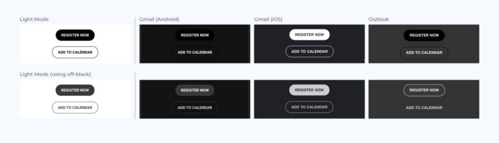
In our last example, you see how our email design appears across different clients. Our tip here is to ask team members with access to various ESPs and devices to test how your emails look for them.

As with many things in Marketing, the initial lift in designing for dark mode is the hardest. Once you identify what works, you’ll be able to duplicate your efforts and tackle dark mode with ease!
This article originally appeared in the Zaius blog and has been published here with permission.

