
Ecommerce brands can lift conversion on high-consideration products by borrowing telehealth UX patterns: guided qualification flows, educational product pages, clear pre-purchase expectations, progressive disclosure, and trust signals positioned at key decision points.
Telehealth brands can’t afford vague flows or fuzzy expectations, so they’ve been forced to engineer clarity — and those same patterns work remarkably well for complex ecommerce purchases.
The reason standard ecommerce conversion rates hover at a modest 2.5% comes down to a fundamental lack of clarity surrounding high-consideration purchases. Consumers do not abandon carts solely because of shipping costs; they leave because unresolved questions trigger cognitive friction right before checkout.
Prescription commerce and modern digital health platforms do not have the luxury of letting users guess their way through a transaction. Because telehealth brands handle strict regulatory environments, complex treatments, and personal health decisions, they are forced to master progressive disclosure, explicit eligibility framing, and upfront expectation setting. By applying these exact healthcare UX patterns, traditional ecommerce brands can eliminate hesitation to buy and drastically increase conversion rates in short order.
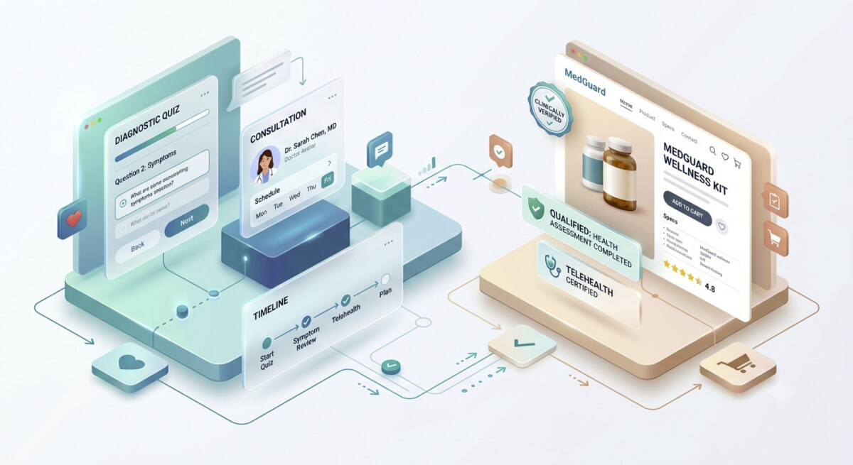
Image Source: Google Gemini
There are thousands of cart abandonments every day triggered simply because shoppers are unsure if a product actually solves their specific problem. High-growth digital health platforms solve this anxiety upfront by replacing generic search bars with structured, interactive onboarding flows.
Instead of throwing a customer directly onto a crowded grid of products, prescription commerce platforms use short diagnostic screeners to guide the customer journey. These assessment flows gather essential intent signals while educating the buyer on what they actually need.
When buyers answer three or four low-friction questions about their preferences or baseline requirements, they build psychological investment in the outcome.
Ecommerce stores selling customizable goods, technical equipment, or premium skincare can easily deploy this framework. Asking targeted questions before showing a primary product recommendation reframes the store from a transactional catalog into an expert consultant.
Standard product detail pages (PDPs) often focus entirely on surface-level specifications, features, and flashy imagery. Prescription commerce flips this hierarchy entirely by prioritizing clear clinical context, explicit candidate criteria, and transparent process timelines.
When shoppers evaluate high-friction products, vague marketing copy creates immediate skepticism. Modern healthcare brands address this by laying out comprehensive visual overviews that break down mechanisms of action, anticipated timelines, and dosage schedules in plain, accessible language.
Providing deep educational transparency transforms a product page from a sales pitch into an authoritative decision tool. For instance, reviewing a thorough clinical overview of Zepbound demonstrates how detailing active mechanisms, realistic candidate requirements, and ongoing support structures builds immediate consumer confidence long before a clinical consultation begins. Taking inspiration from how others get product pages right is a good way to optimize your own.
When traditional brands adopt this level of educational depth, they proactively answer objections before the consumer even reaches the cart. High-consideration retail brands can translate this strategy into practical PDP upgrades:
Integrating transparent educational components directly into your layout reduces post-purchase refund requests while driving conversion velocity.
High checkout drop-off rates rarely occur out of nowhere; they are the direct outcome of surprise fees, hidden shipping delays, and vague delivery timelines.
Telehealth brands operate under conditions where patient anxiety is inherently high. To counter this friction, leading healthcare platforms clearly display every step of the post-order journey before asking for payment details.
Digital health checkout pages typically map out explicit fulfillment sequences, including medical review windows, shipping estimates, and ongoing support access points. Retail brands can mirror this structural transparency by displaying live fulfillment trackers and clear step-by-step progress bars right inside the checkout module. When buyers know precise fulfillment milestones prior to entering credit card info, psychological hesitation vanishes.
Throwing extensive technical data at a customer all at once leads directly to analysis paralysis. Digital health experiences overcome this by employing progressive disclosure, an architectural design pattern that surfaces core information first while keeping deep technical data accessible via expandable UI elements.
Healthcare platforms keep primary purchase pages clean by highlighting core value propositions up front and hiding exhaustive ingredient lists, medical studies, and FAQs behind secondary accordions.
Applying this framework ensures your core value proposition remains scannable for quick decision-makers while still providing comprehensive data for analytical shoppers. Modern digital health platforms leverage these structural design strategies to build instant rapport with visitors:
Implementing dynamic content accordions and contextual tooltips helps clean up complex product detail pages.
UX research demonstrates that reducing cognitive load through guided discovery systematically eliminates purchase barriers for first-time buyers. Streamlining your page architecture allows visitors to digest information at their own preferred pace.
Placing security badges exclusively in a website’s footer is an outdated conversion strategy. Leading prescription commerce experiences embed explicit trust signals directly alongside every critical action button across the user journey.
In telehealth, trust anchors include provider accreditation graphics, medical board seals, and verified patient outcomes.
For standard ecommerce brands, this translates into real-time stock availability, verified buyer reviews filtered by customer use-case, and clear money-back guarantees placed directly beneath the primary purchase button.
Positioning social proof and security assurances right at the exact point of decision neutralizes purchase anxiety at the moment it naturally peaks.
The gap between prescription commerce UX and traditional online retail is closing rapidly as consumers demand higher clarity, speed, and personalization.
By replacing static catalogs with interactive diagnostic assessments, transforming PDPs into educational resource hubs, and building upfront transparency around fulfillment timelines, brands can systematically eliminate conversion friction.
To explore additional ways to optimize your digital storefront architecture, review our detailed tactical guide to structuring friction-free checkout workflows. We’ve got plenty more coverage and advice right here on the site, so whatever UX challenge you’re facing or conversion rate issue that’s plaguing you, a solution should be close at hand.
Prescription commerce patterns improve ecommerce conversion by clarifying eligibility, guiding product choice with short assessments, turning PDPs into educational tools, and making post-purchase timelines explicit, which reduces hesitation on complex or premium products.
The easiest telehealth UX elements to reuse are guided qualification flows, layered PDP content with accordions, clear delivery and onboarding timelines in checkout, and trust signals placed directly next to add-to-cart and pay buttons.
Guided quizzes help ecommerce conversion when they stay short, focus on buyer intent and constraints, and feed directly into tailored recommendations; in that structure, they reduce confusion rather than adding friction.
For high-consideration items, product detail pages should shift from feature lists to decision aids that explain who the product is for, how it works in real conditions, what to expect over time, and why the price and commitment make sense.
Ecommerce brands should place trust and security signals near major calls-to-action — add-to-cart, checkout, and payment — pairing them with relevant reviews, guarantees, and secure-payment badges instead of hiding them in footers.