
![email-design-best-practices-2021-[tips-&-examples]](https://ecommercefastlane.com/wp-content/uploads/2021/08/43507-email-design-best-practices-2021-tips-examples.png)
![Email Design Best Practices 2021 [Tips & Examples]](https://getfirepush.com/uploads/blog/08/05/3/firepush-blog-email-design-best-practices.png)
Do you want to send emails that convert but designing them is not your forte?
Don’t worry, emails aren’t just about the looks. It means that you too can learn how to create engaging emails to increase clicks, conversions, and secure loyal customers for a long time.
The whole magic boils down to a set of tried-and-true email marketing design best practices. If you follow them, you’ll drastically increase your chances of building email campaigns that your recipients will want to click.
We’ll walk you through every element of an email and talk about what you should pay particular attention to when designing your next campaign.
In this guide, you’ll learn how to design:
Email preview:
Email body:
Email footer.
Looking for more ideas for your next email campaign? Take a look at these guides:
Let’s kick off with all the email design best practices that can make or break your email marketing hopes and efforts. Those are sender name, subject line, and the preview text (or preheader).
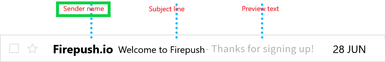
The primary goal of the sender name is to inform your recipients about who the email is from. Sender name can increase your email open rates, provided that the name is not suspicious or deceptive, otherwise, your messages will go straight to the spam folder.
If your audience has positive experiences with your brand, they’ll be more eager to open your messages when they recognize you as the sender. The sender name is usually a company name but there are other possibilities, depending on your goals.
You can choose from a variety of combinations, for example:
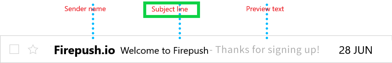
Email subject line is one of the most important elements that influence email open rates. Based on the SuperOffice research, nearly 40% of recipients open an email because of the subject line
Think of a subject line as a book synopsis. It’s supposed to be interesting and give a glimpse of what to expect without revealing the best parts of the story—the reader must look inside to find them out.
And that’s what a subject line should do, according to the best email design practices. It should grab your recipient’s attention and persuade them to open your email.
Here’s what you can try to make your subject lines stand out:
Personalize subject lines. Including the recipient’s name in the subject line may increase the open rates by 20%.
Eg.:
E.g.:
E.g.:
E.g.:
Tip: Don’t try to attract your recipient’s attention at all costs. Using all UPPERCASE and excessive punctuation !!!!! can badly
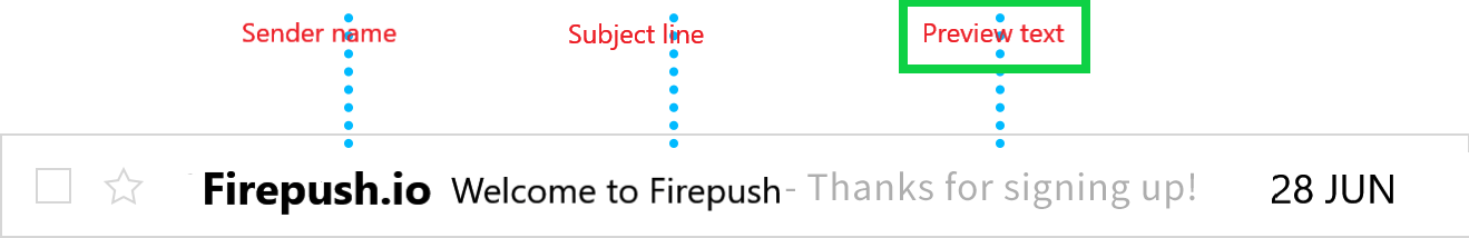
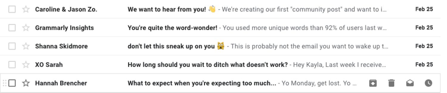
Preview text (or preheader text) is the second thing your readers will see as this line of text directly follows the email subject. It will be visible on mobile and desktop devices but could be displayed a bit differently in both cases.
Email preheader allows you to tell your audience a little bit more about what’s inside your email.
It’s also a great place to mention a special offer or finish the thought you started with your subject line. In this regard, the preheader and subject line should nicely complement each other.
Take a look at those examples:
You can add preheaders to your emails with HTML and CSS. Or, you can use an intuitive email marketing tool that lets you customize your email preheader text without writing a single line of code.
Tip: Without the preview text customization, your audience will see generic text lines like “You’re receiving this email because…” or “Having trouble viewing this email? Click here to view it in a web browser”—neither of these text lines are exciting.
Great subject lines and preview texts will help ensure your readers open your email. What your recipients will do next depends on your email main body layout. Your email layout should lead your viewers’ attention so that they know in what order they should check your email content.
There are quite a few email layouts you can use for your email campaigns:
Residents of Western countries follow an F or Z-like pattern while scanning the content.
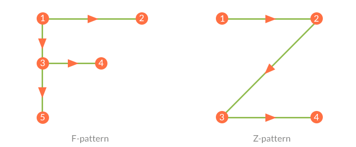
They start scanning from the top left side, move horizontally to the top right, then go diagonally to the bottom right, and finish with another horizontal movement to the bottom right.
In the case of this pattern, it’s best to place the most important information along the pattern’s path.
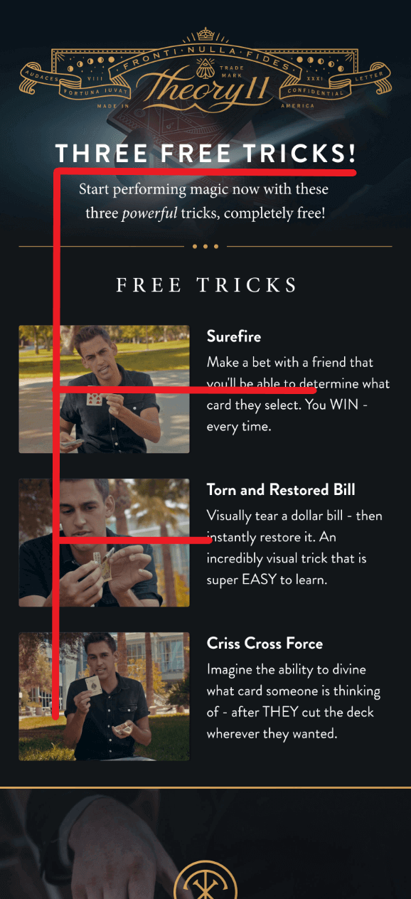
The Inverted Pyramid follows a very simple concept.
You start with presenting your USP (Unique Selling Proposition—your most important message) in the form of an eye-catching headline which should be short but big enough to allow for easy reading.
The next email design best practice is to provide supporting information that tells the reader more about your offer (i.e., why it is beneficial, how it works, etc.). One or two short paragraphs are usually sufficient.
And finally, you place a CTA button on the bottom to invite the viewer to click through your email.
Tip: No matter which design you decide to use, you’ll need a dedicated tool to build your emails. Firepush is a beginner-friendly Shopify email marketing app that comes with a built-in email editor that will let you easily design and launch your emails in minutes.
The diagram divides the composition into four quadrants:
The Gutenberg diagram illustrates the way the reader’s eye scans the web page or email. It goes across and down the page in a series of horizontal movements called axes of orientation.
Each scan starts a little further from the left side (primary area) and moves a little closer to the right side (terminal area). The path that the eye takes is called a reading gravity.
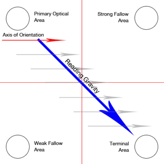
Based on this layout, the key takeaway is that you want to place important elements along the reading gravity path.
For example, you could place a logo or headline in the top or left area, an image or some important content in the middle, and a CTA button (or the most attractive offer) in the bottom right.
Your subscribers won’t spend too much time looking at your emails. About 38% of emails receive attention for less than eight seconds, and nearly one in seven viewers glance at the emails in their inbox for less than two seconds.
So, the sad truth is that your emails will only get a short, a few-second skim at best. That’s why an eye-catching headline is critical.
A study has found that headlines are the first text that people look at in an email which means that they give you the best chance to grab someone’s attention—and prevent them from clicking away.
Well-designed and written links help attract attention and can get you more clicks (and taps on mobile devices). As obvious as it may sound, more viewers will click your links if you make them easy to see and understand.
But if you want to design killer email layouts for your next campaign, there’s much more to consider:
– provides some information when read out of context
– explains what the link offers
– doesn’t talk about mechanics
– is not a verb phrase
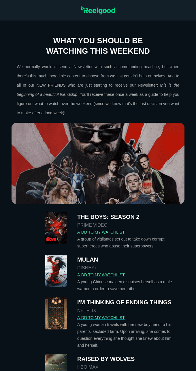
In the email below, link text saying “Add to my watchlist” clearly explains what the link offers, so that the readers know what to expect when they click or tap on it.
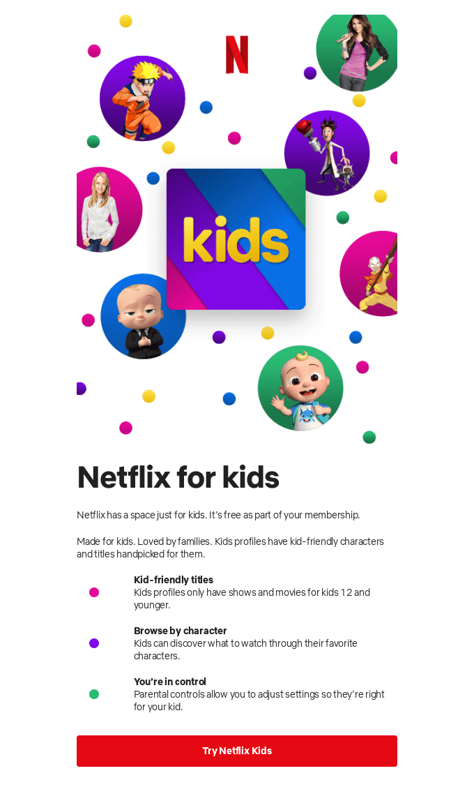
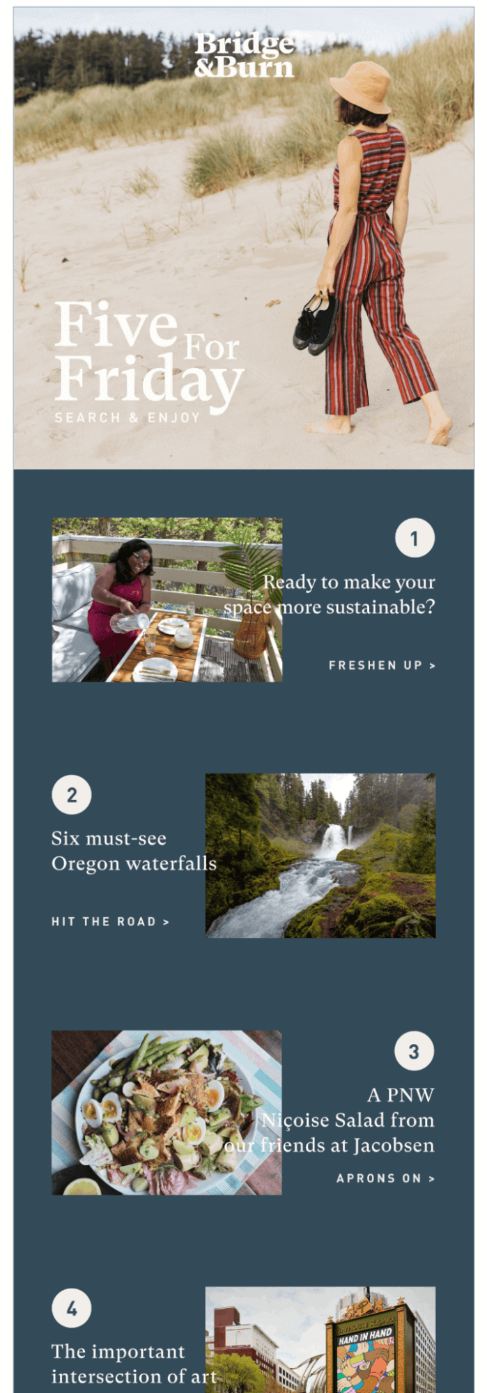
Visual elements, such as images and videos, are an indispensable part of email marketing. About 55% of millennials stated that visuals are most important for a good mobile shopping experience.
When comparing the value that images, product information, product description, and ratings and reviews provide, 67% of consumers indicated images as the most influential factor on their purchase decisions.
The bottom line? The right picture can sell the product. And the same holds true for promotional emails.
Quality visuals beat product descriptions (especially on mobile devices), so you’ll need to ensure that the visuals you use in your emails are appealing and informative.
If you don’t want to install any third-party tools to check how long it takes for your emails to load, you can use the Google Chrome console.
Tip: Manual design of interactive emails that would look great on all devices requires knowledge of HTML, CSS, and JavaScript. But with Firepush you don’t need to worry about it—you can do Shopify email marketing without writing a single line of code!
If you have the opportunity, take your time to create a variety of photos or videos for your email campaigns.
Alt texts are also very important for visually impaired users who rely on screen readers to read them back all the email content.
Tip: It is acceptable to leave the Alt text blank if the image is only for decoration only. But, if you want to follow email design best practices, provide at least a brief description, e.g.: “Company logo” or “Facebook icon.”
Photos, reviews, social media posts—whenever your customers write about your brand or products, they generate content. User-generated content (UGC) showcases your products and how they’re used in real life by real people.
In this regard, it acts as social proof that strengthens trust in your brand. It’s also authentic and allows for more interaction between the buyers and sellers.
After reading a review, 50% of consumers will visit the company’s website. That’s why it makes sense to have UGC included in your promo emails to increase click-through rates.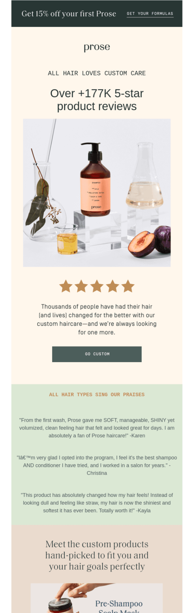
Copy is the bread and butter of your email. While the visuals attract attention, it is the copy that makes the readers want to scroll an email for more.
In a broad sense, a copy is the main body of your email—the main message you’re sending out. But that’s not everything. Link text lines, subject lines, preview text, and CTA labels are also part of the copy.
Long text, on the other hand, is usually found in non-product announcement emails (e.g.: important news and updates).
(You might have come across such emails during the pandemic when brands were communicating their safety measures or changes in order deliveries.)

If there’s no such person, you can use Grammarly or Language Tool apps to make your writing better and free of silly mishaps.
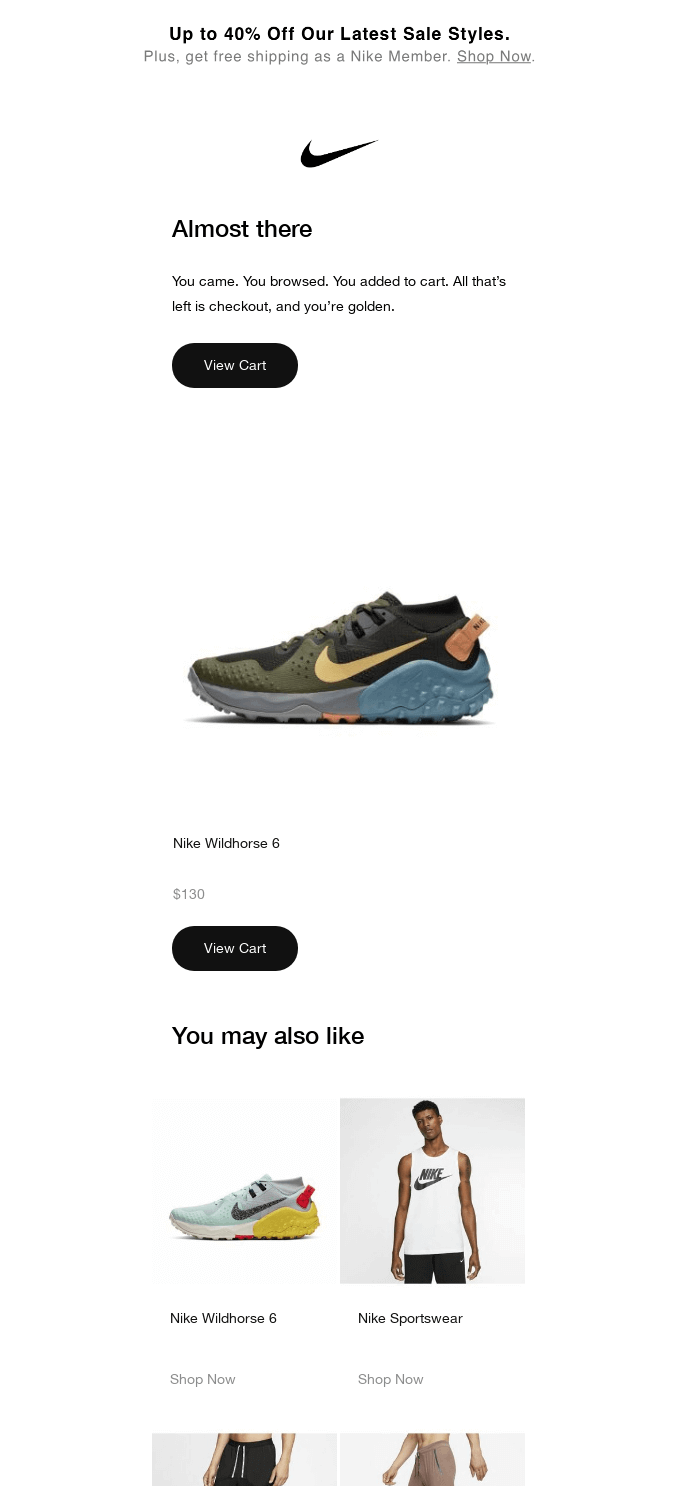
CTA’s role is to gently push the recipients to take an action you want them to take after they’ve read the email. CTA can call your subscribers to read your post, check out new offers, get back to the store to check out the goods they have abandoned, and more.
The design of a CTA is not an easy job but there are a few tips to keep in mind that will help you increase the chances of earning clicks.
The primary call-to-action button’s role is to direct peoples’ attention and clicks to your main offer. If you decide to use more than one call-to-action, make sure that they don’t take your viewers’ attention away from the main goal of your email.
Ideally, you’ll want the CTA button to have at least 50 pixels in height to allow for comfortable tapping.
The best-performing colors for call-to-action buttons are orange, blue, red, and green. But, in reality, any color works—as long as it contrasts well with the colors used throughout the email.
Tip: Color contrast is important for all viewers, especially for those who are color blind. Check the WCAG contrast guidelines and the Contrast Checker tool that will help you design great CTAs for all your subscribers.
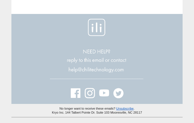
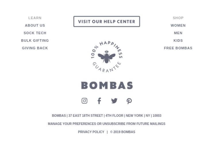
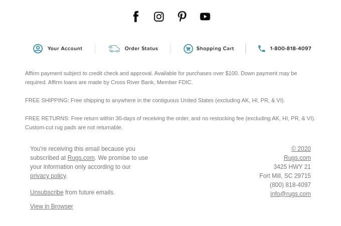
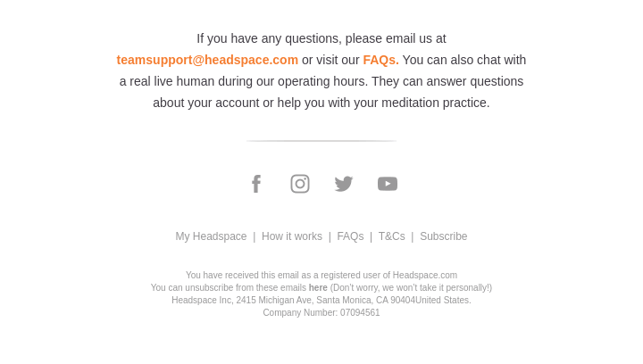
Footers contain a lot of important information. That’s why an email footer is often where your subscribers look for details about your brand. It allows your subscribers to find out how to contact you and manage their subscriptions.
A well-designed footer that contains all the information required by law is also a sign for your customers telling them that you are transparent and care about clarity.
So, let’s talk about the bare minimum elements your footer should contain and how you can make it look less generic.
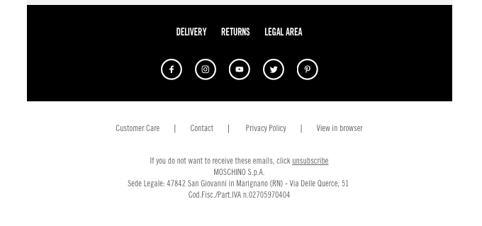
If you’re sending commercial emails, these pieces of information are required by anti-spam laws such as the CAN-SPAM Act of the USA, Canada’s Anti-Spam Legislation (CASL), and many others.
![]()
Great email design is a collection of tried and true practices that can greatly
If you’re looking for an email builder that makes creating emails fast and easy, be sure to add Firepush app to your Shopify store.

Agnieszka Sienkiewicz
Aggie is a digital marketing expert with a strong understanding of customer journey and sales processes. She creates detailed guides, customer success stories, and other content to help online stores drive sales in an organic way. Besides digital marketing, she has a passion for sports (bike riding), studying, and healthy lifestyle.

