
Data is everywhere. We consume and create it on our social media platforms. We analyze it at work and use it to make better decisions. Sometimes we collect it just for fun. In this day and age, data is almost as prevalent as the air we breathe. As mundane as data can seem, it can be quite beautiful. In fact, there is an entire subreddit dedicated to this fact.
But what makes data beautiful? Is it something intrinsic about the data itself or is it our ability to visualize it in an appealing way? I would say the answer is both. Data often has a story to tell, but it is ultimately up to us to craft visualizations that can convey the story accurately and in a visually pleasing way. Sometimes the choices we make when visualizing data can get in the way of the story the data is telling.
In this article, I’m going to talk about five things to avoid when creating data visualizations so that you can ensure the beauty of your data comes through.
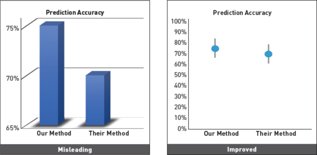
It’s usually not out of malicious intent that data misleads users. It’s all too easy to do. Maybe I want to zoom in on the data by only showing a portion of the y-axis. Maybe I use green and red to categorize entities without realizing the cultural relation to positive and negative. Misleading a user can happen with something as subtle as creating a time-lapse without considering how much weight the user will put on the initial position of the data. We can’t be perfect, but the first step towards avoiding misleading users is to understand how all of us can be easily misled when interpreting data.
A good rule of thumb is to let the data speak for itself. If there is only a 2% difference between data points, and you don’t think the user will notice the difference at a normal scale, ask yourself if they really need to notice. Danielle Szafir, a visualization scientist at the University of Colorado Boulder writes an excellent article that explains many more ways data visualizations can mislead users and how to avoid doing so.
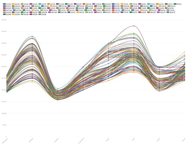
It can be tempting to create compact visualizations that hold a lot of information because they require less screen real estate. However, humans can only focus on so much visual information at once. When too much data is shown, data becomes less meaningful and users struggle to make sense of what they are analyzing. Aggregating data and reporting on the statistical information rather than raw numbers can often help in these situations. Also, by adding the ability to drill-down, you can let the user explore the data on a more granular level without cluttering visual space with too much information. It’s always good to bring data to the forefront by using minimal text annotations and a simple legend. If a complicated legend is needed to explain a visualization, the design can very likely be improved.
This one is hard to do because there are so many types of visualizations. There are line graphs, bar graphs, stacked bar graphs, pie charts, scatter plots, area charts, and heat maps (to name a few). The key to selecting the right type of visualization is to determine what your visualization is trying to accomplish. Data visualizations either answer a specific question, such as “what search term is the most popular on my website?”, or provide some exploratory insight into a dataset so users can discover new patterns or connections. When you boil data visualization down into a simple question it is more intuitive to select the correct type of visualization.
Do you want to analyze a trend in data over time?
A line graph or column chart would work great.
Do you want to understand the distribution of a dataset?
A scatter plot or box plot would be a good fit.
Do you want to show the proportion of parts to a whole?
A pie chart or stacked bar graph would be a good choice.
The Data Visualization Catalogue is a personal favorite resource for learning more about how to choose the right type of visualization depending on the use case.
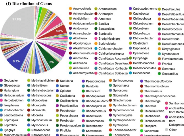
Color is an excellent tool for displaying additional dimensions of data without needing another spatial dimension. It’s especially good for encoding categorical data. However, the human eye struggles to distinguish between more than about 6-12 colors at a time depending on the individual. It’s important to limit the amount of colors used to categorize data so users can readily distinguish between categories. Color Brewer is a great tool for selecting colors in data visualizations.
Animations are an effective way to draw attention to areas in the data and I personally love creating interactive data visualizations with animations using the Javascript framework, D3. But too many animations can distract the user or draw too much attention to parts of the data and indirectly hide other parts. Using 3D can be okay if the user has the ability to interact with the visualization and change visual perspectives, but displaying data using an isometric 3D view is usually a sure-fire way to misrepresent data because of the skewed perspective.
I hope these tips will help you avoid some common pitfalls when visualizing data. Remember that it’s important to get in the user’s shoes and understand how and why they are interacting with the data visualization. Prioritizing this will enable you to let the intrinsic beauty of the data shine through to your users.

