
Quotable Stats
Curated and synthesized by Steve Hutt; Updated September 2025
Eight years ago, most shoppers began their ecommerce journey on a desktop.
Today, that has shifted dramatically. As we approach 2025, mobile now accounts for over 70% of global ecommerce traffic and drives about 75% of all sales. Mobile users are spending more time, money, and attention on mobile devices than ever before. If your DTC or Shopify brand isn’t prioritizing the customer experience through a mobile-first design, you’re missing out on significant revenue opportunities.
Shoppers expect speed, simplicity, and a frictionless checkout process—making user experience (UX) critical. The drop-off rate for mobile shopping is brutal when your site lags or complicates the purchase journey. Even a small delay in page load speed or a clunky checkout process can cause customers to bounce. With the average shopper spending over $2,500 annually via mobile and using shopping apps as much for discovery as for purchasing, having a mobile-friendly website that simply “works on mobile” isn’t enough.
Modern website builders, like Nicepage, have transformed the process for brand owners striving for faster growth without relying on a large development team. These tools enable the creation of mobile-first ecommerce stores that load quickly, look sharp, and improve conversion rate. By focusing on a mobile-first approach as a standard—not an afterthought—brands gain the flexibility to test, optimize, and scale their mobile commerce strategies effectively.
The best-performing brands are unlocking faster growth by making mobile shopping seamless through improved page load speed and an intuitive checkout process tailored to mobile users. Curious how to enhance your mobile ecommerce journey and customer experience? Start with the top mobile commerce strategies.
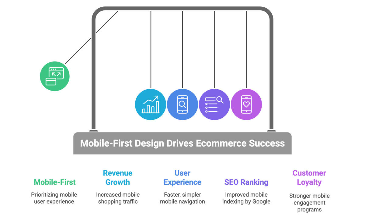
Mobile-first design isn’t just a passing trend—it’s a necessary approach for ecommerce leaders aiming to stay competitive. From what I’ve observed, brands that adopt a mobile-first approach are pulling ahead, while those that treat mobile as an afterthought struggle to catch up. If you want to hit your revenue goals and foster strong customer loyalty, investing in a mobile-first design is key. Mobile devices have transformed the shopping landscape by becoming the primary screen for most shoppers, not just a secondary option. Let’s explore why mobile-first matters so much for ecommerce success today.
Check any modern ecommerce dashboard, and you’ll see that over 70% of all mobile shopping traffic comes from mobile devices, with mobile ecommerce accounting for nearly three-quarters of total revenue. Your next high-value customer is very likely browsing on their phone—whether that’s during a quick break, between meetings, or even making a one-handed purchase at lunch. Working with DTC brands over the past year, I’ve repeatedly seen mobile ecommerce outperform desktop, both in traffic and in the volume of purchases, especially as mobile payments become the norm.
Mobile users have virtually no patience for poor user experience (UX). If your site suffers from slow page load speed or clunky website navigation, they’re gone before your brand can make an impression. Mobile bounce rates are often 30-45% higher than desktop because mobile users’ expectations for speed and usability are different. Common deal-breakers include:
Brands that have streamlined their checkout process and optimized mobile user experience typically see a noticeable jump in conversion rate. This is where many established brands lose revenue and increase cart abandonment rate simply because of subpar mobile UX.
Top-performing brands leverage AI-powered insights to continually refine their mobile experience. Investing $10,000/month in optimizing mobile UX often returns two to three times that in recovered sales and improved customer lifetime value. Key focus areas include:
For more detailed tactics, check out these ecommerce site mobile optimization best practices 2023 to help ensure your mobile-friendly website performs at its best.
Google’s mobile-first indexing is now the standard. If Google can’t properly crawl and index your mobile site, your search rankings will suffer. Many brands stuck in desktop-first mindsets miss this crucial point: mobile page load speed, structured data, and mobile usability directly impact your SEO rankings, not just your site traffic. If your mobile site doesn’t meet these standards, even highly targeted product pages can hurt your visibility. To maintain strong SEO and support organic growth, every element of your mobile experience needs to align with Google’s mobile-first indexing requirements. Interested in tactical steps? Explore strategies on how the impact of mobile-first indexing on SEO affects your bottom line.
Mobile devices represent the strongest channel to build and maintain customer loyalty. Most repeat buyers use their phones to check order tracking, respond to loyalty offers, and leave customer reviews. Loyalty programs that incorporate gamification—like point-earning pop-ups and rewards—work best when designed with a mobile-first approach. If your loyalty program hasn’t yet adapted to mobile ecommerce, these gamification in mobile loyalty programs strategies may inspire you to boost engagement and retention.
Building your ecommerce stack with a mobile-first approach means going beyond adaptation—you’re future-proofing your brand. The data on mobile ecommerce’s dominance is clear, but the real advantage comes from treating mobile-first design as the central experience rather than a secondary concern.
If you’re thinking your site “works okay on mobile,” ask yourself: when did you last complete a purchase on your phone, start to finish? If it feels even a little clunky, imagine the impact on first-time buyers. Every tap, swipe, and scroll shapes the customer experience—and when done right with responsive design and optimized page load speed, you win their trust and long-term business.
You’ve already experienced the frustrations of slow dev cycles and cluttered mobile layouts. So let’s be clear about why drag-and-drop website builders, like Nicepage, revolutionize mobile-first ecommerce. The speed at which you can launch, customize, and optimize your storefront determines whether you lead your market or fall behind. If your build process isn’t rooted in a mobile-first approach, you’re wasting valuable time and resources. This is where website builders deliver a distinct advantage.
Today’s platforms like Nicepage offer thousands of mobile-friendly website templates designed to create a seamless user experience on mobile devices. Each template—not only the homepage but every block from product carousels to testimonials—utilizes responsive design to automatically adjust for mobile devices. I’ve run split tests changing only to a dedicated mobile template, and the conversion rate uplift was clear: double-digit gains within one week, simply by optimizing for mobile users.
What does this mean for your ecommerce business?
This flexibility becomes critical when you need to pivot on the fly—think Black Friday sales or limited-edition product drops. With adaptive templates, you can create campaign-specific landing pages in minutes, not days. You control the user journey, whether accessed via phone, tablet, or laptop, with zero additional coding.
There’s a common misconception that website builders limit your SEO potential or slow down your site. The truth, particularly with platforms like Nicepage, is quite the opposite. Their mobile-friendly website templates are optimized for speed, image quality, and accessibility. Here’s what I observed after migrating high-traffic Shopify stores to mobile-first builders:
Don’t let outdated advice hold you back. Modern website builders incorporate SEO best practices and performance monitoring by default. The lifts I’ve seen in organic rankings and conversion rate improvements are the direct result of thoughtful technical choices baked into these templates from the start.
If you want to dive deeper into best practices for mobile-first design and understand how mobile ecommerce benefits from Google’s mobile-first indexing, exploring these strategies can significantly enhance your site’s SEO and ecommerce performance.
Direct-to-consumer ecommerce growth is all about momentum. To outpace competitors, you need to act swiftly on insights, deliver a seamless mobile shopping experience, and address conversion blockers before they impact next quarter’s revenue. That’s precisely where Nicepage plays a vital role for scaling brands that want operational speed without compromising quality. If you’re evaluating how modern website builders accelerate your revenue flywheel—especially through a mobile-first design—here’s a field-tested look grounded in real results.
When one of the fastest-growing DTC brands in our community hit a growth plateau last year, slow mobile conversion was the culprit. Their team tried countless A/B tests, but the root cause was legacy site infrastructure that couldn’t keep pace with mobile users’ shopping behaviors. After performing a side-by-side speed test, Nicepage stood out—not just for its slick templates but because it enabled full customization for a mobile-first approach without bottlenecks from developers.
What tipped the scales? Three key advantages:
From launching new collections to flash sales and promo pages, this level of speed makes or breaks DTC ecommerce campaigns.
Here’s how Nicepage transformed their mobile ecommerce presence once it powered their mobile site. The team adopted a genuine mobile-first design workflow, prioritizing mobile prototypes while desktop iterations became secondary. Every template was built starting from the smallest screen, flipping the usual design order and forcing clarity.
Key operational moves included:
For lean founders and marketers, this automation freed bandwidth for creative problem-solving and continuous iteration fueled by fresh data insights.
These tactical improvements translated into concrete numbers on the dashboard:
MetricBefore Nicepage30 Days AfterMobile Bounce Rate54%35%Average Mobile Page Load Speed4.7 sec2.2 secMobile Cart Conversion Rate3.1%5.2%Revenue via Mobile$83K/mo$117K/mo
This was no fluke or lucky testing window. The traffic mix was similar, product SKUs unchanged, and paid media spend steady. The brand simply stopped leaking potential customers at crucial touchpoints in the mobile funnel.
Nicepage wasn’t a magic bullet. The team still invested time prioritizing mobile prototype reviews, removing deadweight apps, and listening closely to real customer feedback. But they cut launch cycles in half and reallocated team hours from developer troubleshooting to meaningful customer experience upgrades.
For founders scaling DTC brands on Shopify or similar ecommerce platforms, the key takeaway is this: the brands winning today build with a mobile-first approach—not just “mobile-ready.” Every decision, asset, and campaign element should be tested on how it feels in mobile users’ hands, not just on desktop.
Curious about setting up your own online store with a drag-and-drop website builder like Nicepage? This practical website builder ecommerce guide breaks down the process and helps your team avoid common pitfalls.
There’s no secret sauce. The leading brands simply execute faster, use better tools, and put mobile at the forefront where it belongs.
Choosing the right mobile-first website builder is more than just checking boxes—it’s about fixing costly conversion leaks, accelerating your time to market, and preparing your brand for scalable ecommerce success. Many founders I know have tested builders claiming “mobile-friendly website” capabilities but still frustrated mobile users who had to pinch and zoom or caused developers to rewrite templates every holiday promo. Cut through the hype. Here’s what truly matters when selecting and implementing a mobile-first design approach that gives your team a competitive edge.
Begin by aligning your mobile requirements with your business goals—there’s no place for guesswork. Consider these essentials:
Too many teams focus on features before clarifying the outcomes they want. Print this checklist. If a mobile ecommerce builder can’t meet these criteria, move on.
Next, examine which platforms truly embrace the mobile-first approach rather than merely supporting mobile compatibility. Evaluate how each handles:
I prioritize platforms offering true mobile-first design or instant switching between mobile devices previews. Try building and launching a simple landing page, measuring page load speed, and seeing how easily you can control padding, fonts, buttons, and assets without coding.
A mobile-first design approach only works if your team can move fast. Drag-and-drop builders are essential. Growth teams I’ve seen cut campaign times in half by removing “dev-request bottlenecks.” Empowering marketers with editing control boosts customer satisfaction and improves conversion rate.
Look for these features:
Don’t underestimate the rollout phase—a fast and effective launch depends on a repeatable process:
Remember, launching isn’t the end. Build habits around ongoing optimization so you avoid funnel leaks that erode conversion rate over time.
For lasting success, look beyond the basics. Advanced mobile ecommerce builders often include:
Every fast-scaling 7- and 8-figure ecommerce team I’ve met shares one critical trait: relentless focus on user experience (UX) testing and clear ownership of the editing process. No guessing what mobile users want—only live data tested on real mobile devices by people committed to results.
Have you launched a new mobile-first builder? What was your biggest challenge? Share your best and worst experiences below—real stories help everyone sharpen their process and improve customer satisfaction.
Mobile now drives most online shopping, and the gap is widening. Recent industry rundowns show mobile is set to account for roughly six in ten ecommerce sales in 2025, representing trillions in revenue, while shoppers spend billions of hours inside shopping apps each year. That reality makes a fast, simple mobile journey non-negotiable for growth, retention, and SEO. Google’s mobile-first indexing rewards pages that load quickly, ship the right image sizes, and maintain clean structure, so technical wins on mobile boost both rankings and revenue.
Website builders have removed the old tradeoff between speed and control. Platforms like Nicepage provide thousands of mobile‑ready templates, visual editing, and responsive modes that automatically adapt layouts to any screen. You can export to HTML or popular CMS options, tune global styles for brand consistency, and benefit from built‑in SEO basics and image optimization. In practice, that means marketers can ship campaign pages in minutes, run more tests, and fix friction without waiting on dev cycles.
What matters most is execution. Treat mobile as the primary canvas: design for the thumb, keep CTAs visible, compress every asset, and test on real devices. Track tap events, scroll depth, and checkout steps from day one. Aim for sub‑3‑second loads on 4G, guest checkout in three steps or fewer, and wallet options like Apple Pay and Google Pay to cut abandonment. Build a weekly cadence of A/B tests for product pages and landing pages; roll out winners globally. These habits compound into higher conversion, better ROAS, and stronger LTV.
If you’re scaling on Shopify or leading a DTC team, prioritize speed of iteration as much as design quality. Modern builders make it possible to ship faster and smarter without sacrificing performance or SEO. My take after years of working with founders and interviewing experts: teams that adopt a mobile‑first workflow and empower marketers to edit and launch pages rapidly are the ones that capture share, lower CAC, and grow LTV. Start small, measure, and improve every sprint; the gains add up quickly.

Mobile-first ecommerce means you design and build your store for phones first, then adapt to larger screens. It matters because most shopping traffic and a large share of sales now come from mobile, so speed, tap targets, and simple checkout directly impact revenue and SEO.
Nicepage offers mobile‑ready templates, visual drag‑and‑drop editing, and responsive modes that adapt layouts to any screen. Your team can spin up landing pages, run A/B tests, and fix friction without waiting on developers, which speeds launches and improves conversion rates.
Aim for page loads under three seconds on common mobile networks, compressed images sized for the device, and clear tap targets of at least 45 pixels. Track time to first interaction, input delay, and scroll depth to spot real user friction early.
Google uses mobile-first indexing, so your mobile version drives crawling and ranking. Fast load times, clean HTML, structured data, and accessible layouts improve Core Web Vitals, which can lift both visibility and conversions.
Buy your top product on your own phone and note every delay, tiny button, or confusing step. Fix the top three issues, add wallet payments like Apple Pay or Google Pay, and retest on two other phones to confirm improvements.
That’s a common myth; well-coded templates can improve speed, image optimization, and accessibility, which helps rankings. With a builder like Nicepage, you still control content, structure, and meta data, while saving time on layout and CSS.
Keep checkout to three steps or fewer, offer guest checkout, and enable wallet payments for one-tap pay. Use a sticky “Buy Now” or “Add to Cart” button and reduce form fields to the essentials to cut drop-off.
Run one focused test per week on high-impact elements like hero images, headlines, CTAs, and image weight. Roll out winners across similar pages, then move to the next test so gains compound without slowing releases.
Pick a responsive template for your main use case, start edits in phone view, and set brand styles at the global level. Before publishing, test on real devices, check analytics for taps and scrolls, and schedule a one-week post-launch review.
A smoother mobile journey reduces frustration, speeds reorders, and makes loyalty perks easier to use on the go. When key actions are always visible and checkout is fast, repeat buyers come back more often and spend more over time.