As an account manager here at Recharge, one of my most exciting functions is helping our merchants better understand our enhanced analytics features. When merchants can confidently leverage the treasure trove of transaction data they sit on, they’re empowered to hone their approach to improving customer acquisition, customer retention, and lifetime value (LTV). This post will serve as a deep dive into making the most out of Recharge enhanced analytics ahead of the holiday season.
Over the last two years, Recharge has doggedly dedicated time and resources to make our enhanced analytics dashboards the best-in-class versions our merchants use today. However, the pursuit of a perfect analytics suite is never complete. As such, Recharge continues to develop, test, and release new analytics dashboards every quarter.
With that, arguably the singular most important time of year for ecommerce businesses is nearly upon us: Black Friday/Cyber Monday (BFCM)!
This make-or-break time of year often accounts for a high percentage of most ecommerce businesses’ yearly revenues. This makes it imperative for ecommerce and subscription business leaders to leverage their customer data as much as possible in order to fine-tune, evaluate, and iterate their acquisition, retention, and upsell/cross-sell strategies for BFCM 2021 and beyond.
We’re sharing some of our favorite Recharge merchant analytics dashboards. These allow both our merchants and myself to most effectively and efficiently analyze, aggregate, and transform data, then develop actionable insights.
When analyzing your customers you must first understand their status, as that will be the main, initial driving force around your customer strategies. Below are three categories (and their accompanying strategies) that are commonly used in growing your ecommerce business:
Now, let’s dive into the best Recharge merchant analytics dashboards to use in your holiday season prep.
You can use this dashboard for a number of purposes. In the context of preparing for BFCM, you can use it to determine which groups of customers you want to target for your marketing campaigns—both ahead of and during the holiday season.
Here are the eight main tiles you’ll see in this dashboard:

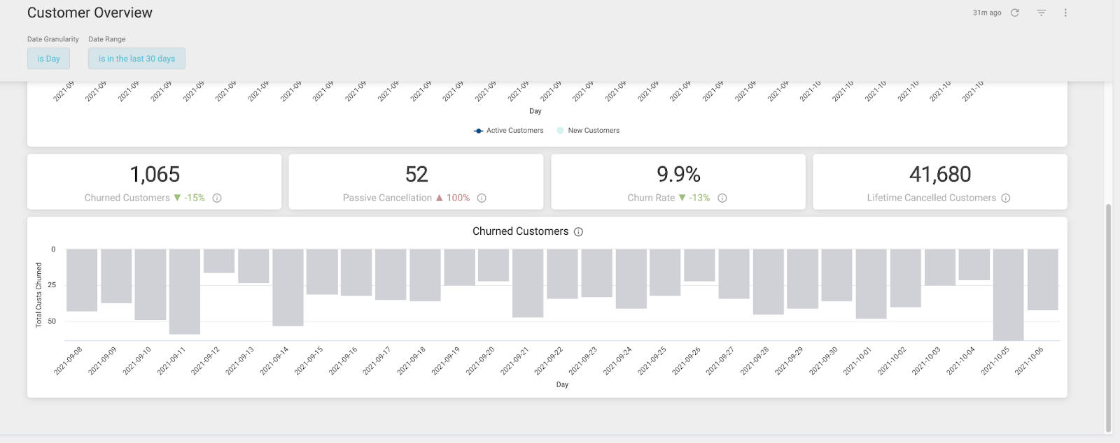
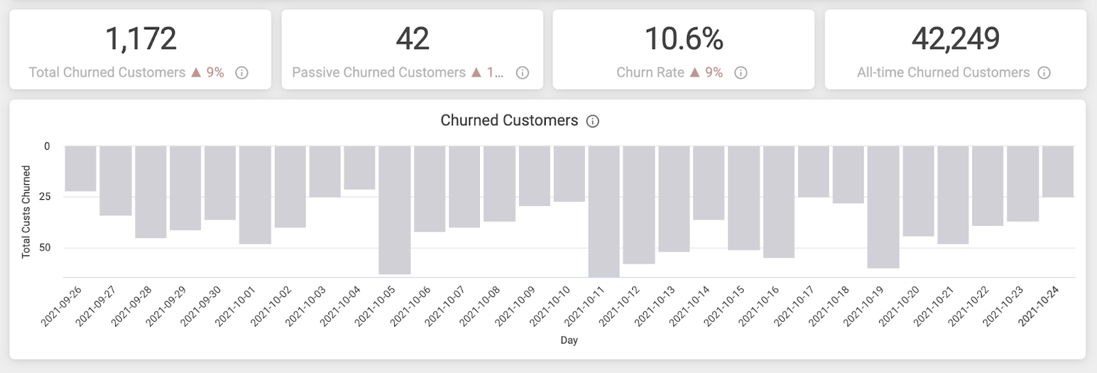
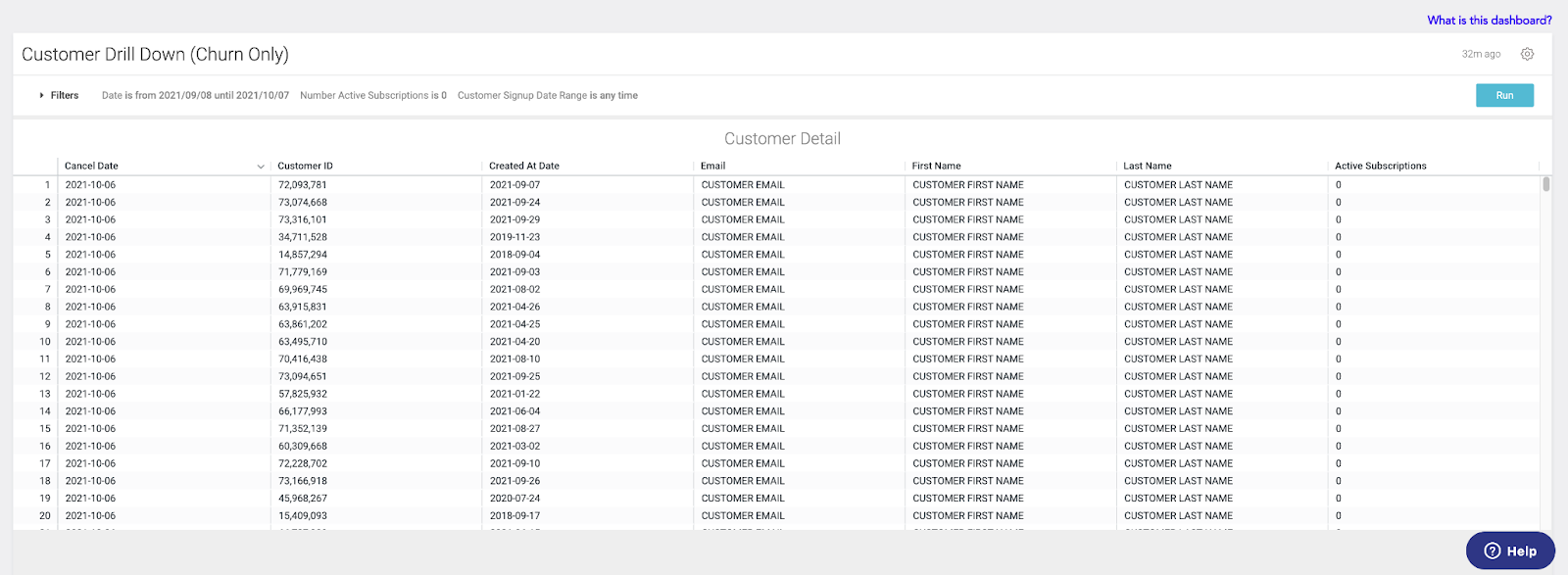
In addition to the overview metrics, you can also drill down by clicking on any of the metrics themselves. This will reveal more granular data around these customers. To export this data directly from Recharge, click the gear icon at the top-right of the table seen below.
While gathering high-level insights on your subscription revenue is very useful as a north star of your data analysis, you can also view more granular data at the subscription-level of your store. Seen in the screenshots below are the eight main metrics of this section:
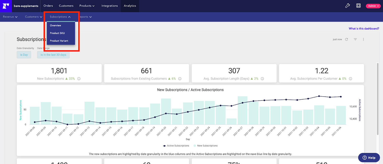

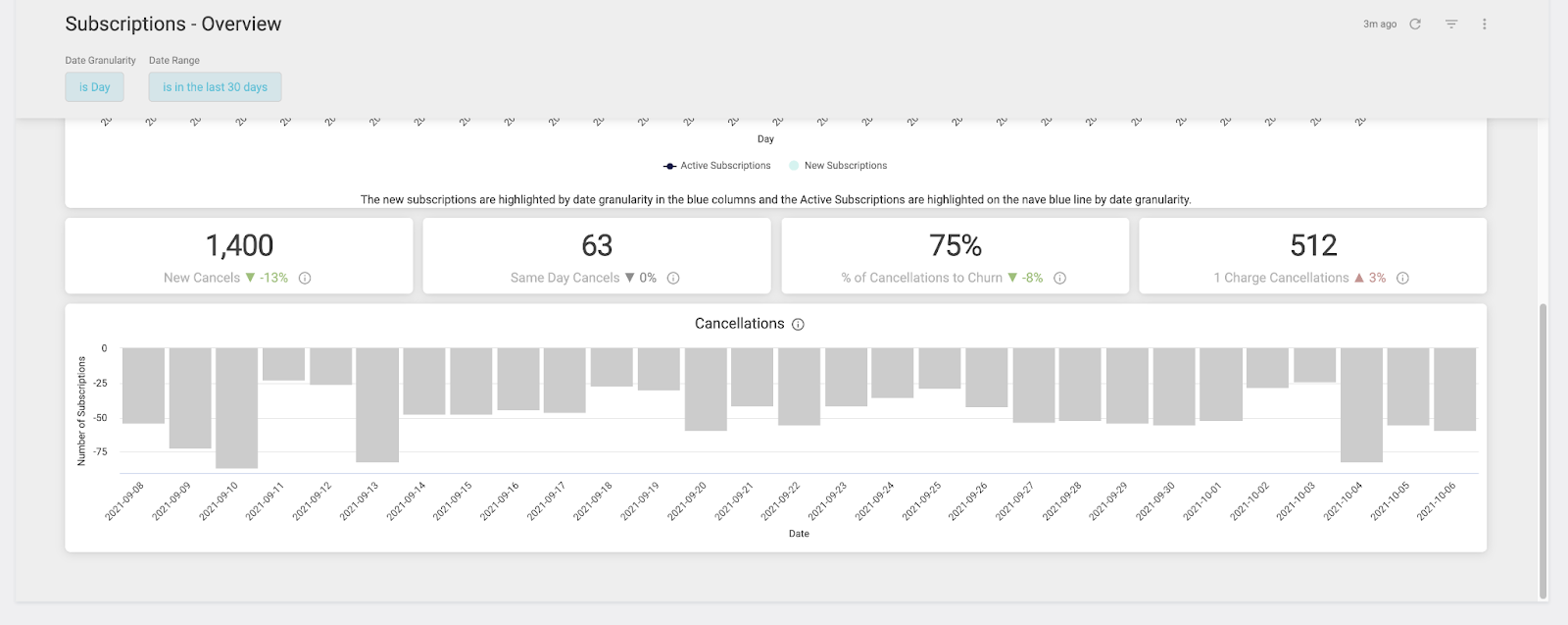
The data in the cancellation section of this dashboard (seen above) is crucial for positioning your BFCM discounting and promo strategies. Why? It minimizes the dreaded “subscribe just for the discount and cancel” strategy that more savvy, less loyal customers use—especially during promotions.
Now that we’ve explored the best dashboards to finish up your BFCM preparation, let’s dive into the insights that can help your business confidently monitor your holiday KPIs, as well as potentially inform any last-minute adjustments needed to crush your seasonal goals!
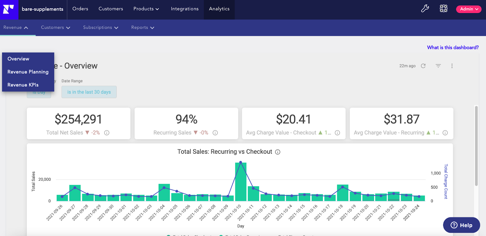
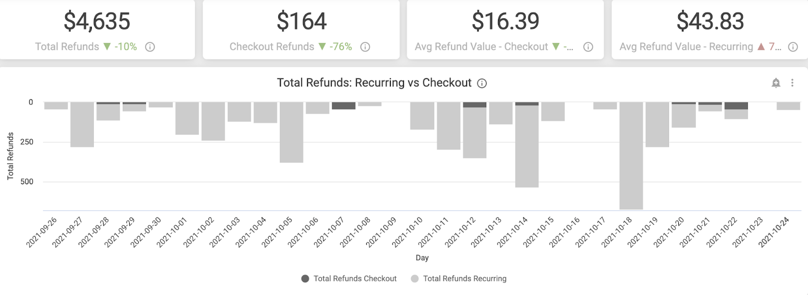
The Revenue trends dashboard is a perfect place to view your high-level revenue metrics in one place. Below are the main tiles you’ll see on this dashboard and how to interpret them:
Overall, this dashboard is great for getting your revenue KPIs at a quick glance. You will be able to better understand your short-term and long-term trends leading up to the holiday season to understand where your business can benefit from the most for your BFCM sale outside of total sales.
It also allows you to better understand the breakdown of recurring sales versus initial subscription checkouts, as well as baseline your average checkout charge and average recurring charge amounts to understand your subscription AOV. Finally, you can use this dashboard to compare KPIs over different date ranges (e.g. week-over-week, month-over-month, or custom).
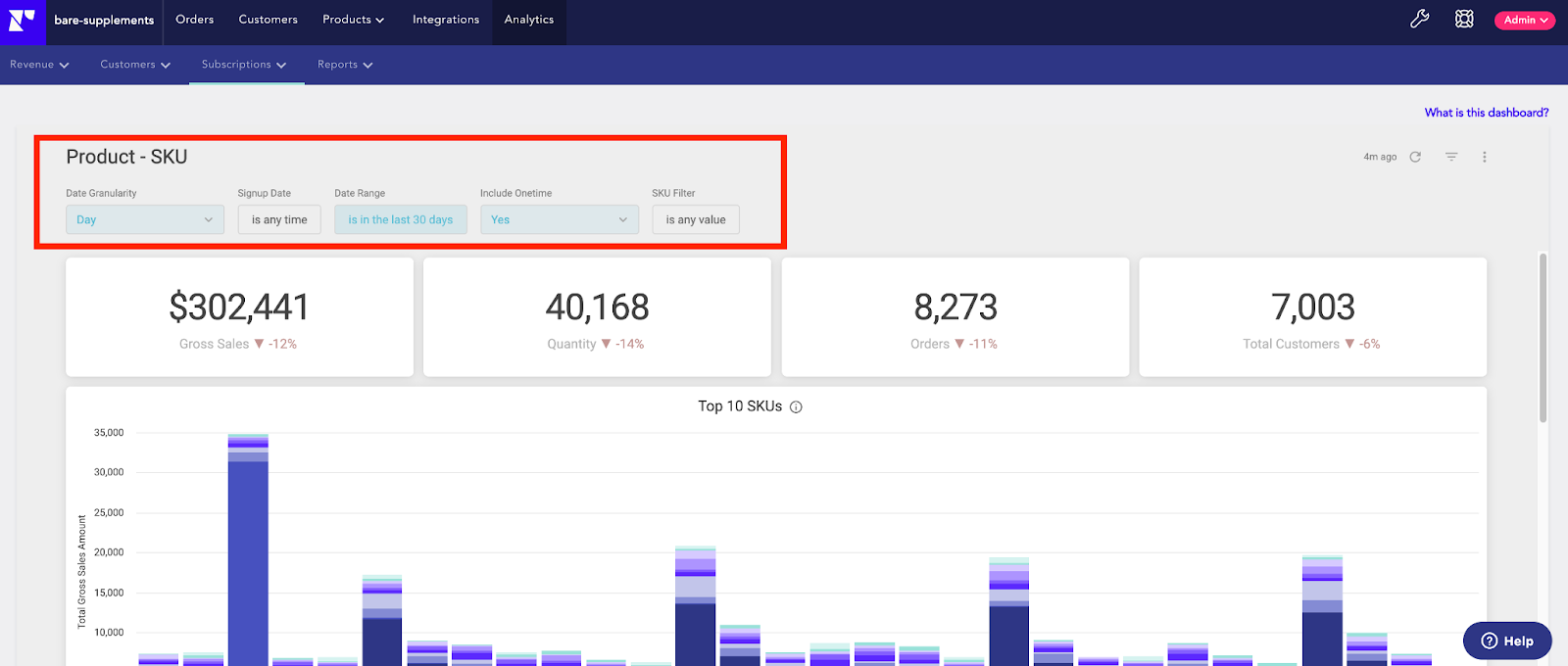
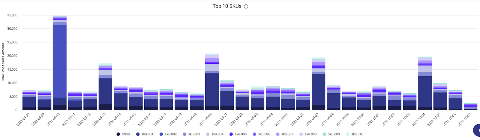
The Product SKU dashboard is a great dashboard for identifying your top-performing SKUs during BFCM. You can see, at a glance, your top-grossing products in subscriptions.
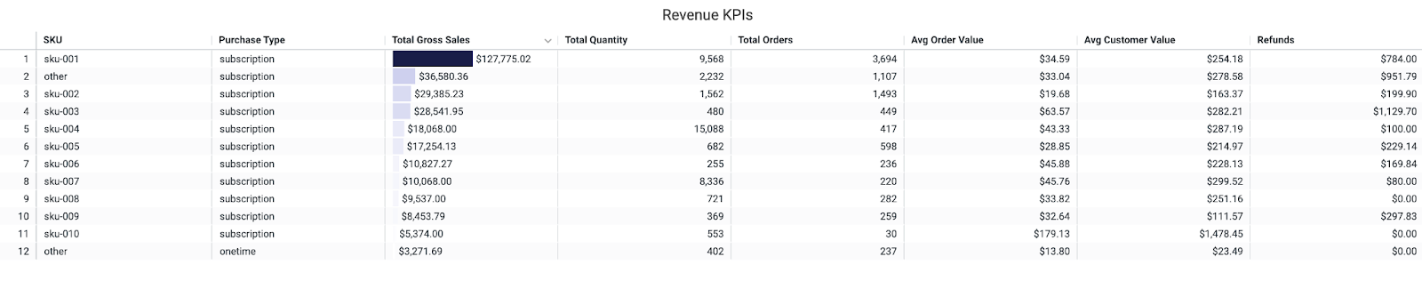
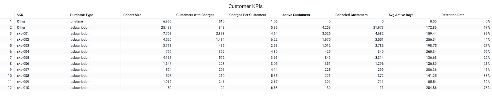
There are two tables drilling down into your top-performing SKUs, with KPIs for revenue (gross sales, % of sales from recurring orders, quantity, orders, AOV, and refunds) and customers (active customers subscribed to specific SKUs, cancelled customers, and percentage of customers cancelled in a selected time period, as well as average customer value).
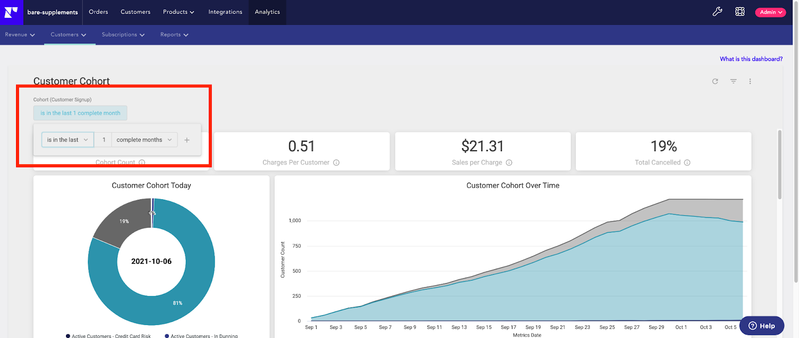
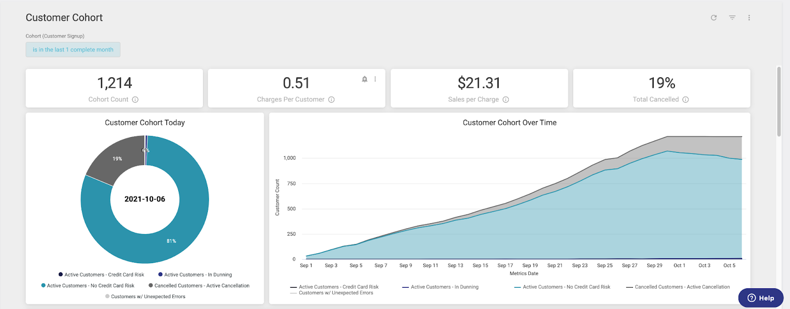
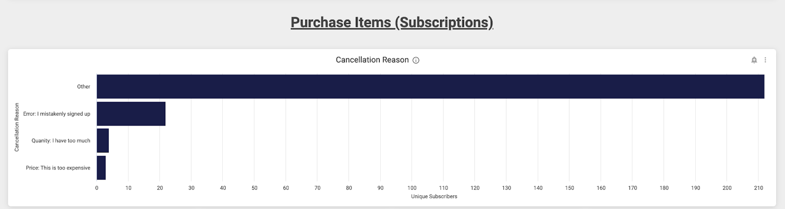
This dashboard allows you to analyze specific cohorts outside of a monthly view (ie. Black Friday to Cyber Monday). Subscription cancellation reasons are shown in this dashboard based on the date range selected. This can inform how you analyze the actions customers are taking on their subscriptions during specific periods of time.
This dashboard is exactly what it sounds like. It allows you to see what types of actions are being taken on your subscriptions by source. You can easily filter by sources, such as ‘customer,’ ‘store admin,’ ‘Recharge admin,’ ‘AP,I’ and even ‘Quick actions’ and ‘Recharge SMS.’
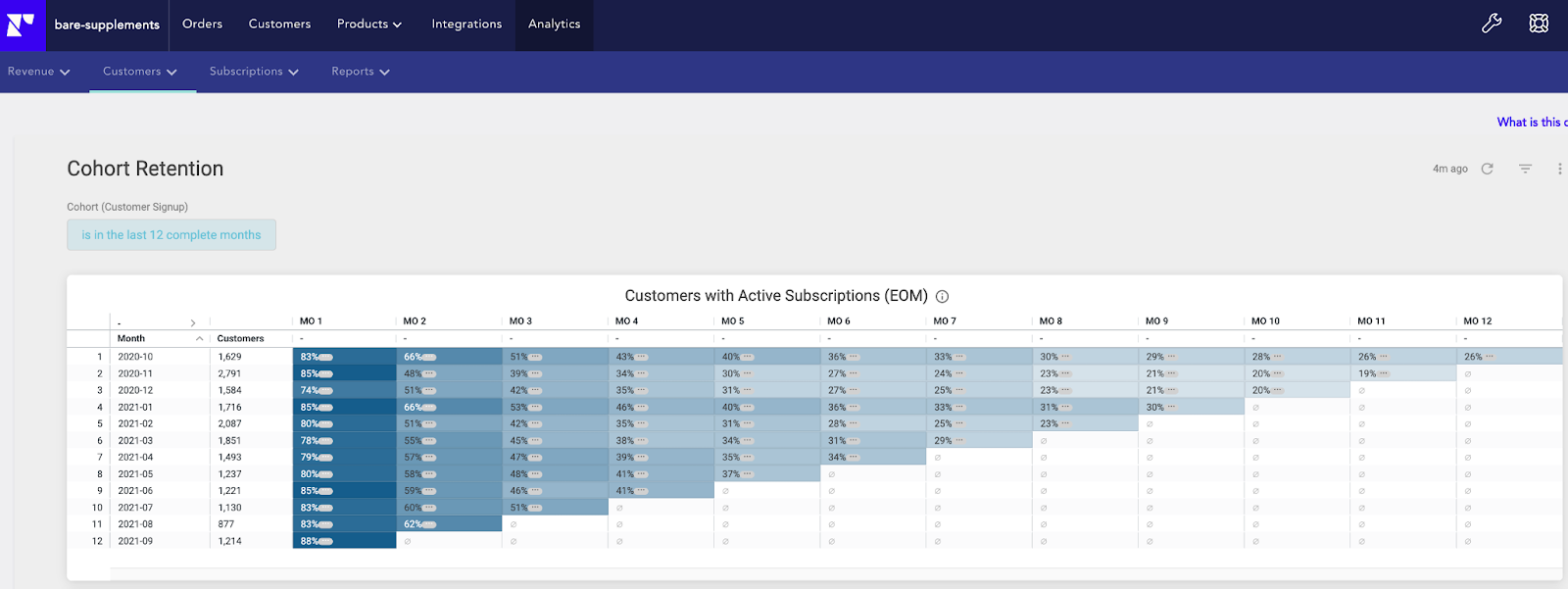
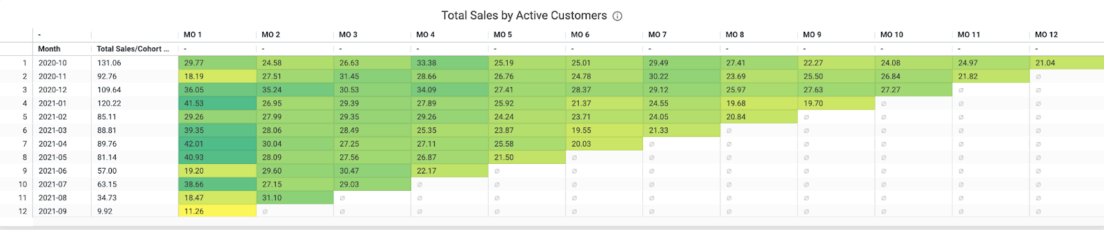

One of my absolute favorite dashboards for analysis any time of the year is the Cohort retention dashboard, because it allows you to do three types of analysis (in monthly view) in one visualization:

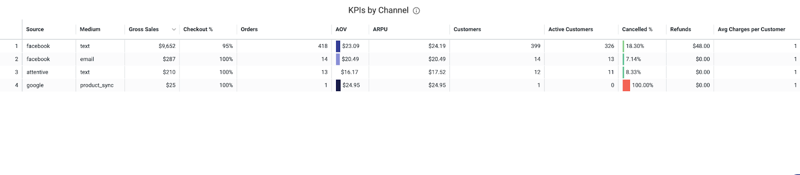
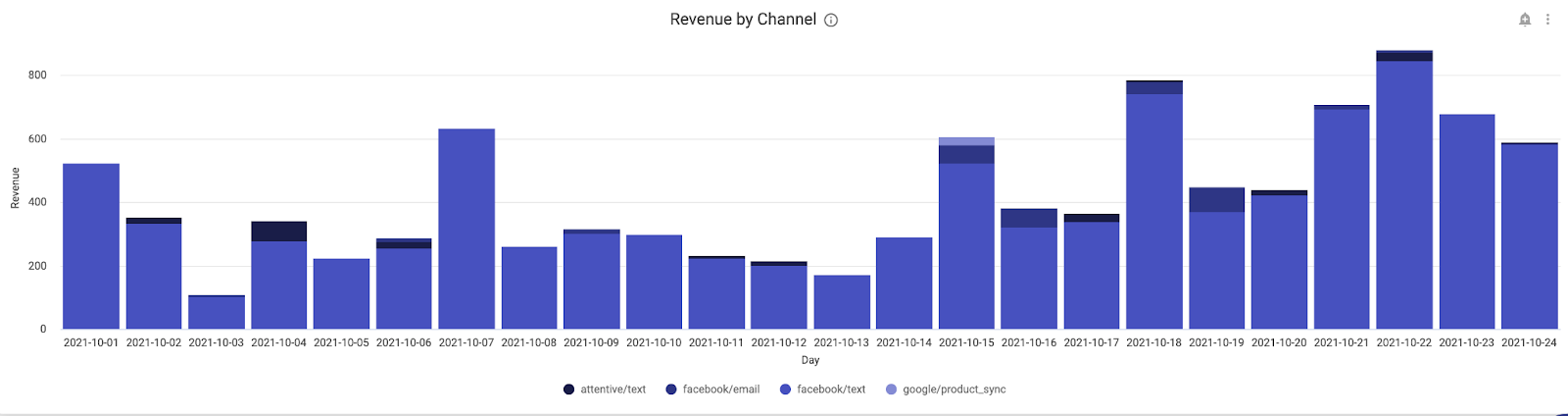
If you are utilizing Recharge’s UTM tracking feature, you can gather performance data by media source, much like you would in Google Analytics. This allows you to track the effectiveness of your marketing campaigns geared toward an ecommerce event or subscriber/subscription acquisition!
If you don’t have UTM set up in Recharge, consult our support page and blog post on UTM parameters, and reach out to Recharge support if you have any questions. If you’re not sure whether you have this enabled or not, you can verify by going to the ‘Analytics’ tab in your Recharge admin, and clicking the ‘Reports’ sub-navigation tab. From there, click ‘Media Attribution’ in the dropdown menu. If you see data populated, you’re already using the feature! If not, you will see a helpful landing page directing you to set up this feature, if you wish.
In addition to analyzing your different marketing channels’ acquisition effectiveness, you can also monitor their value over time, as you can review each channel to see which had the best retention and which had the highest customer value overtime. Just because a campaign is getting you the most signups doesn’t necessarily mean it’s getting you the most value. Know for sure with the media attribution dashboard!
As you can see, there are a seemingly endless number of ways to compile, aggregate, and transform your Recharge data. With this overview, we hope you’re excited to dive into our dashboards and start analyzing.
Of course, data analysis can be daunting at first and arduous at times, but remember that Recharge has many avenues of support and documentation to help answer any questions you might have. If written resources aren’t really your thing and you’d prefer live interactive assistance, our Analytics Team hosts a weekly webinar at no additional cost!
Finally, never hesitate to reach out to Recharge support for any of your analytics questions or needs. There are no bad questions, and every question you ask is a step toward truly owning your customer data and becoming a wizard at data analysis and actionable insights. This is true for any time of year, but with arguably the most important time of the year coming for ecommerce merchants, it’s never too early to master your Recharge data.
Happy holidays!