

We live in an incredible world. We can pull a device out of our pockets and go on the internet to find information that we need. People can even check their emails through their phones, allowing them to easily contact others throughout the day. However, some companies forget to format their emails to work with phones and other devices.
If your company struggles to send well-formatted emails to different types of devices, then you can use responsive emails to overcome this problem. This will help you to increase sales for your company as you create emails that adapt to the devices of your subscribers.
We’re here to teach you about responsive emails and how to use them effectively to benefit your business. Carry on reading this responsive email quick guide.
Some people may wonder “what is a responsive email?” This isn’t the most common term, but it’s something that businesses should use. A responsive email is when you set up your emails to adjust themselves according to the device a person reads it with. For example, you can have it display correctly on a phone and on a computer. This also includes computers with different monitor sizes.
This means that responsive emails adjust their format and size based on the screen that a person uses. It tackles these different issues and provides your business flexibility to reach out to other platforms. These changes can also build up customers’ trust in your omnichannel marketing since they see that you can work effectively through different channels.
Some may wonder why they should use responsive emails. After all, do people really care about how an email displays on their device?
You may be surprised to learn that the way your email displays could affect customers’ perception of your business. If you don’t take the time to adjust them correctly, people will feel like your business is lazy or careless for overlooking the details. When you focus on details and make things correct, you leave strong impressions on your customers.
When you demonstrate these qualities to your customers, they begin to feel loyalty towards your company. They want to support a business that pays attention to the fine details, cares, and wants to provide an excellent experience. As you create responsive emails, you can make sure that you show these qualities to your customers.
To further support using responsive emails, let’s look at some statistics.
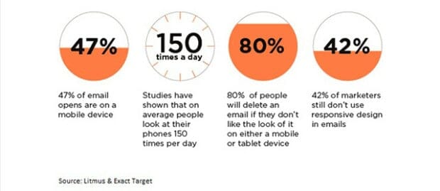
With so many people checking their emails through mobile devices, you should keep them in mind whenever you send out emails.
After all, if you don’t make it look good on their phone, then four out of every five people will delete the email. Not only that, but you will have an advantage over 42 percent of your competition by using responsive emails.
While these are just a few statistics, keep in mind that you can access multiple statistics that further support responsive emails. It allows you to make money, reach more customers, and continue to adapt your email marketing strategy to your customers and their needs.
As you use responsive emails, you can appeal to more users and turn them into customers.
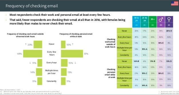
While many people access their emails through computers and their phones, you do need to think about different devices they can use to access emails. Today’s technology provides people with so many ways to access the internet, so knowing about those devices can make a difference in your responsive email.
By looking at the left side of the image above, we can see that people mostly use smartphones and desktops/laptops to check their emails. However, one-fifth of users also use a tablet and a small percentage use their smartwatches. This involves many screen sizes and ways to view a device since desktops, phones, and tablets will vary.
For example, if you adjust your email to only fit mobile devices, then it will appear too small for other users. You need to consider how it displays on other devices and how to approach it. Many people struggle with this. Keep in mind that you have a solution to this problem: responsive emails.
By using responsive emails, you can overcome these problems that businesses face in their email campaigns. It will take effort and work to accomplish, but having the email display correctly for your users will make the effort worth it.
As you consider a responsive email template, you need to consider the different ways that emails display. While this includes screen size, you also need to consider different email websites and apps. Some may support responsive emails, but others won’t. Make sure to do the proper research to find out which apps or websites will support your responsive emails.
You can use different email designs to adjust your emails for your subscribers. Companies can use these three email designs.
1. Scalable
2. Fluid
3. Responsive
Scalable keeps things simple and easy. You create a single column for your emails and you have the size of the column change depending on the device that a person uses when they look at it. It provides the simplest fix, but it doesn’t give you enough variety to make your emails stand out from competitors.
A fluid approach has your emails adjust the size based on percentages. This means that the images and buttons in your email will adjust by a percentage based on the size of the screen. However, this approach makes it so that some people may have empty whitespace on the sides of the emails.
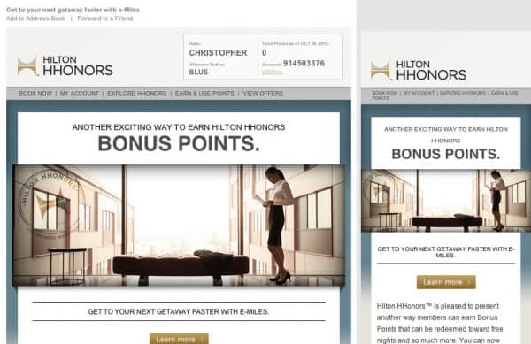
With responsiveness, you have the best options available. You set it up so that it displays the email in a specific way based on the device that the subscriber uses. In the above example, people on a desktop get a different view than those using a mobile device. However, the style and information stays consistent.
While it requires more work, responsive emails give you the most flexibility and freedom with your email design.
Responsive emails require setting up and using Hypertext Markup Language (HTML) and Cascading Style Sheets (CSS). This means that you need to use these computer languages to let the browser know what to do with your emails.
This involves telling it what to do when it comes across different screen sizes. For example, if someone uses a mobile device, you can use HTML and CSS to make the display zoomed in and adjusted for the screen.
Some people may not know how to use HTML and CSS for their responsive emails, and that’s fine. You can always get an employee to do it, hire a freelancer to help you, or you can use software that handles responsive emails. It comes down to your confidence in coding and if you have someone on your team that can do it.
You also need to consider the best practices for responsive email design.
Whenever you create responsive emails, you need to look at your demographics. Find out what types of devices your subscribers use so that you can create responsive emails for them. Consider the most and least used devices so that you can cover as many options as possible.
You should have people test your emails. Send emails to them and have each person open your email on different devices to make sure that it displays correctly. If not, then make changes to the HTML and CSS based on the feedback that you receive.
Most importantly, always make changes to your responsive emails with your subscribers in mind. Your subscribers affect your email marketing metrics, so you want to keep them happy. If you make a change, do so in a way that will benefit subscribers.
Even when you finish setting up your responsive emails, you need to find out how your subscribers feel about your email campaign. We suggest getting customer feedback through data and surveys.
You should reach out to customers with surveys. After you send out the emails, ask them about their experiences so that you can see what you need to change. This will point you in the right direction.
Asking questions can help you to know what areas of your responsive emails you can improve on. For example, do subscribers face display issues or do they not like the email’s design? Keep these questions in mind so that you can create effective surveys that will help you improve your responsive emails.
Make sure to listen to customers: you can apply their feedback and provide them with excellent email displays so that they will form a positive opinion of your business.
As you develop responsive emails for your business, you can use them to fit the different formats and displays of apps, email websites, and devices. After all, you want to make strong impressions on your email subscribers. Creating effective emails with nice designs and correct displays will help you to accomplish that.
Keep in mind that you should adjust your responsive emails as needed. Adapting remains a strong part of the business world. Continue to adapt your business to the needs and wants of your customers and you will make them happy. As you use responsive emails, you can make sure that your emails display correctly and reach more of your customers.
This article was originally published by our friends at Omnisend.

