Retail inventory problems never come one at a time. The same business can be short of inventory in the South on a fast moving item and have too much slow moving stock elsewhere. A supplier can appear acceptable overall, even when one SKU is exposed to long lead times. And a markdown can improve sell-through, while quietly weakening margin if the team is applying it to the wrong products.
This is why effective retail analytics consulting should never start with one stock on hand number. The question is: Do you have inventory where the demand is? Is that inventory moving at the right velocity? Can replenishment fill the gap? What should be the first course of action?
The company in this example is Crestline Retail Group, a fictional multi-store lifestyle omnichannel retailer using Shopify for ecommerce alongside 24 stores across four U.S. regions.
The analysis combines ecommerce and store demand with inventory, supplier, and replenishment data to show where stock is available, where customer demand is going unfulfilled, and where the next shortage is likely to emerge.
It sells footwear, apparel, backpacks, beauty products, consumer electronics, small home appliances and reusable drinkware. The dashboard uses 24 months of historical sales and demand, an inventory snapshot as at 31 August 2026, SKU lifecycle measures, qualified supplier data and an eight-week forward replenishment plan. The scenario is entirely synthetic and contains no customer PII, but the operating questions are deliberately realistic: availability, inventory productivity, supplier reliability and forward shortage risk have to be read together.
Figure 1: Executive Inventory & Availability
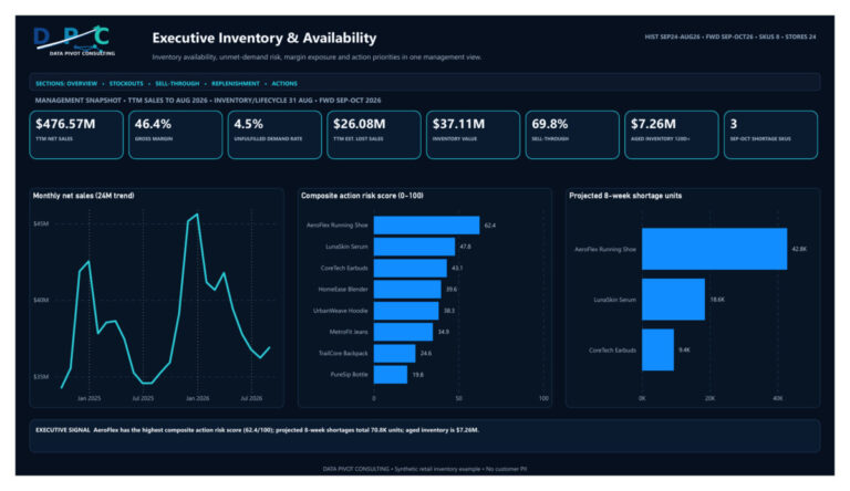
One metric on Figure 1 needs to be explained before the rest of the page is read: the Composite Action Risk Score. In this evidence pack, ActionRiskScore is a synthetic 0-100 value preassigned upstream and stored one row per SKU in sku action scoring.csv. The same source row carries the evidence used to interpret the ranking: stockout store-days, on-hand units, aged and total inventory value, fill rate, forecast error, markdown rate, sell-through and weeks of supply. Power BI does not rebuild the composite from those fields; the report measure simply retrieves the stored SKU value with MAX(‘sku action scoring'[ActionRiskScore]). AeroFlex therefore displays the source value of 62.4.
The current synthetic pack does not preserve the upstream component weights, normalization method or thresholds that produced the 0-100 score, so I would not invent a formula after the fact. In a production implementation, those weights and thresholds should be part of the scoring specification so managers can reproduce and challenge the result. Here the score is only a prioritization signal for deciding which SKU to discuss first; it is not a financial KPI or an automated decision.
Resource Toolkit
Want to make this yourself? The supporting resource pack for this example includes the finished Power BI retail dashboard, exported dashboard PDF, nine synthetic source CSV documents, and validation material used to reconcile the model. The report is 5 pages including executive inventory, stockouts, sell-through and aging, supplier performance and management actions.
We have deliberately not made the executive page a “more charts is better” page. It answers a short list of management questions.
First, is demand turning into fulfilled sales? Net sales of $476.57 million and gross margin of 46.4% were achieved during the twelve months ended August 2026 for Crestline Retail Group. Demand fill rate is 95.5%. Sounds great until you think about the inverse. 4.5% of demand was not fulfilled. This represents 333.8K units that customers wanted but couldn’t get, out of 7.5 million units in demand.
Second, what does the availability gap mean from a business perspective? The model puts TTM lost-sales exposure at $26.08 million. AeroFlex Running Shoe alone accounts for $9.85 million of that exposure. So I would consider that number as an estimate of exposure, not booked lost revenue. The measure takes the positive unmet units at the observed net sales per fulfilled unit rate in that same monthly row. It helps with prioritization but it’s not a finance forecast and should not be presented as revenue that the business is guaranteed to recover.
Third, is the inventory base productive? The snapshot as of 31 August shows inventory of $37.11 million. 69.8% sell-through. 19.6% of the inventory value or $7.26 million is 120 days or more aged. Three SKUs are above the dashboard’s markdown candidate threshold representing $23.72M in inventory.
And last but not least, where is the next risk brewing? The eight week plan shows a projected shortage of 70.8K units on 3 SKUs. AeroFlex is short 42.8K, LunaSkin Serum is down 18.6K and CoreTech Earbuds is down 9.4K. It changes the conversation from “what was backordered?” to “what is likely to be constrained next, and do we still have time to intervene?”
An earlier Data Pivot retail analytics article titled “Power BI Consulting for Retail: Sales, Inventory & Store Data Analytics” looked more broadly at sales, store and inventory performance. This report narrows the lens. It is about the operating tension between availability, working capital, supplier reliability and markdown decisions, rather than treating inventory as one KPI at the end of a sales report.
The model uses nine tables and ten one-direction relationships. SKU, store and region are dimensions; the analytical tables keep the grain of the decision they answer instead of flattening everything into one export. Monthly sales sits at SKU-region-month grain, while inventory and lifecycle are point-in-time SKU-store snapshots.
The row counts make the boundaries easy to audit: 768 monthly sales rows, 192 inventory rows, 192 lifecycle rows, 64 SKU-week forward-plan rows, 13 qualified supplier-SKU lines and eight action-scoring rows. Those controls are more useful here than a long modeling walkthrough because they quickly reveal a missing store-SKU snapshot, an unexpected supplier line or a broken key before anyone debates a dashboard value.
This becomes even more important for brands selling through multiple channels. Ecommerce Fastlane’s discussion of connected multichannel inventory shows how disconnected Shopify, Amazon, wholesale, and social-commerce systems can create overselling, underselling, and an unreliable view of available stock.
At the broader project level, Data Analytics Consulting is relevant before the report layer: source alignment, KPI definitions and validation have to be reliable first. The model follows Microsoft’s Power BI star-schema guidance, while Power Query handles deterministic source preparation and data types. That is enough technical detail for this article; the rest of the discussion stays with the inventory decisions.
The semantic model contains 58 explicit measures, but the logic is easier to understand if it is grouped by decision.
TTM Net Sales uses the latest month in context and evaluates the preceding twelve months. Gross margin is rebuilt from TTM net sales and TTM COGS rather than averaging row-level percentages. Demand fill rate is TTM fulfilled units divided by TTM demand units; unfulfilled demand rate is simply one minus that result.
That pattern matters. Ratios should usually be rebuilt from their numerators and denominators at the current filter context rather than averaged from pre-calculated percentages. Otherwise a small SKU or store can receive the same influence as a much larger one.
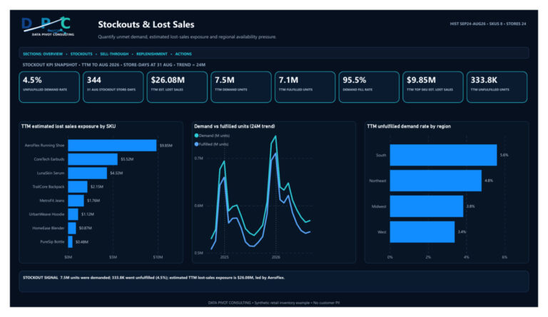
Figure 2: Stockouts & Lost Sales
The stockout page starts with a distinction that is easy to miss: a stockout event and unfulfilled demand are related, but they are not the same measure.
The dashboard shows 344 stockout store-days as at 31 August. That tells an ops team how widespread the availability issue is across locations. The TTM demand measures tell a different story. 7.5 million units were demanded. 7.1 million were fulfilled. 333.8K were not. This leads to a 95.5% fill rate and a 4.5% unfulfilled-demand rate that aren’t simply about the shelves, but are about customer service.
Not all unmet demand has to disappear without a trace. For Shopify retailers, back-in-stock alerts and waitlist data can capture customer interest and provide an additional signal for deciding which products should be replenished first.
Then there’s the regional comparison. South has a 5.6% unfulfilled-demand rate, Northeast 4.8%, Midwest 3.8% and West 3.4%. If the portfolio average were the only number on the page, the South would be buried in it. That’s one of the reasons why a management dashboard should move quickly from a headline KPI to a diagnostic dimension.
Then the lost-sales estimate ranks the SKU’s exposure. AeroFlex is highest at $9.85 million, then CoreTech Earbuds at $5.52 million and LunaSkin Serum at $4.32 million. The others are very small. That focus is useful because you don’t want eight equal priorities for an availability team. It has to know where intervention can credibly have most impact.
There is also a modeling lesson here. The lost-sales measure is not `Unfulfilled Units × a single average selling price`. It calculates positive unfulfilled units row by row and multiplies them by net sales divided by fulfilled units for that row, then sums the result over the TTM window. That keeps the value estimate closer to the sales economics of the SKU-region-month where the shortage occurred.
I would still call it out clearly as “estimated lost sales exposure”, like this dashboard does. I use the estimate to rank where availability pressure is most expensive, not to claim that every unfulfilled unit would have converted into recoverable revenue. Some customers switch products, buy later, visit another store or abandon the purchase. The measure helps prioritize intervention; it is not a booked-revenue forecast.
For a weekly operating meeting, I would use this page to ask 3 questions: What regions are above the service threshold? What SKUs are leading to the most value exposure? And is demand increasing at a faster rate than units filled during the same period? Those three questions typically lead to a more meaningful conversation than simply asking why a shelf was empty yesterday.
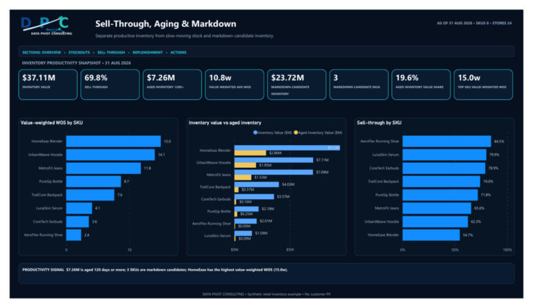
Figure 3: Sell-Through, Aging & Markdown
Too much inventory and too little inventory can exist at the same time. In fact, that is often the real problem.
The sell-through page makes the contradiction visible. The value of inventories is $37.11 million, of which $7.26 million is 120 days or older. The highest value-weighted weeks of supply is HomeEase Blender at 15.0 weeks, followed by UrbanWeave Hoodie at 14.1 and MetroFit Jeans at 11.8. AeroFlex has only 2.4 weeks of supply at the other end and carries the largest projected shortage on the forward plan.
That is a useful management contrast. The business does not have an abstract “inventory problem.” It has excess in some SKUs and availability pressure in others.
Sell-through is calculated as units sold divided by beginning units from the lifecycle table. The portfolio result is 69.8%, but SKU results range from 84.5% for AeroFlex to 54.7% for HomeEase. I would not use that percentage alone to trigger markdowns. A slower sell-through can be acceptable for a long-life or strategically stocked item, while a high sell-through SKU may still be at risk if replenishment is too slow.
Thus, weeks of supply adds a second perspective. The dashboard has an average WOS value weighted by inventory value – a major feature. This means that a low value SKU with a large number of weeks will have less impact on the portfolio result than a high value holding. The report states that weighting directly rather than leaving users to assume a simple average.
Also explicit is the markdown-candidate rule: A SKU is a candidate if its average weeks of supply is greater than 10. That rule applies to three SKUs, with total inventory of $23.72 million. The operative word is “candidate”. It’s a queue to review, not an automatic instruction to discount.
Merchandising should still ask the question why the stock is high before changing price. Was this a bad forecast? Did the promo miss? Was there a large receipt before it was due? Is the product seasonal? Is it possible to move inventory between stores?
For omnichannel retailers, ship-to-customer fulfilment provides another option: a store can complete the sale and fulfil the order from a warehouse or another location that has the product available.
Figure 4: Replenishment & Supplier Performance
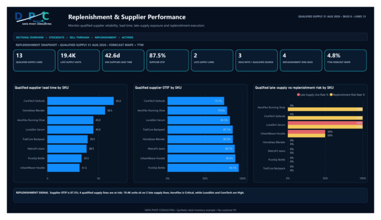
Supplier metrics become much more useful when the grain is explicit. This page operates on 13 qualified supplier-SKU lines, not on purchase-order transactions and not on a list of every possible contingency source.
The portfolio supplier OTIF is 87.5%. Average lead time is 42.6 days. Two qualified supply lines are late, representing 19.4K late-supply units, while four SKUs are classified as replenishment risks. Three SKUs have only one qualified source.
These numbers immediately raise further questions. OTIF – On Time In Full – measures whether a supplier delivers on time and in full. Lead time asks how long replenishment takes. Single-source exposure begs the question: Should that source fail, does the business have a viable alternative? None of these three should be interchanged with each other.
The SKU detail explains why. CoreTech has the longest qualified supplier lead time of 65 days and the lowest OTIF of 75.7 percent. AeroFlex is at 45 days and 79.6% OTIF, but it’s the only Critical supply SKU because its risk isn’t just a supplier score; it’s also inside the broader inventory and forward-shortage picture. LunaSkin and CoreTech are High risk and the other products are Watch or Healthy.
Worth calling out one subtle detail of the modeling. The current WOS on the risk-tier chart is calculated at distinct-SKU grain first and then averaged across the tier. This ensures a multi-source SKU is not overweighted simply because it has more supplier lines. Target WOS is based on average supplier lead time in weeks + 1.5 weeks buffer. The exact buffer is a scenario assumption, not a universal retail rule, but it is much better to be explicit about it than to embed a target that nobody can explain.
The eight-week forward plan then links supply conditions to expected demand. Only three SKUs show positive shortage units, so zero-shortage categories are suppressed rather than filling the visual with meaningless zero labels. AeroFlex, LunaSkin and CoreTech account for all 70.8K projected shortage units.
That is the point where supplier reporting becomes operational. Instead of saying “OTIF is 87.5%,” the team can say, “AeroFlex is Critical, has 7.9 weeks of supply, a 42.8K projected shortage and only the current qualified supply options shown in the model. What action can change the next eight weeks?”
Figure 5: Management Actions & Markdown Decisions
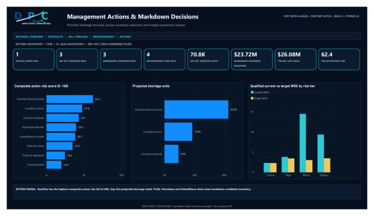
The final page brings the competing signals into one queue. There is one Critical supply SKU, three projected-shortage SKUs, three markdown candidates and four replenishment-risk SKUs. Those groups overlap, but they are not identical.
The most obvious shortage-recovery priority is AeroFlex. Its composite action-risk score of 62.4 out of 100 is the highest in the sample. It also has the largest forward shortfall and largest estimated TTM lost-sales exposure. HomeEase and UrbanWeave are on the other side of the inventory problem; they drive much of the markdown-candidate inventory because their weeks of supply are high.
Because the score is a synthetic prioritization value rather than a financial KPI, I would read it alongside forward shortage, lost-sales exposure, weeks of supply and supplier risk rather than let the 0-100 ranking make the decision on its own.
A simple weekly routine may be practical. Begin with the three SKUs that are forecasted to be short. Find out if supplier, transfer, allocation or purchase-order actions can close the gap. Then evaluate the three markdown candidates and determine if it’s truly a pricing issue, or if redistribution and merchandising changes need to be made first. Finally, review the Watch and Healthy levels for an early warning of drift so the next shortage does not come as a surprise.
The dashboard should also be reconciled before the meeting, not during it. I would validate demand and fulfilled units back to the source, tie inventory value and aged value to the 31 August snapshot, confirm that the supplier page contains only qualified supply lines, and make sure the forward-plan horizon still covers the intended eight weeks. If those controls are automated, the management conversation can stay focused on decisions rather than on whether the numbers are trustworthy.
The broader point is that retail inventory analytics works best when it refuses to reduce everything to “stock level.” Availability, sell-through, aging, supplier reliability and forward demand are different questions. They need different facts, different time grains and different measures, but they should still meet in one management workflow.
For retailers turning this from a one-off report into a governed operating process, Power BI Consulting can help formalize refresh controls, measure ownership and the handoff from dashboard diagnostics to weekly action.
That is where Power BI consulting for retail adds the most value. Not because it can place five pages of charts on a screen, but because it can connect a historical demand signal, a current inventory position and a forward supply risk without losing the business meaning of each one. When that structure is right, the dashboard stops being a report about inventory and becomes a way to decide what to replenish, what to protect, what to move and what to mark down.
Author Bio
Basem Fawzy is the founder of Data Pivot Consulting. He is a Microsoft Certified Power BI Developer and MBA graduate in E-Business with more than 10 years of experience in business intelligence, data modeling, dashboard development and reporting automation. He has worked with more than 200 clients and regularly translates operational data into management-level reporting frameworks.