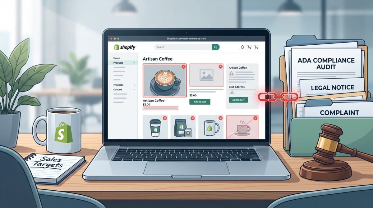
In the direct-to-consumer (DTC) e-commerce space, a quiet legal wave is hitting online stores. Over 3,100 federal lawsuits under Title III of the Americans with Disabilities Act (ADA)—and an estimated 5,000+ total cases when including state courts like New York and California—are filed each year.
According to digital accessibility research from UsableNet, over 70% to 77% of all website accessibility lawsuits specifically target e-commerce brands.
If you run a Shopify, WooCommerce, or BigCommerce store, your storefront is legally considered a “place of public accommodation.” Serial plaintiff law firms utilize automated web crawlers to scan thousands of e-commerce sites every hour. These bots parse your Document Object Model (DOM) code looking for technical violations of the Web Content Accessibility Guidelines (WCAG 2.1/2.2 Level AA).
When a crawler flags code errors, an automated legal demand letter follows—demanding $10,000 to $50,000+ in cash settlements and forced remediation.
Key Industry Insight: Smaller DTC merchants ($1M–$25M annual revenue) account for over 64% of all web accessibility lawsuits (UsableNet). You do not need to be a Fortune 500 company to be targeted.
This guide reveals the 5 most common code-level accessibility bugs lurking inside standard Shopify Liquid themes, explains why quick-fix widget overlays won’t protect you, and provides the exact code snippet fixes your development team can deploy today.
Most store owners believe their custom theme, premium developer, or high-converting app stack makes them immune to compliance issues. In reality, modern e-commerce feature sets—dynamic slide-out cart drawers, variant swatches, sticky add-to-cart bars, and email popups—frequently introduce severe accessibility barriers.
The lawsuit pipeline typically moves through three distinct phases:
When a plaintiff firm targets your site, the financial fallout extends far beyond a simple legal fee:
| Cost Factor | Average Financial Impact | Primary Cause |
|---|---|---|
| Out-of-Court Settlement | $10,000 – $35,000 | Pre-litigation demand letter resolution |
| Legal Defense Retainer | $7,500 – $20,000 | Specialized ADA defense counsel representation |
| Emergency Theme Remediation | $5,000 – $15,000 | Rushed code fixes on live Shopify templates |
| Lost Conversions / Downtime | Variable | Broken checkout flows introduced during quick-fixes |
Merchants can run an ada compliance for websites audit directly in their browser—no consultant needed—to identify high-risk WCAG violations before a demand letter arrives. Proactive compliance opens your store to the 16% of the global population living with a disability, representing over $490 billion in annual discretionary spending in the US alone.
When merchants first learn about accessibility risks, many fall into the “JavaScript Widget” or “Overlay” trap.
Accessibility overlays are third-party JavaScript snippets ($49 to $99/month) displaying a floating blue icon on your store. They promise to make your site compliant using automated AI adjustments without touching your theme code.
Why Overlays Fail in Court and in Practice
Crucial Takeaway: You cannot fix structural HTML bugs with a client-side JavaScript band-aid. True legal protection requires remediating source code.
Below are the five most common theme-level bugs found in Shopify stores, complete with code examples, screen reader impacts, and production-ready code fixes.
The Problem
Shopify themes often render color swatch thumbnails using CSS background images (background-image: url(…)) or raw image files without descriptive alternative text. When images render with empty alt=”” tags or text like alt=”product-image_1024x1024.jpg”, screen reader users miss critical visual context.
❌ Non-Compliant Shopify Liquid Code
HTML
<!– BAD: Using raw file handles or missing alt text on swatch selectors –>
<div class=”product-swatch” style=”background-image: url(‘{{ variant.image | img_url: ‘100x’ }}’);”></div>
<!– BAD: Generic alt text that offers no value –>
<img src=”{{ product.featured_image | img_url: ‘800x’ }}” alt=”Product Image”>
✅ Compliant Code Fix
HTML
<!– BAD: Using raw file handles or missing alt text on swatch selectors –>
<div class=”product-swatch” style=”background-image: url(‘{{ variant.image | img_url: ‘100x’ }}’);”></div>
<!– BAD: Generic alt text that offers no value –>
<img src=”{{ product.featured_image | img_url: ‘800x’ }}” alt=”Product Image”>
✅ Compliant Code Fix
HTML
<!– GOOD: Semantic button with descriptive ARIA label for variant swatches –>
<button type=”button” class=”product-swatch-btn” aria-label=”Select {{ variant.title }} color option for {{ product.title }}” aria-pressed=”{% if option.selected_value == variant.title %}true{% else %}false{% endif %}”>
<img src=”{{ variant.image | img_url: ‘100×100’, crop: ‘center’ }}” alt=”{{ product.title }} in {{ variant.title }}” width=”100″ height=”100″ loading=”lazy” />
</button>
The Problem
Modern DTC aesthetics often favor light pastel tones or subtle gray text. However, WCAG AA guidelines mandate a minimum visual contrast ratio of 4.5:1 for standard body text and 3:1 for large text and interactive UI component borders.
Common failure points include white text over light-pink “Sale” badges (#FFD1DC, 1.8:1 ratio) and light-gray placeholder text in newsletter forms.
❌ Non-Compliant CSS
CSS
/* BAD: Low contrast primary CTA button (2.8:1 ratio) */
.add-to-cart-btn {
background-color: #769ecb;
color: #ffffff;
}
/* BAD: Stripping focus indicator without alternative */
.add-to-cart-btn:focus {
outline: none;
}
✅ Compliant CSS
CSS
/* GOOD: High-contrast primary CTA passing 4.5:1 ratio (7.2:1 actual) */
.add-to-cart-btn {
background-color: #1a4b84;
color: #ffffff;
font-weight: 600;
padding: 12px 24px;
border-radius: 4px;
}
/* GOOD: Prominent focus indicator for keyboard users */
.add-to-cart-btn:focus-visible {
outline: 3px solid #000000;
outline-offset: 3px;
box-shadow: 0 0 0 2px #ffffff;
}
The Problem
Third-party popups (newsletter signups, discount bars) often rely solely on visual placeholder=”…” attributes instead of programmatically linked <label> tags. When placeholders disappear as a user types, screen readers lose context for what input is required.
❌ Non-Compliant HTML
HTML
<!– BAD: Missing <label> element –>
<div class=”newsletter-form”>
<input type=”email” name=”email” placeholder=”Enter your email for 15% off…”>
<button type=”submit”>Submit</button>
</div>
✅ Compliant HTML
HTML
<!– GOOD: Explicitly linked <label> with visually-hidden class –>
<form class=”newsletter-form” action=”/contact#contact_form” method=”post”>
<label for=”NewsletterEmailInput” class=”visually-hidden”>
Enter your email address to receive 15% off
</label>
<input type=”email” id=”NewsletterEmailInput” name=”contact[email]” placeholder=”Enter your email for 15% off…” aria-required=”true” autocomplete=”email” />
<button type=”submit”>Claim 15% Off</button>
</form>
<style>
.visually-hidden {
position: absolute !important;
width: 1px !important;
height: 1px !important;
padding: 0 !important;
margin: -1px !important;
overflow: hidden !important;
clip: rect(0, 0, 0, 0) !important;
white-space: nowrap !important;
border: 0 !important;
}
</style>
The Problem
Slide-out AJAX shopping carts are standard in modern e-commerce. However, when a customer clicks “Add to Cart” and the drawer glides open, theme JavaScript frequently fails to shift keyboard focus into the drawer.
Keyboard shoppers pressing Tab continue cycling through invisible background elements underneath the open drawer, making checkout impossible.
❌ Non-Compliant JavaScript Pattern
JavaScript
// BAD: Opening a slide cart drawer without focus management
function openCartDrawer() {
document.querySelector(‘.cart-drawer’).classList.add(‘is-active’);
}
✅ Compliant JavaScript Pattern
JavaScript
// GOOD: Accessible modal drawer script with focus management
function openCartDrawer() {
const drawer = document.querySelector(‘#CartDrawer’);
const closeBtn = drawer.querySelector(‘.cart-drawer-close-btn’);
const pageMainContent = document.querySelector(‘#MainContent’);
drawer.setAttribute(‘aria-hidden’, ‘false’);
drawer.classList.add(‘is-active’);
pageMainContent.setAttribute(‘aria-hidden’, ‘true’);
// Move focus into the modal once opened
setTimeout(() => {
closeBtn.focus();
}, 100);
document.addEventListener(‘keydown’, handleDrawerKeydown);
}
function handleDrawerKeydown(event) {
if (event.key === ‘Escape’) {
closeCartDrawer();
}
}
The Problem
Developers often select heading tags (<h1>, <h2>, <h3>) based on visual font size rather than semantic structure. Skipping levels (e.g., jumping from an <h1> hero straight to <h4> product titles) creates a fragmented tree for screen reader users navigating via heading hotkeys.
✅ Best Practice Heading Architecture
HTML
<!– Single H1 per template –>
<h1 class=”collection-title”>{{ collection.title }}</h1>
<section class=”product-grid”>
<h2 class=”visually-hidden”>Product Listing</h2>
{% for product in collection.products %}
<article class=”product-card”>
<h3 class=”product-card-title”>
<a href=”{{ product.url }}”>{{ product.title }}</a>
</h3>
<span class=”product-card-price”>{{ product.price | money }}</span>
</article>
{% endfor %}
</section>
Perform this quick 3-step audit on your store to catch obvious compliance gaps:
Remediating a store requires a structured 3-phase process:
Fixing web accessibility is far more than a legal defense strategy. Building an accessible storefront improves technical SEO structure, enhances mobile usability, decreases checkout drop-offs, and opens your brand to millions of underserved shoppers.
By replacing quick-fix widget overlays with clean, semantic HTML and proper DOM focus management, DTC merchants can protect their businesses from legal risk while delivering a superior shopping experience for everyone.