

Task models are a technique for recording user needs. In this article, I’ll demonstrate how task modeling has helped me convert user research insights into compelling ecommerce designs. I’ll describe what a task model is, with practical examples from the world of ecommerce. Then, I’ll look at the psychology behind task models and show why they matter so much when designing effective ecommerce sites. Finally, I’ll walk through the process of creating a task model.
What is a task model?
A task model is a diagram of the steps people go through, and the decisions they make along the way, to accomplish a specific task. Task models are one of my favorite design tools. It’s a bit of an odd thing to say about a diagram rather than an Adobe package or Sharpies-and-Post-its combo, but stay with me.
Like many UX activities, task modeling is all about capturing people’s understanding of the world. Task model diagrams document users’ decision-making processes, and are therefore particularly useful for ecommerce websites. They can capture how customers choose a supplier, then narrow down their buying options from a wide range of products. This helps us to align ecommerce store features with the needs of our client’s customers.
“Like many UX activities, task modeling is all about capturing people’s understanding of the world.”
How can understanding users’ task models help us design interfaces? Let’s look at early cash machines for an example. The first ATMs had a bit of a design flaw: people used to forget to take their cards out of the machine and walked away without them. Looking at it from a task modeling perspective, the user’s task at an ATM is to withdraw cash. With these first machines, users had to:
- Insert their card
- Enter their PIN
- Select an amount to withdraw
- Collect the cash
- Retrieve their card

If the user’s task is to withdraw cash, they’ve completed the task as soon as the cash is dispensed. And they walk away and forget to take their cards with them.
The solution? Swap the order, so that the user retrieves their card before collecting their cash. This way, the user feels that they have completed their task at the point at which the interaction is finished. No more cards left in the machine.
You might also like: Creating User Centered Flows in Ecommerce Design.
Task modeling example

Let’s look at an example from the world of ecommerce. The above diagram shows how customers of a traditional men’s shirtmaker go about buying a new shirt. It shows how the big task of choosing and buying a shirt is broken down into sub-tasks, and the order in which those sub-tasks happen. Here is the breakdown:
- Customers know at the outset what they need their new shirt for. Perhaps a smart work shirt to wear with a tie, or something more casual for the weekend.
- Fit and size are the next consideration: customers know their shirt size and whether they prefer a classic or slim fit.
- Then, customers either know how much they’re willing to pay for their shirt, or if they care more about getting the right color or pattern than they do about paying a higher price. If they care more about price first, they will consider color or pattern next, and vice versa.
- Finally, they consider the details of specific shirts. These details, such as cuff and collar type, button aesthetic, and fabric qualities have different levels of importance to different customers.
- When a customer is satisfied they’ve found a shirt matching all their criteria, they will make a purchase.
Task order and dependencies are shown in the diagram. People won’t be thinking about cuff or collar type until they’ve found shirts they like the appearance of in the right price range. Despite its simplicity, there’s a lot of knowledge about user needs embedded in this diagram.
Grow your business with the Shopify Partner Program
Whether you offer web design and development services or want to build apps for the Shopify App Store, the Shopify Partner Program will set you up for success. Join for free and access revenue share opportunities, developer preview environments, and educational resources.
When to use task models to record user needs
This shirt-buying example is relatively simple, but task models are especially effective for vendors selling products with complex purchase decisions, including big-ticket items or items with a potentially bewildering array of available options.
You can make clear improvements to your client’s ecommerce UX by thoroughly understanding their customers’ buying processes. I’ve found task models to be really useful in supporting holiday purchasing. Here, users are balancing multiple factors against each other, and knowing how to prioritize those factors is vital.
Consumer electronics is another area where task modeling is highly effective. Here, users are often trying to decide between a confusing range of features. Trade-offs between price and functionality may be unclear, especially to novice buyers. Basing the ecommerce flow on a strong understanding of user needs embodied in a task model helps users to make confident, informed purchase decisions.
Designing with task models
I describe task models as a design tool because there’s often a direct mapping between steps on a task model and pages or features on a website.
In our shirt buying model, men know at the outset what they want their new shirt for. So allow them to choose between formal and casual shirts right at the beginning of their journey, on the homepage, and in the main navigation.
Fit and size come next, and both of these factors are non-negotiable: customers won’t buy a shirt in the wrong size and often don’t want to see unsuitable products. So on a product listing page, such as “work shirts,” allow users to immediately filter by size and fit.
Next, customers consider price or color. Again, this can equate to filtering options on a product listing page. Here, you prioritize filtering by color and price over filtering by features like collar style that occur later in the decision-making process. This allows you to prioritize interfaces for your client that meet user needs by removing digital clutter.
Then we get down to the details: cuff and collar type, buttons, and fabrics. All of this can be outlined on the product page, in order to allow users to make decisions they are confident in.
“If you understand the way your client’s users already work, you can successfully fine-tune their ecommerce offering.”
The task model informs information architecture, product categories, sort and filter priorities, and product details—all the way from home page to purchase. If you understand the way your client’s users already work, you can successfully fine-tune their ecommerce offering. You can keep interfaces simple by prioritizing sort and filter options. You can be confident that you’re providing the right information on product pages to support the decision-making process of your client’s users.

The shirt-buying task model represents a relatively simple purchase process. What about more complex decision-making? I have used much more complex task models to represent holiday purchases, and again they have helped with design decisions.

As with the shirt example, the factors earliest in users’ decision-making processes were mapped onto navigation and sort and filter options. The complex set of variables around choosing a specific package from a range was integrated directly onto content for product pages. But other details were crucial to the design too. For example, we learned how users decided between self-organizing trips and buying a package holiday. Thus, we were able to prioritize messaging and features that emphasized the benefits of package holidays that mattered most to users.
Even vendors who are very familiar with their customers’ needs will likely discover new information through task modeling. For example, one client of mine learned that people buying their products as gifts had very different decision-making processes to those buying for personal use. Gifters were much more concerned with making an uncontroversial, safe choice than those buying for themselves. This immediately got everyone thinking about how to better support the gift buying process.
You might also like: 22 Basic UX Laws That Every Designer Should Know.
Why are task models so useful?
This amazing, interesting UX work got me wondering: why are task models so useful? What’s going on from a design psychology perspective? I’m not a psychologist, but I’ve come across a few concepts that I think help explain things.
1. The curse of knowledge
First up, experts notoriously can’t remember what it’s like to be a novice. This is a cognitive bias called the curse of knowledge. It’s why it’s so hard for experts to explain their subject to non-experts. Vendors are experts in their own products, so prioritizing information for their novice customers is tricky. A task model is super useful in this context—it helps remind the creators of ecommerce sites what newbie customers care about, and how they decide on a purchase.
2. The Zeigarnik Effect
Next, there’s the work of Soviet psychologist Bluma Zeigarnik. She spotted that waiters remember unpaid-for orders, but not those where the bill has been settled. She set out to find out why.
She came up with something called the Zeigarnik Effect, which states that people remember uncompleted or interrupted tasks better than completed tasks.
As Nagesh Belludi says on the Right Attitudes blog:
Zeigarnik theorized that incomplete tasks incite ‘psychic tension’ in you, which is a strong impetus to complete the task. As long as you leave the task unfinished, your brain is in an uncomfortable position. Thoughts of the task serve to remind your brain of what it needs to do to get ‘comfortable’ once again. As soon as you complete the task, this tension is alleviated, and in so doing, your brain lets the mind release thoughts of the task from consciousness.
In other words, we’re fixated on our tasks until we complete them and get closure. Incomplete tasks trigger stress. Task models help us understand how we can help our client’s users complete their tasks without inciting psychic tension.
3. Stress causes errors
Finally, as Susan Weinschenk says in 100 Things Every Designer Needs to Know About People:
“People make errors when they are under stress.”
Stress impairs working memory, degrades problem-solving skills, and causes tunnel action to set in. Tunnel action is where you keep doing the same task over and over, even though it isn’t working.
Even mundane tasks are often more stressful than we might think. In 100 Things Every Designer Needs to Know About People, Susan Weinschenk notes that assembling a toy at midnight on Christmas Eve is stressful, as is filling in a form on someone else’s behalf, or trying to make a simple purchase whilst a toddler is demanding your attention. Ecommerce vendors do not want their customers making purchase errors, leading to higher returns rates or abandoned shopping carts.
For stressed people performing a task, you need to remove distractions. Task models help us eliminate distractions by prioritizing the information we present to our client’s users.
Usability vs. task modeling
Products feel hard to use if they don’t map onto people’s expectations. We’ve seen that:
- People’s tasks are broken down into sub-tasks
- Order matters
- We’re fixated when we’re doing a task
- We forget when we’re done
There is nothing more jarring than a flow that imposes its own order on your task, instead of allowing you to work through your own way. Think about how annoying it is when your favorite supermarket rearranges its aisles. They have reordered the sub-tasks in your bigger task of “doing the shopping.”
“There is nothing more jarring than a flow that imposes its own order on your task, instead of allowing you to work through your own way.”
Similarly, there are a few areas in ecommerce interfaces that commonly interfere with users’ task flows.
Pop-ups are explicitly designed to interrupt users’ task flows, which we now know is stressful thanks to the Zeigarnik Effect. They have their purpose—I once heard someone in usability testing saying, “It’s good to know that I can get 10 percent off my order,” when they saw a pop-up. And I’m not going to start a war with ecommerce marketers everywhere about the need for the business to gather email addresses.
But I will suggest thinking carefully about when and where to interrupt users’ tasks with a pop-up. Consider where in your client’s users’ journeys would be the most appropriate place to interrupt them with an incentive or request. Perhaps it’s after they’ve browsed a product or two rather than immediately after they’ve landed on the homepage?
It’s also worth making sure that your client’s ecommerce offering does not create any traps caused by incomplete sub-tasks.
You might also like: User Research Methods: 13 Expert Tips to Master the Process.
I am regularly tripped up by a “Submit” button on a form that makes me think I’ve finished the task of completing my timesheets for the week. After I’ve done that, I need to review my submitted hours and hit “Send.”
But, because I thought I’d finished, I often forget to do that step. It’s the digital equivalent of leaving my card in the cash machine. In the world of ecommerce, make sure that any “review payment” step doesn’t feel like a completed purchase if it is not.
A friend of mine once booked her holiday for the wrong dates due to thinking she had completed a sub-task when she hadn’t. The holiday website began the search process by asking for trip dates, but then showed holidays within a range of a few days on either side of the original dates. My friend had already entered her travel dates. She had finished that sub-task and moved on in her mind to the next one: choosing flight times. She was fixated enough on flight times not to notice she was choosing the wrong dates. That’s a pretty expensive task modeling mistake!
How to create a task model
I hope I’ve managed to sell you on the brilliance of task models. Now, let’s take a quick look at how to create one.
This is not the place to go into detail on how to conduct generative user research. Design researchers specialize in this sort of thing. But don’t let that stop you if you want to get started on your own research—there are lots of great resources out there if you want to find out more. I’ve recommended some books at the end of this article to get you started.
1. Research users’ tasks
The task models we’ve looked at are mostly simple diagrams. But they’re deceptively simple, because they’re built on a solid understanding of complex user behaviors.
You need to do research to help you understand how your users think about the task at hand. This means primary user research with your target audience, usually in-depth interviews of some kind. You could add to this with other forms of qualitative research, such as customer service transcripts or store visits.
The aim of this research is to understand your client’s users’ tasks. What do their users think they’re trying to do? What are their start and end points? How do they go about it? What order do they do things in? How do they describe what they’re doing?
Here are some ways you could answer these questions in your research:
- You could get people to talk you through the last time they did something similar
- You could watch people complete similar tasks on existing and competitor products
- You could ask people to draw their own individual decision-making processes
You want to explore the why and how of their decision-making. The principle here is that you’re asking people to report on past behavior, because it’s infinitely more reliable than asking them to speculate on what they might do in the future.
As with usability testing, you want to speak to at least five people from each of the user groups you are interested in. At least 10 people overall would be ideal. This is so you can start to spot behavior patterns, and don’t get distracted by outliers.
2. Identify common steps
Next, you need to identify common steps. Analyze your research, looking for sub-tasks common to multiple participants.
- Write all the tasks and sub-tasks you heard on sticky notes
- Use affinity mapping techniques to group and de-duplicate them
- Note the words people use to describe their tasks and sub-tasks
- Note what order they usually happen in
Doing these things will provide you with the names and order of your common steps.
To illustrate this point, let’s use a made-up shoe shop example:
a. Write all the tasks and sub-tasks on sticky notes

b. Group and de-duplicate the sub-tasks
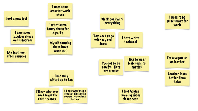
c. Name and order the common groups
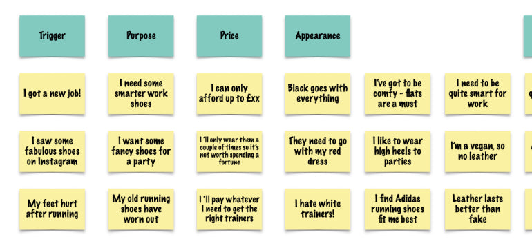
Here, we can see that:
- People know why they want new shoes
- They care about price and appearance
- Appearance is made up of a number of factors, including color, heel height, brand, and material
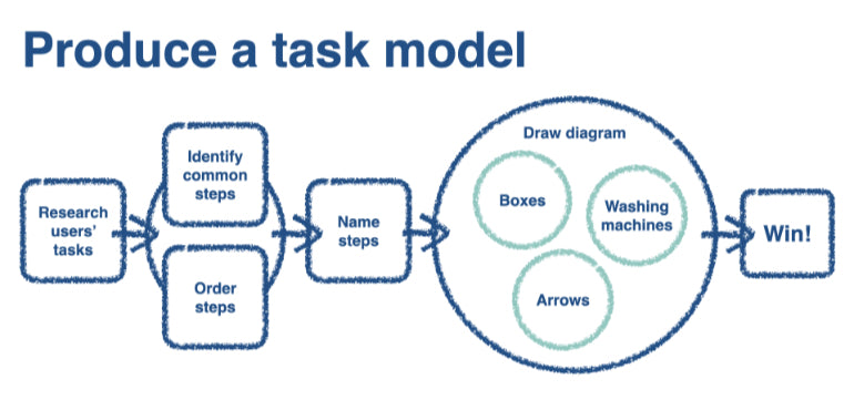
3. Draw a diagram
Then all you need to do is represent your findings in a way that helps make design decisions later—as a simple diagram you’ll refer to again and again. For that, you need boxes, arrows, and washing machines. Don’t panic, there’s no housework to do here.
For your diagram:
- Each sub-task is a step
- Put it in a box and join it to the next step with an arrow
- Multiple factors that are typically weighed against each other at the same time all go in a round “washing machine”
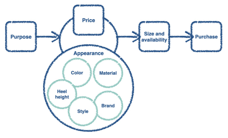
Part of a task model for our made-up shoe example from earlier might look something like this:
Remember that no one individual has to go through all the steps. This is especially true when you have several large washing machines—we group the items in the washing machine to show that people evaluate them at the same time in their journey, but some factors may be of no interest at all to some users.
Some steps do genuinely happen at the same time for different people, so it’s okay to show that. Remember our shirt-buyers—some considered price first, others color.
Use task models to streamline ecommerce flows
Task models are a great tool to have in your UX armory. I love them because they help teams—not just UXers—put the humans they’re building for at the heart of their work.
We can use a task model diagram to empower the whole team to make user-centered design decisions. We can evaluate candidate designs against the task model, rather than personal opinion. At every design review, ask, “Does this design support the task model?” rather than “Do I like it?”
If we know that our client’s ecommerce flow is going to be based on the order in a task model, then development teams can confidently investigate ways to implement that flow, even as UI design work may still be subject to change.
Think about investing in a task model next time you’re working on a client’s ecommerce project selling a complex product, or one where there’s a big difference between newbie and expert purchasers. If their ecommerce offering isn’t converting as it should, could it be a task model problem? Perhaps it’s because you are not supporting your client’s users’ decision-making process in the most efficient way, or have inadvertently set up an incomplete sub-task trap.
Review your ecommerce flow:
- Make sure all sub-tasks are complete when your client’s users think they are
- Don’t stress people out with unnecessary interruptions
- Declutter interfaces to prioritize your client’s users’ decision-making
Use a task model to align your client’s product with user needs and things will flow smoothly. Happy task modeling!
Recommended reading
Keen to find out more? I’ve found these books helpful in my work as a UX practitioner.
Design psychology
- 100 Things Every Designer Needs to Know About People by Susan Weinschenk
Design research
- Just Enough Research by Erika Hall
- Interviewing Users by Steve Portigal
- Userpalooza by Nick Bowmast
- Mental Models by Indi Young
Task modeling
- Communicating the User Experience by Richard Caddick and Steve Cable
Have you ever created a task model to explore user needs? Let us know in the comments below.

