

Every day we receive a plethora of emails: long, short, beautiful, and ugly ones. Which category do your emails belong to?
When the email lands in your professional inbox and addresses job-related issues, usually you don’t expect it to be esthetic. These are plain text emails staffed with important things. Being beautiful isn’t part of the criteria for them.
However, if you open a promotional newsletter, it has to be well-designed otherwise, it ends up being an eye-sore.
And let’s be honest, with some emails it happens.

And let’s not forget about the main role of promotional emails which is “to drive results.” No brand wants emails that only look nice. They want emails that will convert their customers, drive traffic, and engage their audience. And that’s probably the main reason why you should pay decent attention while designing your newsletter.
So what should you do to build compelling messages without losing the aesthetic appeal of your email newsletter design?
Keep reading to learn how to design a newsletter, what the main elements are, key newsletter design guidelines, and trends for 2020.
Email newsletter design is the entirety of textual and visual components of your email message. Starting from your subject line and newsletter layout, ending with your brand logo, fonts, and decent spacing. All these elements matter when we talk about beautiful and effective email design.
Ideally, your email design should serve the main purpose of your email. Some of the most popular things that businesses seek with their email messages are the following:
Defining your purpose will help you get your email design direction. These are the main design variables that you can change accordingly:
Now, how can you make them work together?
Taking into account the huge competitive struggle in your customer’s inbox, an email newsletter design needs to capture the customer’s attention at first glance to avoid being deleted and never seen again. Moreover, how you design your email campaigns will influence your click rate as well as sales.
Follow these guidelines while building your newsletters and enjoy beautiful yet effective email marketing campaigns!
A solid brand style means that your social media channels, website, emails, and other means of communication contain the same or coherent fonts, design elements, colors, tone of voice, etc. Professional marketing agencies call it “the brand book.”
If you are consistent with your brand style, it will be easier for your customers to identify you and build loyalty. Especially in email communication, customers want to know exactly who is approaching them and only trust emails that look familiar.
Consistency is also applicable to your sender’s name and subject lines. You can test what works better, but don’t betray your brand voice.
Look how AWAY keeps its brand style solid.

However, if you think that investing in a brand book pro version is too advanced for your business, create a simple brand style guide and follow it while creating emails, posts for social media, flyers, and other kinds of material. Make a list of fonts that already have been used on your website, right down to the color code of your brand, and include any logo variations that can be used in your company’s material. Trust me, it will help you keep the consistency of your brand’s digital appearance.
The type of content you want to include in your newsletter will dictate the overall layout. A single-column layout is best for more focused messages; for example, the final reminder for a Black Friday sale.
But a multi-column layout is better to show a variety of content; for example, items from a new collection.
One way or another, your email layout must be mobile-friendly. And by saying that I mean both: email responsiveness as well as considered email newsletter size/length to read it on mobile.
When building your email campaign, imagine that it is a table with columns and rows and think about how they will move while responding to different screen sizes.
Remember that:

The quality of your company logo, as well as the images you use in your communication, is crucial. These have a massive effect on the visual attractiveness of your email newsletter design and have a direct
So make sure you cover the basics:
At Omnisend, you can find a built-in Image Editor that helps you adjust your images while building your email design.
Quick tips to make your emails look good:
TIP #1: We see that emails that have a “hero” image with the key message always look the most attractive. Make sure, the main message is above the fold.

TIP #2: Consider doing some photo-shoots with people wearing/using your products. According to semiotic surveys, for marketing purposes, images containing people work better than images with objects, landscapes, etc.
TIP #3: When you use photos, try paring down the color in the surrounding design to make the images the central focus.
TIP #4: Consider using typography for the “hero” part of the email. It can replace the image or supplement it very well. By the way, 3D typography is one of the most trending elements this year.
TIP #5: Always look at different galleries of emails for inspiration. There is nothing bad about that. You will find wonderful ideas and color schemes that you will be able to implement and get great results.

If you send a promotional email to your customers you want them to do something. This is a call to action (CTA). Show it clearly. Ask them to do something: visit your store, read more, follow you on social media, etc. For this, you can link images, buttons or text lines. Use whatever fits your purpose. But be aware of the following:
Many studies have shown that people do not read every word of an email from the beginning to the end. They scan the content starting from the top left corner and stop at the subject lines and images. Only then, if bold text or images capture their attention, will they read the rest. This is the so-called “F” reading pattern described by Jakob Nielsen.
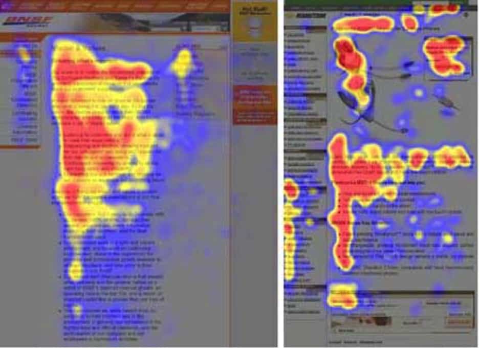
Nielsen’s study found that web users skip over the small-letter content, resulting in an F-shaped reading pattern. Relevant words and images on the left side of the screen tend to get more attention than things on the right, so consider putting the keywords to the left side of the email.
Also, if using text with images, put the images to the left to get more attention.
Adding titles and spacing around them also helps you build visual hierarchy and draw customer’s attention to the products you want the most.
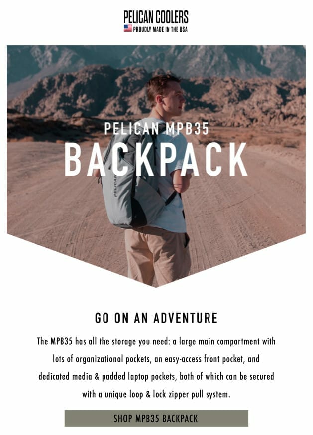
See an example of Pelican Coolers: email design leads the reader to the main copy and CTA.
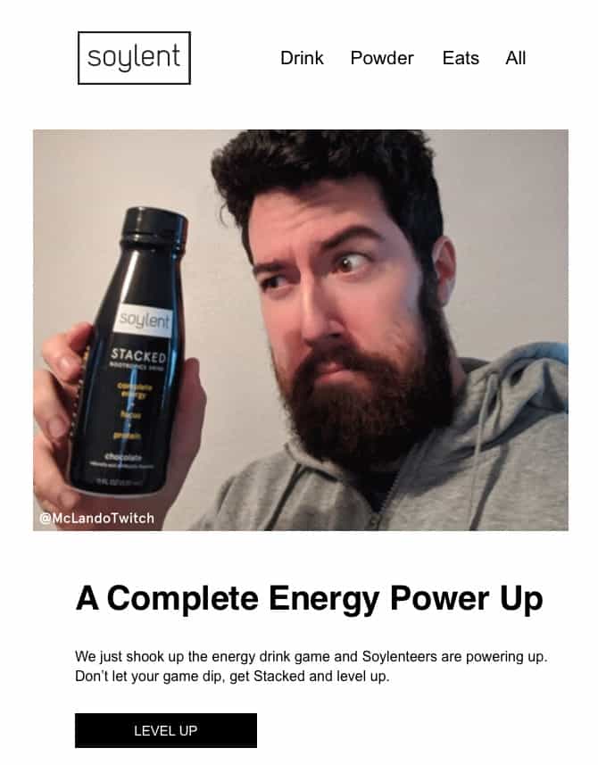
The most common and best practice while building your email newsletter design is placing your brand logo at the top of the email. That’s the spot noticed immediately after the subscriber opens your message.
This part of the email and the footer (which we will discuss later) should be the most stable and consistent parts of your email messages. They are like your signature, prerequisite for your reliability as a brand.
The following components in the header may vary. Some brands include the menu bar, others – small, not too intrusive lines with shipping information or free returns (depends on what you can offer). There is also a place for social icons. You can try to include all of them or shuffle.
Currently trending DTC brands seem to be minimalistic and use very few elements next to the logo. That makes the logo stand out.
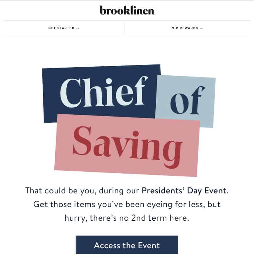
1. Brooklinen
2. Soylent
Usually, email footers are more functional than beautiful. Promotional newsletters must have legal information and the Unsubscribe button. On top of this, brands include links to Terms and Conditions, Privacy and Returns Policy, FAQs, etc.
Usually, this information is concisely packed in the email footer and doesn’t bother subscribers unless they look for it. But it doesn’t mean that you can’t think about the esthetics of this part.
View some great examples, that might inspire you for designing a beautiful yet functional footer for your emails.
Minimalistic footers, like Harry’s and Ritology, or extended ones, like Bellroy and Stitch Fix, have.
1. Harry’s

2. Ritology

3. Bellroy

4. Stitch Fix

There is always a temptation to design a nice picture with a key message included, put it into the newsletter and send it to subscribers without worrying about fonts, email elements, etc.
Unfortunately, an image-heavy newsletter will increase the chances of your email client flagging it as spam, resulting in damage to your sender reputation and email deliverability.
There should always be a balance between the amount of images and text in the emails you send. Following this rule you will avoid ending up in the Spam folder.
Moreover, there are email clients that block images by default. This is one more reason why you should repeat the key message and have the call-to-action in written text. They should be viewable when opening the email, even if the images are not visible.
At Omnisend, we suggest this ratio: 40% of visuals and 60% of the text.
Outlook 2016 and AOL’s Alto Mail app block images by default. So you should use design techniques like ALT text that can be seen instead of blocked images, bulletproof buttons (Omnisend takes care of that), and a proper balance of images and text to address image blocking.

By proper, I mean the size and the email safe font type.
The optimal text size for the email body is within 14-16 px. 14px text is better for longer paragraphs and 16px for a sentence or two. The headings should be bigger – within 22-42 px.
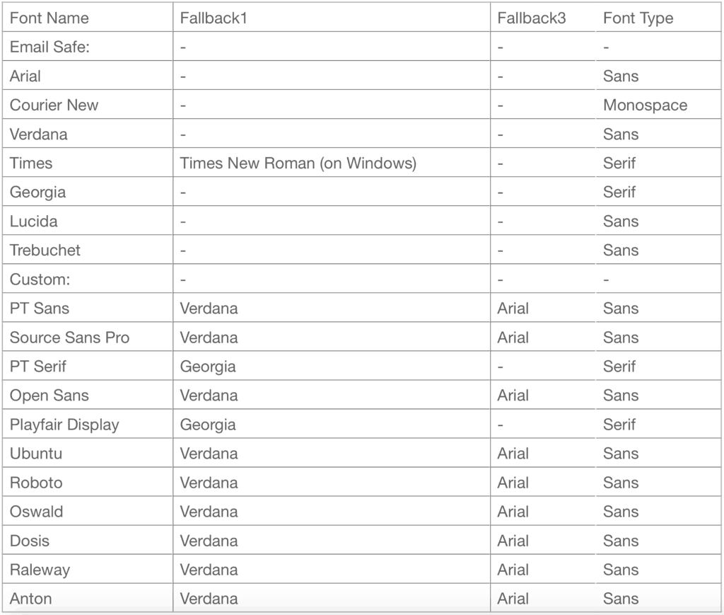
An email has a list of fonts that are considered to be safe to use. This means that by using them all your subscribers from different email clients will see your text the same way. The most popular email-safe fonts are Arial, Verdana, Helvetica, Georgia, Tahoma, Lucida, Trebuchet and Times.
You can learn more about fonts in my previous article Email Safe Fonts vs. Custom Fonts: What You Need To Know About Them.
Below, you can find a complete table of fonts supported on Omnisend with a comprehensive list of fallback fonts, so you would know what to expect.
Looking for email design inspiration, you will find a lot of beautiful emails with themed backgrounds. Indeed, they look fancy and posh. But bear in mind that not all users will be able to see the newsletter background as you want them to.
Since the 2007 version, Outlook does not support background images. Neither do some other major email clients. To avoid awkward design metamorphoses, always use a solid background color as a fallback and make sure no crucial information or imagery exists solely in a background image.
Don’t forget to send a test email to your inbox. Open it on a desktop and a mobile phone. More than 50% of all customers open emails in their mobile devices, so it’s crucial for emails to look good on the small screen. Omnisend users can use email preview on desktop and mobile devices in the Campaign Editor. Don’t forget to check!
As with anything, email design trends go in and out of fashion over the years.
Your message may look classic, but at the same time, have too much of a traditional feel and cause you to lose engagement.
Sometimes small tweaks can fix this and make your email look great again. So what are the latest email trends you should take into account when designing your emails?
Interactive elements in the email boost customer engagement. That’s a fact.
Videos, moving .gif images, new technologies like APNG images and AMP dynamic content are all extremely trendy in 2020.
At the beginning of 2019, Gmail introduced its AMP – dynamic content – functionality to amplify the interactivity of emails. Some email service providers have already adopted it and allow their customers to include carousels, images galleries, and add-to-cart functionality into their emails.
Unfortunately, Apple Mail/iPhone/iPad OS doesn’t support this functionality yet. So a significant part of the ecommerce audience still isn’t able to have this user experience.
However, step by step we are getting there and a year of 2020 may be the year of interactivity.
At Omnisend, you can find some interactive elements (a Scratch Card and a Gift Box) that are different by nature. They have two big benefits:

This year is still favorable for minimalistic designs. You can’t go wrong with simple lines, a lot of spacing and sans-serif fonts.
However, bold design solutions and bright colors have just kicked-in. Dark background, contrasting colors are getting more and more used to attract attention to the main CTA.

Last year many fashion brands were using motifs from the ‘90s.
In 2020, we see this tendency fading out and the new emerging. More and more brands are using futuristic motifs and 3D effects. You can definitely try these out for some occasional email campaigns and see how your audience accepts this new trend.

Follow the link to learn more about upcoming email design trends.
There are tons of different email newsletter designs you can test out with your store, and you can use the guidelines as a beacon for the best elements to include. Following the newsletter rules and tips above, you will improve email design as well as conversion.
Here’s a handy checklist you can use with your next newsletter:
This article originally appeared in the Omnisend blog and has been published here with permission.

