

Conversion rates tend to be depressingly low. How low? Well, a good rate would be 2-3%. So, in the best-case scenario, 98% of people you bring to your site, often through paid ads, will leave without buying anything.
Fortunately, there are plenty of things you can do to improve your odds. Tools like popups can help you put your offers and discounts front and center to snag first-time buyers, and abandoned cart sequences can help you convert the people who add something to their cart and bounce without checking out.
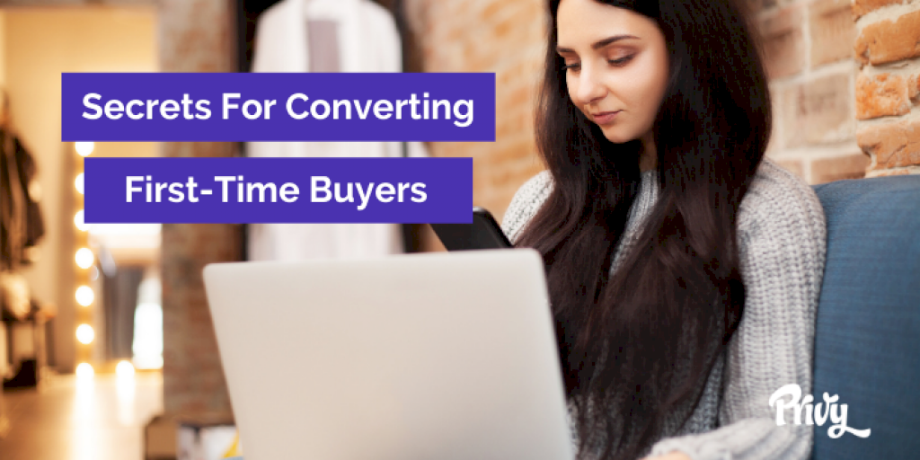
The hardest sale to make is the first one. We all know discounts and offers can help motivate that purchase. Here’s how you can share discounts and offers right where visitors can see them – even if they’re on their way out the door.
Done right, popups aren’t an interruption, but an opportunity to take advantage of a much-appreciated offer.
The secret to non-obnoxious popups is making the offer at the right time. For instance, when you’re targeting new visitors, wait until they’ve been on your site for five seconds or they’ve scrolled 75% of the way down the site, whichever comes first. This gives them time to land and see what you’re all about. In those first few seconds, maybe something will catch their eye that they’d be stoked to get at a discount.
Don’t forget compliance. The exit button should be big and obvious, and the format of your popup should comply with GDPR and other relevant regulations. Tools like Privy have this built in for you, but you can read more about designing popups that convert here.
Flyouts are another type of display, often triggered by specific actions visitors take. For example, you can have a flyout appear after the visitor puts an item in their cart, suggesting another item that goes with it. Flyouts are helpful for upselling and cross-selling, and they’re ideal for mobile.
An exit-intent popup triggers when a visitor is about to leave your site. It’s targeted specifically at the 98% who bounce. Maybe ask for an email in exchange for a discount; getting their contact details makes it possible to continue communicating with someone who might never come back otherwise.
Announcement bars can be used to notify visitors about new products, sales, or free shipping offers without interrupting the content on the page. The best part is they can update in response to actions taken by a visitor. A Free Shipping Bar will tell a customer how many dollars they are away from free shipping as they add items to their cart, which helps you increase your average order value.
Abandoned carts suck. This visitor was so close. They thought about making a purchase. They put the item in their cart…and then they leave. But that doesn’t have to be the end of the story. When a visitor flakes on his or her cart, reminders and cart savers come to the rescue.
A cart saver popup appears when someone with items in their cart moves their mouse toward the dreaded close button and away from completing a purchase (A.K.A. exit intent).
The total cost of the order (with shipping and taxes) is often the cause of cart abandonment. A cart saver popup addresses this by offering a discount, so if price really is the main issue, this might be just the push they need to complete the purchase.
With email and/or text reminders, you can recover abandoned carts after visitors have left your site. We recommend an abandoned cart sequence coupled with a text reminder.
Everyone wants the app or hack that’s going to solve their conversion woes. But one of the most effective things you can do to improve your conversion is to make sure your copywriting is on point. Three things should be clear from the home page:
Declutter your copy. Pages like “contact us” and “FAQs” can be footer links. Save the header for things that drive conversion and get customers engaged with your brand.
When designing a popup, make sure the CTA and headline are bright, clear, and eye-catching. A good way to think about it is that someone who closes your popup should at least know what the offer was just from a glance.
Treat every product page as its own landing page and use it to tell your story.
Think of ways to go beyond product descriptions in the written content accompanying each product. This could be reviews, which are basically free written content, or explainers on how to use or clean the product.
Reviews and testimonials have become an expected part of the online shopping experience. They can answer questions and clarify any concerns that might be keeping your visitors from buying. Because what’s more valuable to them? You telling them why they should buy? Or other people just like them that have made the purchase telling them why your product is so good?
And if you don’t have 5-star reviews, don’t worry. Believe it or not, customers are less trusting of businesses with perfect ratings. Amazon has a category for “most helpful negative review” because critical opinions are often the most helpful when making a purchase decision. Including the bad with the good communicates honesty and transparency.
We are living in a mobile-first world. Most visitors are going to experience your site on their phones. If your site isn’t truly mobile friendly, you’re making it difficult for them to make purchases even if they want to.
Keeping what we’ve just talked about in mind, visit your own site on a mobile device and then a computer. Start from the homepage and work your way through checkout. Note anything that isn’t working or could be smoothed out. So you can step up your conversion game.
Topics:
Website Conversion

