

Knowing how to create and iterate on a sales funnel is one of the most profitable concepts an entrepreneur can master.
In fact, virtually every business on the planet that has success at scale uses some type of sales funnel.
Turning a consumer into a customer requires a logical series of steps.
First, a consumer in your target market sees your ad and becomes a prospect. Then, they land on your website and become a lead. Finally, they make a purchase and become a buyer.
A sales funnel is a curated series of relationship-building experiences that help turn prospects into buyers. Research also shows that nurtured leads make 47% larger purchases than non-nurtured prospects.
In this article, you’ll learn how to build a one-page ecommerce sales funnel with leading ecommerce expert and founder of Smart Marketer Ezra Firestone.
A sales funnel is a visualization of the path customers take to purchase. It represents the marketing strategy that turns cold prospects into paying customers by moving them through various stages. The “funnel” involves taking large groups of people and turning them into high-value customers.
According to Salesforce, a full 68% of companies have not identified or attempted to measure a sales funnel, and the same survey showed that a whopping 79% of marketing leads are never converted into sales.
The goal is to map the route to conversion and automate sales. A sales funnel shows you what to do to influence potential buyers at a specific stage. It starts the moment they become aware of your brand, and continues until they purchase a product and become an advocate.
Say you see an Instagram ad for a new pair of running shoes. They intrigue you, so you go and check out the shoes on the company’s website. You’re now a prospect.
On the site you take a quiz, check out a blog post, look at other pairs of shoes, and maybe even sign up for an email marketing list. Now you’re a lead.
Eventually you receive an email with a discount off your favorite running shoes. You buy them, maybe even some recommended shorts too, and you’re a happy customer. You’ve come to like the brand’s products, so you promote them online.
This cycle then continues with one of your friends or family members. That’s how sales funnels work in action. They are pre-planned stages a company brings you through until purchase that also include retention tactics to keep you happy and promoting the brand’s products.
At a high-level view, sales funnels consist of three parts:
Sales teams or small business owners can create sales funnels for one product, an entire category, or specific target audiences. If you don’t have as many resources, you can create one for your bestsellers. Regardless, sales funnels work when they’re built correctly and provide relevant content for buyers.
87% of consumers choose to do business with companies that provide valuable content at all stages of the customer journey.
The sales funnel helps you know what customers do at each stage of their journey. They allow you to understand which marketing activities work, and which don’t, so you can invest in the right channel and realize a higher return.

The AIDA framework, which stands for Attention, Interest, Desire, and Action, is a funnel model that represents the consumer thought process at each funnel stage. Many ecommerce brands apply this purchasing funnel because it’s effective and easy to comprehend.
The AIDA framework helps you identify what buyers need at each stage of the funnel and support them until purchase.
Let’s look at the different stages of the sales funnel, with examples of how you can apply them to your online business.
The awareness stage is where you catch a potential customer’s attention. It can be an ad, a YouTube video, an Instagram post, a friend’s recommendation, or any other affiliation with your brand or products.
In this first phase, focus on three things:
Your goal is to persuade the prospect to return to your side and engage with your brand. People lingering in the top of your funnel aren’t interested in product information right away. They are often casually browsing and stumble upon your brand.
Content is critical here: 95% of buyers choose businesses that provide them with sufficient content, which helps them navigate each step of the buying process.
You want to create non-promotional lead generation content in this stage, such as:
Take Digest by Great Jones, for example. The brand Great Jones makes cookware for home chefs. It’s mission is to empower people on their culinary journey.

The shop offers Dutch ovens in bright colors, retro-inspired baking dishes, and ceramic-coating frying pans. It’s blog, called Digest, is one of four main categories in its ecommerce store’s navigation. Digest is home to delicious recipes, interviews with different chefs, and the Great Jones items you can use to make the dish.
The blog creates a sense of community for readers, making it feel like they’re in a home kitchen versus reading a blog. They can learn about different cultures, recipes, or stories, and get inspiration for their next big dish. It’s a great top-of-funnel asset for Great Jones that attracts the right customers, builds trust, and subtly kicks off the sales process.
In the interest stage, prospects are doing reach and comparing your products to other brands. You’ll want to begin forming a relationship with them and learning about their problems and goals.
Areas to focus on when building this stage are:
Your goal here is to help shoppers make informed decisions, offer help, and establish yourself as experts in the field. The content you create here should be more in-depth. Why? Because you’re proving that you are the better solution for customers.
Businesses that nurture leads produce 50% more sales at 33% lower costs.
Some lead magnet style content you can provide are:
Beardbrand does an excellent job of sparking interest through its interactive quiz. Right on its homepage, website visitors can find out what types of beardsmen they are.

The quiz asks a series of questions related to the visitor’s lifestyle and needs, such as “Which activity do you prefer to do the most?” and “What style of facial hair do you want?” To receive your quiz results, Beardbrand asks the customer for their email address, which also signs you up for its marketing emails.
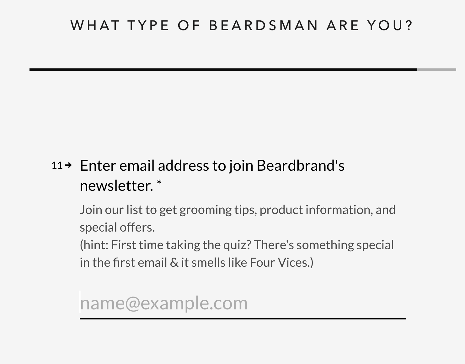
Once your email address is in, you’re guided to a landing page where you’ll find a description of your Beardsman style with relevant products to match it.

People are ready to buy in this third stage of the funnel. They know there’s a problem that needs solving and are actively looking for the best solution.
Ask yourself the following questions when planning this stage:
Here’s where you promote your best offers, be it free shipping, discount codes, or free gifts. Your goal is to make your products so desirable that leads cannot turn them down.
The final stage is where a prospect decides whether or not to purchase your product. Consider where your calls to action are and where to place them on your product pages. Make it easy for potential customers to get in touch with you if they have any hesitations or questions.
Whether you’re in ecommerce or B2B sales, the sales pipeline is something we all have to build. It doesn’t stop here though. Once a customer acts, you’ll need to focus on retaining them (i.e., keeping them happy and engaged) so they return to buy again and again.
Brands drive traffic from advertisements and emails directly to their product offer pages as the core way of generating sales. Some brands also include collection pages, pre-sell articles and other stops along the way. But the almighty funnel that rules them all is the one-page funnel.
For that reason, if the goal is to build a dangerously effective sales funnel, it all starts with optimizing the product offer page.
You’re about to learn an effective 10-step process you can follow to design an ecommerce product page that engages and converts.
The first step in designing an ecommerce product page that converts and engages is to decide what the overall layout of your page will be. You have three basic layouts to choose from:
This step is fairly straightforward. And if you don’t already know which layout you want, there’s a simple litmus test you can use to figure it out. Ask yourself: Is there a lot to say about this product?
If the answer is no, there isn’t much to say, then you’ll probably want to go with a traditional product page. This is the case for a lot of products that are easily understood or very visual, like clothes or sunglasses, such as the Hawkers example below.

But if the answer is yes, and there’s a lot to say about this product, then you’ll want to use a long-form product page or a mini-site. This is usually the case when you have stories to tell, technology to explain, benefits to reveal, objections to overcome, and so on.
For example, Boosted Boards clearly has a lot to say about its product in this long-form ecommerce product page:

The only real difference between a long-form page and a mini-site is how the content is laid out.
With the long-form layout, everything goes on one long page. With a mini-site, that same content is presented over several smaller pages. Both layouts can be highly effective, so you really can’t go wrong.
ACTION ITEM: Decide on a layout for your ecommerce product page design.
Your header is an incredibly important element of any ecommerce product page design. So while we’re on the topic of your navigation links, let’s chat about it for a minute.
The header is simply the top part of your website. It’s where you typically have your logo, your menu, your shopping cart, and any other important links or information that you want to have present on every page. When you’re styling your website’s header, here are a few tips to help improve your conversion rate optimization:
While your header is important, it should never overwhelm the content on the page. You should try to keep your header as small as possible to allow for the biggest viewing area.
On your desktop site, try to make sure your header takes up no more than 20% of the website’s height. Like Harry’s does here:
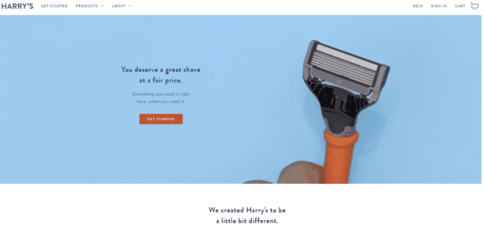
And on mobile, because screen space is even more limited, try to make sure your header takes up no more than 10% of the height. Again, Harry’s does a great job of this:

Every ecommerce store that has a shopping cart page should link to it in its header—always. This applies to desktop and mobile. People are used to it. They expect it. And if you don’t include this in your header, there’s a chance they might get frustrated trying to find their shopping cart and leave without completing their purchase.
If you want to add a nice touch, give a notification when there’s a product in the cart, like M.Gemi does here:

The header is a prime place to display your brand logo. Anytime someone lands on your website, you want them to see that logo and instantly know they’re in the right place.
You’ll want this on your mobile site, too:
![]()

A good tagline can really help reinforce your brand identity. So if you have one, go ahead and put it in your desktop header. Here’s an example from BOOM! by Cindy Joseph:

But on mobile, you’re better off skipping the tagline. The screen space is too limited and valuable.
Because your header is such a visible part of your site, it’s also a great place to put some kind of offer for a purchase or email opt-in.
In this example, Keeps uses a header bar to call out a special offer:

BOOM! includes an opt-in button in its header:

MVMT has one too—a sticky Add to Cart button along the bottom of the screen on mobile:

Now the downside to what MVMT is doing here is that between a sticky header, another sticky bar calling out free shipping, and a sticky Add to Cart button, it’s taking up quite a bit of space.
Another option is to put your mobile email opt-in inside the flyout menu, like BOOM! does here:

When this brand added a call to action to its header, it saw a 30% increase in email sign-ups. Definitely a worthwhile thing to add to your ecommerce product page design!
A 2016 eye-tracking study found fonts sized 18 points or higher to be optimal for online readers. Make sure you use a big font that’s easy to read, in a color that contrasts the background and really stands out.
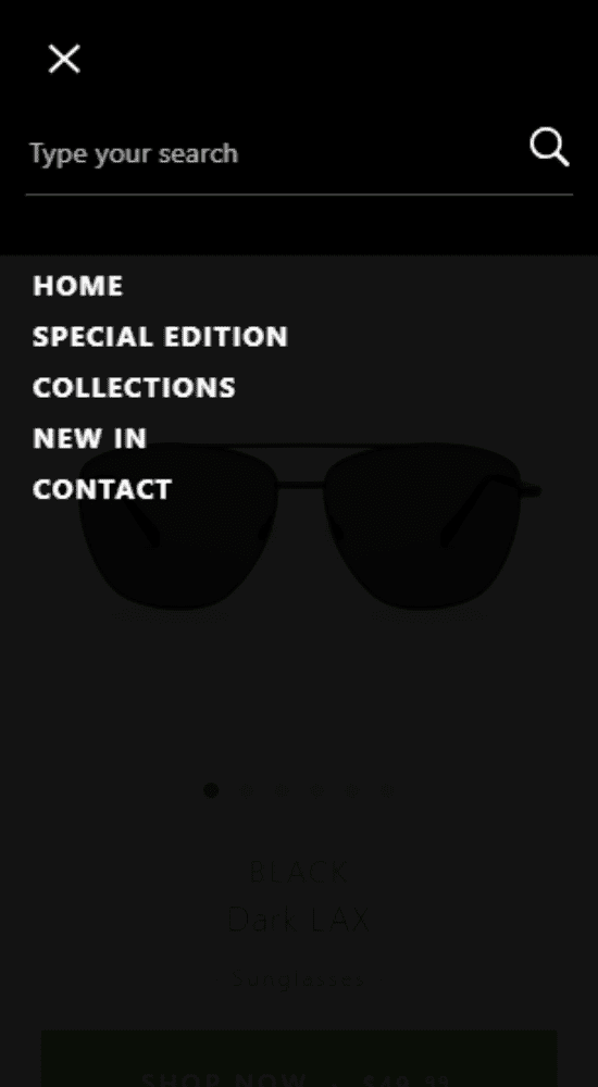
Pay particular attention to your mobile menu. A lot of companies ignore this part of their site, and as a result they miss out on the opportunity to convey value and make additional calls to action.
Notice how Hawkers has all kinds of wasted space underneath its menu:
Compare that to the company Hims, which does a great job of making its links bigger and including additional links to its social media profiles at the bottom:

Big links are especially important on mobile, where it can be easy to mis-click and end up on the wrong page. Keeping your links big, with space between them, helps to minimize this frustrating experience.
A “sticky” header is one that sticks to the top of the page. So when you scroll down, that header is always right there at the top
Here’s an example from Purple Mattress:

Its mobile page has it, too:

Sticky headers work really well, especially on long product pages (like Purple Mattress’). This is because you can keep a call to action on the screen at all times.
Notice that on Purple Mattress’ sticky header, for example, the only clickable link is Shop Now.
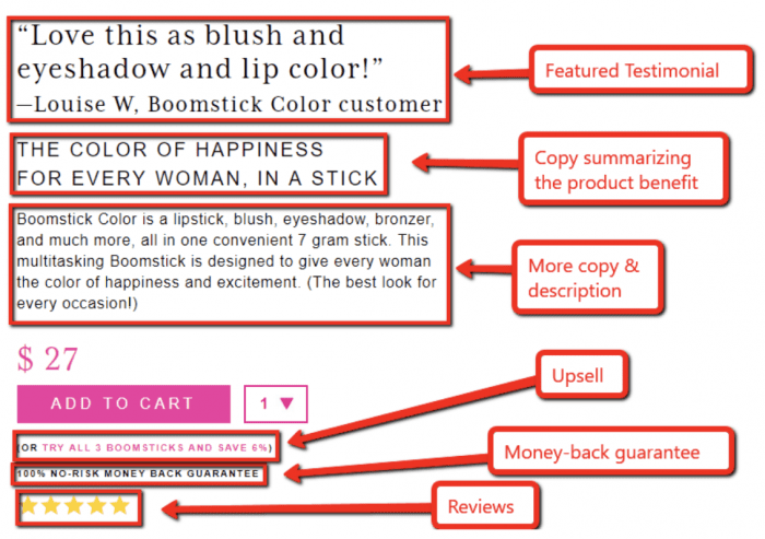
Next up, it’s time to choose a featured testimonial. This is different from your reviews. You still want a Reviews section with lots and lots of people saying how much they love your product.
But what we’re talking about here is a single testimonial you put inside your buy box. This will be a highly visible customer quote, so make sure it’s a good one.
Why do you want to add a featured testimonial to your product? Because it improves your conversions.
BOOM! tested this. It took its original buy box, which looked like this:

And tested it against this version:

The only difference is that one version has the product name at the top, while the other uses a featured testimonial.
Adding the testimonial increased its conversion rate by 5.25% and its average revenue per user by $1.25. BOOM! repeated this test many times over, and the testimonial won every time.
This is a testament to just how important it is to leverage social proof on your product page.
When you’re choosing a featured testimonial, here are three tips:
It sounds obvious, but it bears repeating. You want this to be one of the best quotes you can find about your product.
Because if it’s too long, people will skip over it. Here’s a great example of a concise and effective testimonial:
If your buyers are 75% female and 25% male, use a testimonial from a woman. You can’t rotate this featured testimonial, so make the most of it by having it represent your most common buyer.
ACTION ITEM: Select your featured testimonial for your ecommerce product page.
Now it’s time to add product pictures to your ecommerce landing page design.
Here’s an example of a typical product image carousel:

On an ecommerce site, having a good selection of high-quality product images is very important. Remember, people online aren’t able to pick your product up and inspect it for themselves. They have to rely on your pictures to give them a good idea of what the product is really like. An engaging product image carousel can showcase various angles, features, and close-ups, building trust and enhancing the online shopping experience
To put it another way, your images represent your product’s perceived value and quality.
A recent survey revealed that 90% of consumers consider images to be essential when making a purchasing decision online.
So it’s not surprising that product page pictures get a lot of engagement. Here’s a sample heatmap to prove it:

The same thing is true on mobile, even when that button is pushed below the fold:

Because your photos get so much attention, they need to be as good as you can possibly make them.
Generally speaking, there are only two main kinds of product photos:
This kind of photo just shows the product itself against a pure white background (or a background of another color). For example:

These photos show your product being used in its intended environment. Basically, they show the product in use. For example:
You need both kinds of images on your product page. You also need multiple photos for shoppers to browse. The minimum is six to eight, but you can always add more.
Here are some tips for creating your product image carousel:
You want to show people actually using the product. And when you do this, make sure it looks like they’re enjoying it—they should look happy and excited, like they’re having a good time.
Boosted Boards does a great job of that here:

Also show how the product is made and/or what it’s made of. Another effective picture type is one that shows people what your product is made from.
BOOM! does this by highlighting certain ingredients, like this facial scrub that’s made with oats:

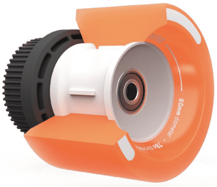
Boosted Boards uses animated photography to give you a close-up of some of it products’ most important components:
A third way to do this is to give a visual overview of all the parts that come together to make your product. See how nice this image from Purple Mattress looks?

The last pointer is to optimize images for quick loading. This helps improve your SEO ranking and create a good shopping experience. Yes, you want the best possible images you can get.
But no, you don’t want those images to slow down your website so it loads at a crawl.
The best course of action is to get the best images you can find, and then have your developer optimize them to load as quickly as possible.
ACTION ITEM: Decide on four ideas for showing off your product in its intended context.
Video consumption is the most popular internet activity worldwide. The number of digital video viewers is projected to reach over 3.1 billion by 2023, spending over 100 minutes per day watching videos on their devices.
If you aren’t leveraging video on your ecommerce product page, you’re missing out on one of the most effective conversion assets out there. Now, if you already have a high-quality product video—maybe something with interviews, testimonials, and product shots, and so on—that’s great. Keep it.
But a lot of savvy ecommerce stores are also finding it really useful to have a short-form product demonstration video. This can even come in the form of a GIF.
This is a short and simple video that shows the product in use. It’s a really useful video because you can add it to your product carousel, share it on Facebook and Instagram, use it for video ads, and more.
You should ideally keep your video under 30 seconds. This video doesn’t even have sound—although some short-form videos play catchy music in the background. You’re just looking for a simple, clean, and elegant product demonstration.
ACTION ITEM: Create your short-form product demonstration video or GIF.
Here’s an example of a buy box from M.Gemi:

The goal of your buy box is to get the visitor to click that Add to Cart button. And to accomplish that, it needs to remind people of the most important reason why they should buy now.
In other words, your buy box needs to quickly summarize the main benefits of your product. Unfortunately, many ecommerce companies miss out on this opportunity by not using any copy.
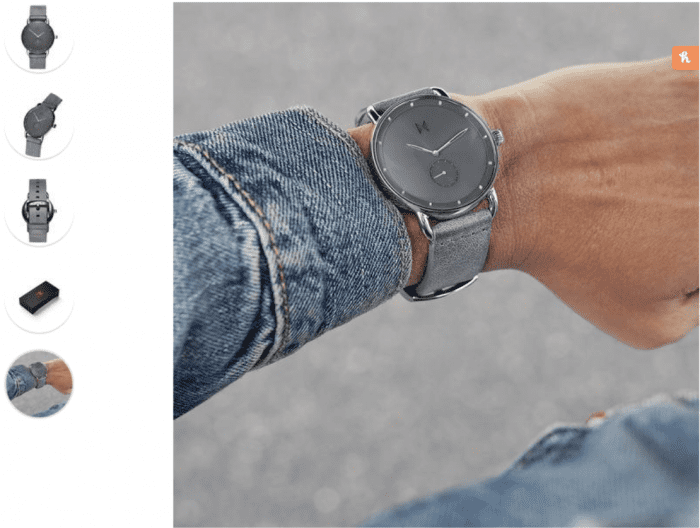
As a result, their buy box doesn’t effectively communicate why the visitor should buy. In this example, MVMT does a great job demonstrating social proof by showing its reviews near the top, but it misses out on an opportunity to include some really important ecommerce copywriting.

Compare that to BOOM!, which takes full advantage of the buy box to repeat the product’s main benefit along with additional social proof, upsells, reviews, and more:
If you want to use a framework, your buy box should follow these steps:
When you’re thinking about that one-sentence ownership benefit, the trick is to ask yourself questions like:
Put the answer in your buy box in a succinct and compelling sentence. Remember, this is perhaps the most critical part of your ecommerce product page. So take advantage of the opportunity to remind people why they should buy. It could mean the difference between winning a sale or losing one.
ACTION ITEM: Write your buy box content.
Now let’s narrow in on the single most important element within your buy box: The Buy button.

A lot of websites get creative with the CTA text on their buttons. Netflix, for example, uses Get Started.

This may work really well in some situations. But it’s generally not a good idea for ecommerce.
For ecommerce, you should be using one of these common CTAs:
What’s so magical about these CTAs?
In a word, they’re clear. People have been shopping online for years now, and they’re used to seeing a button that says one of these things. If you break with that tradition and do something different, some people are liable to get confused and wonder if your website works differently.
So, for your own good, don’t try to get too creative here. Most ecommerce stores should just stick with Add to Cart and move on. (Unless you’re in Europe, where Add to Bag seems to be more popular.)
ACTION ITEM: Choose your CTA text.
USP stands for a unique selling proposition” In a nutshell, USPs are things that make you different; the things that set you apart from your competition. They’re reasons why people should buy from you instead of somebody else.
Now, it’s always good to mention these USPs in your product page copy. But it’s also a great idea to take your USPs and turn them into USP images. This is a really effective technique that a lot of ecommerce stores are doing. Like Puravida:

Now it’s time for you to figure out your USPs and put them into an image format. If you already know your USPs, great. But if you’re still working on that, here are some ideas for USPs for your business:
These kinds of things make for great USPs. So take some time to think about it, and when you have your USPs ready, put them into an image format. Then stick those images somewhere on your product page.
ACTION ITEM: Decide on your USPs (pick at least three to four) and stick them somewhere on your product page.
Guarantees are another thing that can have a major
You can’t see the product in person, so you don’t really know for sure what it looks like. And while you can read reviews and see testimonials, you can’t always be certain that the product is going to work the way it should.
That’s why a guarantee can be so powerful. It’s just a way of telling your visitors, “If you don’t like this product, you can get your money back.” It reduces that feeling of risk and makes people more likely to click the Buy button.
You can offer all kinds of different guarantees:
In general, nothing seems to ever beat a money-back guarantee. The most effective guarantee you can provide your shoppers is the promise that you’ll give them a refund if they change their mind.
But that doesn’t mean you can’t have multiple guarantees. You could offer a money-back guarantee and a product-specific guarantee, like Away Luggage’s “TSA-approved lock” guarantee:

So next, take some time to think about guarantees you can offer. Your goal here is to minimize any feeling of risk and replace it with a sense of security in your shoppers.
ACTION ITEM: Decide on your guarantee(s).
Our final step in creating a high-converting ecommerce product page design is to add social proof images to your page. These are usually small images or logos—about the same size as your USP graphics—that lend credibility to your product or your company in some way.
If you’ve been featured in a magazine or on a website, for example, you can add their logo for a little extra social proof:

Even more effective is to feature a quote along with the logo, like Frank Body does here:

Purple Mattress follows the same formula:

Having a quote like this from a well-known media source is ideal. But if you don’t, you can always use quotes from current customers. The idea is to add more social proof to your product page.
Here are a few places you can look for quotes to turn into social proof images:
In short, you’re basically looking for anything from a third-party source that gives your product greater credibility. Then throw those credibility-boosting images onto your ecommerce product page.
ACTION ITEM: Select social proof images.
Companies that create an easy buying process are 62% more likely to win a high-quality sale. A solid sales and marketing funnel, targeted at the right buyer personas, can help find new customers, move them through the decision stage, and turn them into paying customers.
If you’ve been following along, you should have everything you need to finalize your high-converting ecommerce product page design. Just take the assets you created from each of the 10 steps and build them into a winning ecommerce product page. Going step by step will ensure you don’t forget any of these important conversion-boosting elements. You can also download a sales funnel template to skip the building process.
A sales funnel is a series of pages that a prospect engages with on their way to becoming a customer. Depending on what kind of funnel you have set up, this could range from one page to many, with retargeting ads and retention schemes. The most common ecommerce sales funnel is actually the onepage funnel.
Say you run Instagram ads that drive traffic to a landing page. On that page, you ask a prospective customer to sign up for your email or SMS list in exchange for a lead magnet, like a discount. You now have new leads.
Next you send out content to educate, inspire, and help people solve their problems. At the end of the campaign, you send a 15% discount coupon of a subscriber’s first order. You then get a bunch of sales, add those new customers to another email list, and start the process over again.

