


There are a ton of ways to drive leads and sales for your ecommerce business: automated emails, broadcast emails, popups, displays…you get the idea.
But one of the more overlooked tactics for growing your email list and boosting your sales is using tabs with your popups.
You might be wondering, “What exactly is a tab? Why should I use it? How is it different from other popup triggers?”
But don’t worry: we’ve got you covered.
Let’s take a closer look at tabs for ecommerce popups, and how they can help you grow your business. Before we do that, though, let’s get some context on why tabs can be so effective.
Okay, so let’s say that you’re building a form on your site. It could be a popup, flyout, banner, or any other kind of form.
When you’re creating it, there are a number of triggers that you can bake into its design, so that it automatically appears once those trigger conditions have been met.
Take popups as an example. Probably the most common trigger is the timer — in other words, a popup appears on the user’s screen after 5 seconds (or however many seconds you want, it’s up to you).
Another trigger that ecommerce brands use a lot is scroll percentage. That’s when the visitor has scrolled a certain percentage of the way down the site (75%, for example).
Then there’s exit intent. In other words, the visitor is about to abandon the shopping cart, leave the website, close the browser tab, etc.
All of these are great triggers to use when designing an effective popup. Here’s the problem: they’re all automatic triggers. In other words, the visitor has no control over when and how these popups appear — they just do, once a trigger has been met.
So here’s a question for you: What if the visitor clicks away from the automatic popup, keeps browsing your site, and then decides after a few minutes that they do, in fact, want the coupon code you were offering after all? That’s where tabs come in.
A tab is basically a “collapsed button” that allows the visitor to re-access the popup that automatically appears whenever they want.
It allows visitors to intentionally pull up a popup window. And when you think about it that way, it’s no wonder that tabs have crazy awesome conversion rates: after all, with a tab, the customer is proactively looking for the popup, instead of having it sprung on them without notice.
Another great thing about tabs is that they can come in all shapes and sizes. For instance, they can be full width and span across the user’s entire screen (either on the top or the bottom). They can be wedged in a corner (usually the bottom right). They can be small tabs on the side of the screen. They can come with bold or nuanced color schemes. They can even include images.
Really, the sky’s the limit when it comes to tabs. But why should you consider using a tab for your store?
Get our best content on ecommerce marketing in your inbox 2 times a week
There’s no better way to illustrate the power of a well-designed tab than to use a real-world example. In this case, we’re going to take a brief look at Doe Lashes, a brand that sells high-quality, artificial eyelashes.
The store’s operator, Jason Wong, uses tabs on his site to drive business and boost his subscriber count — especially from mobile traffic.
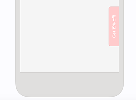
He likes to put the tab on the right side of the screen for smartphones, because he finds that area to be the most accessible spot for the user’s thumb.
He used a light pink tab, which is definitely an on-brand, attention-catching choice. It has white text that encourages the visitor to click. It couldn’t have taken him very long to design (maybe two or three minutes, tops), and it feels like a native element of the site. Here’s an example:
“Okay,” you may be thinking, “that’s great; but what has the tab actually done?”
We were curious about that, too. So we took a quick look at their Privy account, and here’s what we found: the tab feature alone had helped Doe Lashes generate over 1,000 additional email signups in just 30 days. That’s a whopping 15% of the total number of signups the store had received in the same time frame.
So on the one hand you have a simple design element that takes maybe 3 minutes to develop, and on the other you have an extra 1,000 subscribers to show for it. That’s huge!
But really, it makes sense when you think about it. Put yourself in the customer’s shoes for a moment.
Imagine that you’ve just landed on Doe Lashes for the first time. As you begin to browse the site, you’re hit with an automatic popup. You’re not ready to engage with any marketing material, so you quickly close it out.
However, after another minute or two you realize that: “Hey, there are some neat products in here! I really want to get that discount code mentioned in the popup.” But where should you go to pull up the popup window again?
And that’s when tabs are clutch. All you have to do is click on that pink tab to re-open the popup, get your code, and make your purchase.
That’s really what the tab is all about: giving interested visitors a clear path to signing up later in the visit, when they’re ready to engage.
So you’re giving them the power. And it really feels like they have a choice.
And the thing is, anyone who ends up clicking the tab is much, much more likely to convert than a visitor that gets hit with an automatic popup. Of course, we’re not saying that automatic popups are bad. In fact, you’ll often need them to help you close sales, get leads, and prevent cart abandonment.
At the same time, it’s important not to sleep on tabs. In our experience, a well-designed tab is far and away the highest converting trigger you’ll ever have for your store. And that’s saying something.

Topics:
Website Conversion

