

Are you having trouble choosing the perfect font for your logo, advertisement, or content? Typography plays a significant role in marketing and branding but doesn’t get as much attention as other business factors.
Why is typography important? Think about Apple: the company doesn’t use flashy fonts for advertising its products; they use simple, elegant fonts to represent its brand. This font matches Apple’s vision – providing shoppers with simple and innovative technology to increase productivity. Would a bold font deliver this message of subtle luxury and their current low-key font?
We’re telling you everything you need to know about typography in business to help you better convey your brand’s message through your fonts.
How do you want your shopper to feel when they see your font? Do you want them to laugh, feel excited, or feel productive? The right font can convey any of these feelings if you choose the right one.

Consider the following when you decide on a font:
Use your answers to the questions above to choose a font that connects your audience emotionally.
Remember elementary school when you would draw each letter of a word with a different colored marker? Using too many fonts is a similar mistake. It sounds like a good idea but delivers an unattractive and hard-to-follow final product.
Your reader will have trouble focusing on what your content says when they’re too busy looking at five or six fonts. Never use more than two fonts to not distract your reader from what you’re saying. Using only two fonts, your content delivers a uniform and professional appearance.
Most fonts come with various weights you can use to make them stand out. Typically you can set fonts to bold, italic, or bold-italic to deliver a different emotion from the text.

You can use varying font weights to bring attention to one line of text or another. The differences in weight allow bold or italic text to stand apart from the standard text found elsewhere in the document.
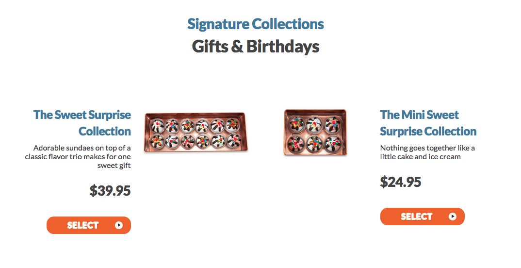
Weight links, titles, prices, and subheadings to bring them to your reader’s attention. Don’t weigh non-vital information; otherwise, your weighted text won’t stand out as intended.
The size of your text determines how your reader perceives it. Important information, such as titles and prices, is usually much larger than the body text. Photo captions and credits are typically much smaller because they are non-vital to your content.
Your biggest concern with size should be your body text. Some designers say it should be 12 pixels, while the growing trend is 16-point font. The paragraph font of your content should be easy to read without distracting your readers from the content itself. Thus huge font is unsuitable for paragraph text.
Body text which isn’t spaced appropriately can be uncomfortable to read. When words are too close together, it isn’t easy to see where one word ends and another begins. When they’re too far apart, your eyes must move too far to read the next word, which can be distracting.
There isn’t much creativity involved with paragraph spacing. Your words should be close enough for your reader to read them quickly but far enough apart so it’s clear where each word stops and starts. Avoid using justification alignment unless you’re publishing a magazine or newspaper, as this may adjust your spacing and make it difficult to read.
Your titles and headings should grab the attention of your reader. Use fonts and sizes to make them stand apart from the rest of the text on the page. Consider using a font generator to find creative ways to make your headings stand out.
Use a sans-serif font for your body text to make your headings stand out even more. You don’t have to use a serif font for your titles, but some experts recommend it. Any font that makes your label stand out from your body text will work.

