Free every Thursday · 59,694 Readers
Fastlane Insider Newsletter: What's working for Shopify in the AI era?
Free every Thursday · 59,694 Readers
Fastlane Insider Newsletter: What's working for Shopify in the AI era?
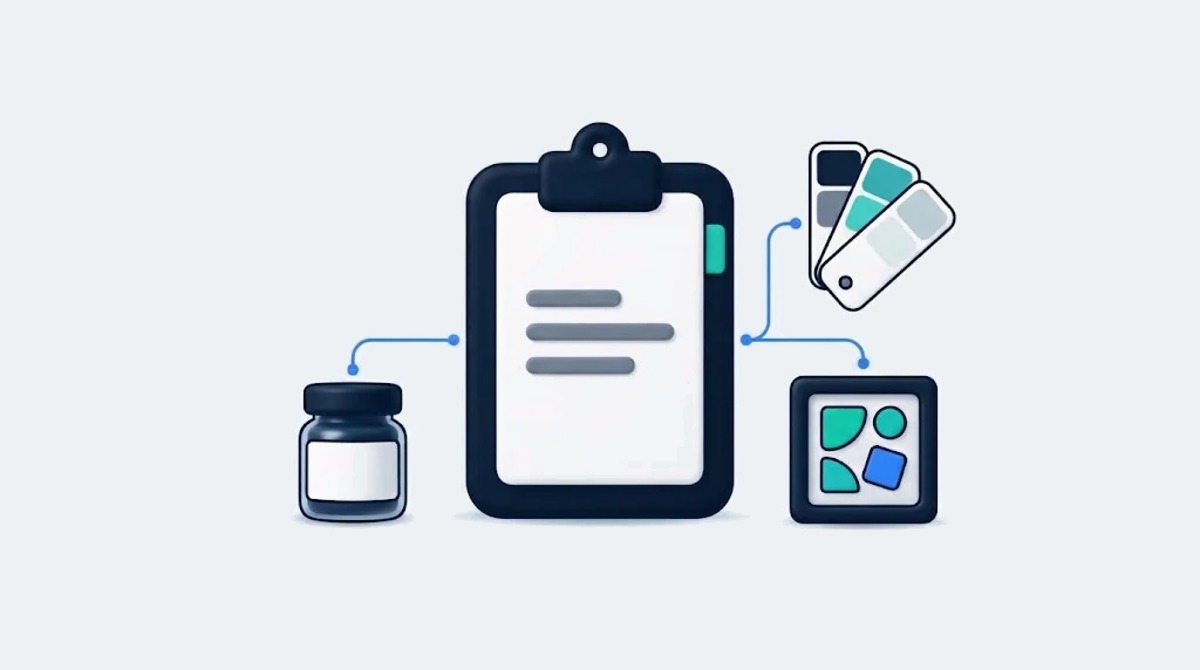
78% of marketers say their briefs give clear strategic direction. Only 5% of the creative agencies receiving those briefs agree.
A brand brief can fail in two familiar ways: it leaves the team guessing, or it buries the important decisions in background information. Either way the cost shows up later, in revision rounds, missed launch dates and work that looks good in a review meeting but does nothing for sales. A usable brief gives creative work a clear starting point. It explains the problem, the audience and the boundaries without deciding every execution in advance.
The gap between how briefs read to the people writing them and the people receiving them is wide. In the global BetterBriefs study of marketers and agencies, which surveyed more than 1,700 marketers and agency staff in 2021, 80% of marketers said they write good briefs, while only 10% of creative agencies agreed. The sections below walk through what closes that gap, using a fictional jam company as the running example.
A usable brand brief opens with the business problem the work must solve, not the thing the team should make. Many briefs open with the deliverable. They ask for a new visual identity or a launch campaign, which tells the creative team what to make without explaining what they need to solve.
Creative work goes wrong when the solution is prescribed before the thinking starts. If the brief says “redesign the packaging,” the team redesigns packaging. They don’t ask whether packaging is the reason sales slipped or whether the message is the issue. The brief has already closed down better options. That question, whether the identity is broken or only the way the brand talks about itself, is the one eCommerce Fastlane’s breakdown of a rebrand versus a messaging shift helps a team answer before anyone opens a design file.
Start with the business problem in plain terms. Name the outcome the work has to create. For example, imagine a fictional jam company that gets trial but almost no repeat purchase. The problem to solve is “get first time buyers to pick up a second jar within two months.”
That shift gives the team more to work with. They can now think about taste memory and shelf impact, and question the brief itself. A clear problem gives them room to solve it.
A good problem statement has a verb and a customer. Get lapsed buyers to reconsider. Get busy parents to trust the ingredients. Direction matters more than adjectives here. If you can’t state the problem in one line, you aren’t ready to brief.
The problem line should also come from evidence you already have. For a Shopify brand, that usually means a repeat purchase rate, a returning customer report or a drop in conversion on one product page. Name the number the problem is based on, even if it sits in an appendix, so the team knows the problem is real and not a hunch from the last leadership meeting.
When the team understands that repeat purchase is the goal, they can judge every headline and color choice against whether it would make someone reach for that second jar.
The audience section of a usable brief describes one customer tension the creative can speak to, not a demographic range. Most audience sections read like a census table, with an age range and income. That information doesn’t give a creative team much to work with on its own, and the BetterBriefs UK findings published with the IPA show that only 38% of UK creative agencies were clear on the target group in the briefs they received.
Target audience insight is about what buyers believe and how they act when no one is watching. Demographics describe a group. Insight explains a tension the creative can speak to.
Say you sell lunchbox snacks. “Millennial moms 25 to 40, urban” won’t spark an idea. “Parents who feel judged by what’s in the kid’s lunchbox” will. One is a label. The other is a pressure the brand can ease.
That single human truth does more work than three pages of personas. It helps the writer decide what to say and the designer decide what mood to set. Keep the demographics in an appendix for media planning if you must, but don’t lead with them.
If you get the insight right, tone of voice follows. A judged parent doesn’t need a lecture on nutrition. They need humor and relief. Write that down: “Talk like a friend at the school gate, not a dietitian.” That’s direction a creative team can use.
Treat that parent scenario as a hypothesis until interviews or observations support it. Record where an insight came from and how often it appeared. Product reviews, post purchase survey answers and support tickets are useful sources for an online brand, because they record what customers say in their own words. If the research points somewhere else, revise the brief rather than forcing the audience into an appealing story.
Every usable creative brief carries one plain sentence of brand strategy that the team can test every idea against before they present. That is usually a short line about what the brand stands for.
Bad essence lines sound like this: “Innovative, dynamic food for modern families.” Good ones sound like a promise: “Good food for chaotic mornings.” The promise gives the team something specific to judge. If the line can’t rule an idea out, it isn’t working. That’s the test.
The positioning statement sits right behind that sentence. It says where the brand sits against rivals and why it matters to the customer. Many marketing leads don’t have that clarity when they start writing, which is why they turn to a brand agency to pressure test the thinking before creative starts.
Consistency is where that sentence pays off. In a 2016 Demand Metric and Lucidpress survey on brand consistency, organizations with brand consistency issues estimated an average revenue increase of 23% from always presenting their brands consistently. That figure is the respondents’ own estimate, not a measured result, but it shows how much value marketers place on a shared direction. A shared brief helps establish that direction: it gives the team an agreed promise to express across packaging, campaigns, product pages and other customer touchpoints.
Name the final decision maker and gather input from everyone who needs a say. Agree on positioning before reviewing design concepts, then set review dates and a process for consolidated feedback. Make clear who approves strategy, who approves execution, and how changes to scope will be handled.
Think of that sentence as the end of the customer’s story. The buyer is the protagonist and the business problem is the tension that has to break. Keep it visible on page one.
A usable brief names the emotional territory the work should own and pairs it with two hard reasons to believe. Strategy means little until it points to a feeling. Confident or tender. Playful or defiant. Choose a direction and describe what it looks like in real life.
Feeling without proof feels fake. If the territory is tender, the proof might be a short ingredient list and a founder story about allergies. Give the team facts that earn that warmth rather than asking them to invent it.
Tone of voice turns that feeling into words. Messaging hierarchy turns it into order. Tell the team what must land first and what can wait for the website. For the fictional jam company, taste comes first, with the origin story in a supporting position. Health claims don’t lead at all.
Write this part in verbs. “Talk fast and joke about burnt toast” beats “playful yet authentic.” One tells an actor what to do. The other leaves the team guessing. Concrete images give art direction a start without fixed layouts.
When hierarchy is clear, designers don’t try to cram every claim on the front panel, because they know taste is the job of the jar and the rest lives online. For an online brand, “online” is specific: the product page, the collection page and the post purchase email each have room for a different layer of proof.
Prioritize the proof points each execution needs. A small label may carry one main reason to believe, while a website can explain the supporting evidence. Include the source for product claims and identify who will approve them before publication. In the US, health and ingredient claims need competent and reliable evidence behind them, which is why the FTC’s health products compliance guidance is worth having open when the proof section is written.
Good briefs narrow choices by listing what rivals already own and what the brand will never do. If every competitor uses farm imagery and words like natural, say so. Then the team knows to avoid that space. Fastlane’s guide to building a product branding strategy starts with audience and competitor research for the same reason: you can’t claim a gap you haven’t mapped.
Add an explicit not-list. The brand will not be preachy or use scare tactics about sugar. That list is kinder than it sounds. It stops the team from pitching ideas you would kill anyway.
Art direction needs the same honesty. Don’t write “clean and premium.” Show it. Attach two mood boards that point in different directions you could live with. Note what you like in each: light and shadow in one, type scale in the other.
For the fictional jam company, the competitor review might reveal an opening for morning humor. The team would still need to test whether that approach fits its audience and promise. A visual or verbal gap is useful only when the brand has a credible reason to occupy it.
Keep this section short. Two competitor notes and three not-dos are enough to steer without dictating. If the creative team understands what not to touch, they can take bigger swings within those limits, because they don’t waste concepts on ideas that were never allowed.
Limits spark ideas. Open fields stall them. Don’t fear sounding negative. A clear no saves a week of rework.
A usable brief states the real budget, deadline, mandatory guidelines and exact deliverables, because honest edges produce better work than polite vagueness. Nothing kills trust faster than fake freedom. “Budget is flexible” never is. “Deadline can move” rarely moves. Good creatives prefer honest edges.
Put mandatory brand guidelines and legal rules on page one. List media formats and budget next to them, along with the real deadline and the reason behind it.
Imagine the fictional jam company must keep its existing logo and color because shelf recognition is high, and must avoid health promises because counsel bans them. It must deliver for jar front and mobile video.
Whether the work goes to an in-house team or a brand and design agency, scope has to be exact. Name deliverables and count. Three jar labels and two video cuts is clear. “Pack refresh plus social” leaves the team guessing about what is actually required, and it is the kind of scope that turns into a change order halfway through the project.
Honest limits help focus the thinking. A designer who knows the color can’t change will push type and image harder. That’s better work, not less.
Don’t hide trade-offs. If budget allows only one shoot day, say so. If retail print needs files by June 10 for a seasonal reset, put the date and the why. Teams plan around truth. They resent surprises.
Keep this section to five hard limits the team can pin above their desks. Fake freedom wastes money. Clear edges save it.
A usable brief ends by naming one primary outcome, its starting point, how it will be measured and who owns that measurement. For the fictional jam company, that is repeat purchase within two months. Keep supporting measures separate so the team knows which outcome takes priority.
This is the step most briefs skip. In the same BetterBriefs UK research, only 30% of UK marketers said they had clear evaluation criteria in place to assess the work coming off a brief. That clarity keeps the review focused on outcomes rather than personal taste. Work isn’t judged on whether executives like the color. It is judged on whether it could move the chosen outcome. Get stakeholder sign-off on that metric before work starts, and ask the same question Fastlane’s guide to hiring a marketing agency for a Shopify store recommends: which number will be reported, and where does it come from?
Keep the whole brief to two readable pages. Make the hierarchy clear with headings for the problem and person. Put extra research in an appendix for those who want depth. A creative director should grasp it in ten minutes.
Leave the last box for open questions. Invite the team to challenge ambiguity. “What don’t you believe in this brief?” “Where do you need more proof?” That turns a handoff into a dialogue.
Strong briefs make feedback easier. When comments tie back to the agreed problem and person, revision stays honest. When they don’t, the brief gives the team language to push back. That loop protects both sides. A brief written in verbs and images plus one metric that matters gives creatives room to invent and a way to know when they have.
A usable brand brief fits seven sections on one or two pages, each answering a single question the creative team would otherwise have to guess. Use the grid below as the skeleton, and fill each row with one or two lines before adding anything else.
The order matters. Problem and person come first because every later section is judged against them. Limits sit near the end of the template but belong on page one of the finished brief, next to the strategy sentence, so nobody reads three sections before finding out the logo can’t change.
How much goes into each row depends on the size of the brand. If you are under roughly $500K and briefing a freelance designer, the problem, person and limits rows do most of the work, and a single page is plenty. If you are between $500K and $2M and hiring your first agency or in-house designer, the strategy sentence and the named decision maker matter most, because that is the stage where more people start giving feedback. Above that, with several stakeholders and channels, add the approval process and an appendix of research, and reuse the same brief across packaging, product pages and paid social so the brand stays consistent. Briefing creators for social content is a different job; Fastlane’s guide to writing a creator brief that gets the content you want covers that format.
A brand brief is the first creative act. Write it like a story with a person and a tension. Keep it short and honest about limits and success, and the team will tell a better one back.
A brand brief should include a one line business problem, one customer tension, a single strategy sentence, the emotional territory with two reasons to believe, a short not-list, the hard limits and one success metric. Each section answers a question the creative team would otherwise guess at. The problem names the outcome the work must create, such as getting first time buyers to make a second purchase within two months. The limits cover mandatory guidelines, legal rules, budget, the real deadline and counted deliverables. Extra research goes in an appendix so the main brief stays readable.
A brand brief should be about two readable pages, short enough that a creative director can grasp it in ten minutes. Length is not a sign of rigor. Three pages of personas and background tend to bury the decisions the team actually needs, such as the problem, the strategy sentence and the limits. Keep demographics, survey data and competitor screenshots in an appendix for anyone who wants depth. If the main brief keeps growing past two pages, it usually means the problem has not been narrowed to one line yet.
A brand brief sets the strategic direction a brand’s creative work must follow, while a creative brief usually directs one specific project or campaign within that direction. In practice the two overlap, and many teams use one document for both. The useful distinction is what each one fixes. The brand level content, the strategy sentence, positioning and not-list, should stay stable across projects. The project level content, the problem, deliverables, budget and deadline, changes every time. Keeping the stable parts consistent is what lets packaging, product pages and ads read as one brand.
You measure a brand brief by the one primary metric it named before work started, compared against the baseline recorded in the brief. For a brand with a repeat purchase problem, that might be the share of first time buyers who order again within two months. Record who owns the measurement and when it will be checked. Keep supporting measures, such as engagement on launch content, separate so they do not compete with the main outcome. Getting stakeholders to sign off on the metric in advance also keeps creative reviews focused on outcomes rather than personal taste.
Yes, a small Shopify brand should write a short brand brief before hiring a designer, because it is the cheapest way to avoid paying for rework. At this stage a single page is enough: the problem in one line, the customer tension, the hard limits and the deliverables counted out. A freelance designer working from a vague request such as “refresh the packaging” has to guess at the goal, and guesses are billed as revision rounds. The brief also helps compare quotes, since every designer is pricing the same clearly scoped job.