

Think about the worst logo you’ve ever seen—what comes to mind? If you’re having trouble thinking of one, that’s not surprising.
Good logos stick. Bad ones don’t.
That’s what makes designing a logo different from designing other branding materials. Web banners, ads, and social media posts each have their own design objectives, but none are as focused on being remembered as a logo.
Some of the best logos are the least complicated—think of the Nike swoosh or the McDonald’s golden arches. Ted Kaye, of the North American Vexillological Association, says flag designs should be simple enough that a child can draw them from memory. The same is true of logos.
Your logo is not your brand—you build that separately—but it will become the face of your brand. It will appear on your website, your products, your marketing, your in-store signage, and just about any other place where people interact with your brand.
No matter your budget, you deserve a logo you feel good about. That’s why we put together this guide on logo maker. We’ll walk you through every step of the process to create a business logo from scratch—from choosing a color to hiring a designer—with the help of real in-house graphic artists.
A logo is a symbol that represents your brand and your brand’s personality through the simplest image possible. Logos embody your brand in the minds of your customers. Without one, they have nothing to latch onto. Here’s why:
If there’s something about your brand you want your customers to know, science says images are more effective than words in communicating it. If images have this power to convey ideas, then the image that will appear most often in your branding is potentially the most important.
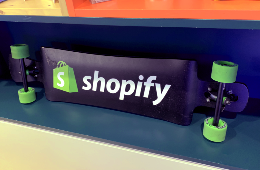
If you’ve ever been in a corporate office, you may have noticed a large number of items branded with the company’s logo, like pens, notebooks, bags, or clothing. There might be step and repeat banners or big signs displaying the logo as well. The Shopify office even has a branded skateboard:
Branded swag can be handed out at trade shows, given as gifts to potential clients, and even sold in-store. Good conversation can be forgotten a lot quicker than the branded pen a client finds at the bottom of their swag bag.
Brand consistency is a key element in developing a lasting impression. By having a definitive representation of your brand at its most base level, you’ll have something to draw from when designing other marketing elements.
Certain symbols or icons are associated with certain industries. Think of how many medical supply businesses use variations of a red cross in their logos. When there are a lot of businesses competing for the same market, distinguishing yourself is the key to getting noticed and remembered.
A logo provides many advantages, so it’s not hard to understand why nearly every business has one. Going logo-less looks unprofessional. It comes across as illegitimate, even untrustworthy.
Once you’ve decided you need a logo, you next need to figure out whether you should design your own or hire a designer. Visit www.Logomaker.net, an online platform to create amazing & free logo designs for your business.
Designing a logo that’s unique but also simple enough to be remembered isn’t something that’s easy for amateur designers. Do what you’d do in any aspect of your business and hire a professional if you have the budget. But how much should a logo cost?
The cost of a logo design can vary significantly based on the experience level of the designer you hire. Logos can be exceedingly expensive, incredibly cheap, or even free. You can look at a designer’s portfolio, but there’s still no definitive way to know the quality of the logo you’ll receive until it’s been designed. Generally, expensive logos created by design agencies are made by professionals, but not every professionally made logo is necessarily good.
Here are some questions to ask yourself if you’re considering hiring a designer to create your logo:
Do I have the budget? Logo designs can cost anywhere from nothing, if you’re using a free online logo maker, to tens of thousands of dollars if you’re working with a professional designer or agency. Expect to pay around $50 to $300 at the lower end to hire a reasonably experienced designer.
Can I afford to burn money for a logo I don’t use? When you hire a designer, you’re paying for their time, not the logo itself. Since there’s a chance the end product won’t meet your expectations and gets tossed, designers and business owners typically negotiate a “kill fee”; an amount paid to the designer regardless of whether or not the logo gets used. Keep this in mind when budgeting and make sure to account for any potential kill fees.
How much time can I afford to dedicate to logo design? Designing a logo involves more than sitting around and waiting for a “eureka” moment. The process usually is a collaborative one, with designers presenting you several rough options and relying on your feedback to revise their work.
Do I have a good eye for design? Logo design isn’t easy. If it was, you wouldn’t be considering hiring a designer. Some business owners excel at expressing their brand values in words but have trouble translating those words into an image. Designers, on the other hand, usually excel at translating words to images. If your skills are better suited to management than creativity, hiring a designer is probably the right route to take.
Whether you choose to design a logo yourself, hire a designer, or use an online logo maker, the process will involve the same steps:
“Brand Identity” is a catch-all term for the visual elements of your brand: everything from your brand colors to your logo to the way elements of your brand are designed. These visual elements work together to distinguish your brand in the minds of your customers.
Before you start sketching designs for your logo, you’ll want to have an idea of your brand’s identity. To start, ask yourself these questions:
Your brand’s distinguishing features—what’s most important to you and what will be most recognizable to your customers—lie in the answers to these questions. Before putting your pen to paper, before choosing your colors and aesthetics, ask yourself who you are.
Don’t worry if you can’t answer these questions right away. They’re a step-off point, meant to be pondered. But once you’ve thought about it, you’ll be in a better position to create a logo that effectively sets you apart.
To give you a better understanding of this process, we worked with real in-house designers at the Shopify office to create a logo for LawnPure—our very ownnot-real line of organic, citrus-based, chemical-free lawn-care products.
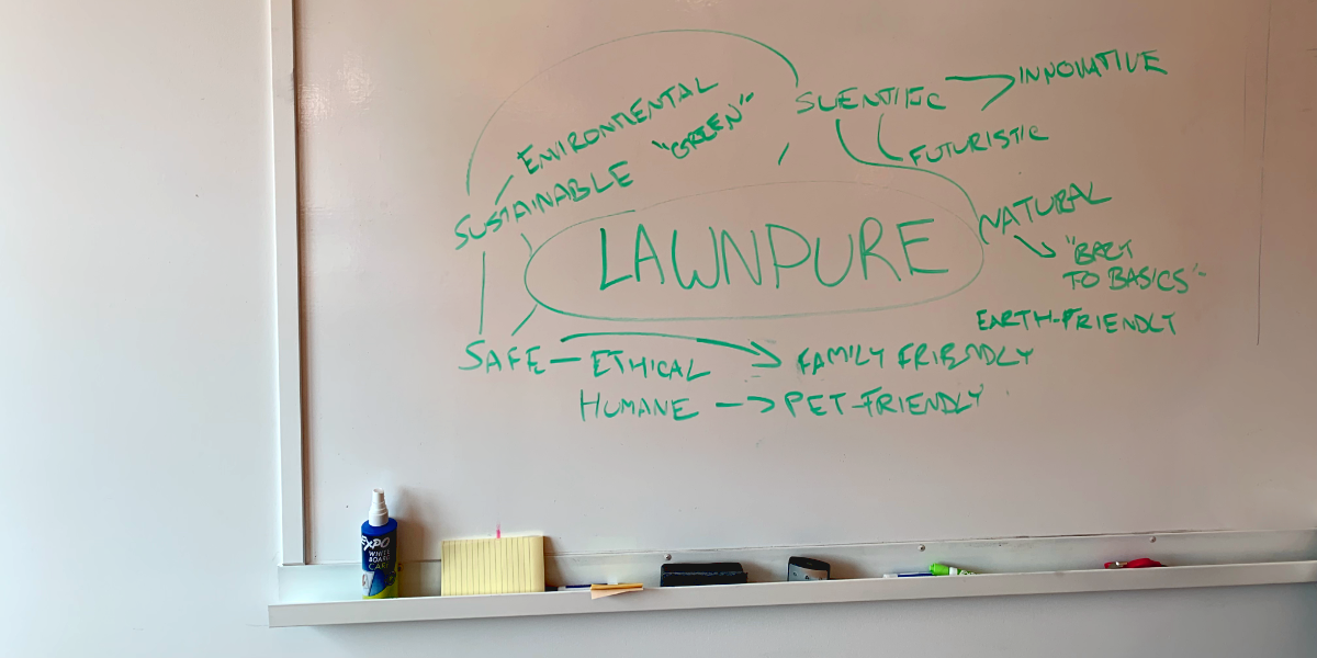
We started out by creating a “mind map” for our brand values. Mind mapping is a visual brainstorming technique. You start with a central idea (your brand, in this case) and diagram your thoughts by connecting keywords and related concepts around that central idea.
Mind mapping can be done alone or in a group and is a great tool for refocusing your ideas or creating new ones. In brand development, it’s perfect for coming to a consensus around a coherent brand identity.
From our mind map, we were able to develop a conceptually strong brand, making it easier to answer questions that would help us understand what set our brand apart from the competition:
Why did we start our business?
We started our company because we wanted to maintain a healthy green lawn that was safe for our kids and pets to play on. Current chemical fertilizers are great for maintaining a green lawn, but they’re often toxic after being treated. Vinegar-based fertilizers are safer, but are not nearly as effective. When we couldn’t find an effective natural fertilizer, we decided to make our own.
What values are important to us as a company?
At LawnPure, we value ethical, safe methods of lawn care and insect population control. We believe that the key to human prosperity is through scientific research and development of safe, effective, and sustainable lawn care products. We are advocates of environmental sustainability. We believe that humanity has an obligation to protect our environment for our own safety and for the safety of future generations.
What sets us apart from the competition?
Agricultural biotechnology (or “agritech”) is plagued with corporate greed, unsafe practices, and careless disregard for the sustainability of the planet. We’ve seen enough lawsuits over health and environmental issues to know that big agritech cares more about corporate profits than the safety of their customers, employees, and future generations.
What sets LawnPure apart is our desire to implement change. Our team of scientific researchers dedicate their lives to creating safe, effective products for long-term, sustainable farming. In a world of corporate carelessness, LawnPure is like a breath of air as fresh as your naturally cared for lawn.
Considering our brand identity got our creative juices flowing. We didn’t have a logo design pinned down just yet—but we were able to figure out what values our design needed to project.
Getting started is often the hardest part of any creative endeavor. It’s good if you have an idea, but sometimes the problem is having too manyideas at once.
Analysis paralysis occurs when you have so many ideas you get stuck over-analyzing them and become unable to make a decision about which one is best.
To avoid analysis paralysis, don’t think about creation as a task of building something from nothing. Instead, think of it as a puzzle: the logo already exists in your mind, you just have to put the pieces together by drawing on established design principles.
Learn to speak the language of logos by viewing as many great logos as you can. Think about what made your favourites so memorable.
If you’re looking for some places to check out great logo designs, here’s a list:
Design-related hashtags: Many social media communities use specific design-related hashtags for showcasing their graphic design work. Instagram is especially good for this, given the visual nature of the site. Next time you’re browsing the ’gram, check out some of the more popular design hashtags: #logo, #logodesigns, #logodesigner, #graphicdesign, #graphicdesigner.
Color is more fundamental to a person’s perception of visual stimuli than many people realize. Studies have even suggested that color can affect your users’ mood, making it crucial to their buying decision.
Your logo’s colors will end up on your website, in-store signage, social media feeds, marketing emails, and every other place where a user interacts with your brand. There’s no color that’s universally “better,” but each color does say something different. You want to make sure you’re saying the right thing.
With that in mind, let’s go over the psychological effects of certain colors:
Brown: An earthy tone, brown is often associated with all-natural ingredients, homemade goods, and freshly baked treats. Given its the color of tree bark, sticks, autumn leaves, and rich soil, brown can also give an outdoorsy aura to your brand.
Orange: Like a roaring fire, orange radiates warmth, energy, and passion. The color of sunsets, it also tends to invoke summer—especially when paired with lighter blues and soft greens.
Yellow: Orange’s high-saturation sister, yellow, also gives off light, energy, and warmth. But if orange’s warmth is a glowing fireplace, yellow’s is the intense heat of a midday sun radiating over baron dessert. Yellow tends to invoke happy feelings, but use it sparingly. A little yellow can add a touch of optimism to a dependable brand, but a lot can be maniacal.
Green: A color with two personalities, green can invoke an organic aura that brings to mind lush rainforests, eco-awareness, and a sense of calm. And yet green just as easily becomes the color of money, greed, envy, and nausea.
Pink: A softer, gentler color, pink has at different points in history been viewed as both masculine and femine. Though contemporary customers will likely associate pink with femininity, it more broadly brings to mind kindness, romance, and love.
Red: Bold and unforgiving, red tends to stand-out, which is why it’s become such a dependable color in branding. Like pink, red tends to invoke romance. But whereas pink’s romance is tender and gracious, red’s romance is passionate, loud, and carnal.
Purple: The Rasputin of colors, purple is a shadowy, mysterious stranger with an almost magical magnetism. Given that purple dyes historically have had a reputation for being rare and expensive, there’s no mystery how purple has come to be associated with wealth, excess, mysticism, magic, and indulgence.
Blue: The color of a clear sky, blue tends to invoke feelings of trust, ease, and peace. That said, blue has also been shown to be the least appetizing color. Try to avoid it if you’re selling food.
Black, White, Gray: Sometimes the best color for your brand is no color at all. Shades of black, white, and gray tend to invoke a sense of calmness, balance, or clarity.
Using more than one color
Most logos are monochromatic. Single colors are easier to coordinate with, and using only one color will simplify your brand’s other graphic design elements. Mono logos also can be reimagined in different colors for different purposes.
The more you can simplify your design, the better. Complex designs are harder to remember and less likely to stick in your customer’s heads.
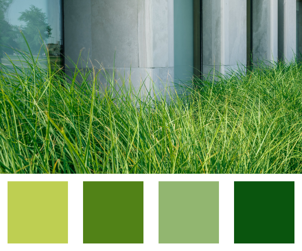
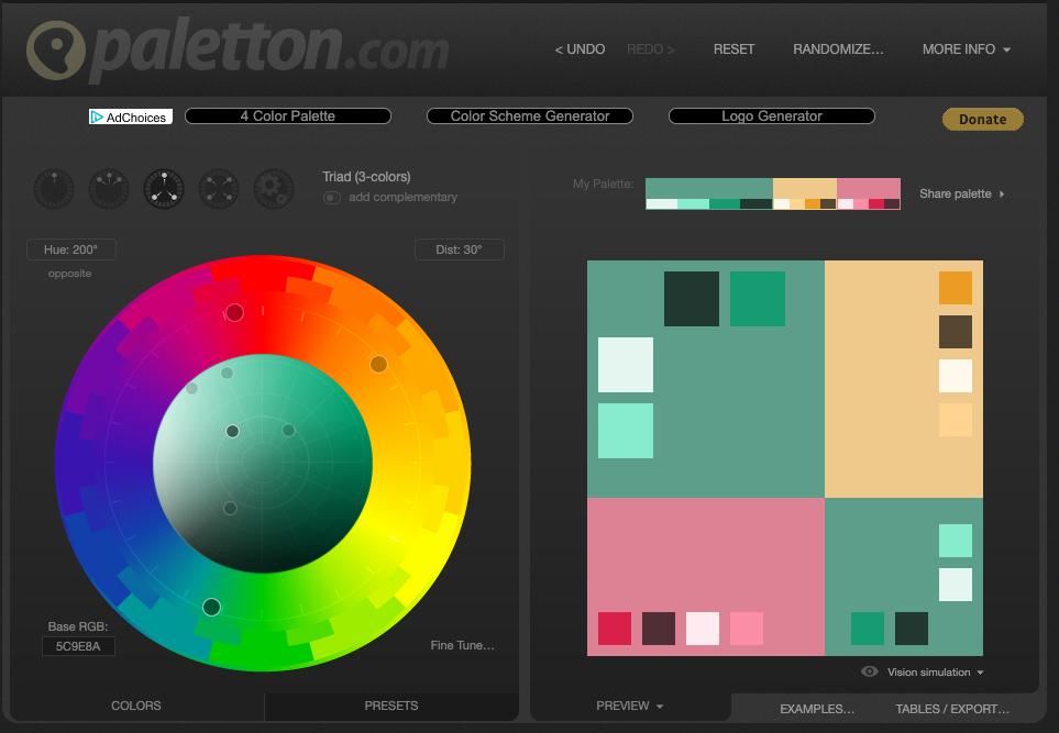
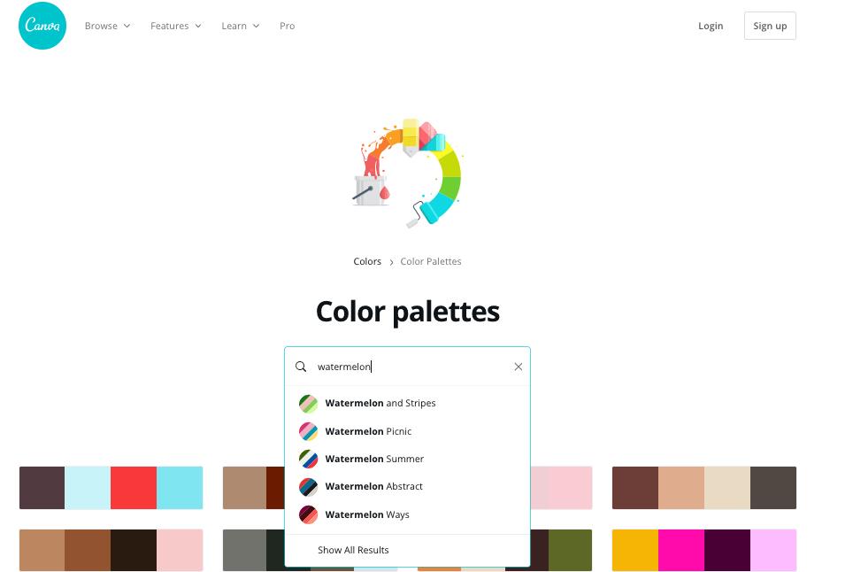
If you choose to have a multicolored logo, it’s important to be conscious of what colors you use together. While color theory can be quite complex, there are a lot of online tools to help you fast track a color scheme:
We decided very early in the creation process for LawnPure—the all-natural, citrus-based organic pesticide—that green would be the base color of our logo. Eco-friendly and reminiscent of a healthy lawn, green seemed like the perfect fit.
We started out by trying to replicate the color of a healthy green lawn. This seemed logical in theory, but colors aren’t perceived in real-life the same way they are on-screen. Variations in light, distance, and a host of other factors can affect visual perception and make the same object appear to be many different shades—even in the same image.
Expect to spend a while playing around with your base color before you find the perfect fit. The visible spectrum is so vast that the smallest changes in hue, saturation, or brightness can significantly change the mood of your brand’s color. Altering some basic icons and text, we compared a couple of possible shades. Even slight tone differences seemed to communicate something completely different.
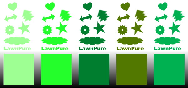
Brighter, more saturated tones were attention-grabbing and playful, but also had a cartoonish, juvenile feel to them. A good color for selling toys or comic books maybe, but not right for LawnPure. Darker, more earthy tones of greens did seem to harken back to nature in the way we felt the LawnPure brand should, especially when paired with browns, oranges, and dark reds.
Still, there was something not quite right about them. They exuded a “getting back to nature” quality, but also tended to remind us of military camouflage. A color combination like this might work great for a more rugged brand selling hunting supplies or camping gear, but for the peace-loving hippies at LawnPure selling environmentally sustainable lawn care products, it wasn’t a good fit.
Originally, deciding on green seemed easy, but after hours of experimentation, it started to feel like we hadn’t made a decision at all. “Green” can mean lime green, seafoam green, or forest green—but which green is LawnPure green? After saying no to so many shades, we finally stumbled on to just the green we were looking for.
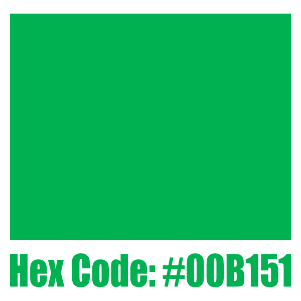
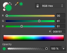
LawnPure green (hex code #00b151 if you’re a programmer) is a purer, mild green that’s not too saturated, not too dark, and has just a touch of blue—barely noticeable, but enough to conjure up images of a lush field under a bright blue sky. This was LawnPure’s brand as a color.
We considered pairing LawnPure green with other colors. Mixing it with bright pinks and oranges looked great and gave it a summery quality, invoking the taste of juicy fresh peaches, strawberries, or watermelons. Great for fruity summer beverages or berry-scented candles, but not quite right for LawnPure.
Mixed with sky blues and sandy beiges, it was much closer to epitomizing the image of a well-kept summer lawn. Too close maybe: something felt artificial about these color combinations. It might work for a golf course pro shop, but it still wasn’t quite the LawnPure brand.
Finally, there was brown. Mixing with brown seemed to make the most sense, given that it’s the color of rich soil. But this combination seemed less aesthetically pleasing. Darker browns weren’t very complimentary of LawnPure green. Lighter browns looked better but tended to invoke rocky, dried-up infertile land instead of rich, arable soil.
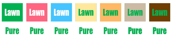
In the end, we decided to leave the second color up in the air. We weren’t rejecting additional colors just yet, but it was clear that any second color used would be minimal. For now, the brand’s main color was decided, and we were ready to start sketching ideas.
Your logo may not include any text, but much of your graphic design will, including your web copy, signage, and a host of other branded materials. For the sake of consistency, it’s important to consider which typefaces your brand plans on using when designing your logo, even if you’re not using them in the logo itself.
The terms “typeface” and “font” are used interchangeably in most contexts, so it’s common to assume they’re synonyms. However, there’s an important distinction: a typeface is a characteristically distinct set of typographical symbols and characters, often divided into variant sets, like Italic and Bold. Each of these variant sets is a font.
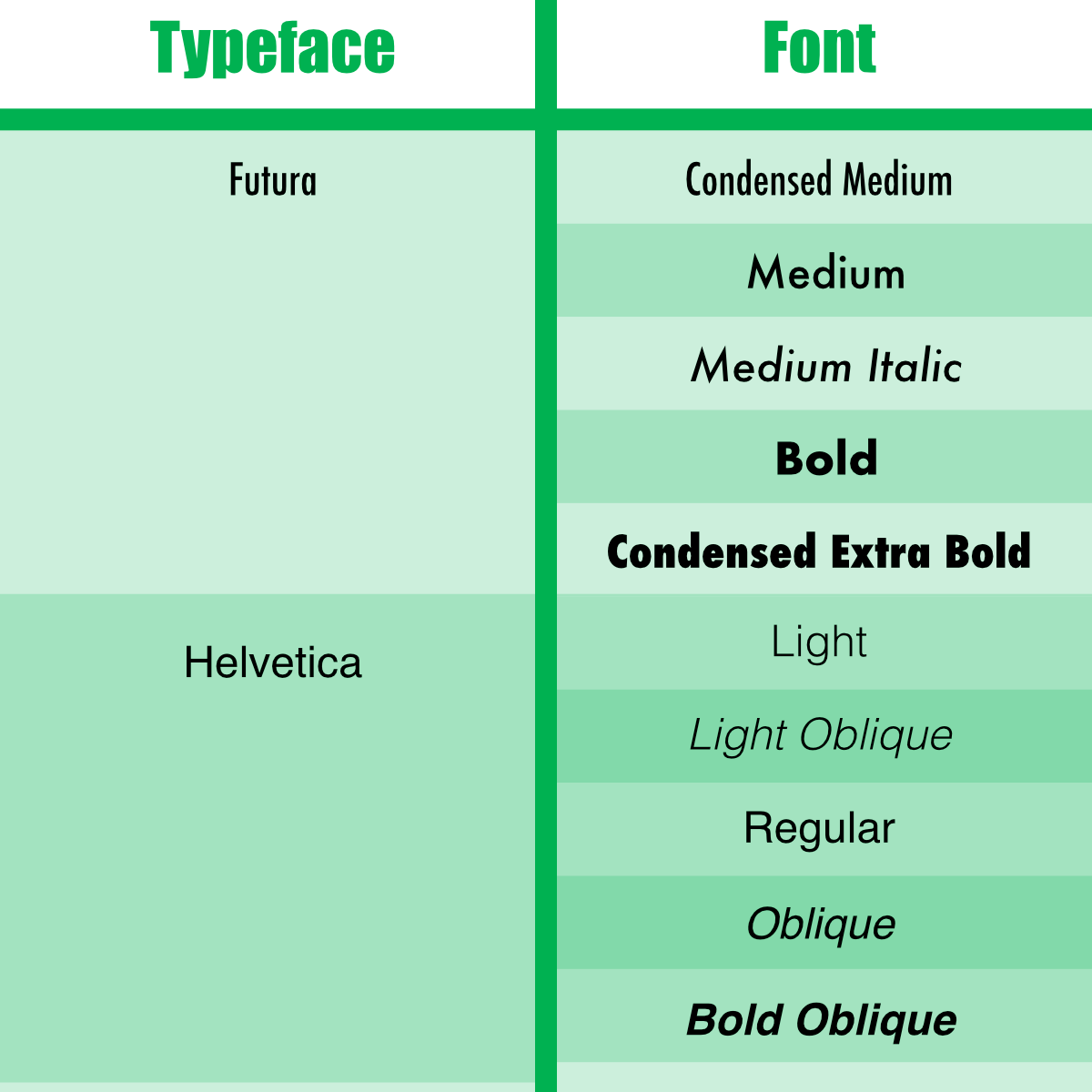
There are many models for sorting fonts. Some focus on style, some on historical significance, and some on endless splintered sub-categories. Although there’s more than one way to classify fonts, the most common methods largely derive from the Vox-ATypI classification system, adopted by the Association Typographique Internationale in 1962. This classification sorts fonts into four basic types: serif, sans-serif, script, and decorative.
1. Serif type styles
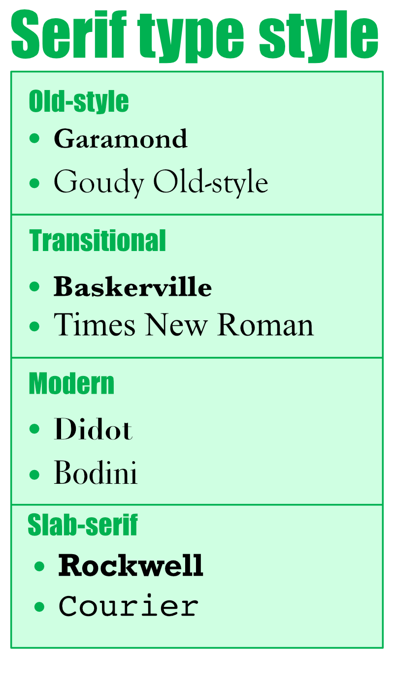
The word “serif” describes a small line or stroke attached to the end of a longer stroke in a letter or other character. Serifs are the oldest type style, tracing their roots back to inscriptional lettering used in the Latin alphabet.
2. Sans serif type styles
 Sans-serif typefaces, sometimes called gothic, do not have serifs at the end of character strokes. Sans-serifs have less line-width variation and tend to be easier to read when backlit, making them most prevalently used in text on computer screens. In print media, they’re most commonly used in headlines, but can sometimes be used in body copy.
3. Script styles
 Script typefaces are derived from handwriting or calligraphy. Scripts are more fluid than sans or serif styles and are often used in more whimsical contexts. Script styles are versatile and can be used by both formal and casual brands.
3. Decorative fonts
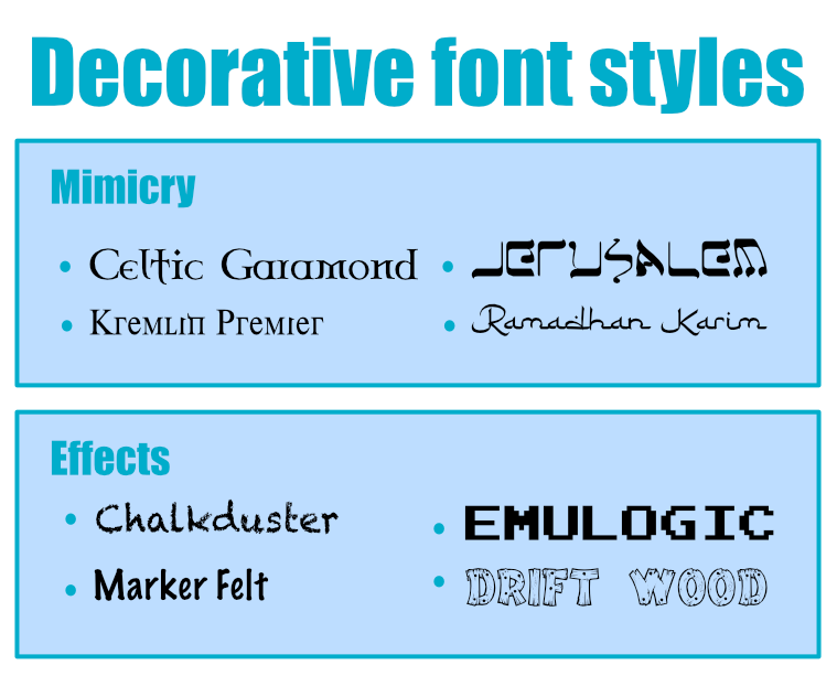
Decorative (or display) fonts are difficult to categorize since their defining feature is that they forego typographical conventions. Decorative fonts can convey a wide variety of moods but generally focus on a specific theme, motif, or aesthetic. More recently developed fonts tend to be decorative, oftentimes developed specifically for a particular brand.
Like color, a subtle difference in typeface can say very different things about your brand. It’s OK to have more than one brand font, but the key is consistency. Switching between drastically different fonts over and over can give your branding an indecisive feeling overall, which tends to morph into customer mistrust over time.
If your brand uses a particular set of typefaces, make sure you have concrete guidelines about when to use which fonts. When font choices switch frequently and at random, they tend to evoke a sense of suspicion and anxiety.
Finding the right font might not happen right away, but you can narrow down your choices by considering a few key factors alongside your brand identity.
Just as it was to color, brand identity is the most important factor to consider when it comes to your typeface. Different font attributes tend to invoke different brand qualities:
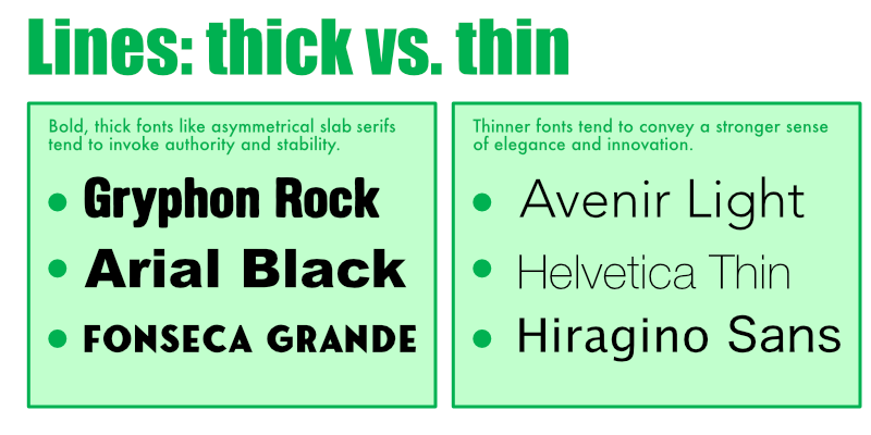
1. Lines: thick vs. thin
Bold, thick fonts, like asymmetrical slab serifs, tend to invoke authority and stability. Thinner fonts tend to convey a stronger sense of elegance and progress.
2. Stress: diagonal vs. vertical
Designers refer to a font’s “stress” when describing the angle at which the thinnest parts of a character’s stroke are aligned. Brush scripts and italicized text would be described as sitting on a diagonal axis, while block text would be described as sitting on a vertical axis. Fonts on a vertical axis tend to look more formal and traditional, whereas fonts on a diagonal axis look more casual and inviting.
 3. Contrast: low vs. high
When talking about a typeface, “contrast” describes the difference in weight between think and think strokes. Low-contrast typefaces tend to be more legible but less formal looking than mid-range-contrast type. High-contrast fonts tend to look more modern and authoritative.
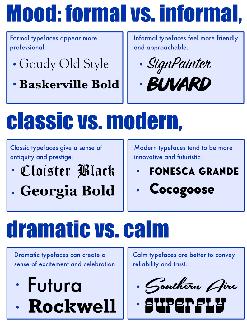
 4. Mood: formal vs. informal, classic vs. modern, dramatic vs. calm
Harder to pinpoint is a typeface’s “mood.” Older serif fonts and scripts are more formal and classic looking, with older scripts feeling more dramatic. Newer sans-serifs tend to convey calm modernity but can be either formal or informal. Decorative fonts can be all of the above but generally feel more dramatic. Ask yourself what qualities you ascribe to your font and if those are the same qualities you’d ascribe to your brand.
5. Create several rough versions
Back at LawnPure, we started brainstorming our brand font alongside the logo creation process. The LawnPure brand considers itself innovative, modern, and futuristic, so classic-mood fonts didn’t feel right. More dramatic fonts didn’t work with our brand either— LawnPure is calm, like fresh grass on a hot summer’s day.
We decided to play around with some calm, modern fonts to see what we came up with:
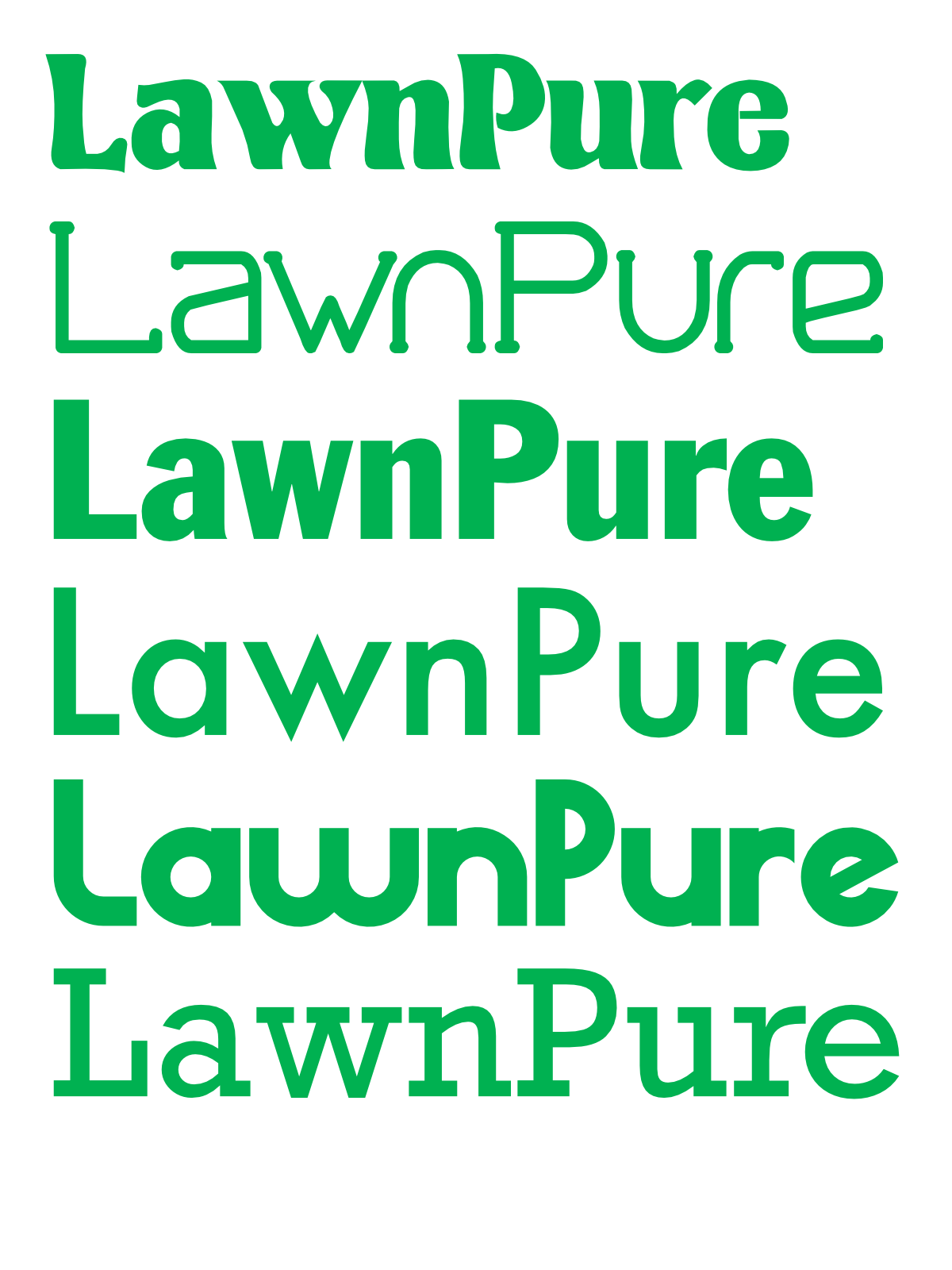
Like with the logo, our first instinct was to try and emulate the look and feel of grass. We wanted something that felt alive and thriving. Serif typefaces felt “fixed” and tended not to express this quality very well. Sans-serif typefaces were better—but still didn’t feel right.
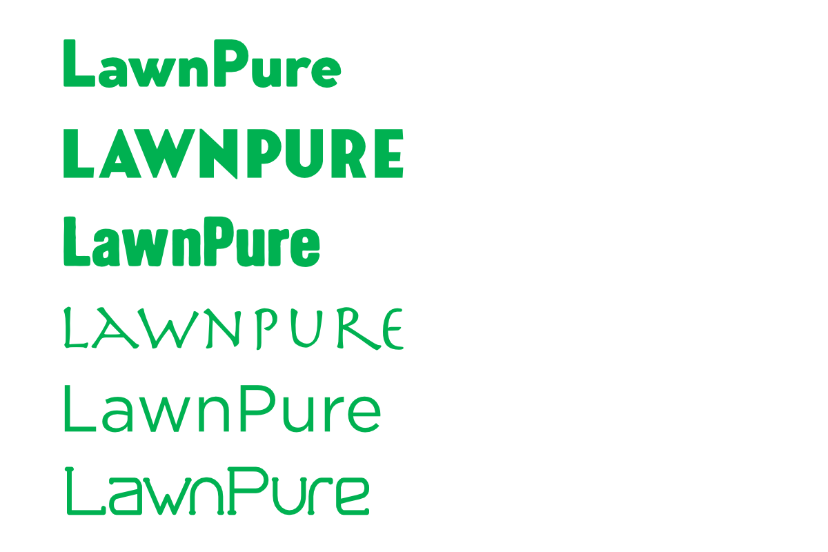
Thin lines tended to feel less formal than thick lines, which was good. However, they also felt pedestrian in a way that didn’t mesh with LawnPure’s innovative character. Thick lines felt more innovative but seemed to convey a dramatic, less calm mood. We needed something that landed in the middle.
We also tried out some scripts to be used for emphasis. Scripts have the active, wavy quality of grass on a windy day, so we thought this might work well with the LawnPure brand.
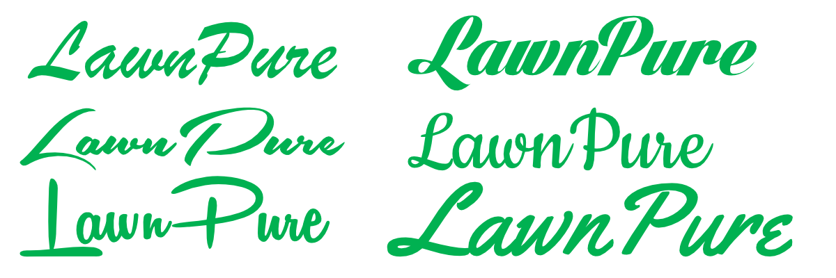
Our scripts definitely had a more informal and interesting character. Script fonts certainly had the wavy quality of grass, but in large doses felt a bit too retro for LawnPure. It was here where we had the idea to combine fonts. We tried a few combinations, but nothing seemed to stick.
Our favorite script was Southern Aire, since it looked the most like grass. We tried combining this font with some other, more formal sans-serif typefaces to see what worked.
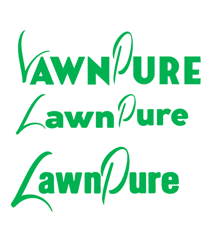
Our problem was, the more we tried to make the script looked like grass, the less legible the words became. The more legible we made the script, the less it looked like grass. We were trying to combine two typefaces that just didn’t go together. In the end, we abandoned the script font. But testing it out like this was an important step in creating our final logo.
When you design your own logo, you’re likely going to encounter issues like this. Design involves a lot of trial and error. You might spend a whole afternoon experimenting and have nothing to show for it at the end of the day, aside from the knowledge that narrowing down your options means less work tomorrow.
When completed, the font we thought best exemplified our brand values was Rhino Sans.
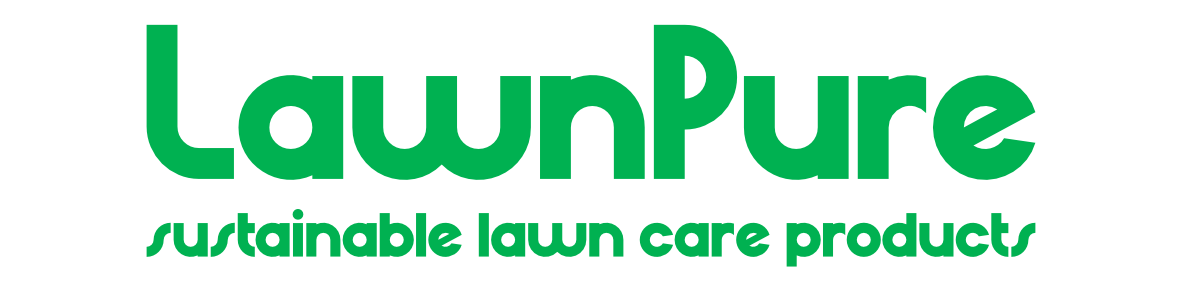
Rhino Sans was formal, but not too formal. The lettering felt calm, modern, and unique. It was occasionally unreadable but we weren’t planning on using it for any body text.
One thing we didn’t like about it was the “W,” which was wider than the other letters. It was here we decided to combine our grassy script idea with Rhino Sans. We tested some things out:
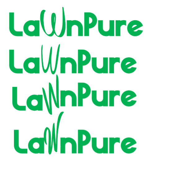
Here, again, we ran into an issue. The more we altered the “W” to look like grass, the less legible it became. It’s important to stress here the hours of trial and error that can go into creating even what appears to be a simple logo.
We tried every script we could. We played around with the dimensions of the characters, adjusted individual lines and angles, used the outline of the characters as a guide for our own hand-drawn characters – but no matter what, the logo just wasn’t right yet.
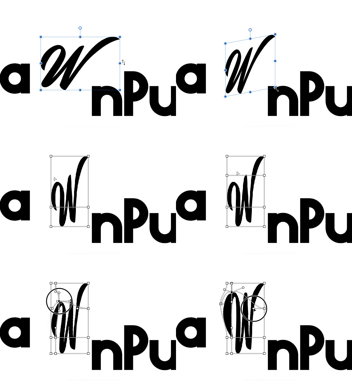
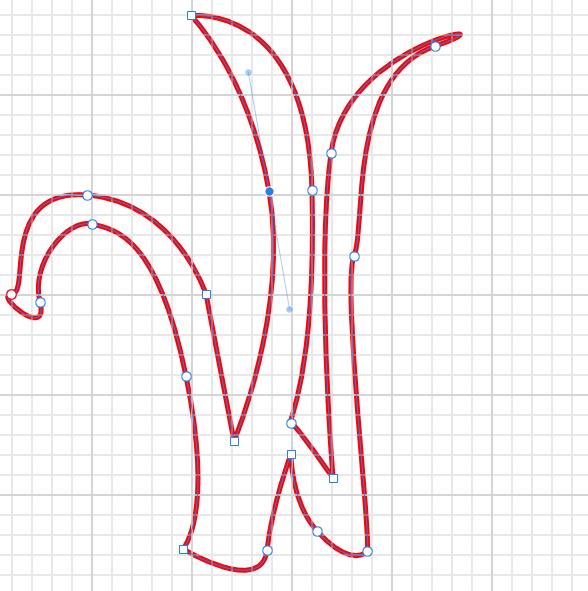
That’s when we decided it would be best to design our own “W” specifically to look like grass. If you’re more comfortable hand-drawing your logo, feel free to take this route. Our personal preference was the pen tool in Photoshop.
6. Get feedback
The creative process is different for everybody. Some may start with sketches, while others might jump right into Adobe Illustrator. The drafting phase involves a lot of trial and error, so don’t get discouraged if things aren’t working.
At a certain point, you’re going to start to feel like you can’t even recognize letters from shapes or good logos from bad. When this happens, it might be time for feedback. Feedback is incredibly important to the creative process, because it’s the only method creators have of “testing” their ideas.
You can get feedback from nearly anyone, just make sure you’re not relying on a single person. It also helps if the people providing feedback are in your brand’s target demographic.
For the best feedback, ask specific questions about how each person perceives your brand based on the logo. Being told your logo is “good” or “bad” won’t be helpful, but knowing how your brand comes across will be.
Here are some ideas for questions to ask when getting feedback:
It’s hard for someone to be certain of how they’d react to your brand in real life, so avoid questions like, “Would you buy this?” or “Is this interesting?” More specific questions will garner more specific answers and better feedback.
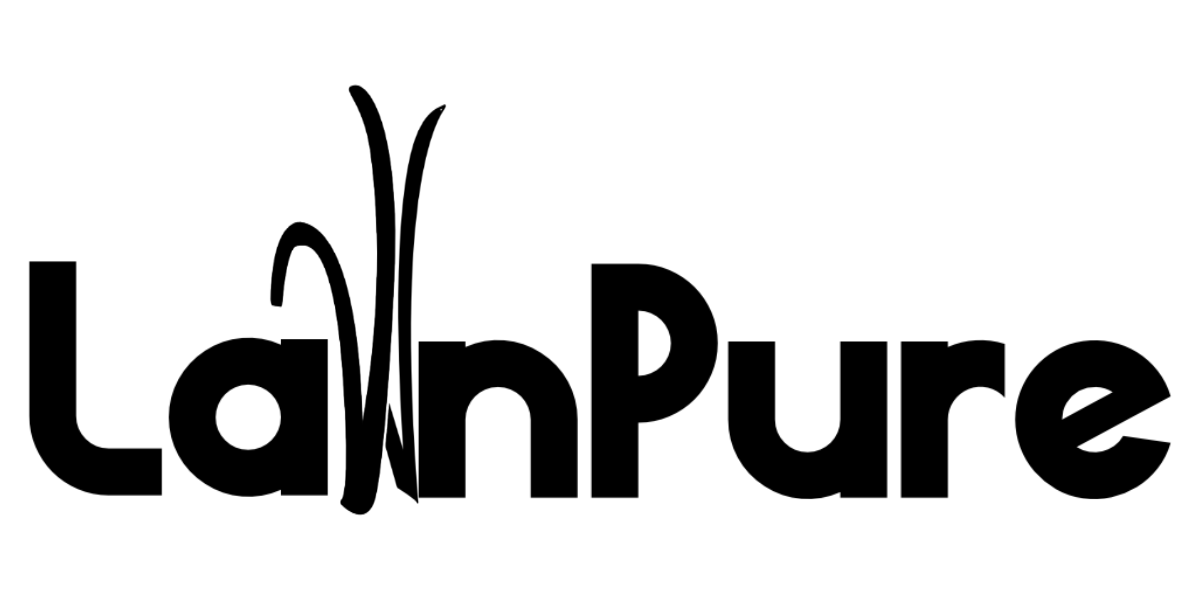
After messing around with LawnPure’s logo, we had a design that was ready for feedback:
7. Polish your winning design
Using our selected font, we spelled the brand’s name and then drew blades of grass that would stand-in as the “W” The thing about logo design is that when you meticulously make adjustments to the same image for hours, you can start to lose your grasp of what made the logo good in the first place.
As you gather feedback, the strength of your designs will begin to become more apparent. You’ll notice parts of your design that might not be sticking like you thought they would. Meanwhile, aspects you didn’t give a second thought to will turn out to be widely successful. Feedback can surprise you.
This happened to our design. We spent so long trying to get the grass logo to look more like grass that we forgot to make it look like a “W.” The most common feedback we got on our first draft was that it was unclear how to pronounce “LallnPure.” We went back to the drawing board to widen things up.
The second piece of feedback had to do with the kerning on the last “e” in LawnPure. We used the font’s default spacing, but since the size and dimensions had been altered significantly, the “e” looked a little to far off.
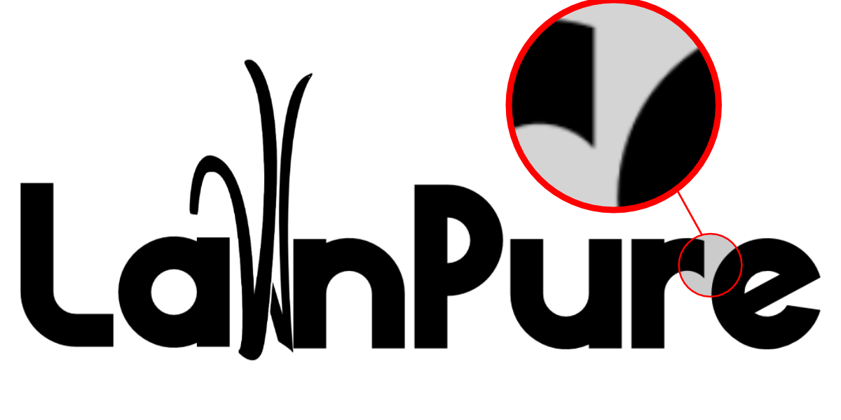
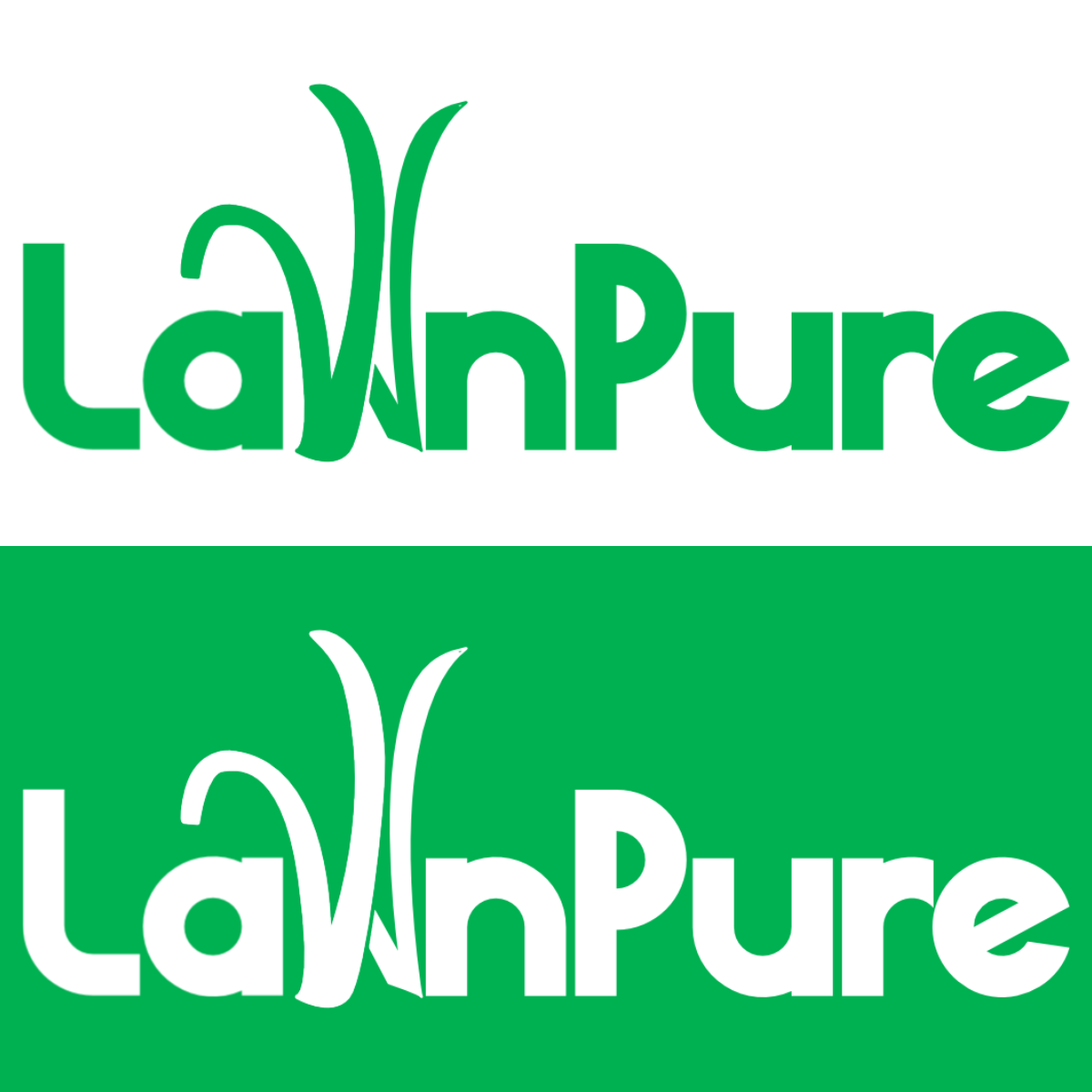
We took the feedback, made the suggested revisions, and finally, our polished logo was ready:
If you decide you want to work with a professional, there’s no shortage of websites and online communities where you can find designers to hire for freelance jobs:
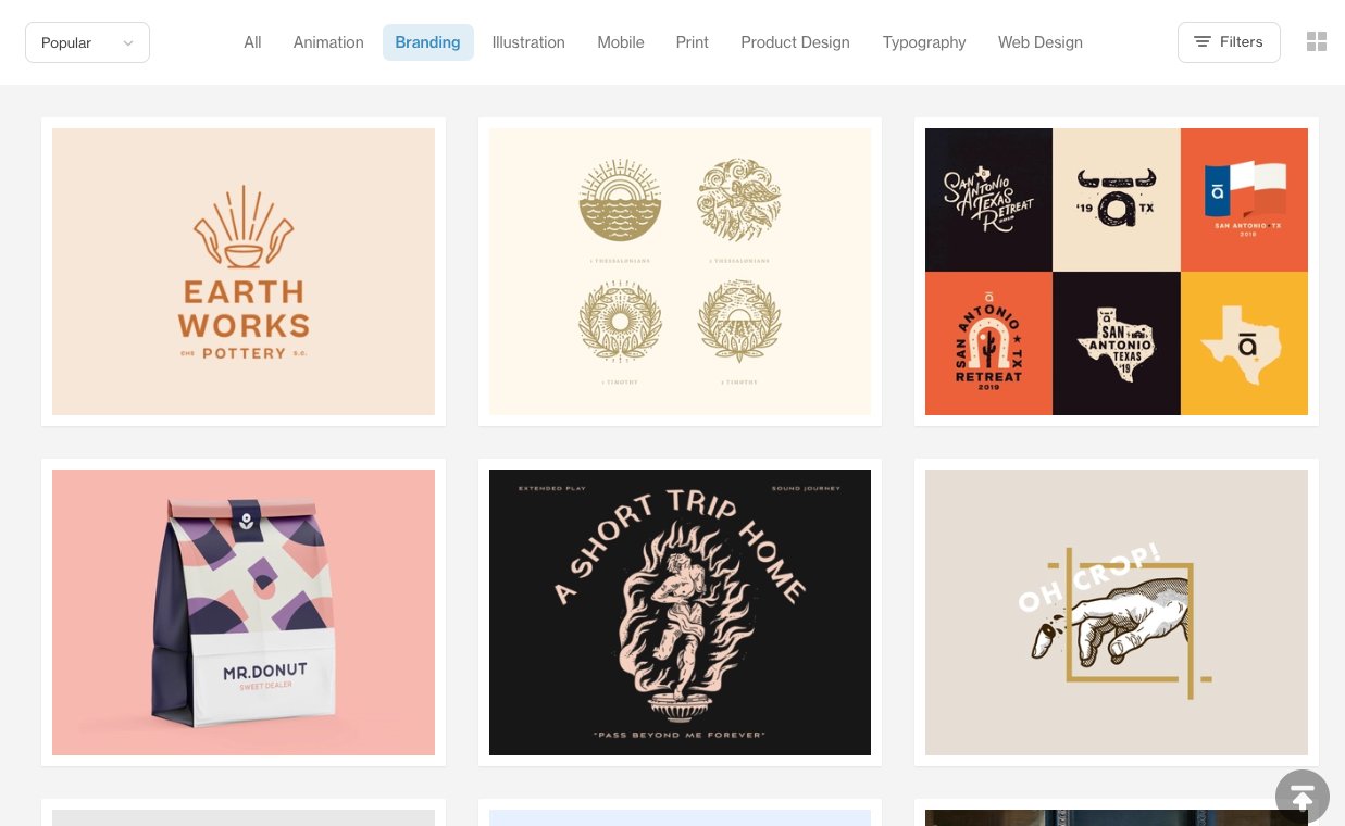
Recruiting a professional graphic designer can be a huge advantage for business owners in need of a good logo. Having an expert to bounce ideas off of is a great way to revitalize your creative energy and separate ideas that work from the ones that don’t.
But partnering with a designer isn’t always a golden ticket to the perfect logo. It’s important to know what to expect when you hire and how to manage a graphic designer. If you’re looking to hire a pro, here’s some tips on establishing a good working relationship with your designer:
In the startup phase of your business, taking on a new hire, even a freelancer, might not be feasible. When this happens, you’re left with two options: design your own logo or use a free online logo generator.
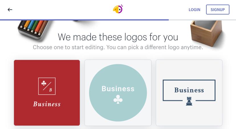
If you’re short on time and need a professional logo designed ASAP, then a free logo generator is your best bet. There are plenty of adequate logo makers online, but beware—low-quality logo makers generally result in low-quality logos.
To help your decision-making process, we’ve rounded-up a list of the best free logo creators currently online:

With its aim on ecommerce, Hatchful’s development process draws heavily on visual marketing fundamentals and the relationship between brand values and design.
For business owners who are well versed in those fields but might need a little help with the design process itself, Hatchful is a great fit. Also, because it’s ecommerce focused, Hatchful provides free, fully loaded branding packages that include high-resolution versions of your logo designed for social media profiles, website banners, branded swag, in-store signage, and more.
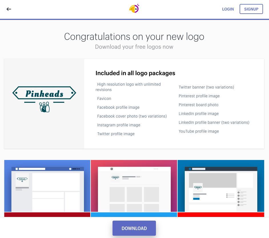
The logo creators on this list have advantages and disadvantages. We encourage you to try them all to find the best fit for you.
Logo-generation tools are great for creating professional logos at break-neck speed, but any free logo generator comes with limitations, not to mention the fear of encountering strikingly similar logos from competing brands.
For many full-time entrepreneurs, free online logo generators just won’t cut it. Not because of the logos themselves (there’s no doubt you can create a stunning, original, on-brand logo with these tools), but because of the curtailed creation process.
Entrepreneurship tends to attract people that thrive on creative expression and innovative problem solving. For people like this, the opportunity to round out their skillset and cultivate their branding chops by designing their own logo is just too good to pass up.
If there’s one thing to take away from all of this, it’s that you shouldn’t underestimate the importance of your logo.
Logos are subjective. While there’s no right or wrong way to make one, there are common mistakes and useful techniques to be aware of:
DO use minimal amounts of color. Monochromatic logos are more adaptable and having one simplifies the color selection process. The more colors you use, the more complicated adaptation becomes.
DON’T over complicate your design. Don’t pack too many icons into one logo. Simple figures are far easier to convey rather than complex scenes, and are more likely to be remembered. Consider the staying power of Apple’s iconic design or Volkswagen’s symmetrical “VW” logo.
DO create variations of your logo in different sizes and proportions. When you go to add it to everything from websites to pens, you’ll start wishing you had size options.
DON’T create variations that are too different. Avoid re-arranging too many elements and don’t change the design.
DO explore logos and get inspired by other brands, especially ones in your industry.
DON’T imitate logos too closely. Not only is it plagiarism, but it’s also going to impede any chance your logo has to stand out.
DO be contemporary. Even if your brand has a more “classical” character, it will still need to compete in the modern world. Tons of brands draw on classic design attributes, but completely neglecting decades of design theory will be alienating.
DON’T be too trendy. Logos made in an era obsessed with specific colors, designs, or aesthetics quickly become dated. For example, the original Toronto Raptors logo was conceived in 1994 at a time when bright pastel colors, sharp angular designs, and Jurassic Park were at the height of their popularity. Initial merchandise sales were high, but the logo became dated quickly and after a few minor tweaks was finally discontinued in 2014.
Your logo will become the face of your brand, appearing on everything from web ads to your office stationary. Making one that sticks isn’t easy—especially when it needs to convey the complexity of your brand.
But strong, memorable brands tend to have strong, memorable logos. Going through this long process to create a simple image might seem like a lot of work, but considering that the design will forever be linked to your brand, it’s worth it.
Every large brand started off small. You don’t need to sacrifice quality just because you’re in the startup phase of your business. The idea of designing your own logo may have seemed daunting at first, but now, with a stronger understanding of the principles of design and the steps involved in the process, you’re better equipped to give it a try than you’ve ever been.
This article was originally published by our friends at Shopify.