
Fewer and fewer people want to turn on their computers to perform everyday tasks.
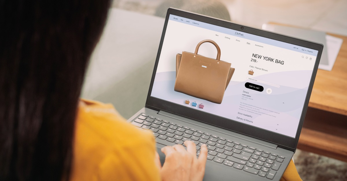
It’s much easier to check email or shop on a smartphone. Therefore, website owners need to ensure mobile users feel as comfortable as possible. This especially applies to online stores. In this guide, we’ll explain in detail how to make your Shopify store mobile-friendly.
In today’s world, you no longer need to delve deeply into the technical details of any process. You can turn to responsive Shopify design consultants and achieve excellent results. But if you want to optimize your website yourself or control the process, it’s essential to start with the basics.
Simply put, mobile responsiveness is a website’s ability to instantly adapt to any user’s screen size without losing quality. This means whether the user is accessing the site from a computer or a mobile phone, they won’t lose important information and can easily complete their desired action.
It sounds simple, but in reality, it requires serious work. The site must instantly adjust the placement and size of elements to prevent potential customers from leaving the page immediately. Shopify store owners already have an advantage, as the platform is mobile-friendly. The main challenges arise for those who want to customize their store and use a unique theme. This is where additional work will be required.
So, you’ve realized the importance of making your theme mobile-friendly and are eager to get started. Then you need to pay attention to the following points.
Shopify offers a variety of ready-made store themes. You can also find interesting designs on specialized platforms. Many of them already have built-in adaptation mechanisms for different screen sizes. So, if you haven’t yet chosen a design for your online store, pay attention to this. When ordering a custom theme, make mobile responsiveness a key requirement in your specifications.
Ease of navigation largely determines whether a customer will stay in your store or switch to a competitor. If a user can’t figure out how to get to the desired section, they won’t waste their time. Therefore, the first thing you should pay attention to is the buttons that direct you to different pages. There are several aspects to consider here.
You’ve probably already grasped the main idea: even on a mobile device, navigation should remain clear and logical. The user came to you to make a purchase, not to complete quests.
An online store is a place where users expect to see lots of photos. Your goal is to present your product in all its glory. It’s logical to upload the highest-quality, most detailed images possible. As for dimensions, Shopify specifies specific values:
To prevent photos from slowing down page loading and making users wait impatiently, compress them as they load. This can be done using third-party programs, Shopify’s built-in tools, or a convenient plugin. The latter option is optimal, as it offers the most options and simplifies the process.
Not only photos, but everything you publish on your website should be optimized for mobile devices. Even on small screens, all information should be easily readable. To achieve this, consider the following factors.
Be sure to check how easy it is to navigate your website. Even if you, as the owner, are annoyed, the buyer will definitely not tolerate it.
Page loading speed is the cornerstone of a website’s usability. No one wants to waste time waiting, so pay special attention to this parameter from the start. All elements that slow down loading should be optimized. We’ve already written about photos. However, they aren’t the only source of problems. Pay attention to all large files. It’s also worth using cacheable elements to avoid refreshing the entire page.
Once you’ve worked on the technical aspects of your website and ensured it works well on mobile devices, it’s too early to relax. Now you need to add a few features to ensure mobile users have the best experience possible. This will significantly increase the likelihood of a purchase, so do not neglect this step.
All these features are easily added using the appropriate plugins. Since Shopify is designed with mobile friendliness in mind, you’ll find plenty of such tools. The key is to make the site user-friendly and not overload it. Finding the right balance is crucial.
Once all the work is completed, you need to conduct an inspection. There are two primary methods for this. Let’s look at each.
Simply go to the tool’s page and enter your website URL. After a short measurement, you’ll receive a page performance report. It’s also convenient to see how mobile-friendly the results are. The test takes a couple of minutes, but it provides a wealth of information.
To do this, you’ll need a PC and several mobile devices with different operating systems and screen sizes. Your task is to visit the website, test the navigation, add items to the cart, and check out the purchases. Try to remain objective and don’t ignore minor flaws. It’s better to fix them right away.
On a PC, you should also open your website and test how it works in a reduced browser window. This will also provide information about the design’s adaptability to different sizes.
As you can see, adapting the Shopify website for mobile devices doesn’t require anything out of the ordinary. However, it’s painstaking work that requires a comprehensive approach and consistency. First and foremost, you should understand that your sales largely depend on the ease of use of your website on mobile devices. Therefore, if you’re unsure of your abilities, you can always turn to optimization specialists.
How can I ensure a new feature appeals to mobile users?
A/B tests are best. They will accurately show which design option or feature is most popular with users.
How often should I test mobile responsiveness?
The first test should be conducted immediately after feature integration. Performance metrics and user feedback should then be regularly monitored.
If I use a ready-made theme, do I need to further optimize it for mobile friendliness?
It all depends on the theme’s specifications. Many stores prefer custom themes created specifically for them. Therefore, it’s essential to ensure the design has the required level of mobile responsiveness and make adjustments if necessary.

