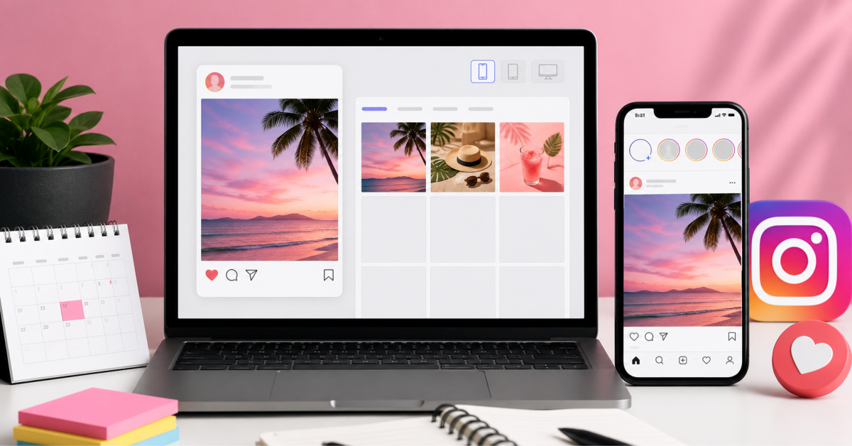
Social media managers can use realistic Instagram post mockups to preview campaigns exactly as clients will see them, align feedback around one screen, and turn approvals into a repeatable, low-friction system.
Clients give clearer feedback when they review the actual Instagram experience, not a caption in one file and an image in another.
Client approval becomes difficult when a campaign is reviewed in separate pieces. The caption may sit in one document, the visual in another file, and tags inside a spreadsheet. Each part can seem acceptable while the final post still feels crowded or unclear. A realistic preview shows how the message, image, profile details, and engagement elements appear together before publication. This helps social media managers catch problems early.
A fake instagram post maker can create a visual draft with the username, profile image, caption, post image, likes, and comments. FakeInstaPost also allows changes to verified status, story indicators, tagged states, and comment display. The aim is not to create a public post. It is to give the client a realistic screen that can be reviewed without publishing anything. Everyone can then discuss the same version instead of relying on separate files.
A preview should answer practical questions before formal review. Does the image remain clear inside the Instagram layout? Is the opening line strong enough to hold attention? Are hashtags and mentions placed correctly? Does the post feel crowded once comments and engagement details appear? These points are harder to judge when copy and visuals are reviewed apart.
The full post should be treated as one communication unit. A strong image can lose impact when the caption is too long, while concise copy can feel weak beside a confusing visual. Profile details also affect how the post is read. The preview should include the intended username, profile image, date, and caption structure. Once clients see the complete arrangement, their feedback becomes more specific.
A useful review process separates decisions into stages. Start with the main visual direction, then move to copy, tags, and interface details. This prevents one minor concern from reopening every part of the campaign. It also gives the manager a record of what has already been approved.
The first review should focus on the campaign idea and the role of the post. The client needs to confirm whether the image supports the offer, announcement, or message. Small wording edits can wait until that decision is settled. The main question is whether the post communicates its purpose within a few seconds. Further polishing cannot fix an unclear idea.
The second inspection may look over how the caption has been structured and how the voice of the brand has been maintained. The breaks between lines should be clearly visible because it may happen that text that looks perfect in the document seems unsuitable in the caption of the post. Hashtags and mentions should occupy their correct places to help the manager understand if the caption is well-structured or is overloaded with information. The point is to find out whether the main call to action has been placed at the right moment.
The last check should confirm the latest approved version of the caption before posting it. It needs to contain all the information relevant to the approval file; date, the text of the caption, tags used, as well as visual materials. A screenshot of the final variant of the caption can be kept with the notes concerning the campaign. It can be used as a reference in case any changes are proposed later.
Visual review should begin with composition, cropping, and text placement. Instagram changes the context because the image sits beside account details, icons, and engagement information. A design that looks balanced in an editor may feel crowded inside the full interface. The mockup should be checked at a realistic viewing size. Clients can then approve spacing and readability.
Several versions can be prepared when the client is choosing between headlines or image crops. Each version should change one important element. When the image, caption, username, and engagement details all change together, the better choice becomes difficult to identify. Controlled comparisons lead to cleaner feedback. They also make recommendations easier to explain.
While tags and interface details are often considered only at the end of the process, they can have a significant impact on how accurate the post is in the end. Any mention that is missing, wrong username or hashtag that is placed incorrectly can cause additional work even after approval. It is desirable that these details make up a separate review pass. In this way it can be verified that everything is correct without coming back to the creative concept.
Using FakeInstaPost it is possible to see mentions, hashtags, links, comments, states that are tagged and details of interactions at the stage of drafts. These options will be helpful if there is a campaign with a partner account, credits for creators, tag for an event or branded hashtag is used. The preview will let see if the account reference is visible and the caption is readable along with the reference.
Light and dark viewing modes can also reveal layout problems. Text, icons, and profile images may feel different when the background changes. Checking both versions does not require another creative round. It is a basic quality check for contrast and distracting visual choices.
Previewing becomes more valuable when the process stays consistent across campaigns. A simple workflow can include a draft mockup, visual approval, copy approval, and final verification before scheduling. Each approved image can be saved with a clear version name and added to the campaign record. Over time, these files show which layouts and review methods create fewer revisions. The final post becomes more accurate, but the larger gain is a clearer working relationship with the client. Approval is based on visible evidence rather than different interpretations.
Previewing campaigns in a realistic mockup lets you see the full post—image, caption, profile details, and engagement elements—on one screen, so you catch crowding, unclear messaging, or misplaced tags before anything goes live.
By sharing that mockup with clients, you align feedback around the actual Instagram experience instead of scattered documents, which makes approvals faster and reduces last-minute changes.
A fake Instagram post maker such as FakeInstaPost helps with approvals by generating a screen that looks like a live post but is never published, so clients can review the username, profile image, caption, image, likes, comments, and tagged states as a single unit.
This realistic preview keeps discussions focused on how the campaign will appear to followers and eliminates confusion caused by reviewing captions and visuals in separate tools.
The first review pass should focus on the campaign idea and the post’s role, confirming that the image and core message support the offer, announcement, or story within a few seconds of viewing.
Once the client agrees the concept is clear and aligned with the campaign goal, you can safely leave small wording edits and tag adjustments for later passes without reopening the entire creative direction.
You can avoid endless revisions by separating approvals into stages: concept and visual direction first, then caption structure and voice, then tags and interface details, and finally a full mockup verification before scheduling.
Each stage locks specific decisions so small concerns in later reviews do not force you to revisit approved elements, and the final mockup serves as a single source of truth for what will be posted.
Checking both light and dark modes matters because text, icons, and images can look balanced in one theme and become hard to read or overly busy in the other.
Previewing the post in both modes is a simple way to ensure contrast, legibility, and composition hold up for all users, without requiring extra creative rounds or separate designs for each mode.