Free every Thursday · 59,694 Readers
Fastlane Insider Newsletter: What's working for Shopify in the AI era?
Free every Thursday · 59,694 Readers
Fastlane Insider Newsletter: What's working for Shopify in the AI era?
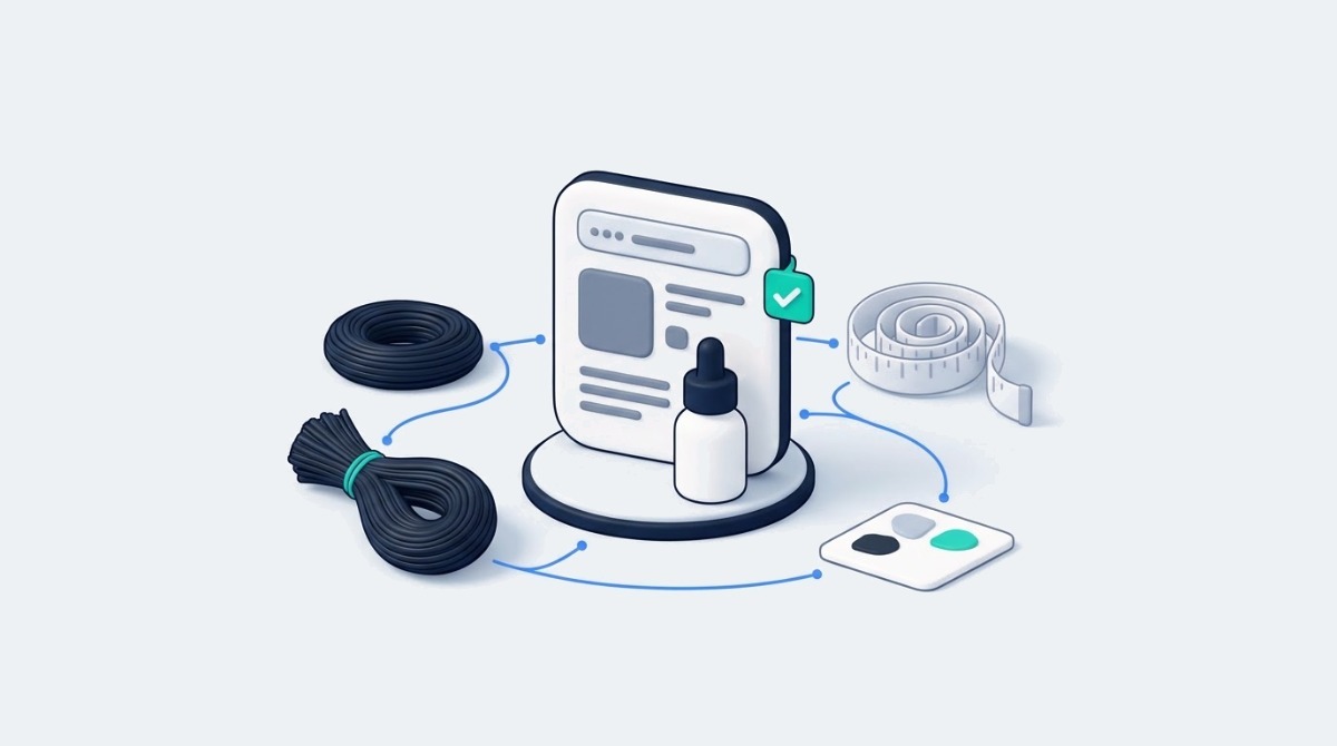
A product page can contain every specification a shopper needs and still lose the sale, because having the information and making it clear are two different jobs.
A shopper finds a promising beauty product through Google, clicks through to a Shopify store, and likes what they see. The photography looks professional, the price is reasonable, and the reviews seem encouraging. Yet instead of adding the item to their cart, they open another tab.
The problem may have nothing to do with the product itself. They simply cannot tell whether it will work for them. A foundation shade can look different in daylight, a serum can contain an ingredient that does not suit sensitive skin, and a human hair wig can have a lace construction that limits certain hairstyles. None of that shows up in a polished hero image.
For Shopify merchants, a better product page means finding those unanswered questions and answering them before the shopper feels the need to leave. The goal is not a longer description. It is more useful information at the exact moment someone is deciding whether to buy.
Beauty products raise more questions than their images can answer because the purchase depends on personal fit (skin, hair, head size, routine) that a photograph of someone else cannot confirm. Two customers can look at the same item and reach completely different conclusions about whether it suits them.
A skincare customer wants to understand ingredients, how often to apply the product and whether anything might irritate their skin. Someone buying hair extensions needs to know the texture, length, weight and maintenance involved. A wig shopper may be comparing lace materials, cap sizes and hair densities before choosing a variant. These details decide how the product performs after delivery, which is why shoppers go looking for them.
The research backs this up. In the Baymard Institute’s usability testing on product descriptions, half of the users shopping for beauty products needed ingredient information, and users who could not find key details either abandoned the product or made wrong assumptions that led to returns. Baymard also observed that shoppers rarely use chat for product questions, so the page is often the only source of answers they will consult.
Product pages often lean on visual appeal and leave the practical questions open. A beautifully photographed wig might show the finished hairstyle without revealing the cap construction. A foundation listing might feature several models without saying which shade each person is wearing. The result is a gap between what the merchant knows and what the customer can confidently work out.
Closing that gap starts with a different question. Instead of asking which features the brand wants to promote, ask what a customer needs to verify before buying. Fastlane’s guide to building a Shopify store for a beauty or skincare brand makes the same point at the planning stage: model the customer’s choices before the design work begins.
Technical specifications only help shoppers when each one is tied to the decision it affects, so every spec on a beauty product page should say what it means for the buyer, not just what it is. Listing terms without explanation is one of the most common weaknesses in beauty product descriptions.
Human hair wigs show the problem clearly. A customer might see HD lace, 13×6 frontal, 5×5 closure, 180% density and 250% density on the same collection page. Each term is useful, but only if the shopper knows what it means:
HD lace describes a fine lace material intended to create a less noticeable transition at the hairline. The finished look still depends on skin tone, lighting, installation and the lace itself, so it is a description of the material, not a promise of invisibility.
A 13×6 frontal generally gives a wider and deeper lace area across the front than a smaller closure such as a 5×5. That allows more flexibility for different parting styles, although the usable area depends on the cap construction.
Hair density describes how full the wig is designed to look. Higher density produces more volume, but it is not automatically the right choice for every customer or hairstyle.
A useful product page connects each of these to a real choice. Instead of showing only “250% Density,” a merchant can explain that the option suits shoppers who want a fuller style, while a lower density option suits someone after a lighter, more natural look. The same logic applies to skincare (what a stated active concentration means for daily use) and makeup (what “buildable coverage” means in practice).
This does not require long technical essays. Short explanations next to each option, comparison photographs and a clear sizing guide usually do the job better. If you are just starting out, add a one line explanation to each variant option on your three best sellers this week. If you are running a larger catalog, build those explanations once as reusable content blocks so every product in the collection inherits them.
Beauty product pages need close-up images of the materials and construction alongside the finished look, because lifestyle photography shows the result but cannot answer how the product is made. Customers want to imagine how the product will look on them, and they also want to inspect what they are paying for.
For a lace wig, shoppers may want to see the lace against skin, the hairline up close and the construction inside the cap. A full length model photograph tells them very little about any of those details. A store selling a wig with an HD lace front could show the lace material in natural light, a close-up of the hairline, the interior cap construction and the finished style from several angles.
Each image does a different job. The lace close-up helps shoppers judge how visible the material will be, the cap photograph explains construction, and the model images show the intended appearance when worn. Together they replace guesswork with evidence.
The same approach works across beauty categories. Skincare brands can show texture and consistency, plus close details of the packaging and pump. Makeup merchants can photograph shades side by side under the same lighting. Hair extension stores can show curl patterns before and after washing, as long as the images accurately represent the product.
Accuracy is the rule that matters most here. Editing tools make it easy to tidy an image, but as Fastlane’s guide to AI image editing for Shopify product photos points out, an edit should never change the product the customer expects to receive. A smoothed hairline or a color corrected shade that does not match the real item creates exactly the kind of return this work is meant to prevent. The goal is to reduce the number of important details customers must guess from one attractive photo.
A strong product page does not need more specifications; it needs a clearer link between the specifications it already lists and the way the customer intends to use the product. Information being available and information being clear are not the same thing.
WowAngel’s HD lace wig collection, linked above, is a useful example to study. As of November 2026, its 13×6 HD lace full frontal silk straight listings name the hair material, the lace area and a pre-plucked hairline, the collection lets shoppers filter by density (including 180%, 200% and 250%), and it states a default medium cap of roughly 22 to 22.5 inches, with other cap sizes available by request in the order notes. Those details let a shopper compare far more than the hairstyle in the main image.
For a merchant reviewing a similar page, the next question is whether each detail is immediately clear to a first time buyer. Three checks are worth running:
Measurements need a visual. A 13×6 measurement is easier to understand with a simple diagram showing where the lace sits on the head.
Options need comparison photos. Density choices make more sense when the shopper can see 180% and 250% side by side on the same style.
Sizes need instructions. A cap measurement is only useful if the page shows customers how to measure their own head and what to do if they fall between sizes.
A page can technically hold every necessary specification and still force customers to dig through several tabs to work out which option suits them. Organizing the information around the buying decision makes the page more useful without removing the detail that experienced customers expect. Repeat buyers skim straight to the variant picker; first time buyers need the explanation beside it.
The most practical way to find product page gaps is a structured audit that scores each page on whether it answers the questions most likely to stop a purchase, rather than on how good it looks. The checklist below adapts to wigs, hair extensions, skincare, cosmetics and other beauty categories.
A simple scoring method makes the audit actionable. Give each area zero points when important information is missing, one point when it exists but is hard to understand or find, and two points when the page gives a clear answer backed by useful evidence. Nine areas give a maximum of 18 points per page.
Illustrative example, assuming a wig page that scores 2 on materials, close-ups and real use results but 0 on size and fit and 0 on returns: the total might look respectable, yet the two zeros are the ones most likely to stop a cautious buyer. That is the point of the score. It is not about chasing a perfect 18; it is about seeing which missing details are most likely to affect purchasing decisions. A missing decorative photograph may have little impact. Unclear sizing or return eligibility can matter far more.
If you are under roughly $10K a month, audit your top three products by hand in a spreadsheet. If you are doing $1M a month or more, run the audit by product template, because a fix to one template usually fixes dozens of pages at once.
Information should sit at the point on the page where the shopper makes the related decision: fit details beside the variant picker, material close-ups in the image gallery, and care and policy details further down but easy to reach. Even a complete product page creates doubt when the important parts are hard to find.
A shopper choosing between two wig densities should not have to scroll past a long brand story to understand the difference. Someone comparing foundation shades should not have to leave the product page to find the swatches. Placement should follow the customer’s decision process.
Near the product title and variant selector, put the details that decide whether the item is suitable. For a wig, that means lace type, cap size, density, texture and length. Beside the image gallery, add material close-ups and photos of the available options. If a customer selects a different texture or color, the images should switch to match whenever possible. Further down, add installation instructions, care guidance and the full specifications. Shipping estimates and return conditions should stay easy to locate, especially for products that may face hygiene related restrictions once opened or worn.
Shopify makes this repeatable. Shopify metafields let merchants store details such as cap size, lace type or key ingredients as structured fields, then display them through theme sections and reusable product templates, so every page in a collection presents the information the same way without formatting each description by hand. Fastlane’s guide to Shopify product data enrichment covers how moving attributes like material and size out of description text and into structured fields also helps filters and AI shopping assistants read the catalog.
Care and maintenance details belong on the product page before checkout, because how much ongoing effort a beauty product needs is often part of whether the customer should buy it at all. Treating care instructions as something only needed after delivery is a mistake in this category.
A customer considering a human hair wig may want to know how often it needs washing, whether heat styling is appropriate and how much care the lace needs. Someone buying a skincare product may need to know how often to apply it and whether it fits into an existing routine. A product that needs more upkeep than the customer expects may still be a good fit, but that expectation should be set before the order, not discovered after it.
Merchants can handle this with short care notes on the page and links to fuller tutorials. Short videos work especially well for cleaning, installation and handling, where a 30 second demonstration answers what a paragraph struggles to explain.
The line to watch is between explaining reasonable maintenance and making unsupported promises. Phrases such as “maintenance free,” “perfect for everyone” or “guaranteed to last” set expectations the product may not meet, because the real outcome depends on how it is used and cared for. Accurate guidance builds more trust than reassuring marketing language, and it protects the store from the reviews that follow broken promises.
Beauty stores should spell out return eligibility on the product page, including any hygiene or customization exclusions, because a generic “30 day returns” line rarely answers the question a cautious buyer is actually asking. Some beauty products carry restrictions tied to hygiene, condition or customization. A wig may be treated differently once its lace has been cut, and opened cosmetics may face other conditions depending on the seller’s policy and local consumer law.
Shoppers want answers to specific questions. Can the product be tried on? Does removing protective packaging affect eligibility? What happens if the wrong size was ordered? Who pays for return shipping? These should be answered in plain language before purchase.
The legal side varies by market, which is why precision matters. In the UK, for example, the Consumer Contracts Regulations 2013 remove the standard cancellation right for sealed goods that are unsuitable for return for health protection or hygiene reasons once they are unsealed after delivery. A store relying on an exclusion like that needs to say so clearly on the page, and its stated conditions need to comply with the consumer protection rules of every market it sells into.
Where a store advertises a return window, the product page should link to the complete policy and make the important exclusions easy to spot. Clear policies do not eliminate returns, but they reduce disagreements about what the customer agreed to when ordering.
The clearest signs that product page changes worked are fewer repeated pre purchase questions and fewer returns caused by size or appearance mismatches, with conversion rate as one measure among several rather than the only one.
Start with customer service. If shoppers keep asking whether a wig suits a particular head size, the sizing guidance still falls short. If they ask what a lace material looks like, the photos do not show enough. Return reasons are the second source. Returns because the product “looked different from the photos” point to a presentation problem, while returns for incorrect sizing reveal gaps in measurement guidance or the variant picker. Fastlane’s breakdown of where ecommerce returns leak money makes the case for fixing return reasons first, which is exactly where better product information helps.
Merchants can also track product page add to cart rates, engagement with sizing guides and how often variant questions come up. Where traffic allows, test changes one at a time rather than redesigning everything at once. A density comparison, for example, can be measured separately from a new image gallery. Smaller stores without the traffic for formal tests can compare ticket volume and return reasons for the 60 days before and after a change.
Do not expect every improvement to lift conversion right away. Better information also helps customers see when an item is not right for them, which prevents a sale that would have become a return. The broader goal is better purchasing decisions, not simply more clicks on the checkout button.
Better beauty product pages give shoppers enough reliable information to decide whether a product is right for them, which matters more than persuasive copy or one more lifestyle photo. Customers need to understand what they are buying, how it differs from the other options, whether it suits them and what care it will need.
For Shopify merchants, that means translating specifications into practical guidance, backing claims with detailed imagery, and making maintenance and return conditions easy to understand. The most useful improvements often start with one question: what would a cautious first time customer still need to ask before buying this product?
Answer those questions clearly, place the answers where the decision happens, and keep refining the page from real customer feedback. A better product page will not remove every doubt, but it gives shoppers what they need to buy with confidence, or to walk away before a return ever happens.
A Shopify beauty product page should include materials or ingredients, size and fit guidance, clear comparisons between variants, close-up photos in consistent lighting, representative images of the product in use, application steps, care instructions, delivery estimates and the return conditions that apply. The exact mix depends on the category: a wig page leans on lace type, cap size and density, while a skincare page leans on ingredients and how often to apply. A useful test is to list the questions your support team answers most often and confirm each one is answered on the page itself, close to the variant picker, so shoppers do not have to leave the page or open a chat to decide.
Explain wig density and lace types by tying each term to the result the buyer will see. Say that higher density such as 250% gives a fuller, more voluminous look while lower density gives a lighter one, and that a 13×6 frontal offers a wider, deeper lace area than a 5×5 closure, which allows more parting options. Describe HD lace as a fine lace intended to blend at the hairline, while noting that the result still depends on skin tone, lighting and installation. Pair these short explanations with side by side comparison photos and a simple diagram showing where the lace sits, because visuals communicate the difference faster than technical definitions.
Sizing information should sit beside the variant selector, where shoppers choose the option, and return conditions should be easy to find on the product page itself with a link to the full policy. Shoppers make the fit decision at the variant picker, so cap sizes, shade guidance or measurement instructions placed there answer the question at the right moment. Return details matter most for beauty products with hygiene or customization exclusions, such as opened cosmetics or a wig with cut lace. On Shopify, storing these details in metafields and showing them through a product template keeps the placement consistent across the whole collection.
You can tell product page changes are reducing returns by tracking return reasons and pre purchase support questions before and after each change. Fewer returns tagged “looked different from the photos” suggest your imagery improved, while fewer “wrong size” returns suggest your sizing guidance is clearer. Watch whether repeated questions, such as which cap size to choose, drop in your support inbox. Add to cart rate and sizing guide engagement add useful context. Change one element at a time where possible, so you know which update made the difference, and remember that some shoppers will now correctly decide not to buy, which is a good outcome.
Beauty stores can often restrict returns on opened or used products for hygiene reasons, but what is allowed depends on the consumer law in each market they sell into and must be stated clearly before purchase. In the UK, for example, the Consumer Contracts Regulations 2013 remove the standard cancellation right for sealed goods unsuitable for return for health protection or hygiene reasons once they are unsealed after delivery. Rules differ elsewhere, so merchants should confirm requirements for each market. Whatever the policy, put the key exclusions on the product page and link to the full policy, so customers know the conditions before they order.