
TypeType is a focused independent foundry that gives modern brands both a deep retail font library and direct access to customization, multilingual support, and production help, so one typographic system can scale from first campaign to long-term global identity.
A strong type partner is less about a single best-selling font and more about whether their catalogue, services, and technical rigor can keep your brand voice consistent as you add new products, platforms, and markets.
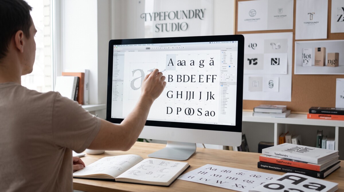
A typeface can be quiet and still carry an entire brand. It can disappear into a mobile interface, hold a campaign together, or become the recognizable voice of a company before the reader has finished the first sentence. That is the territory where TypeType works. Founded in 2013 by Ivan Gladkikh and Alexander Kudryavtsev, TypeType is an independent type foundry that designs commercial fonts, custom font systems, and technical font services for designers, agencies, and global brands.
The studio’s catalogue now includes more than 75 font families across sans serif, serif, display, script, monospaced, and variable fonts. The audience is really broad, but the approach is precise: create a type that looks distinctive, behaves reliably, and remains useful after the first campaign has ended.
TypeType began with a practical idea: designers needed accessible, well-built typefaces that could compete visually and technically with more expensive alternatives. That mission still shapes the studio. Instead of treating retail fonts and custom work as separate worlds, TypeType connects them. A team can buy fonts online for a brand launch, test them in a product, and later ask the foundry to adapt spacing, expand language support, modify glyphs, or create a bespoke typeface.
This flexibility matters because brand typography rarely stays still. A young company may first need a website and social templates; a year later, the same brand may need app embedding, multilingual campaigns, packaging, video titles, and legal-safe licensing. TypeType’s service model follows that growth rather than forcing every client into the same solution.
The TypeType library covers the categories most design teams rely on every day. TT Norms® Pro, TT Commons™ Pro, and TT Hoves Pro sit in the practical core of the collection: neutral, versatile sans serif families built for brand systems, digital products, and editorial use. Around them are more expressive families for headlines, packaging, entertainment, and campaign work, plus serifs such as TT Norms® Pro Serif and TT Livret for editorial and premium contexts.
Variable fonts add another layer. A variable font allows designers to control axes such as weight or width inside one file, which can help responsive layouts and reduce the need for multiple static files. For a digital brand, this is not only a visual feature; it can affect performance, consistency, and the way typography adapts across screens.
TypeType offers customization, font subscription, mastering, hinting, and cyrillization. Customization can be as light as adjusting spacing or replacing several characters, or as complex as reshaping a typeface for a corporate identity. Mastering prepares files for reliable release, while hinting improves readability on screens, especially in demanding interface environments.
Cyrillization is one of the studio’s most valuable services for international brands. It is not a mechanical addition of Cyrillic letters to a Latin design. A strong Cyrillic extension must preserve the rhythm, proportions, and voice of the original typeface while respecting the logic of another script. For companies moving into non-Latin markets, that difference can decide whether the brand feels native or imported.
The studio’s fonts are used by more than 75,000 companies worldwide. The client list includes ASUS, DreamWorks, WHO, Canva, Uniqlo, AliExpress, Domino’s Pizza, Kylie Cosmetics, Macy’s, CBS, Doordash, Telefonica, and Intercom. These names matter not as trophies, but as proof that the fonts have been tested in very different brand environments.
TT Norms® Pro has appeared in identities and communication systems for brands such as Cartoon Network, Sartorius, Intercom, and CSN. TT Commons™ Pro has been used by Uniqlo and other international companies that need a clean, flexible voice across many formats. These examples show the same pattern: the font is visible enough to define tone, but stable enough to support daily communication.
The same font family may need to support a campaign headline, a product interface, a legal note, and a localized landing page. A foundry becomes more valuable when its fonts can move between these contexts without losing clarity or character.
Awards are not the only measure of a typeface, but in type design they can signal both originality and execution. TypeType has received international recognition including Red Dot Best of the Best 2024, D&AD Wood Pencil 2025, and Granshan Gold 2024. For designers and brand teams, these awards are useful context: they show that the work is evaluated not only by customers, but also by design juries focused on craft, function, and innovation.
The studio also invests in education. Since 2016, TypeType has run a six-month course in type design, helping new designers understand both visual and technical sides of the discipline. That educational work feeds the wider design community and reflects a simple belief: better type culture creates better typography in real projects.
This educational role supports the same long-term view that appears in the catalogue: type design is not only about releasing files, but also about helping designers understand how fonts are built, tested, licensed, and used.
The strongest argument for TypeType is not a single bestseller. It is the combination of design range, technical support, multilingual coverage, and clear commercial access. Many families support extensive language sets, some covering 275+ languages. The foundry also tests and updates its fonts, which is essential for teams building long-lasting systems rather than one-off visuals.
Designers can explore the catalogue, trial fonts, licensing options, and custom services when they need commercial fonts, brand typography support, or a custom font design path that can grow with the project. For a modern independent type foundry, that combination of accessibility and depth is the real value.
Different font providers solve different problems. A large marketplace may be best for browsing thousands of unrelated options, while a subscription library may suit teams that need quick access inside a specific software ecosystem. TypeType sits closer to the middle: it offers retail fonts, but also provides technical services, customization, and multilingual support for teams that need a type system to grow.
| Criteria | TypeType | Large font marketplaces | Subscription-based font libraries |
| Main strength | A balanced mix of retail catalogue, custom services, multilingual work, and technical support. | Very broad selection from many foundries and designers in one place. | Fast access to many fonts through an existing design or software subscription. |
| Best for | Brand systems that may need retail fonts first and customization, cyrillization, mastering, or licensing help later. | Early exploration, broad visual research, and finding many stylistic alternatives quickly. | Teams that need convenient font access for recurring content and internal design workflows. |
| Customization path | Directly connected to the studio services, from light modification to custom type design. | Depends on the original foundry; customization is not always part of the buying path. | Usually limited, because the library is built around access rather than bespoke production. |
| Multilingual support | Many families support extensive language sets, and script expansion can be handled as a service. | Varies widely by font and seller; every family needs to be checked separately. | Varies by library and family; coverage can be strong, but may not fit every brand system. |
| Licensing clarity | Licensing and service discussions can be handled directly with the foundry. | Terms may differ from one seller or foundry to another inside the same platform. | Often simple for access, but brand, client handoff, or special media use still needs careful review. |
| Strategic fit | Useful when typography is expected to become a long-term brand asset. | Useful when the main need is discovery and comparison. | Useful when convenience and everyday production access matter most. |