

In the ecommerce space, product page design is an often underestimated and overlooked conversion optimization practice.
However, when you take a minute to think it through, it becomes apparent that pages that aren’t explicitly designed with conversions in mind stand less of a chance than those that have thought conversions through.
What is it that helps certain product pages convert more visitors than others? What best practices can you apply to ensure customers add a product to their shopping cart?
Let’s identify examples of quality product page design and its conversion-oriented elements.
CTAs are customers’ direct road to conversion, so they should be as well-optimized as possible. Best practices include using square shapes with rounded edges, choosing a color that contrasts the rest of the page, and choosing action-oriented words.
However, you don’t need to tick all these boxes with one CTA (you may not be able to). You need to take them under advisement and land on a design that works for your brand and audience.
Could you take a look at Touchland? Their CTAs are not colorful, nor do they particularly pop. The personalized and action-packed copy is, however, spot on.
Shop Solar Kits does the opposite on its solar power systems page. They have chosen the most standard copywriting solution, but they have made all CTA elements bright orange, including the “quick view” and the discount that pops up when you hover over an item.
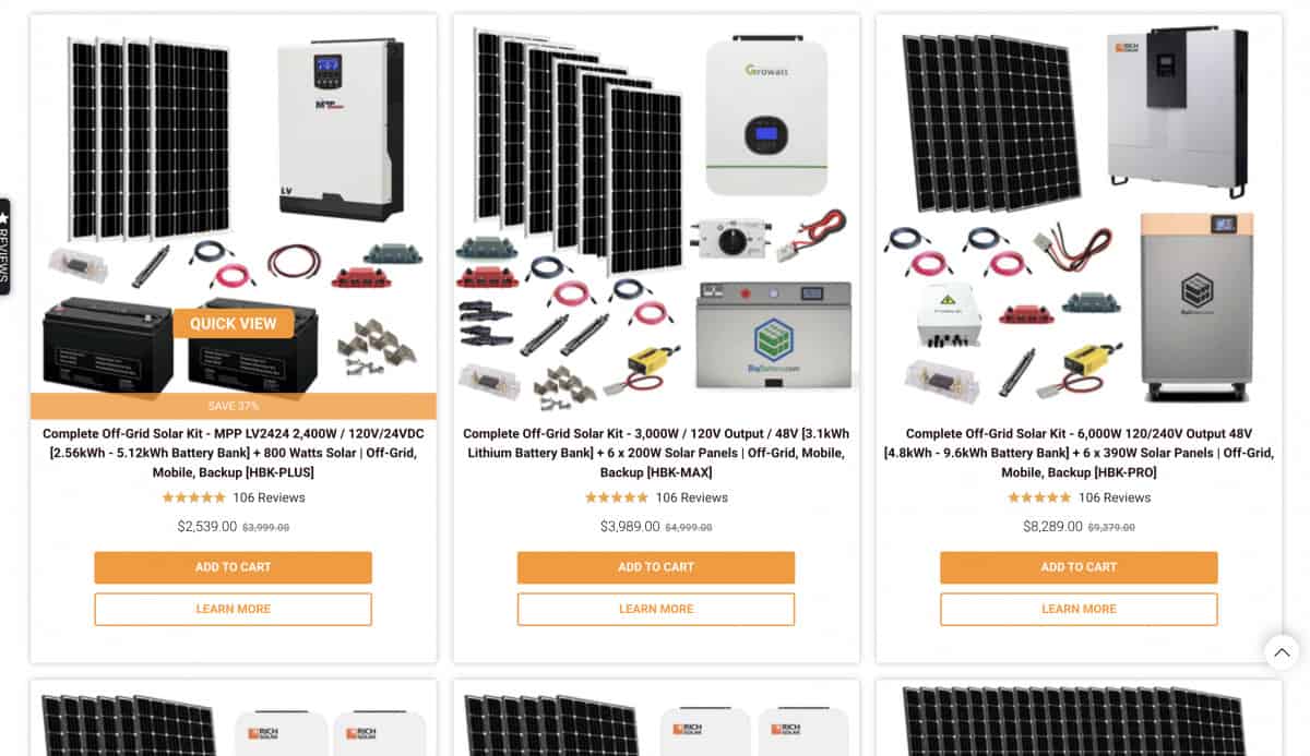
Source: shopsolarkits.com
Product page videos can be an excellent tool for boosting a range of important metrics, including time on page and bounce rate. They also allow you to showcase a product in motion, explain hard-to-grasp topics, and demonstrate the best use of the product.
You can make your video and explainer or a demo. You can also do unboxing videos or even comparison videos. There are no limits, as long as you remember that your main goal is to provide value to your customers rather than push a sale.
Let’s look at the video GetSafe made of their medical alert systems. They’ve chosen to demonstrate how the product works and show you the actual device and what it looks like. But they also walk you through the process of calling for help.
This video works well because:
Using any social proof on your product page is a great way to add more credibility and trustworthiness. While you are usually advised to add this element to your homepage or landing pages, it works just as effectively on product pages.
If someone lands on your website directly through a product page link, they won’t be interested in checking out other pages and ensuring you are genuine. They will want to learn everything there is to know from that one touchpoint with your brand.
Product reviews are practically a given, and there is no reason for you not to use them. Even if your brand is new and you only have a handful of reviews, it will speak volumes. Once you are more established and have worked with more prominent brands, reference them on your product and product category pages as well.
Mannequin Mall did an excellent job on its dress forms page. They’ve included the logos of some of their more prominent clients just above the footer. This is not essential; they are not shoving it down your throat. But it’s there for those ready to scroll to page two of their offer.
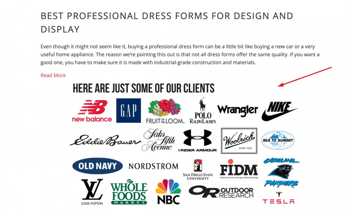
Source: mannequinmall.com
This may sound like a prominent piece of advice, but don’t forget to make the product the most prominent element of the page. While you need to add the copy, the CTA, and the social proof, and there are dozens of other elements you are probably considering, none of them should overshadow the product.
This is what you want your audience to see first. It should be the most prominent image and have some element of interest to it.
For example, Vivion’s page on bulk ascorbic acid is an excellent example of making a very ordinary product the hero. It loads with an interesting effect, it takes up half the screen real estate, and while it’s not the most exciting product photo you’ve ever seen, it’s very clear about what you are looking at.
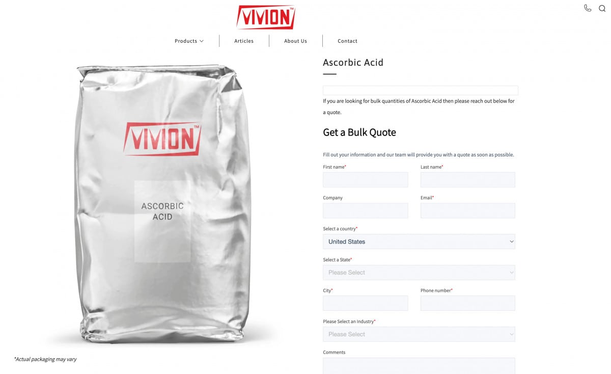
Source: vivion.com
If your product comes in several options, like size, color, or finish, you must ensure the choice is exceptionally user-friendly. The easier you can make it for users to get their hands on exactly what they need, the likelier they are to convert.
For instance, you’ll be wasting their time if you need to redirect them to an entirely new page for each option. If you can’t instantly tell them which sizes of a particular color are available, they’ll lose interest quickly.
Let’s look at Buffy and how well they’ve handled this UX aspect on their product pages. Whenever you select a color, you are instantly served the appropriate images (note the extra touch with the “product in use” photo) and are told which sizes are available. On this page, you already know that they are out of their blue stripe model in all sizes.

Source: https://buffy.co
Features– vs. benefits-based copywriting and marketing must often be understood. In short, highlighting the features tells customers what a product does, while highlighting the benefits tells them how it can help them.
Describing a product’s features is essential, but it’s equally (if not more) necessary to highlight its benefits. Ultimately, customers will care very little about a product’s capabilities if you can’t tie them in directly with the benefits it also comes with.
How to describe the benefits of certain products is often the biggest challenge. Let’s check out Glossier, which does a magnificent job. They tell you what the product is, but they also tell you it’s vegan, cruelty-free, enhancing, nourishing, and long-wearing. These may look like features — but they are benefits.
They are telling you that this product is good for the planet and your lips, plus you won’t have to keep reapplying it.
Certain products require you to provide an extreme level of zoom, clothing items being the most obvious on that list. This feature will often overcome the biggest drawback of online shopping: you can’t see and touch the product.
While an image will convey less information than a real-life product, you can help visitors understand more about the fabric and the fit if you let them zoom in very closely.
Urban Outfitters is a prime example to check out. Their product images are super-high-quality and let you zoom in so close that you can see the textures and fabrics. That makes deciding if a product is a right fit much easier.
This simple tactic can reduce bounce rates and cart abandonment rates, as well as the number of returned items you must deal with.
Upselling and cross-selling your products is a great way to boost average order value, among other important metrics you are likely tracking. It also provides a great experience to your customers, as they can see more products they will likely be interested in without having to take the time to look for them.
What do you think is an excellent way to do this? Let’s take a look at Sephora. They give you three different types of recommendations:
This is cross-selling at its very best, where the customer is given much choice and freedom, but most importantly, served with highly personalized and relevant recommendations.
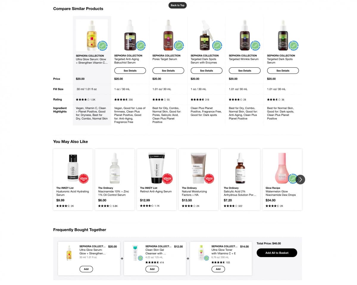
Source: sephora.com
If you want to overcome more common conversion obstacles, add a FAQ section to your product pages. This will allow you to preempt many of the questions your customers are likely to have, thus saving them the time to contact your customer service. At the same time, it will show that you care about your customers’ experience.
Please try to answer the most common questions about the product and your business. For instance, you can address shipping rates and costs here as well.
Leesa did an excellent job with this section of their product pages. They address different pain points and points of interest on each page, teaching their customers about bedding and simultaneously demonstrating their expertise and the quality of their products.
If you want to ensure your product pages are ticking all the boxes and have been designed with the best CRO principles, use Oddit to test and analyze your pages.
They will provide actionable advice and actual Figma design files showing you what your pages could be improved and what they need to do better.

Source: oddit.co
Oddit puts user experience to the forefront, ensuring a seamless experience that boosts conversions and brand value.
Please review these product page best design practices and compare your existing pages to them. Is there something you could be doing but still need to do? Have you found another design hack that works better for you?
Remember to always align your design efforts with your brand values and your customers’ interests. That will yield the best possible results!

